
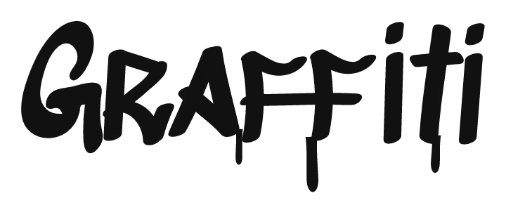

How to use the graffiti tag generator
- Type your tag. Short names of three to six letters look best, the same length most writers use.
- Shuffle for a new flow. The shuffle button next to the text box changes the bounce and tilt of the letters, so you can try different versions of the same tag.
- Pick a color. Tags are one color. Black, silver or a single bright color all work.
- Download it as a transparent PNG, or as a sticker or profile size from the size menu.
- Practise it by hand. Print it or keep it on your screen and copy it in a blackbook until the line comes out in one go.
What makes a good tag
- Short: fewer letters means a faster, cleaner line.
- Flow: letters that connect, so the pen rarely leaves the paper.
- The same every time: a tag is recognised by its shape, so consistency matters more than tricks.
- Your own style: a slant, a long tail on the last letter, or a crown or underline that only you use.
- Readable enough: other writers should be able to read it, even if it is stylised.
Tag letters: how the alphabet changes
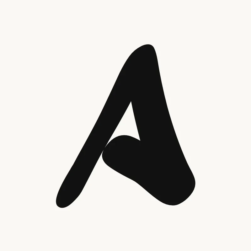
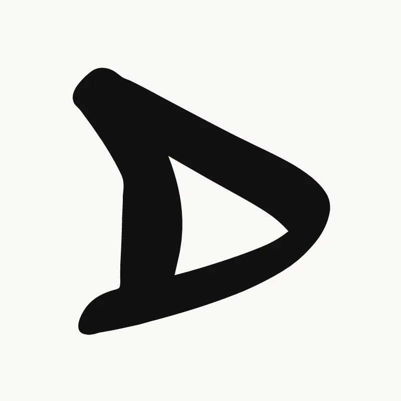
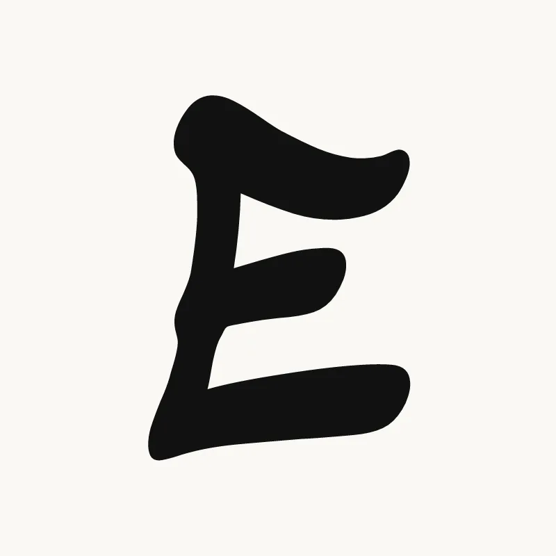
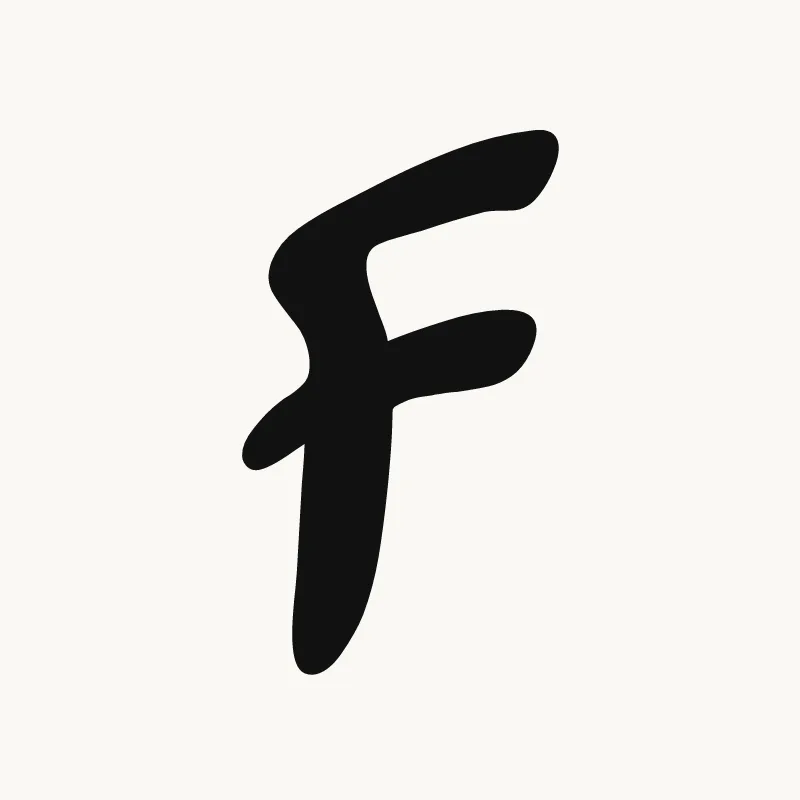
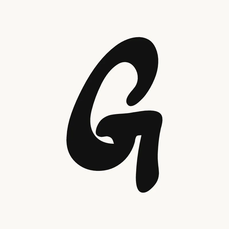
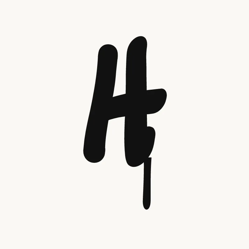
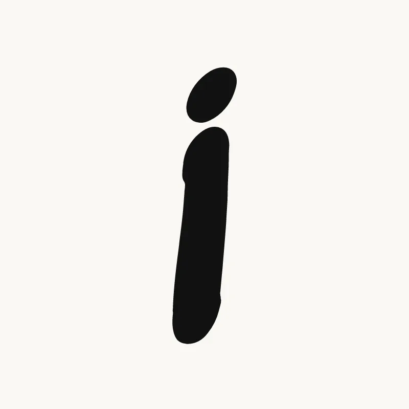
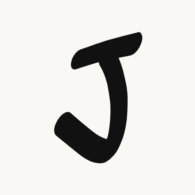
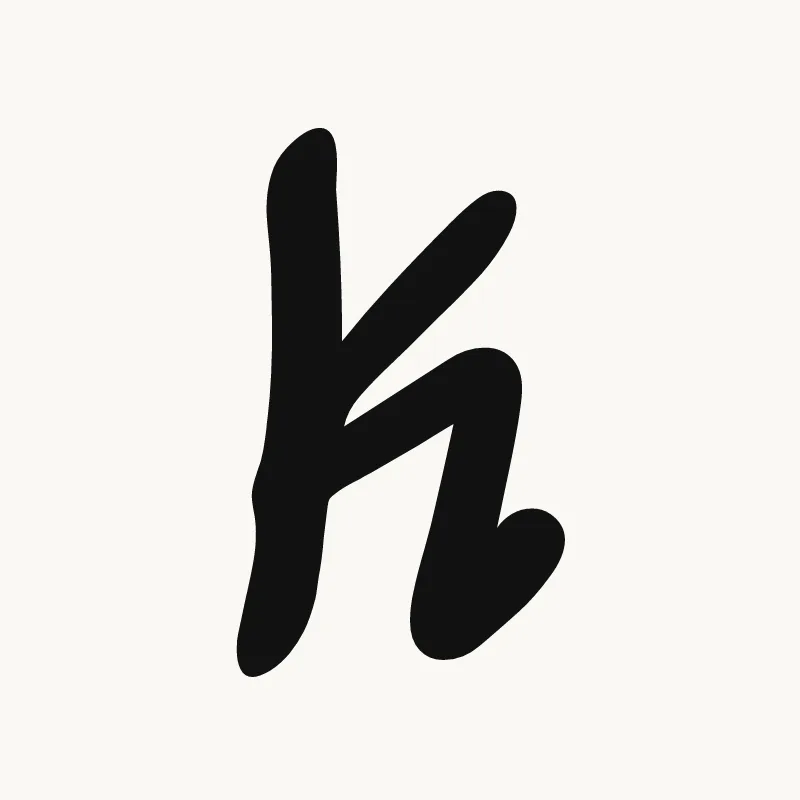
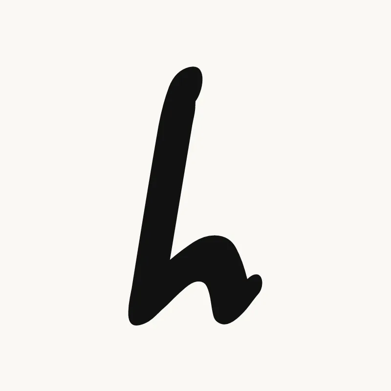
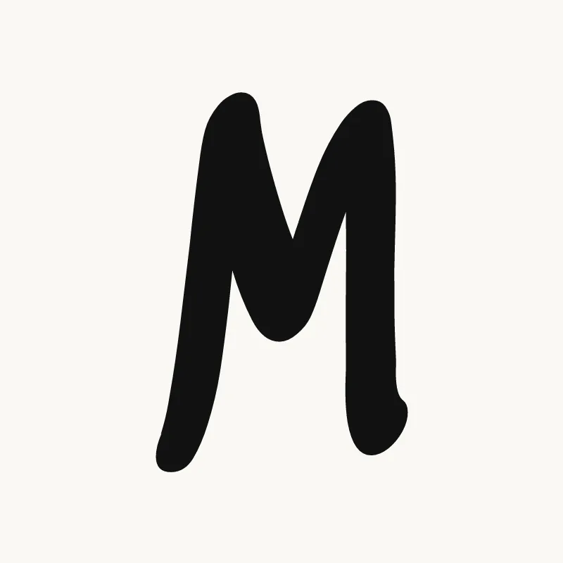
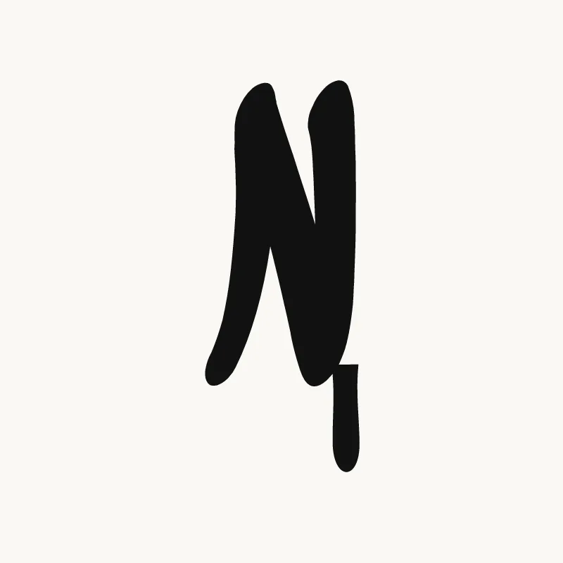
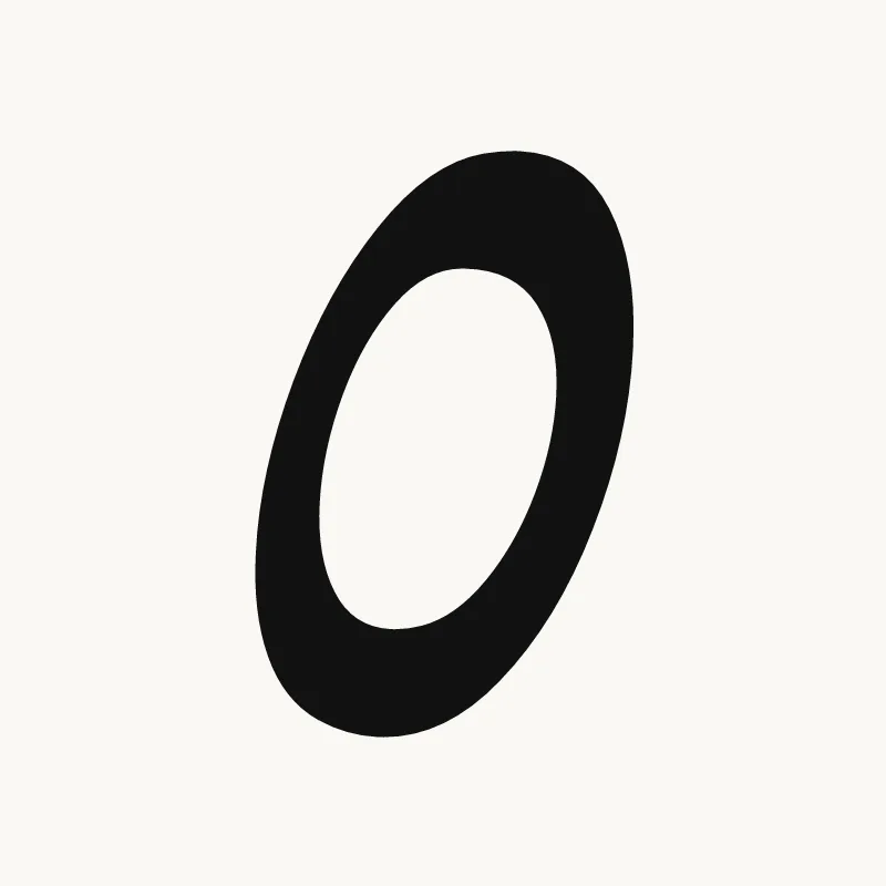
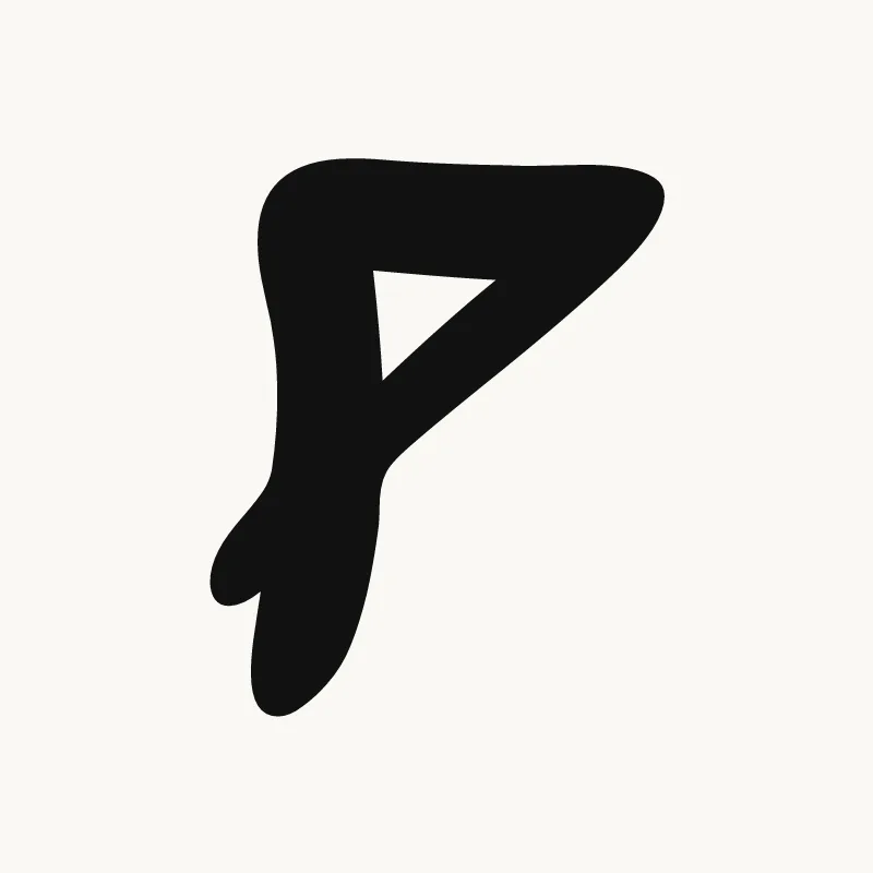
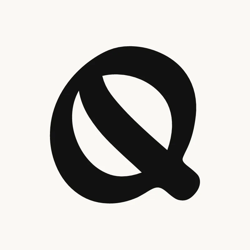
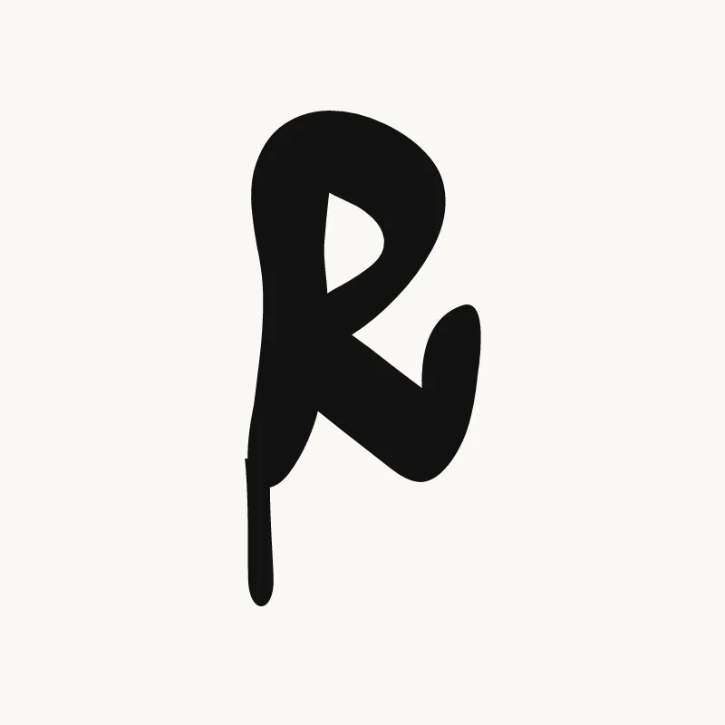
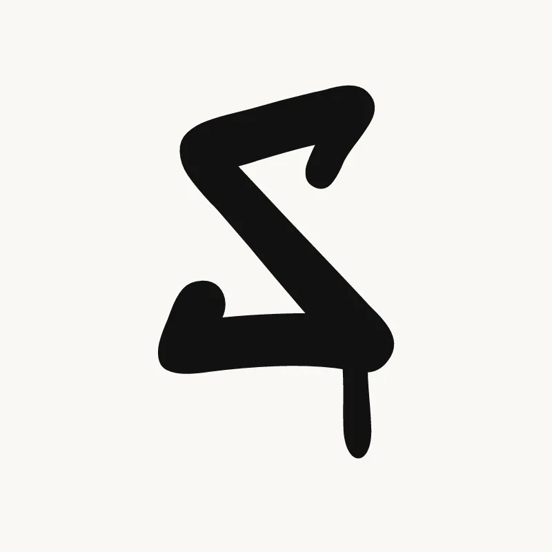
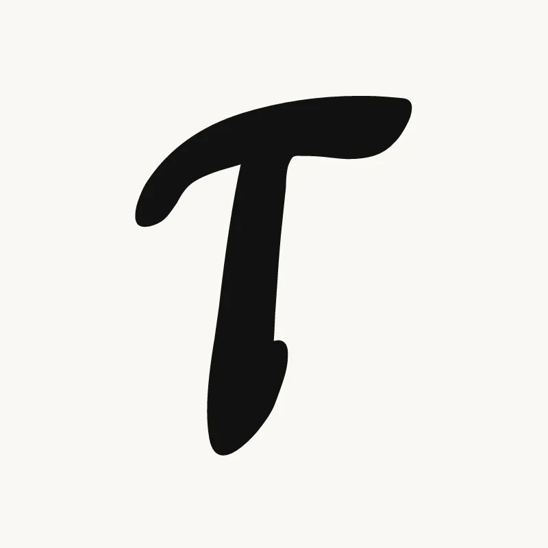
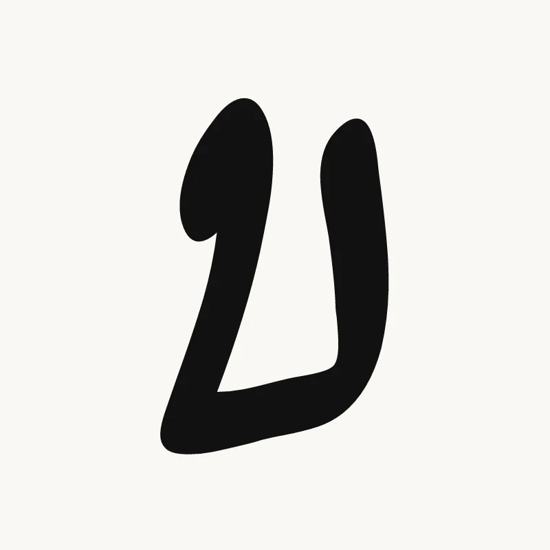
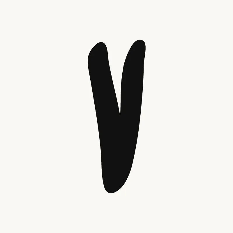
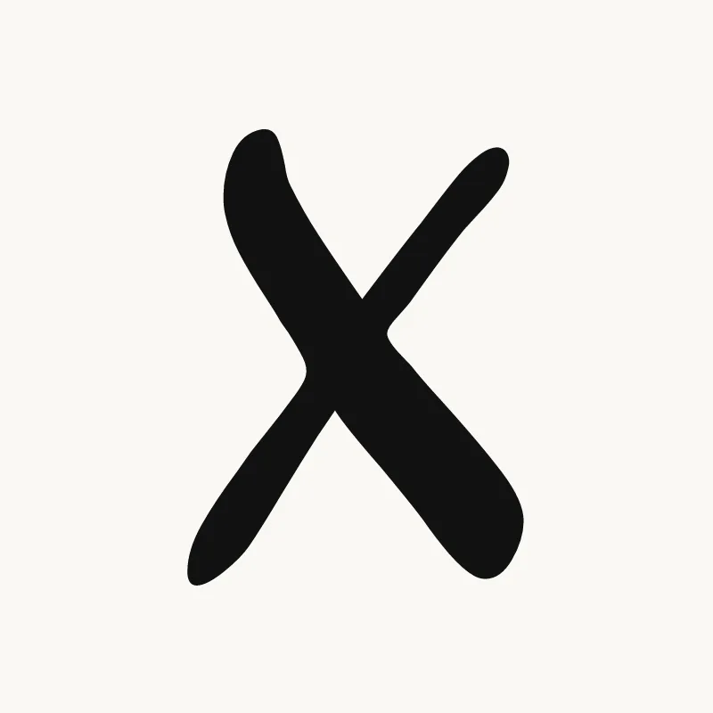
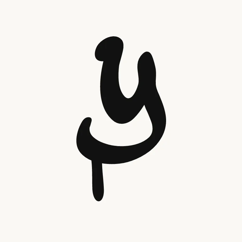
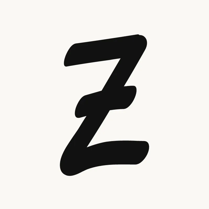
Tag letters are written fast, so they lose detail and gain movement. Straight strokes lean, round letters stretch, and the first and last letters often get the biggest flourish. The alphabet above shows each letter in the generator's tag style. For each one, look at where the stroke starts and ends, because that is what lets you join it to the next letter.
- A, M, N: sharp, fast peaks. Many writers drop the A's crossbar. See the letter A.
- E and S: the easiest letters to join, which is why they show up in so many tags. See the letter S.
- K and R: long diagonal legs that can become an arrow or a tail. See the letter K.
From tag to throw-up to piece
Most writers start with a tag, then draw the same name as a throw-up, then as a full piece. You can follow the same path here: switch the style to throw-up or bubble letters, or open the full graffiti generator for 3D, drips and wall scenes.