




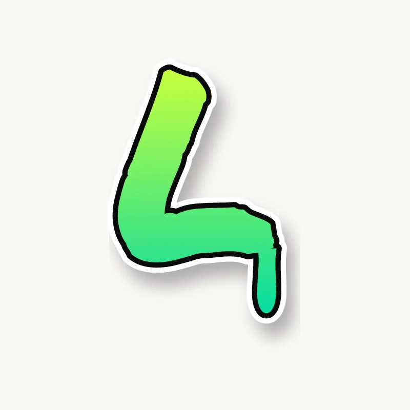






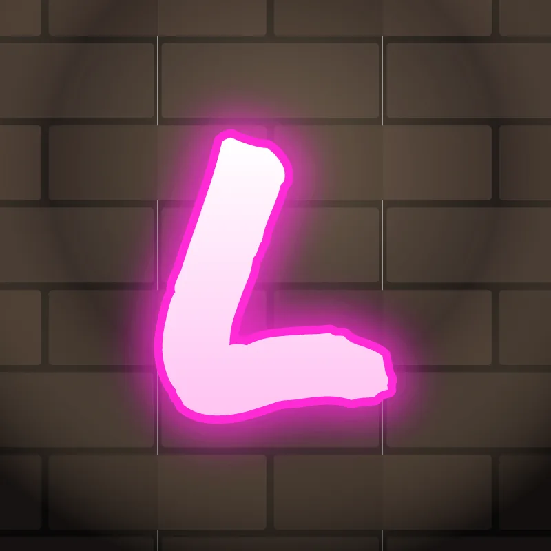
How do you draw an L in graffiti?
To draw an L in graffiti, pencil a stem and a foot about half the letter's height or longer, thicken both, and round or cut the corner to suit the style. Outline it and add the 3D block along the foot, where the depth shows best. The long foot is the L's signature, so do not cut it short.
- Stem. A vertical line, slightly taller than the letters around it.
- Foot. Run a horizontal line from the bottom, about half the letter's height or longer.
- Shape the corner. Round it for bubble, keep it square for block, or notch it for wildstyle.
- Thicken. Build the body. A foot slightly thinner than the stem makes the corner look natural.
- Outline and 3D. Ink it, extrude below the foot and along the stem, and add a highlight on top of the stem.
Letter structure: the parts of an L
An L is a stem with a foot. Its only counter is the open space above the foot. Because so much of the letter is empty, the L relies on the length of its foot to be recognized, and that same empty space is where the next letter can move in.
The L in bubble, blockbuster, wildstyle, throw-up and Old English
Bubble. A fat boot shape. Round the corner and the end of the foot, and keep the inside angle soft.
Blockbuster. A thick right angle with a deep 3D block. One of the easiest blockbuster letters.
Wildstyle. The foot stretches into an arrow under the next letter, and the top of the stem can carry a cap or a second arrow pointing back.
Throw-up. One quick stroke down and across, often with a curved corner. Make the foot obvious.
Old English. The blackletter L has a curved stem with a hairline loop at the top and a foot that swings out into a thin tail.
Common mistakes with a graffiti L
- A short foot. The L then looks like an I.
- A foot that rises. If the foot tilts up, the L starts to look like a V or a check mark.
- A thin stem with a heavy foot. The weight should feel even, or the L looks like it is sliding over.
Uppercase or lowercase L?
A lowercase l is just a tall stem, so it can look thin. Add a curl or a foot at the bottom, or give it a cap, so it carries the same weight as its neighbors.
Adding arrows to an L
The end of the foot is the arrow spot on a capital L. Stretch it under the next letter and finish it in a point. See how whole words lock together in wildstyle.
Making an L flow in a word
The next letter can sit on the foot, which locks the two together. L shows up doubled in many words (Bella, Will, Hello) and often ends them (Paul, Cool). In "LL", the second L can stand on the first one's foot for a stepped look. In "LA" or "LE", slide the next letter onto the foot. At the end of a word, the foot can stretch out as a final arrow.
Want to see it with your own name? Type it into the graffiti letter generator, or learn the whole process step by step in how to draw graffiti.