








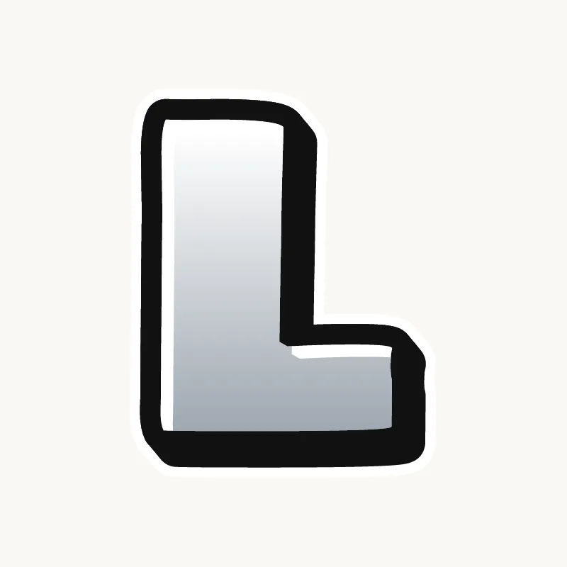


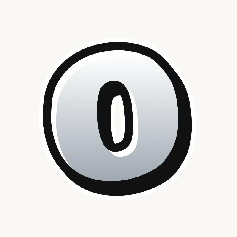

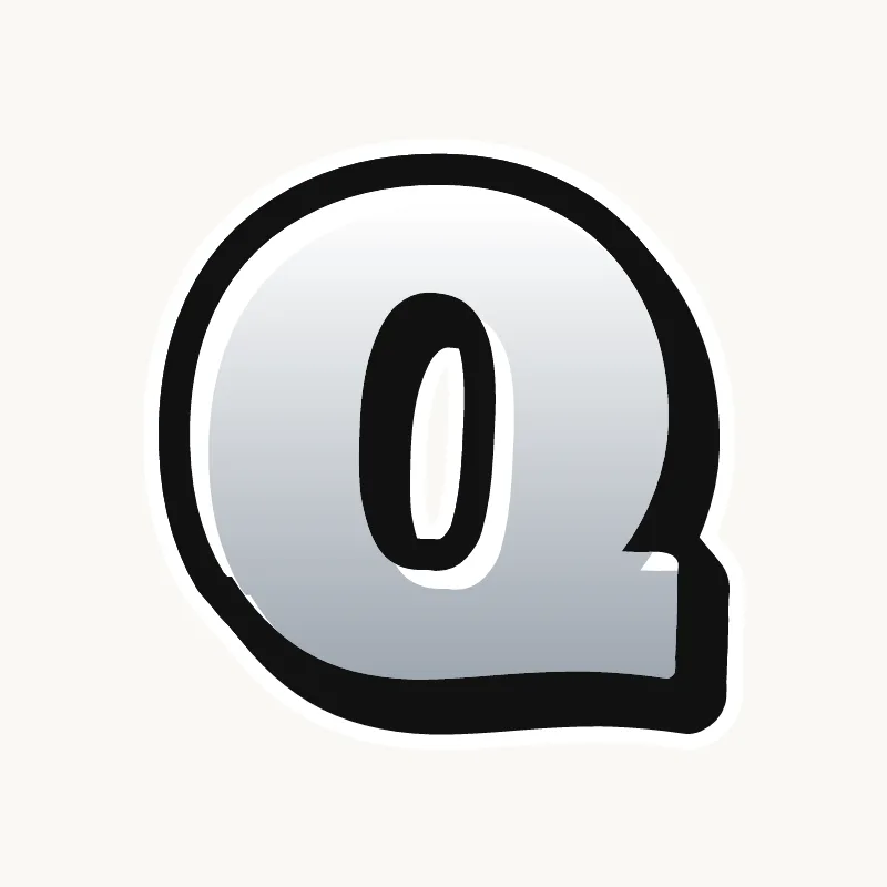









How to draw a throw-up
To draw a throw-up, sketch two to four fat, rounded letters that overlap, fill them with one color, then outline the whole word in a contrasting color with one smooth line. Speed and a clean silhouette matter more than detail, so keep it simple and stop once the outline is done.
- Keep the word short. Most throw-ups are two to four letters, often a writer's tag name.
- Draw fat, rounded letters that overlap each other, all in one quick pass. Squash them so the whole word fits a rough oval or rectangle.
- Fill with one color. Speed matters more than a perfect fill; a few gaps are normal.
- Outline with a contrasting color in one continuous line around the whole word, then add the inside lines that separate the letters.
- Optional extras: a thin highlight line or a simple drop shadow. Then stop.
Practice on paper with a timer: give yourself ten minutes per throw-up, then five. Drawing against the clock is what trains the confident, smooth line a throwie needs. A blackbook full of the same name drawn fifty times is normal.
Throw-up alphabet: how letters change
Throw-up letters are simplified so they can be painted fast. Corners become curves, small details disappear, and letters squeeze together until they share one outline. A good throwie reads as a single shape first and a word second, which is why writers practice the same few letters over and over until the shape is automatic.
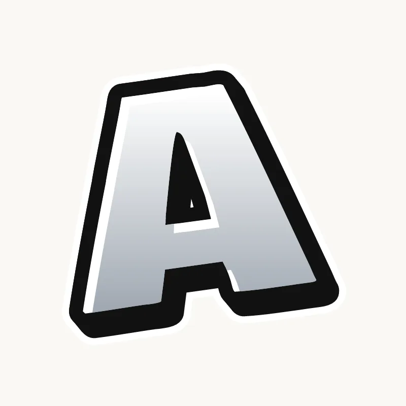
- A: a rounded hill with a small hole, often with no crossbar at all. See the letter A.
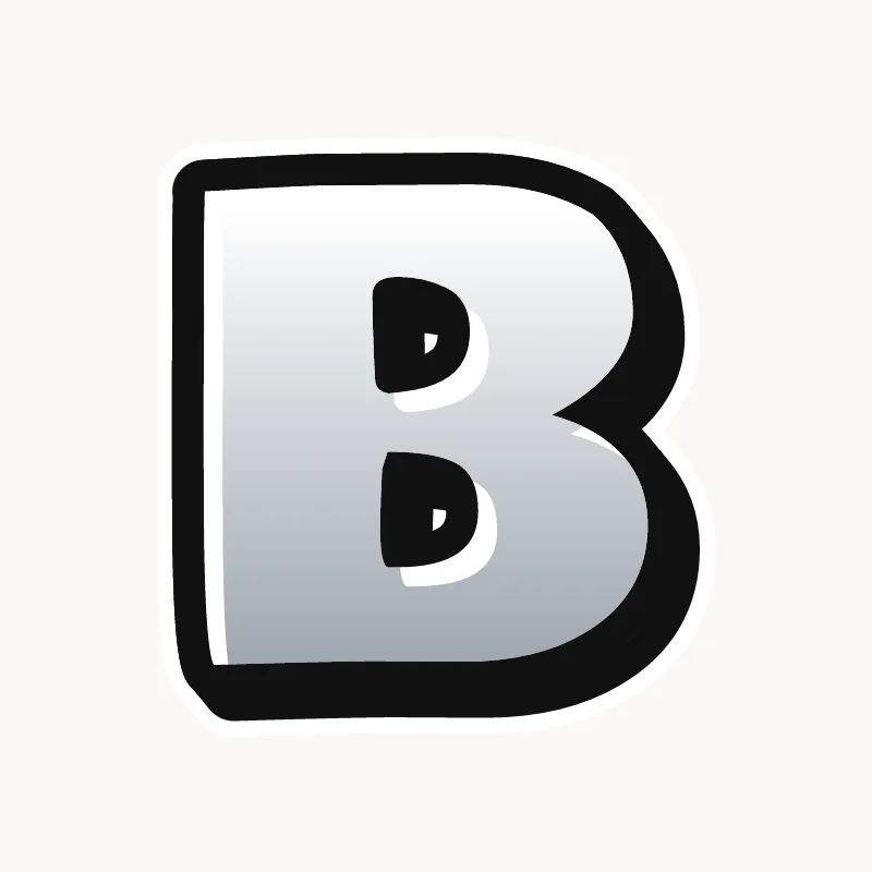
- B: two fat circles stacked on a short stem. More on the letter B.
- E: a puffy stem with three short, round fingers. Keep the gaps between them open. See the letter E.
- M and N: soft humps instead of sharp points. The M and N pages show the shapes.
- S: a fat snake shape that leans with the word. See the letter S.
Old school throw-up alphabets from the New York subway era tend to be rounder and puffier; newer ones are often squarer and more compact. Both follow the same rules.
Colors that work
- Chrome and black: the classic. Silver covers fast and the black outline pops on any wall.
- White and black: just as fast, and very readable from a distance.
- One bright color and black: for a throwie that stands out from the chrome around it.
Using the throw-up generator
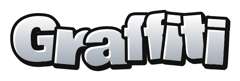
The Throw-up style in the generator gives you fat, squashed letters with a chrome fill and a heavy black outline. Type a short name, press shuffle to try a different bounce, pick another palette in the Colors tab if you like, then download a transparent PNG or an SVG. Many people print the result and copy it by hand a few times to learn the shapes. For a rounder, more detailed version with 3D and highlights, switch to bubble letters.
Common throw-up mistakes
- Too many letters. Long words take too long and lose their shape.
- Gaps between letters. A throw-up should hold together as one block.
- Over-detailing. 3D, highlights and drips belong in pieces. Keep a throwie clean.
- A shaky outline. One smooth, confident line beats a slow, careful one.
- Letters that do not match. If one letter is round and the next is square, the throw-up looks like two different writers.
Tag, throw-up or piece?
| Colors | Time | Detail | |
|---|---|---|---|
| Tag | One | Seconds | A signature |
| Throw-up | Two | Minutes | Bubble letters, outline |
| Piece | Many | Hours | 3D, highlights, background |
Most writers learn in that order: a tag first, then a throw-up of the same name, then a full piece. Paint throw-ups only on legal walls or surfaces you have permission to use. See the rest of the terms in the graffiti glossary.