



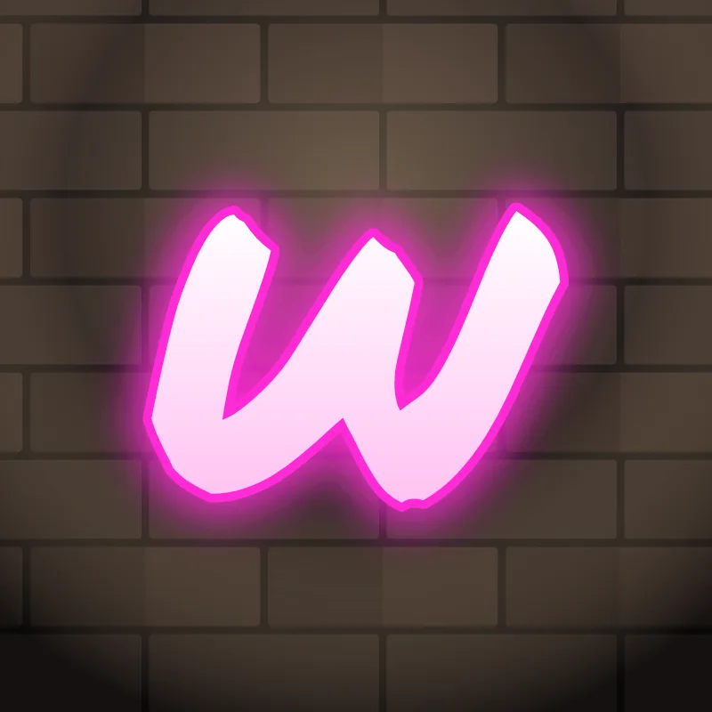
How to draw a W in graffiti
To draw a W in graffiti, pencil two Vs that overlap in the middle, lower the middle peak, then thicken all four strokes. Squeeze the letter until it is not much wider than an M, keep the three gaps open, outline it and add 3D. In bubble style, draw three soft humps instead.
- Two Vs. Pencil them so the inner arms cross or touch.
- Lower the middle. Drop the center peak below the outer tops.
- Squeeze. Pull the outer arms in until the W is about as wide as an M.
- Thicken. Alternate thick and thin strokes for block styles, or keep them all fat for bubble.
- Flat feet, then 3D. Make sure both bottom points are flat enough to stand, then ink it and extrude.
Letter structure: the parts of a W
A W is two Vs side by side. Its four diagonals form two vertices at the bottom and a peak in the middle, leaving three counters: two V-shaped gaps at the top and an upside-down V in the middle. With that many strokes packed together, a W fills in quickly once it is outlined.
The W in bubble, blockbuster, wildstyle, throw-up and Old English
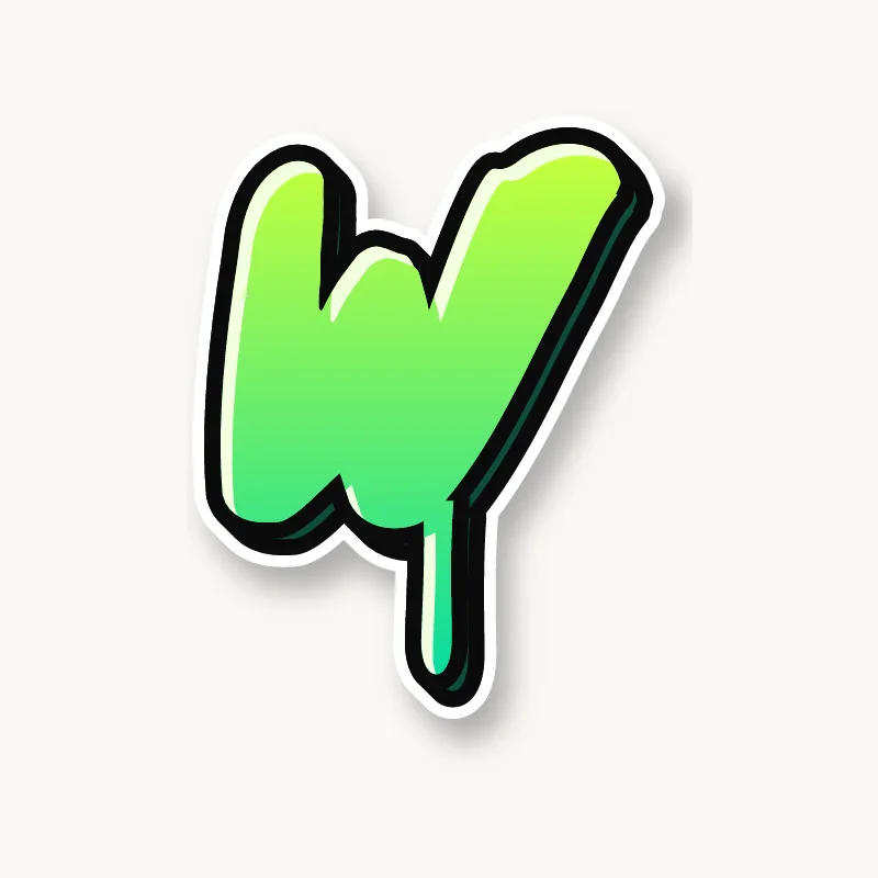
Bubble. Three humps, or two round cups side by side.
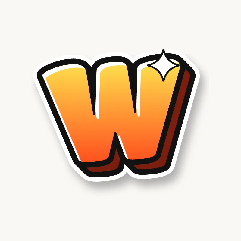
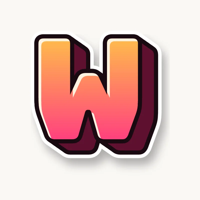
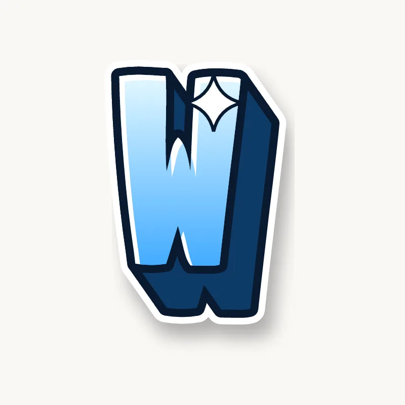
Blockbuster. Two square wedges joined, with flat bottoms.
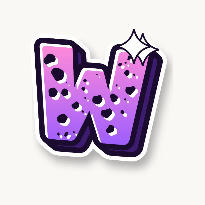
Wildstyle. The outer arms become arrows, and the middle peak can overlap the next letter.
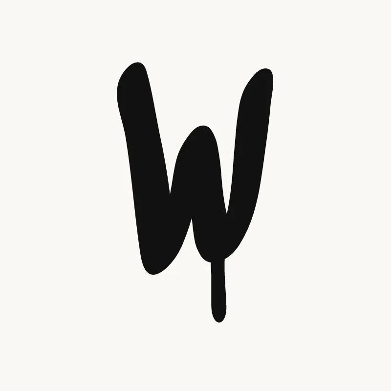
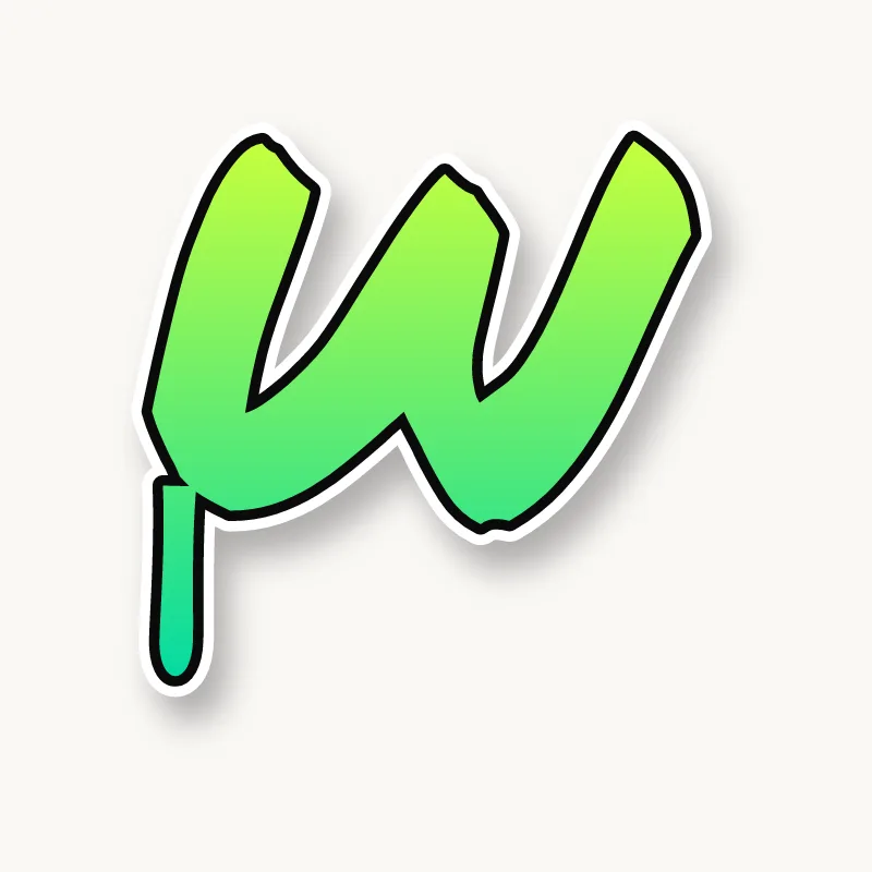
Throw-up. A quick wavy line with two dips, often in lowercase.
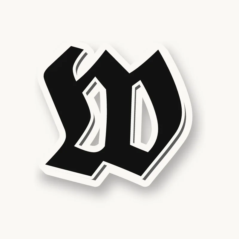
Old English. The blackletter W is a doubled V with curling hairlines, one of the most decorative capitals in the set.
Common mistakes with a graffiti W
- Drawing it too wide. Like M, the W can stretch a word out of shape.
- A middle peak as tall as the outer arms. The W then looks like two separate Vs.
- Thin inner strokes. Four thin diagonals read as a zigzag, not a letter.
Uppercase or lowercase W?
In lowercase, the w drops to x-height and gets even wider relative to its neighbors. Rounding the bottom points turns it into a soft, bubbly shape that works well in throw-ups.
Adding arrows to a W
Arrows go on the outer arms, pointing up and out. Keep the middle peak simple so the letter still reads. See how whole words lock together in wildstyle.
Making a W flow in a word
The overlapping halves of a W are a good warm-up for overlapping whole letters. W often starts words (Will, Wild, Wow) and appears in "OW" and "EW". At the start, let it overlap the next letter. In "WW", overlap heavily or shrink one of them. Like the M, a W looks better leaning, so tilt it rather than letting it sit flat.
Want to see it with your own name? Type it into the graffiti letter generator, or learn the whole process step by step in how to draw graffiti.