
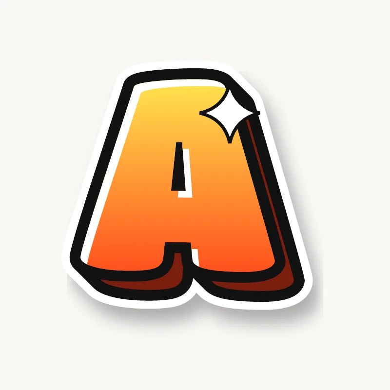

























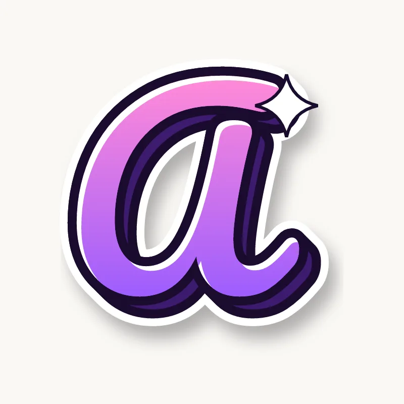









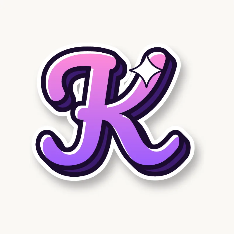















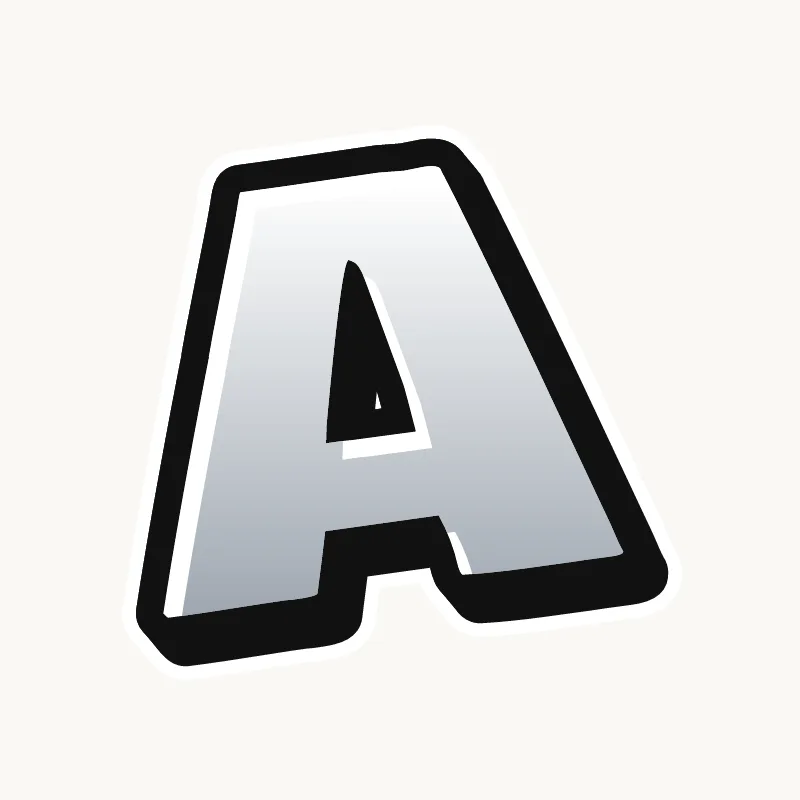











































































































































































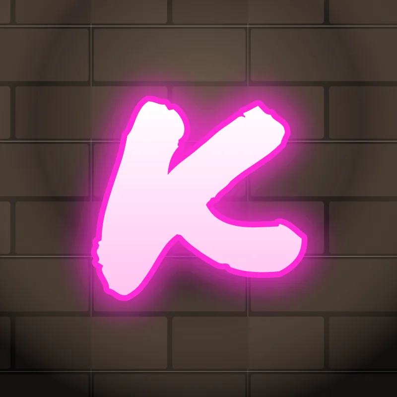
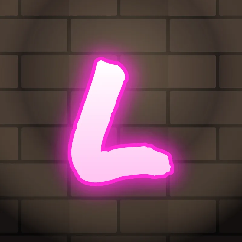

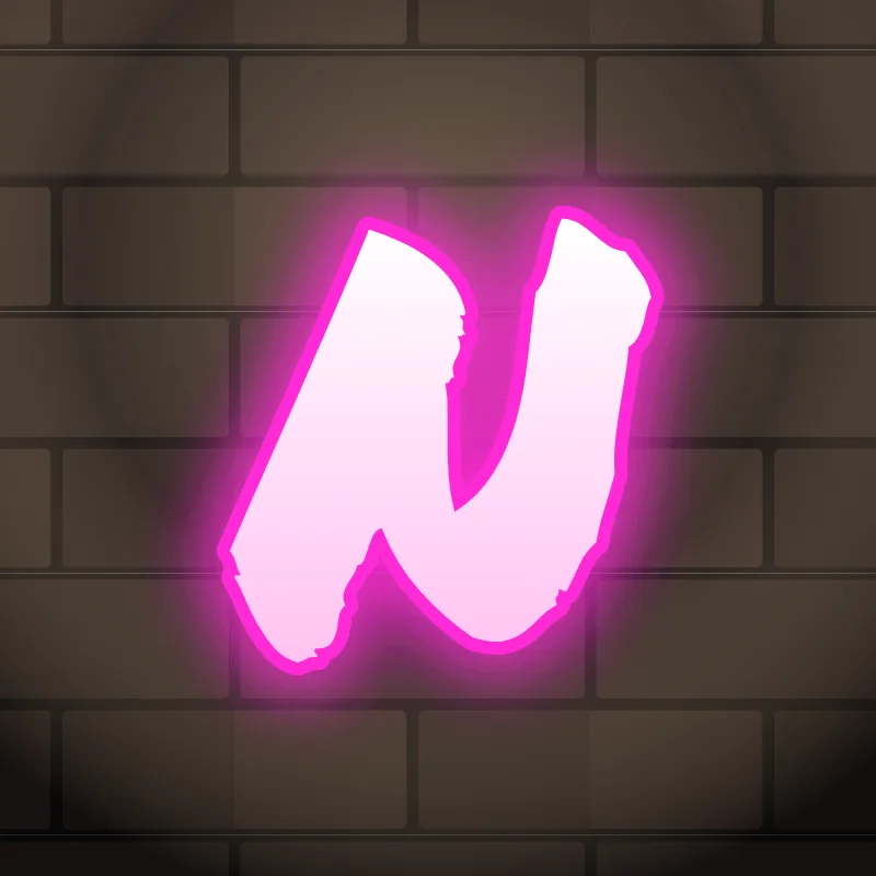


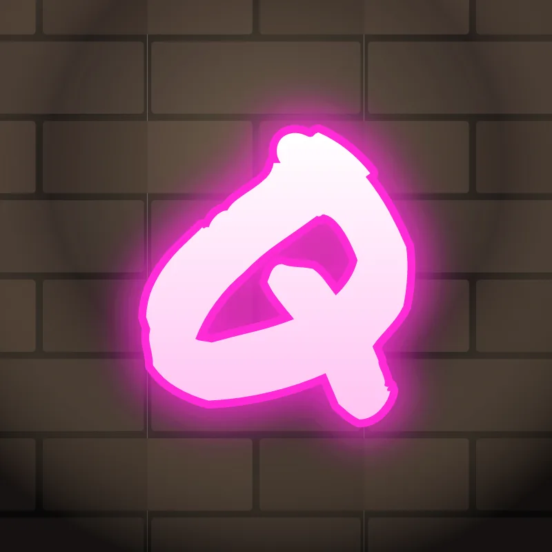


How a graffiti alphabet works
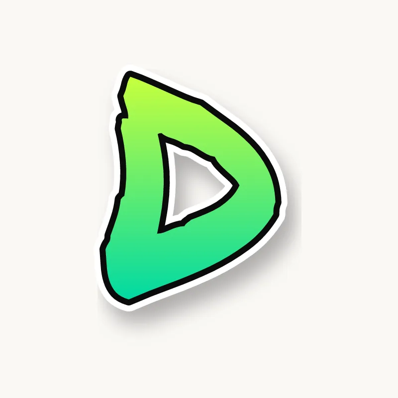
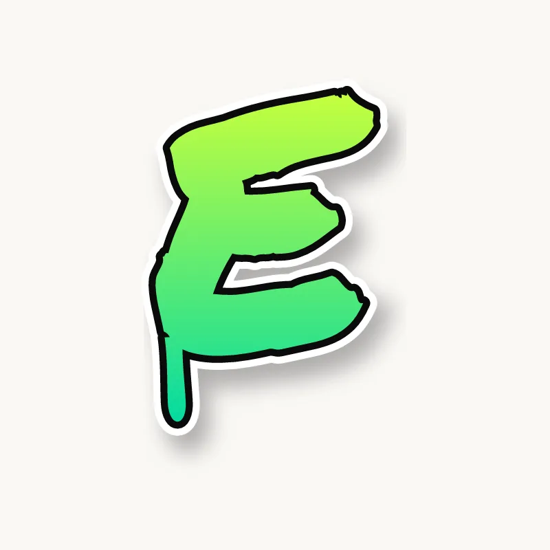
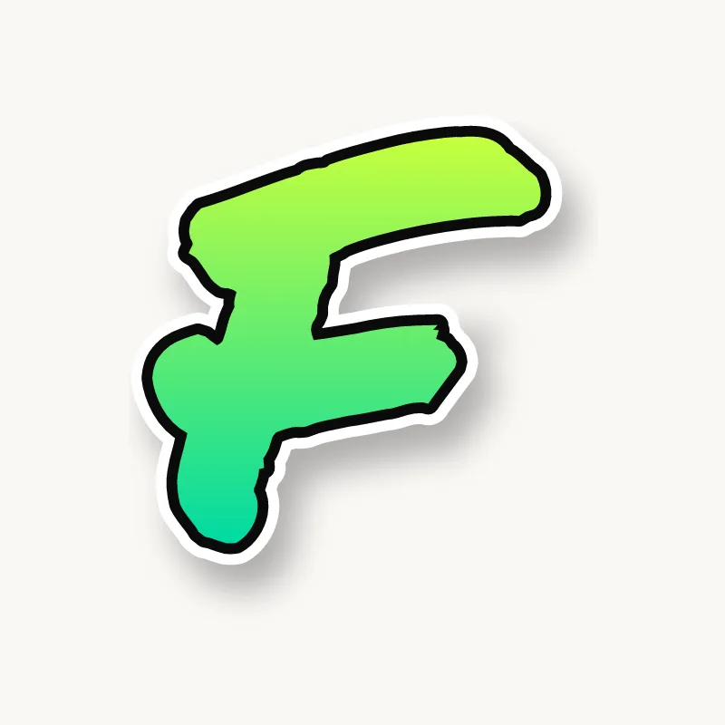
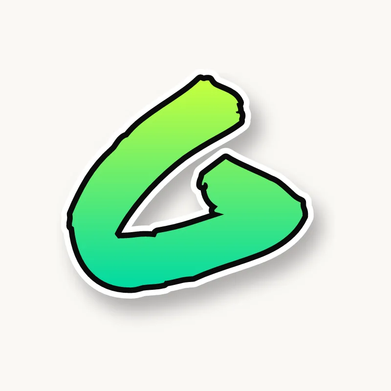
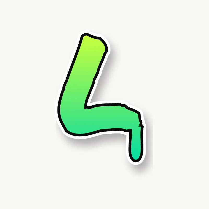
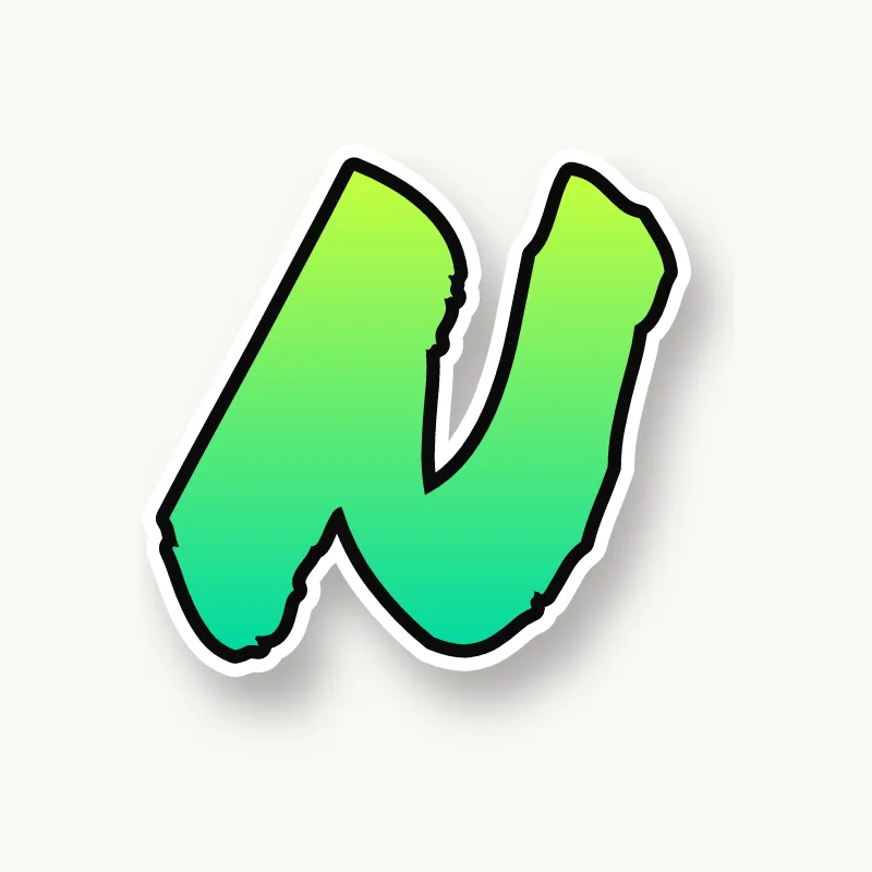
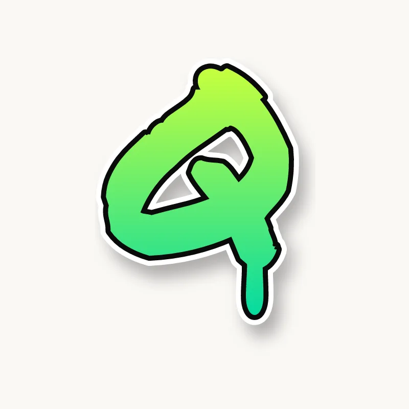
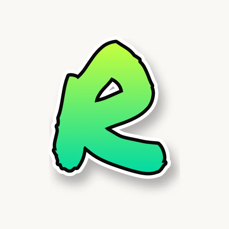
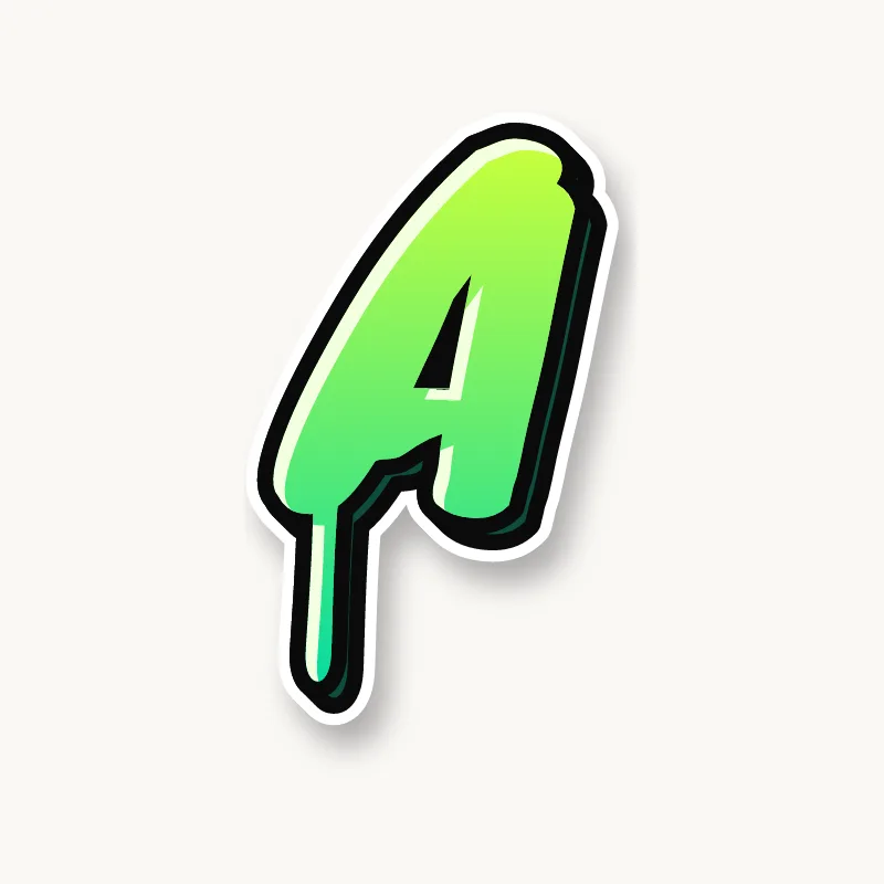
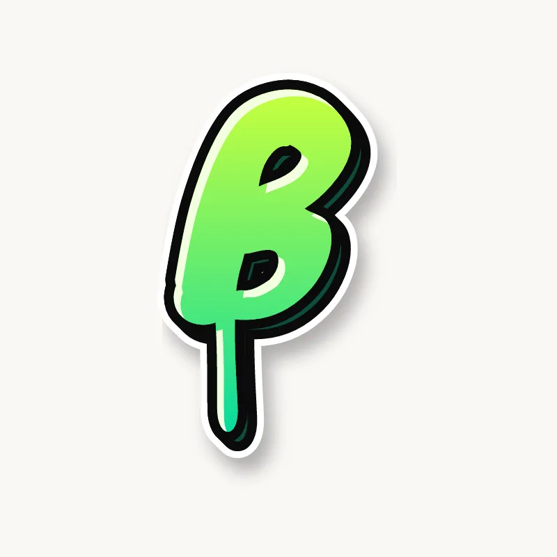
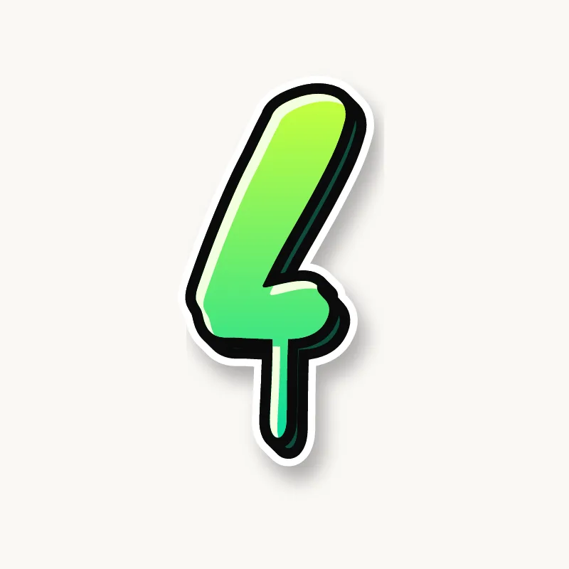
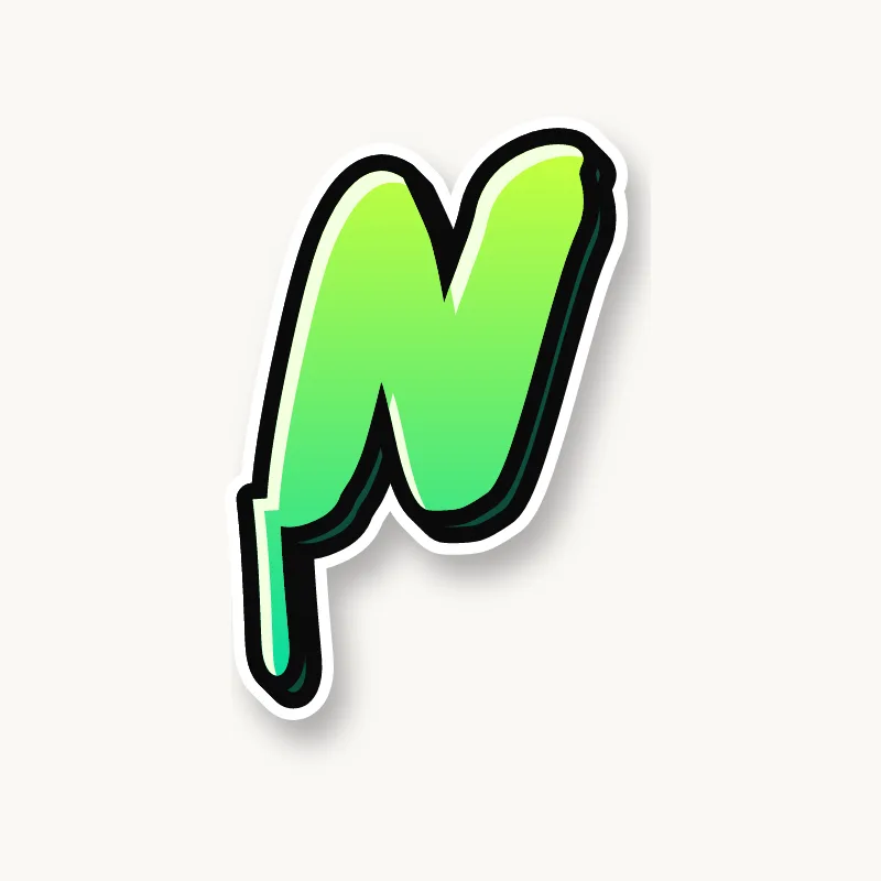
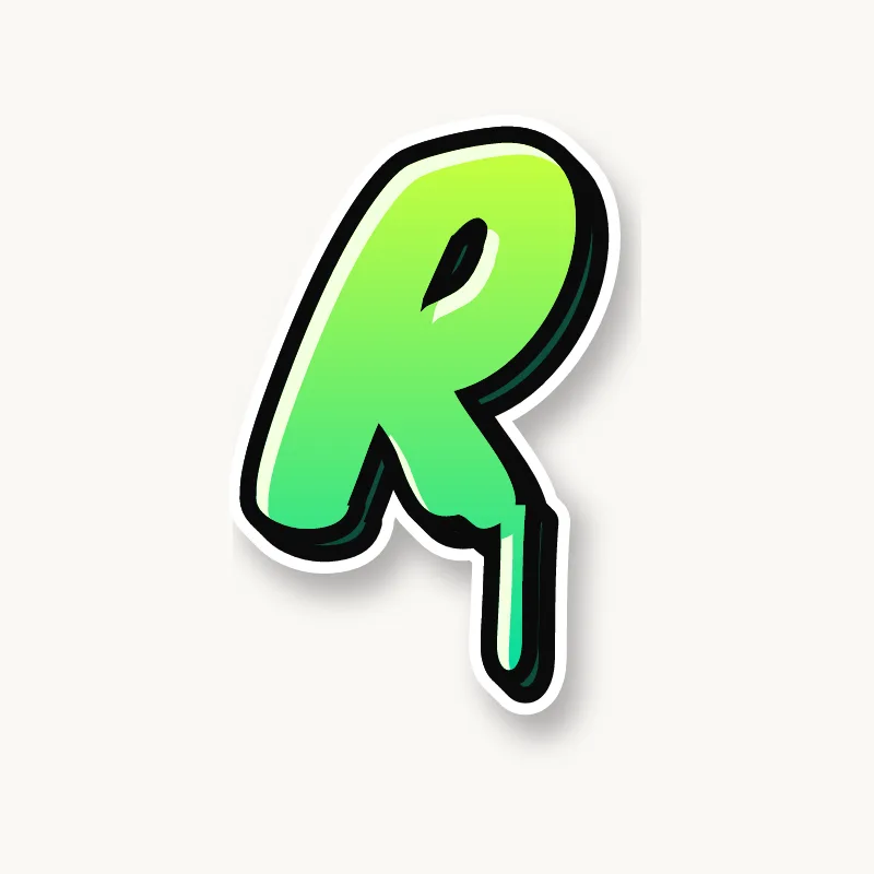
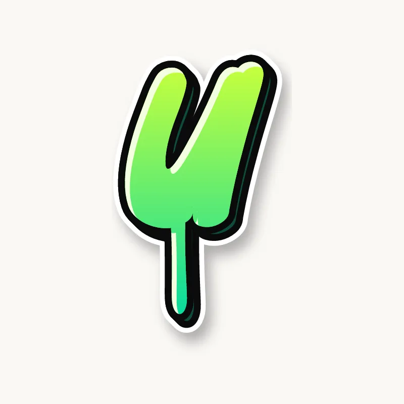
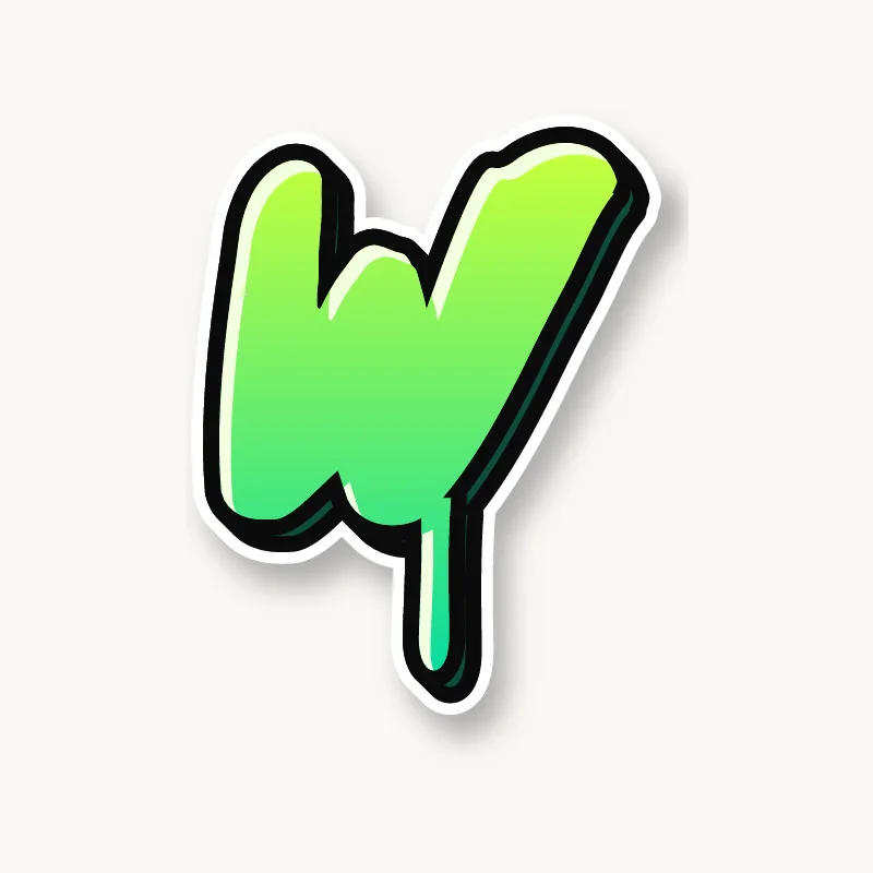
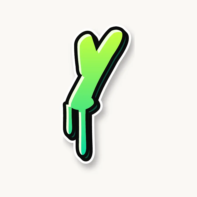
A graffiti alphabet is not a font. It is a set of rules a writer follows so that every letter looks like it belongs to the same family: the same stroke width, the same lean, the same way of ending a stroke and the same kind of 3D. Once the rules are set, any word can be built from them.
Most writers keep these things consistent across the whole alphabet:
- Weight. Every letter uses the same thickness of stroke.
- Angle. The letters lean the same way, even if each one bounces a little up or down.
- Endings. Strokes finish the same way, whether that is a round end, a square cut or an arrow.
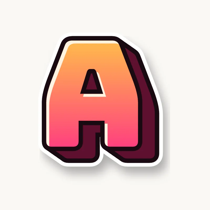
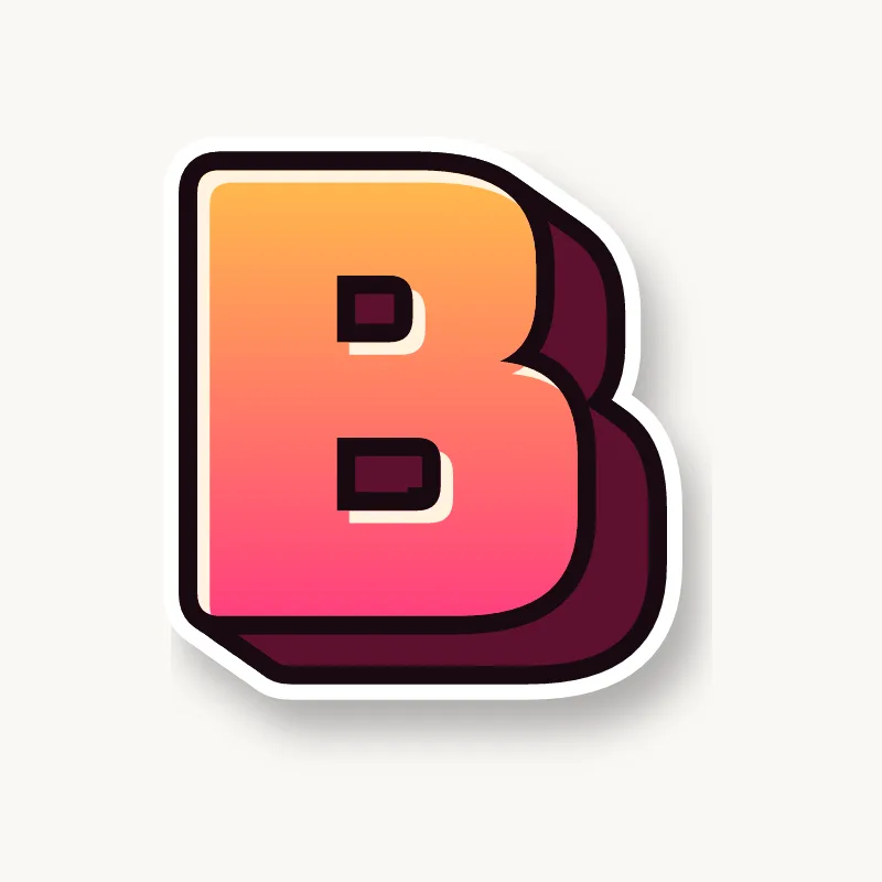
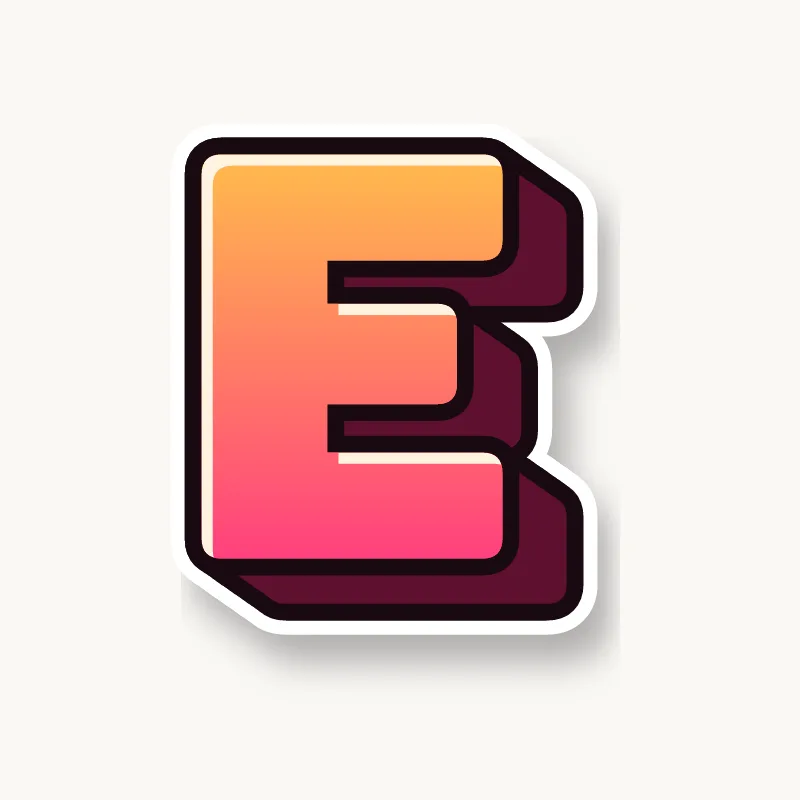
- Light. Highlights sit on the same side of every letter, and the 3D block goes on the opposite side.
If you are new to it, start with bubble letters. Their round shapes forgive mistakes, and they teach the outline-and-fill method that every other style builds on. Then try the step-by-step drawing guide.
How do you draw graffiti letters from A to Z?
Draw the whole alphabet in one style before you mix styles. Sketch each letter as a thin skeleton, give it the same stroke weight and lean as the others, then outline, fill and add 3D in the same direction every time. Working through A to Z in one sitting shows you which letters break your rules.
- Draw a guide. Rule two lines in pencil for the top and bottom of the letters, and a slanted line if you want them to lean.
- Write skeletons. Draw A to Z as plain single-line capitals. This is where you fix proportions: the bowls of B, P and R, the width of M and W.
- Add weight. Draw a fat outline around each skeleton, the same distance out on every letter.
- Clean and ink. Erase the skeletons and go over the outline with a marker. Keep the line confident; small wobbles disappear once the fill goes in.
- Fill, 3D, highlights. Fill every letter with the same colors, push the 3D block out on the same side, and put highlights on the side facing the light.
- Repeat and compare. Draw the alphabet again a week later and put the two pages side by side. The letters that changed most are the ones still settling.
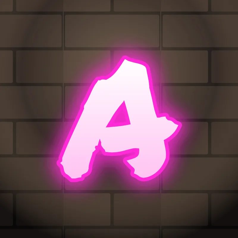
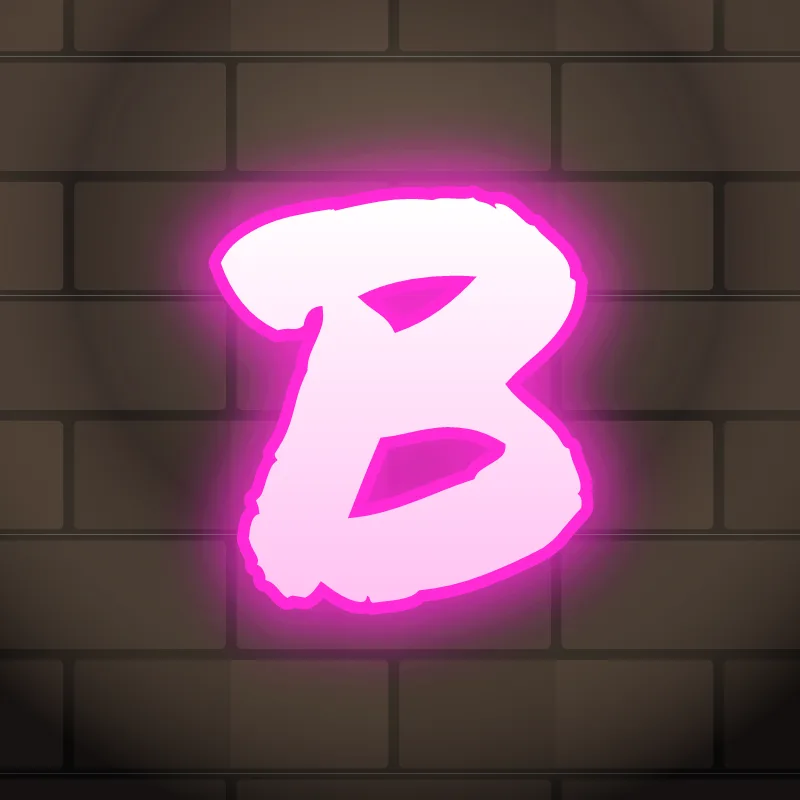
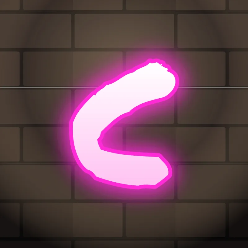
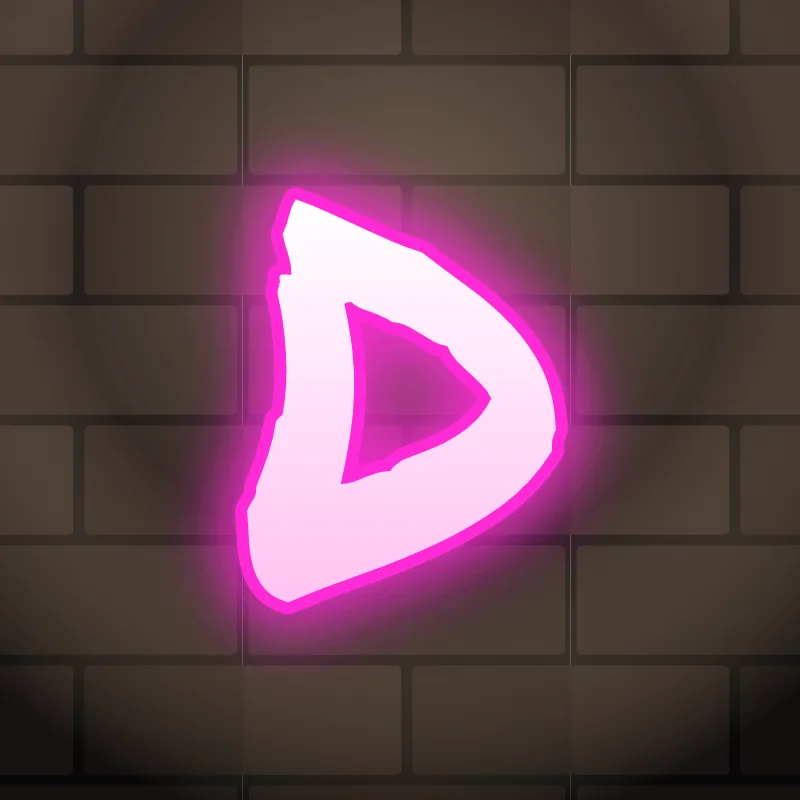
A blackbook (sketchbook) is the usual place for these alphabet drills. Graph paper helps keep heights even while you learn. Each letter page covers the uppercase and lowercase forms, where arrows fit, and tips for drawing that letter in each style.
Learn the graffiti alphabet in letter families
Letters that share a shape share the same problems, so it is faster to practice them in groups than in alphabetical order. Fix the shape once and the whole family improves.
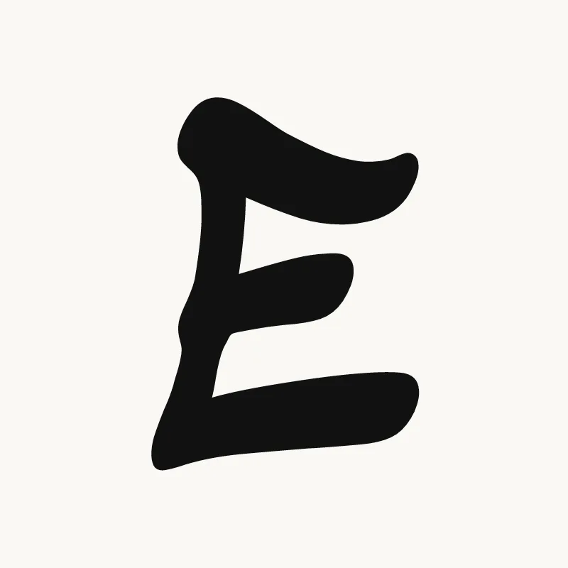
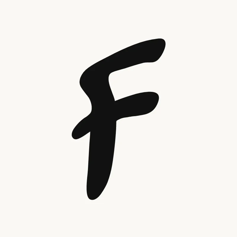
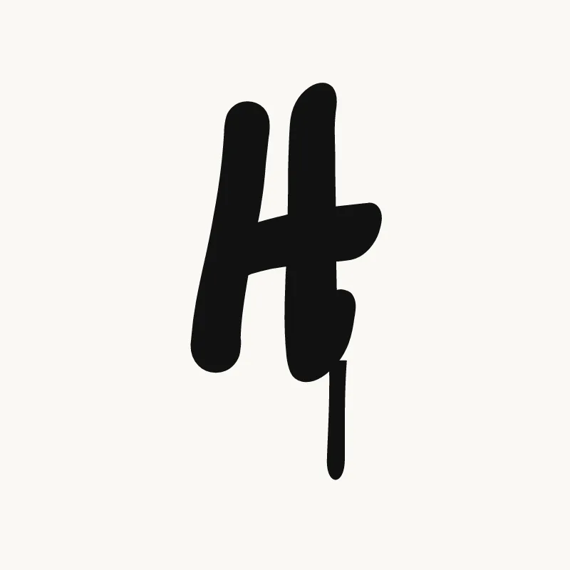
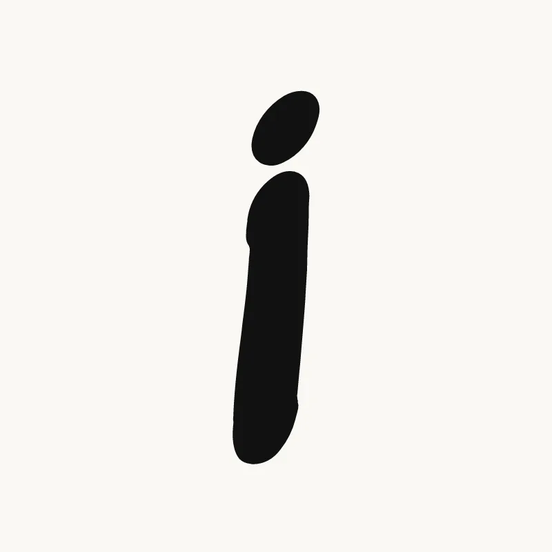
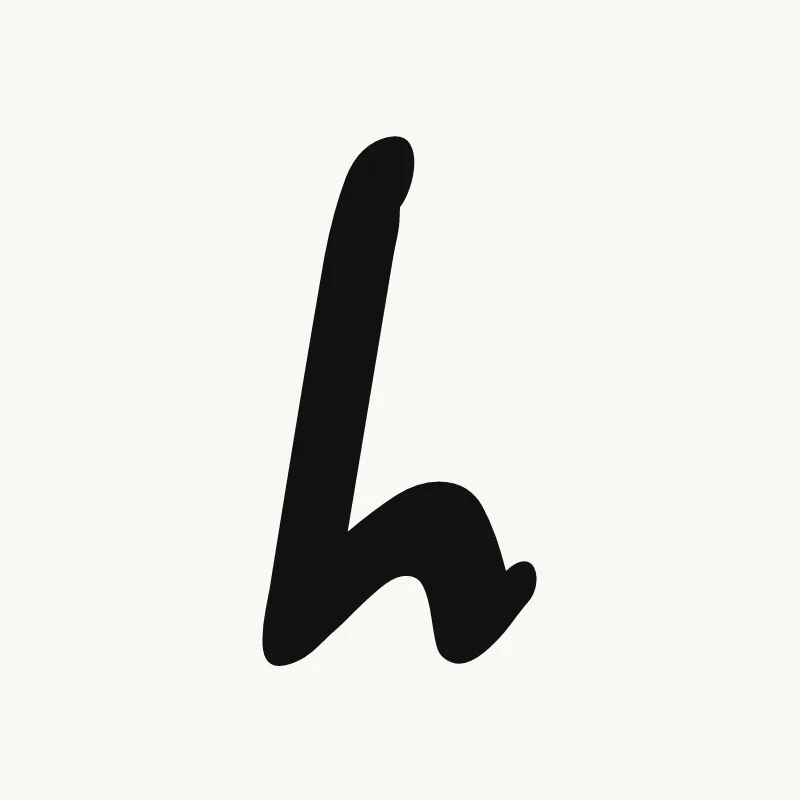
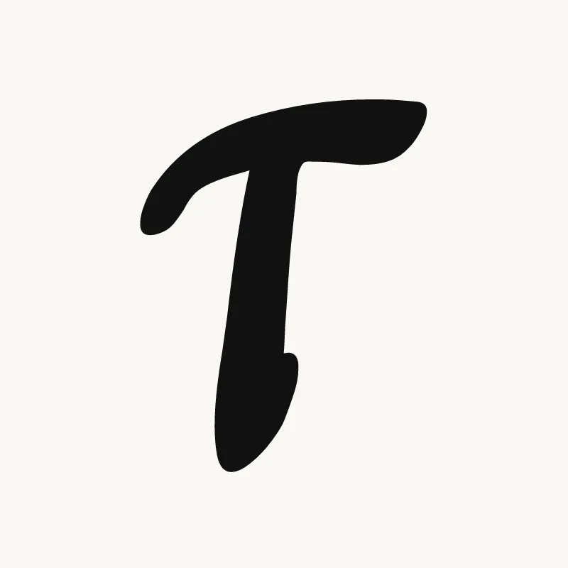
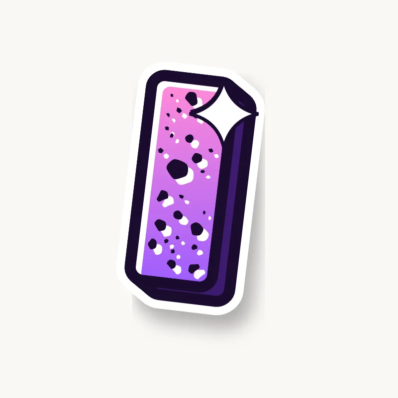
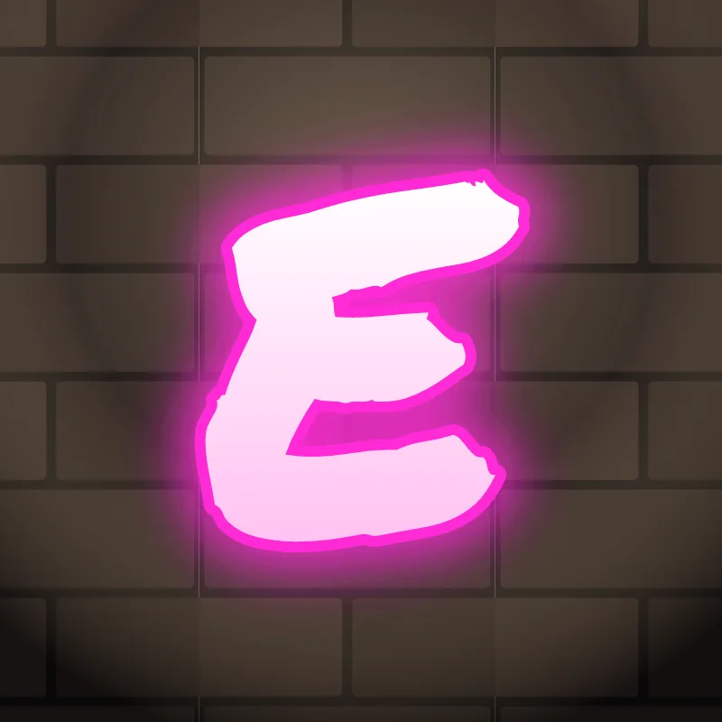
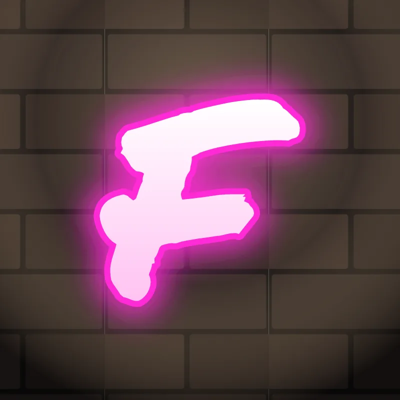
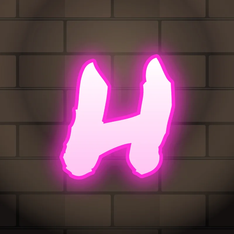
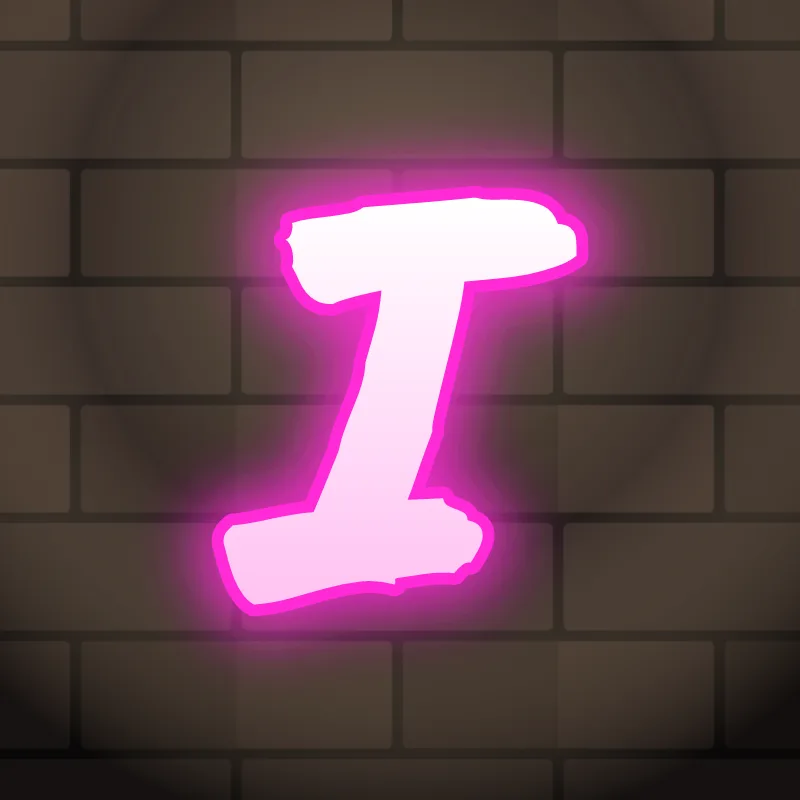
- Straight letters: E, F, H, I, L, T. The easiest to start with. Make them less stiff by bending the bars or cutting the ends at an angle.
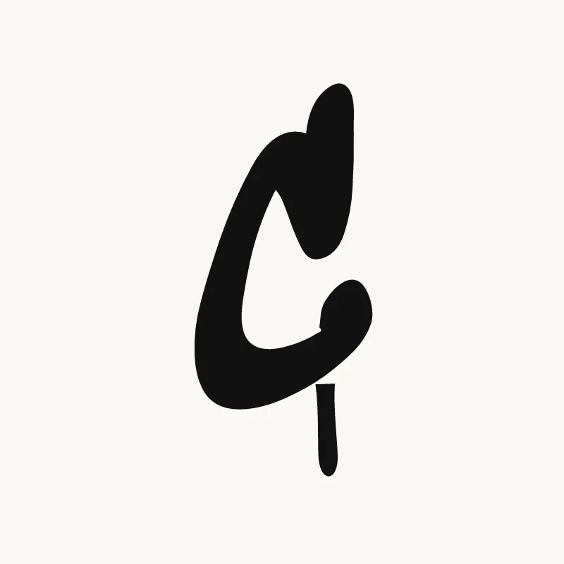
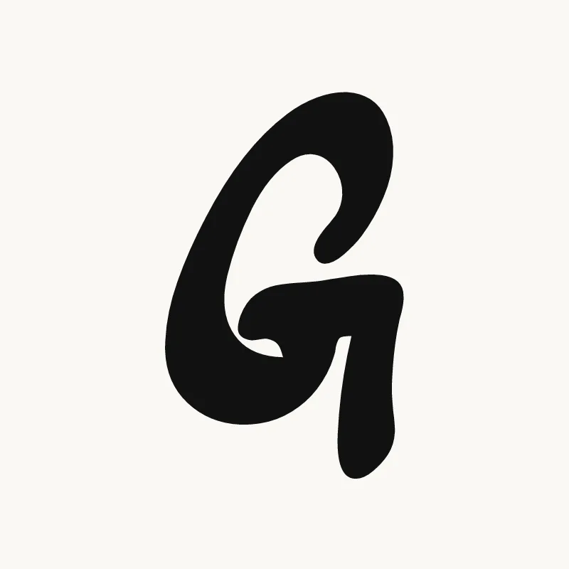
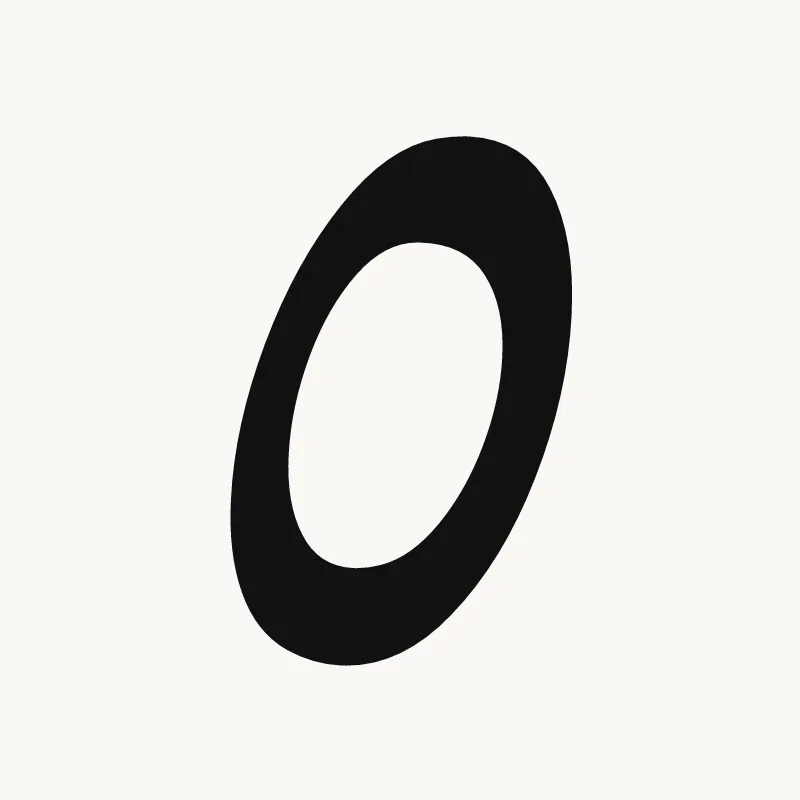
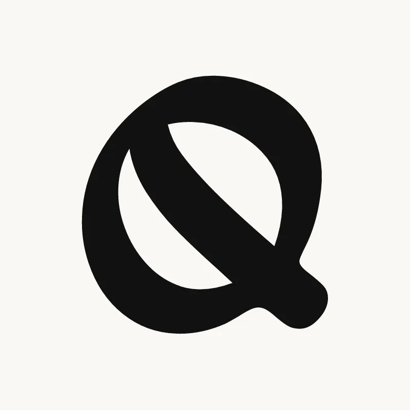
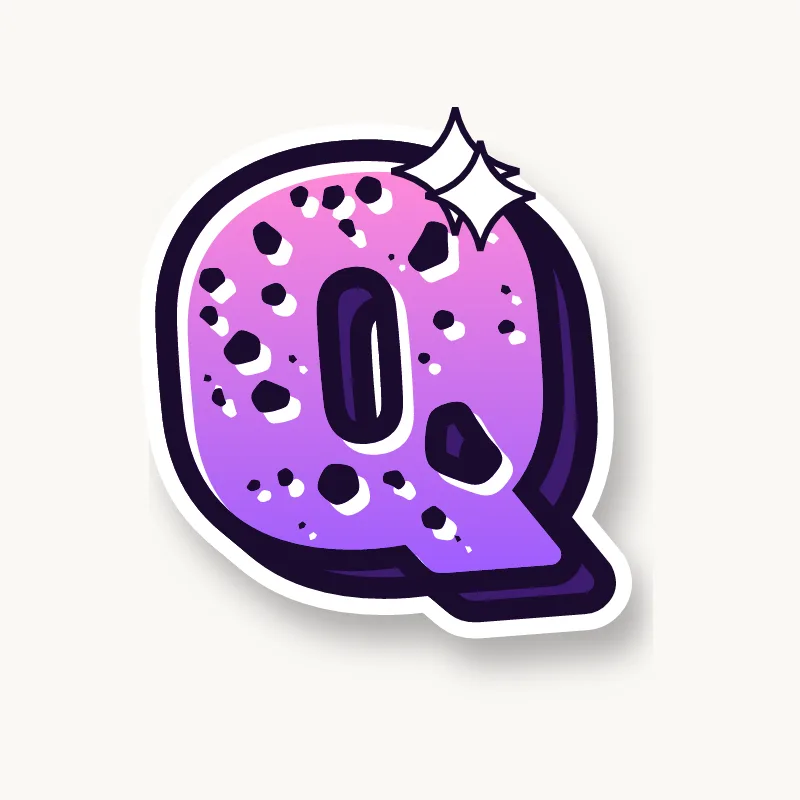
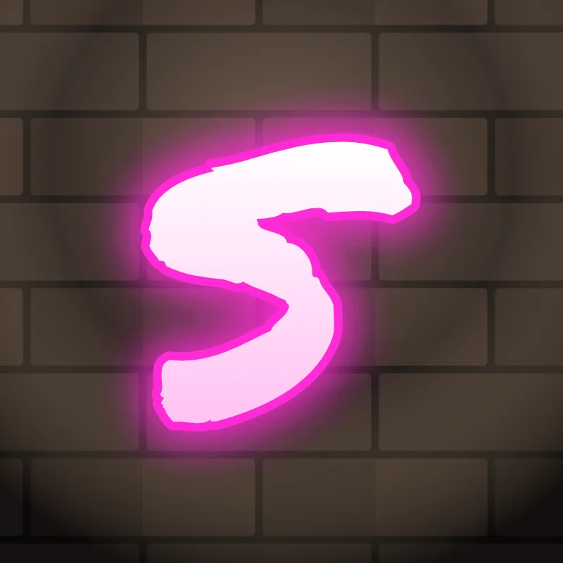
- Round letters: C, G, O, Q, S. Keep the curves full and even. A C that closes up too far turns into an O.
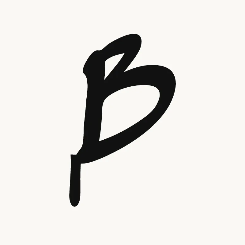
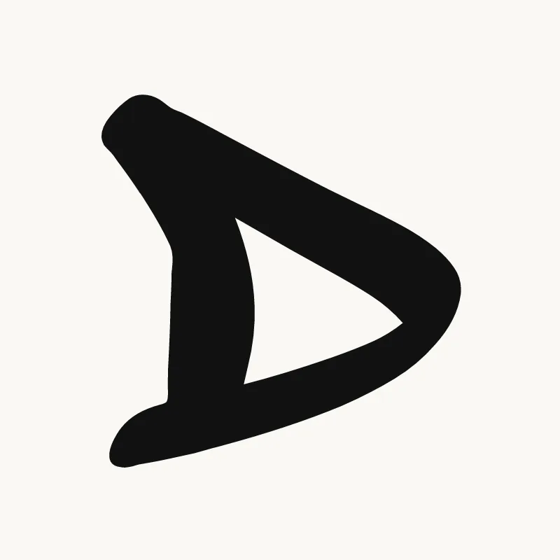
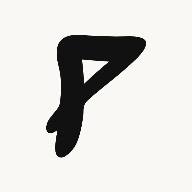
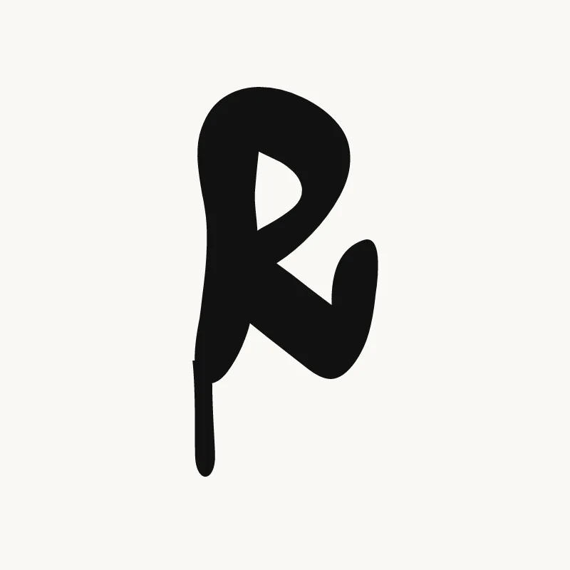
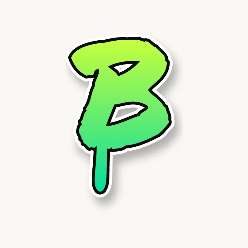
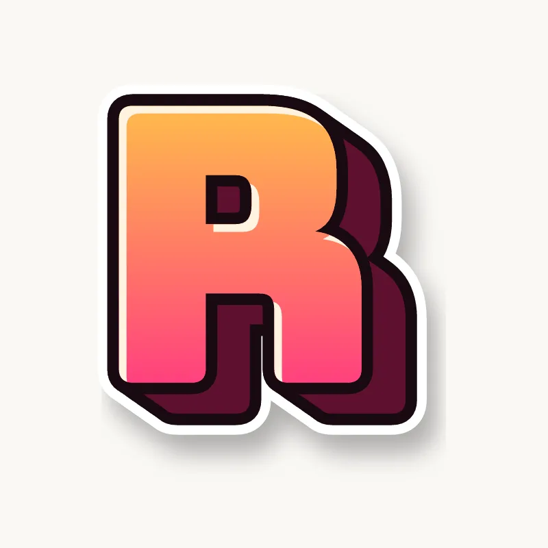
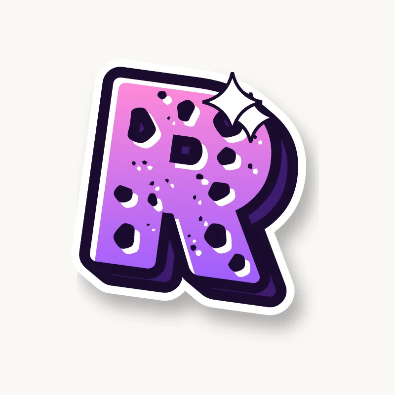
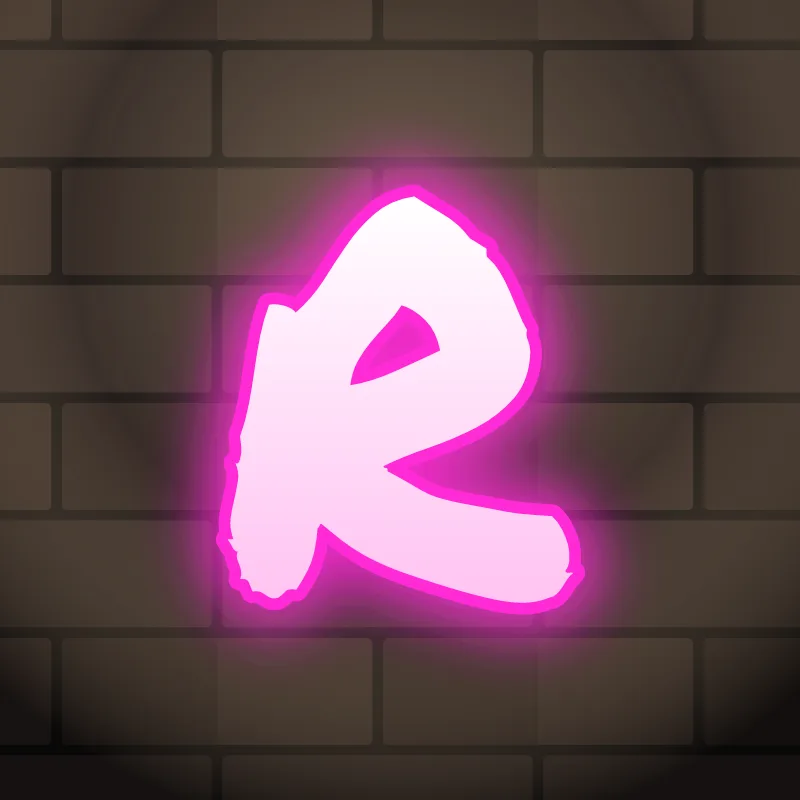
- Bowl letters: B, D, P, R. The size of the bowl decides the letter: make the top bowl of B smaller than the bottom one so it does not read as an 8.
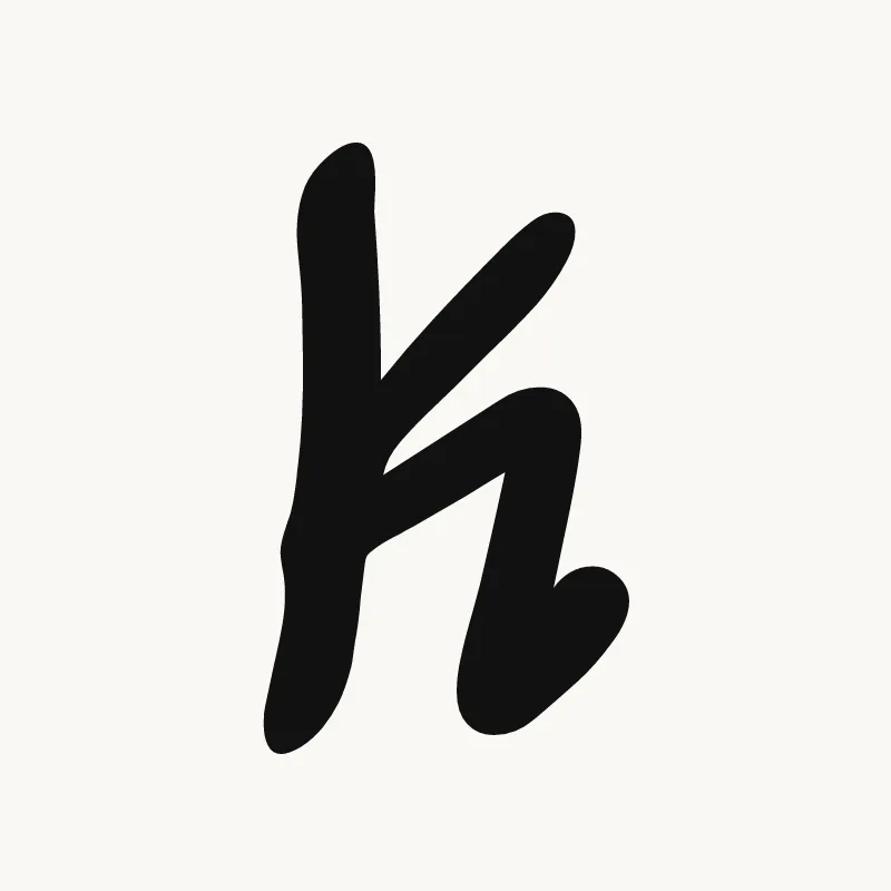
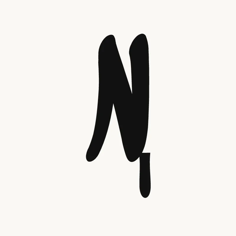
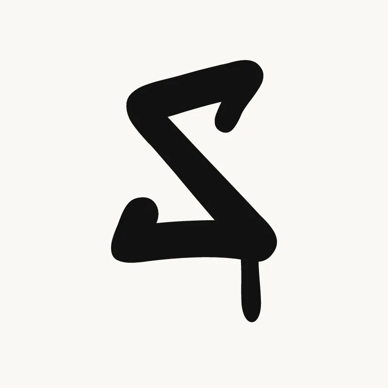
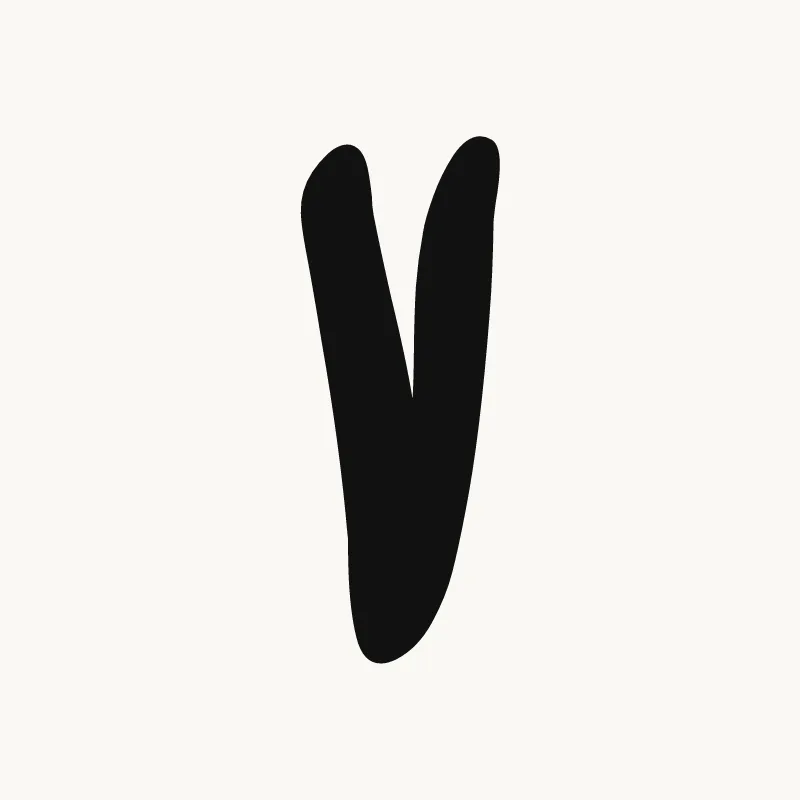
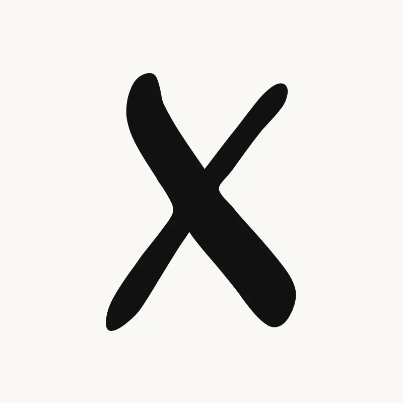
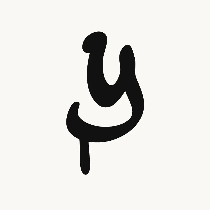
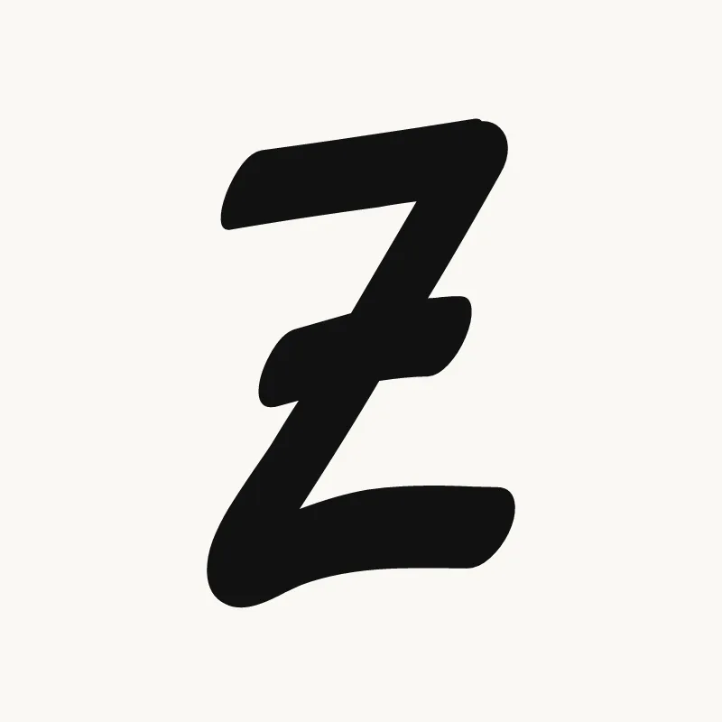
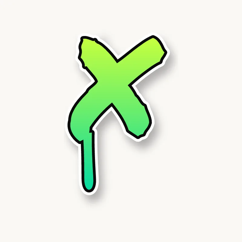
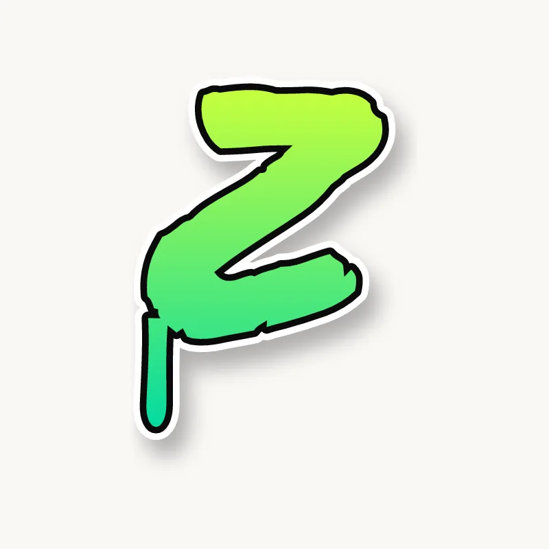
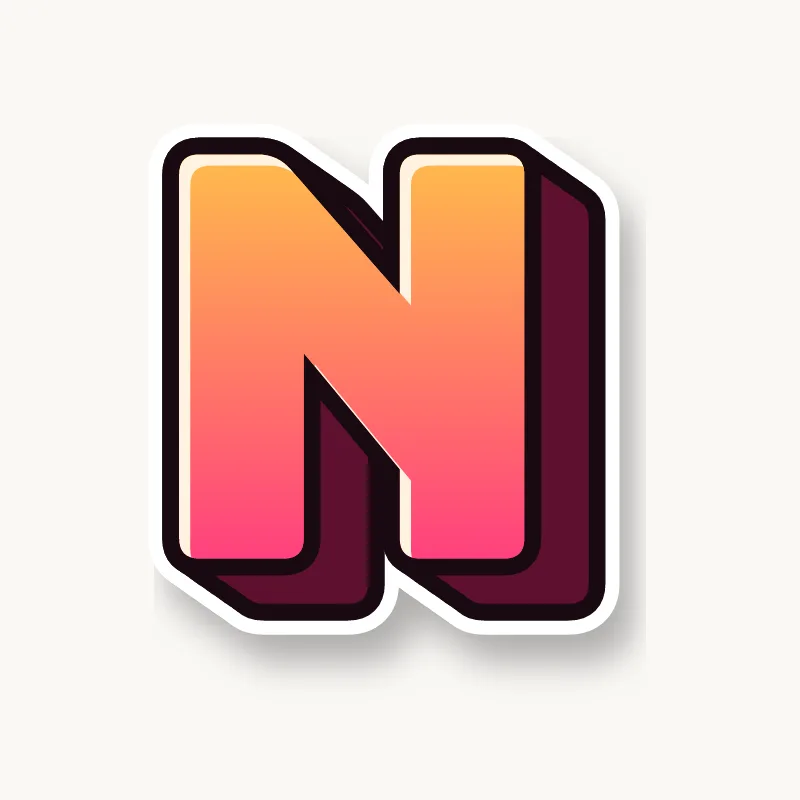
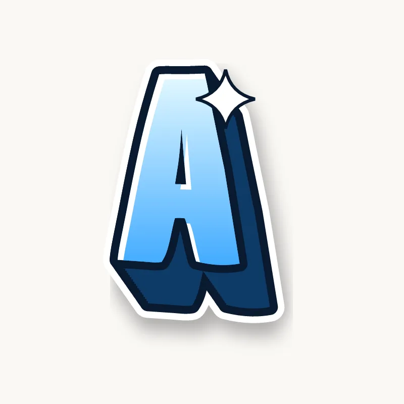
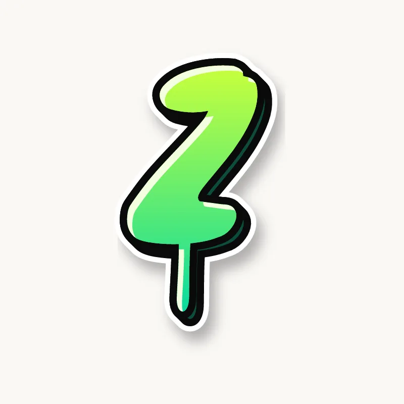
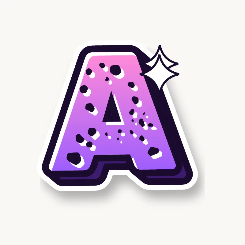
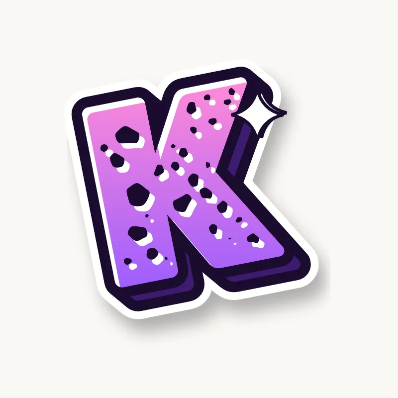
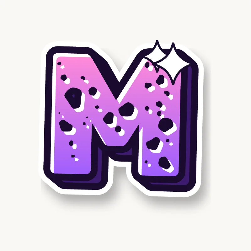
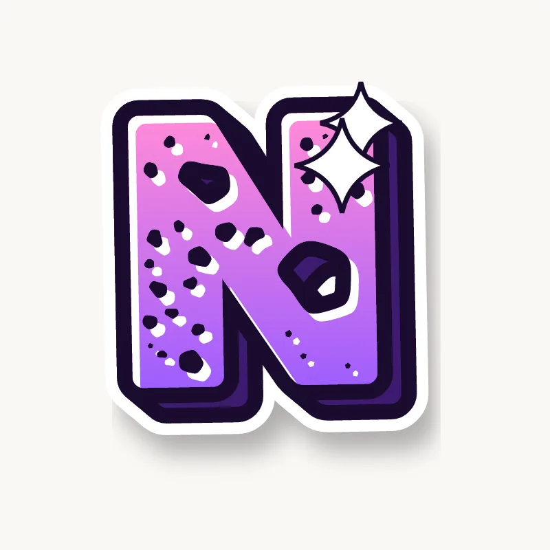
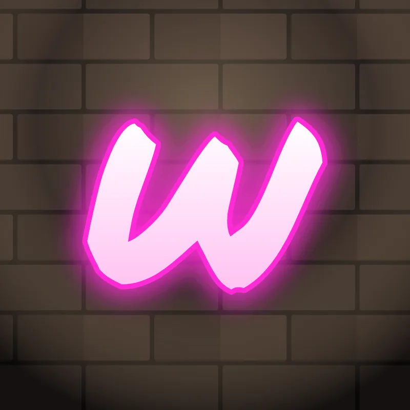
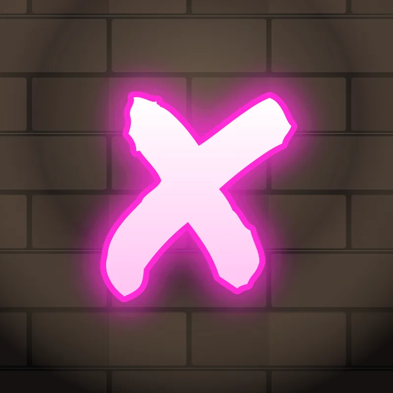
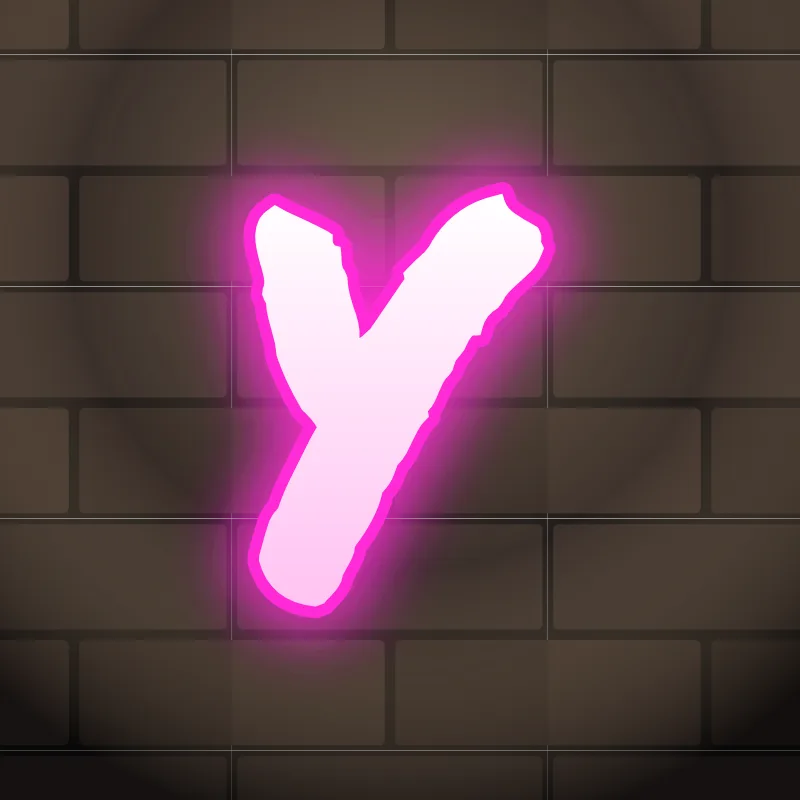
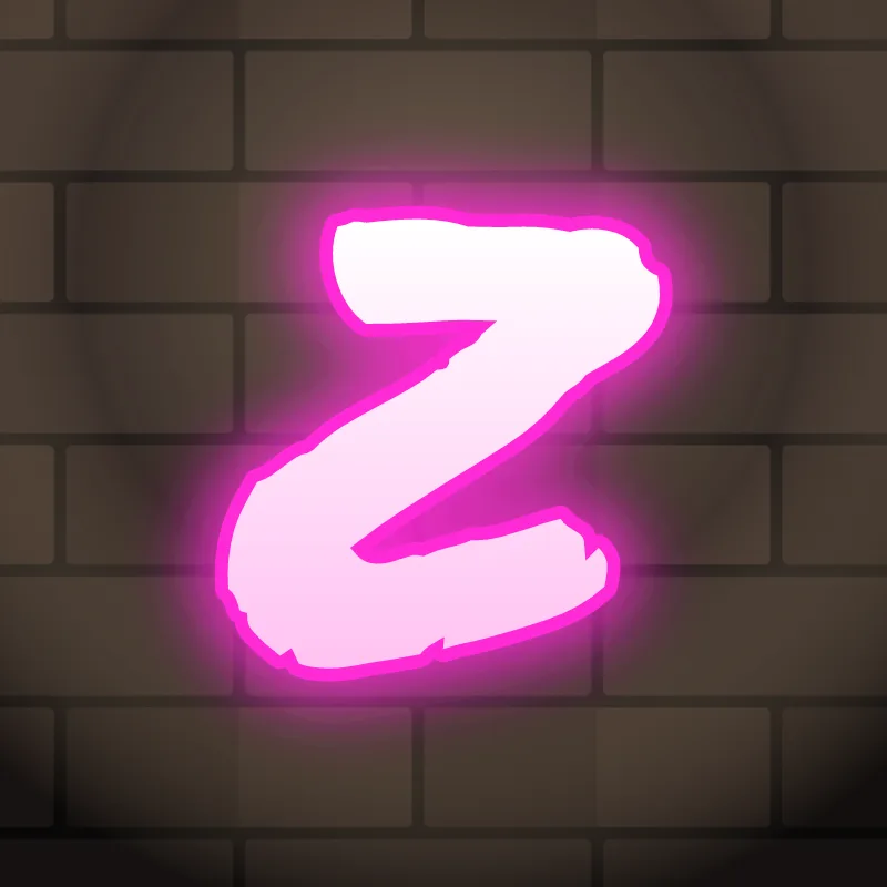
- Diagonal letters: A, K, M, N, V, W, X, Y, Z. The hardest group, because thick diagonals crowd the inner spaces. Open those gaps up and thin the strokes where they meet.
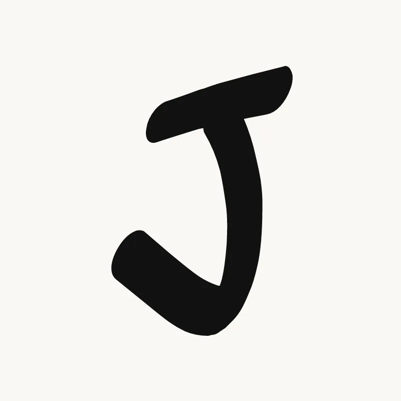
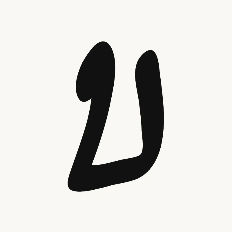
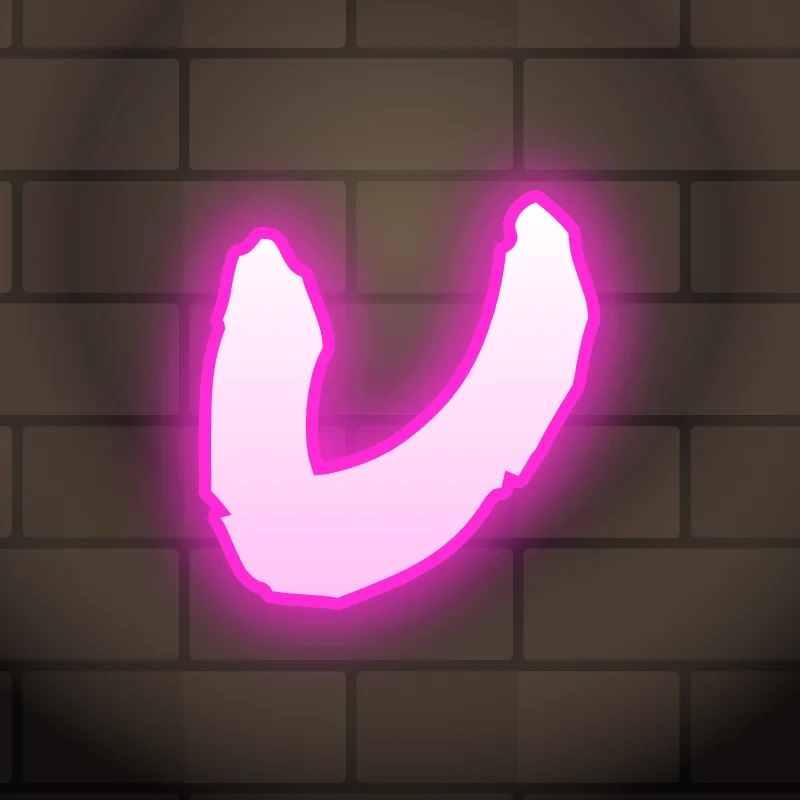
- Hook letters: J, U. A single curve at the bottom. Give it room so the letter does not collapse into a straight bar.
Which graffiti alphabet style should you learn first?
Learn bubble letters first, then throw-ups, block letters, 3D and finally wildstyle. Each step adds one new skill to the last: round shapes, speed, straight edges, depth, and then connections and arrows. Skipping ahead usually means relearning the basics later.
Each step has its own guide: bubble letters, throw-up letters, 3D graffiti letters and wildstyle. For lettering outside the spray-can tradition, Old English letters follow their own rules, and graffiti numbers complete the set for dates, ages and crew names. The graffiti styles page compares them all.
Printable graffiti alphabet
Need the alphabet on paper? Download the printable graffiti alphabet PDF (26 A4 pages, one bubble-style letter per page), or browse the graffiti coloring pages. The letters print as black outlines, so you can trace them for practice or color them in.