

How do you draw an S in graffiti?
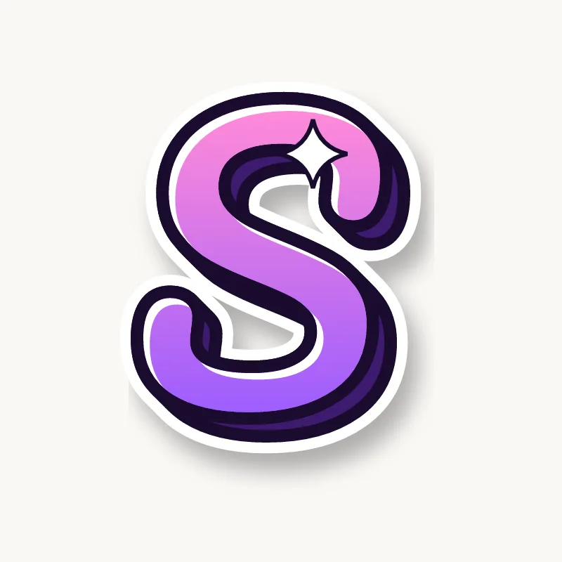
To draw an S in graffiti, pencil two stacked circles with the top one smaller, then trace one smooth curve through them: around the top, through the middle, around the bottom. Thicken the spine most, cut or point the two ends, outline it and add 3D. A wider bottom keeps the S upright.
- Two circles. Pencil a small circle stacked on a bigger one.
- Trace the spine. Draw one curve around the top left of the upper circle, across the middle, and around the bottom right of the lower one.
- Lean it. Tilt the S forward slightly for movement.
- Thicken the middle. Make the spine the heaviest part and let the ends taper.
- Ends and 3D. Cut the ends square, point them or make them arrows, then outline and extrude.
Letter structure: the parts of an S
An S is two curves joined by a spine. The spine is the diagonal middle curve, with two bowls opening in opposite directions and a terminal at each end. In most typefaces the bottom half is slightly bigger than the top, which stops the S from looking top-heavy. Both open counters must stay open.
The S in bubble, blockbuster, wildstyle, throw-up and Old English
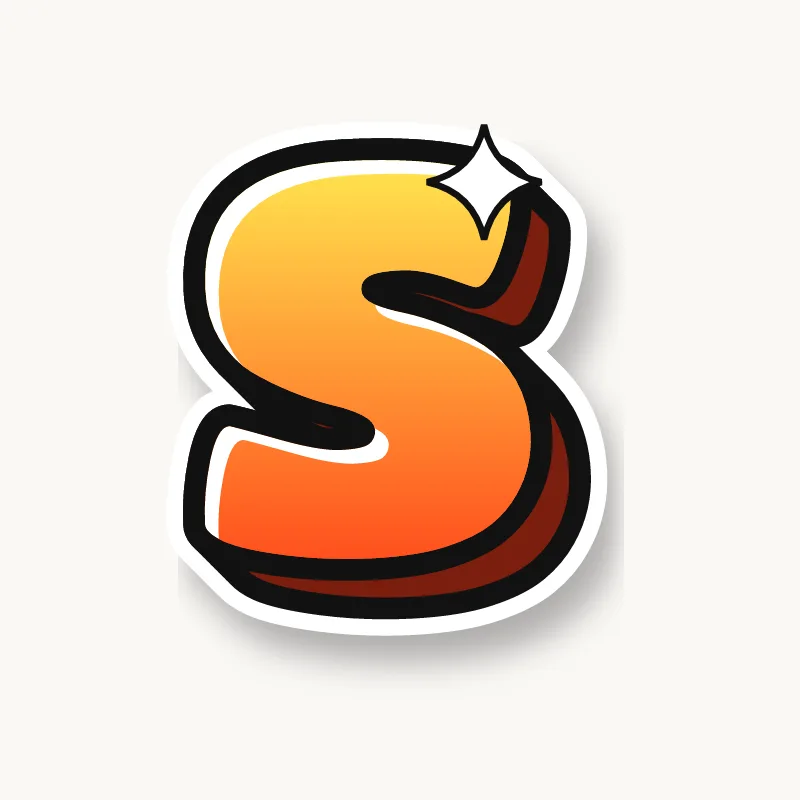
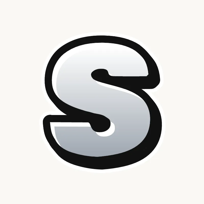
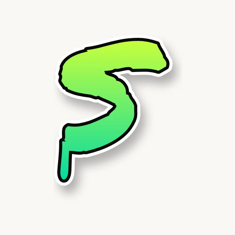
Bubble. A fat snake with round ends and deep inside curves.
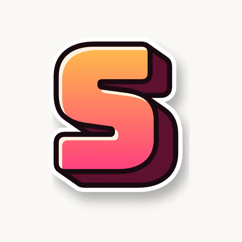
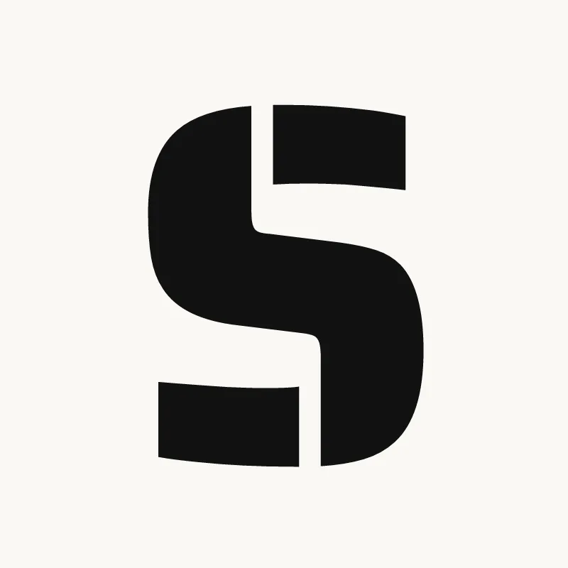
Blockbuster. Built from straight bars, sometimes called a straight-letter S: three bars joined by two short uprights.
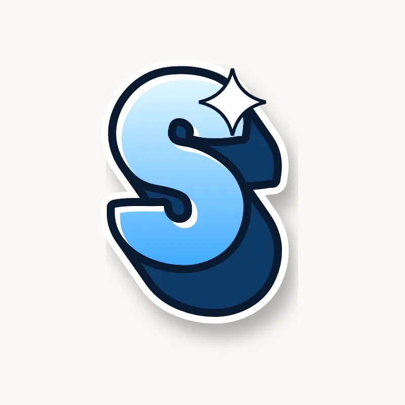
Wildstyle. Both ends turn into arrows pointing opposite ways, and the spine can break into two overlapping pieces.
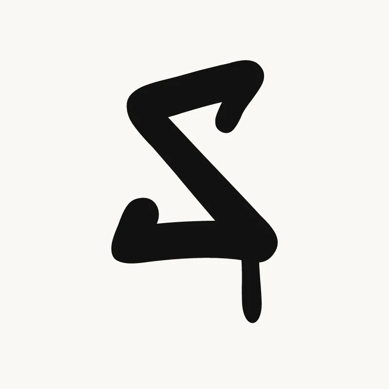
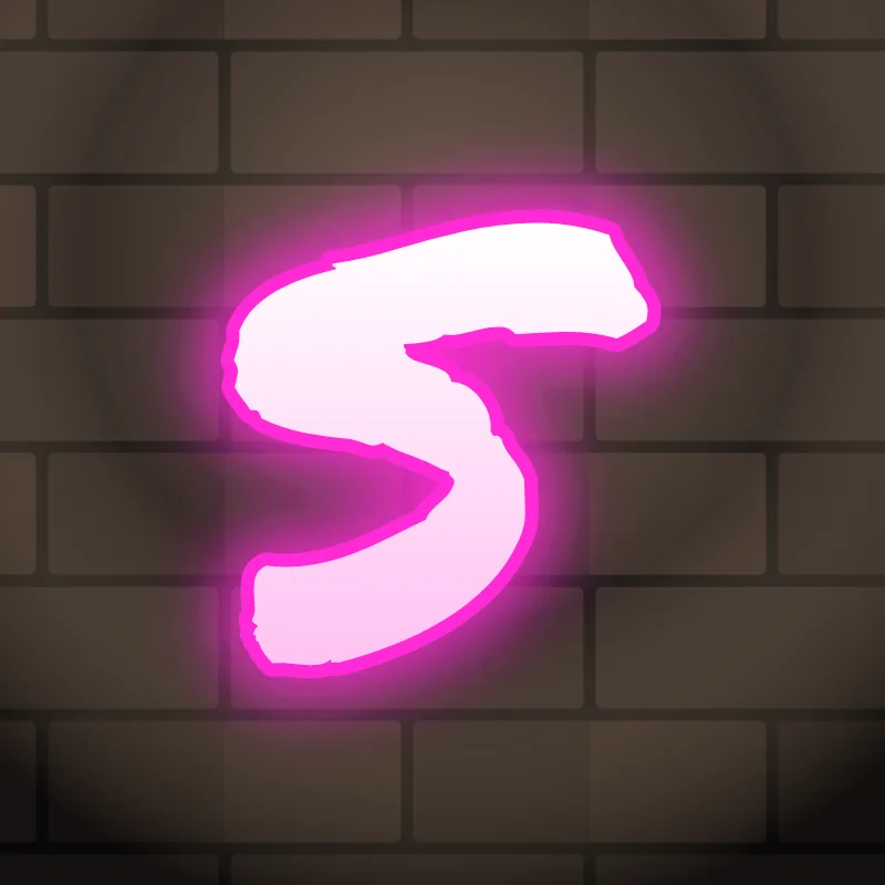
Throw-up. One smooth stroke, often the fastest letter in a throw-up. Keep the bottom bowl wide.
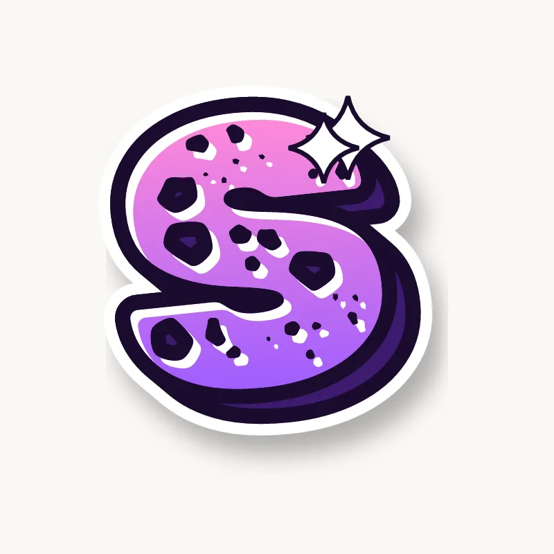
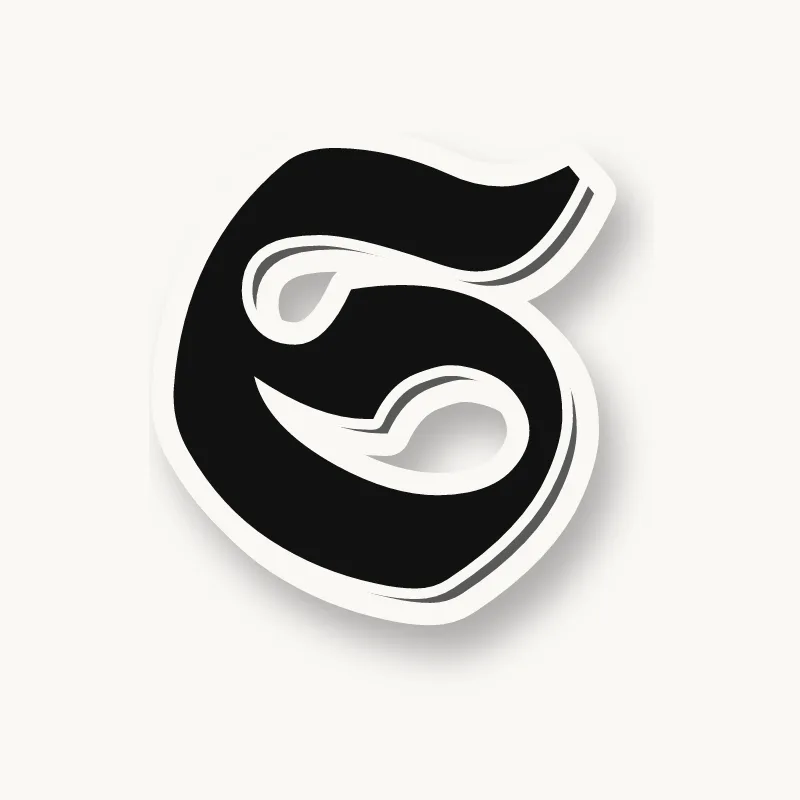
Old English. The blackletter capital S is ornate, with hairline curls at both ends. Old blackletter texts used a tall "long s" at the start and in the middle of words, which looks a lot like an f.
Common mistakes with a graffiti S
- A bigger top curve. The S then looks upside down.
- A weak spine. An S without a strong middle stroke looks like a 5 and a 2 stuck together.
- Writing it backwards. When styling fast, it is easy to flip the curves, so check it against a plain S.
Uppercase or lowercase S?
A lowercase s is the same shape as the capital, just smaller. In tags it is often written fast in one smooth curve, which is why it is a favorite letter for handstyles.
Adding arrows to an S
An S has two open ends, top and bottom, and both can become arrows pointing in opposite directions. See how whole words lock together in wildstyle.
Making an S flow in a word
The open ends of an S can hook into the letters on both sides. S often ends a word as a plural or a name (Chris, Lewis, Yes), so its bottom terminal can be the final flourish. At the start (Sam, Sky, Style), the top end can arc over the next letter. Common pairs are "ST", "SH" and "SS". In "SS" (Jess, Boss), set the two at slightly different heights so they do not look like a pattern.
Want to see it with your own name? Type it into the graffiti letter generator, or learn the whole process step by step in how to draw graffiti.