
How to draw graffiti step by step
To draw graffiti, write your word as a thin pencil skeleton, build each letter out around it, fill it with color, outline it in black, then add a 3D block, highlights and finishing touches like drips. Below, every step is shown on the same word so you can watch a piece build up from a sketch to finished color.
Practice on paper or in a sketchbook first. When you want to paint, use a legal wall or a surface you have permission to paint. Painting on property without permission is illegal almost everywhere.
What do you need to draw graffiti?
You need a pencil, an eraser, paper and two or three markers. That is enough for every step on this page. Start cheap, and only buy better tools once you know which ones you actually use.
- A pencil. An HB or 2B pencil sketches light enough to erase. Press softly: dark lines are hard to rub out and leave grooves in the paper.
- An eraser. A kneaded eraser lifts pencil without smudging your marker work.
- Paper. Plain printer paper is fine for sketches. For finished drawings, marker paper or smooth Bristol board stops ink from bleeding. Writers keep their drawings in a sketchbook called a blackbook.
- A black marker with a medium or broad tip for outlines, plus a fine one for small details.
- Two or three colored markers for the fill, and a white gel pen or paint marker for highlights.
The graffiti markers guide compares paint markers and alcohol markers if you want to know which to buy.
How do you draw graffiti letters step by step?
Draw graffiti letters in six steps: sketch a skeleton and build the letter shapes around it, fill them with color, outline them, add a 3D block, add highlights, then finish with drips and a background. Each step below adds one layer to the same word, "Style", so you can compare your drawing at every stage.
-
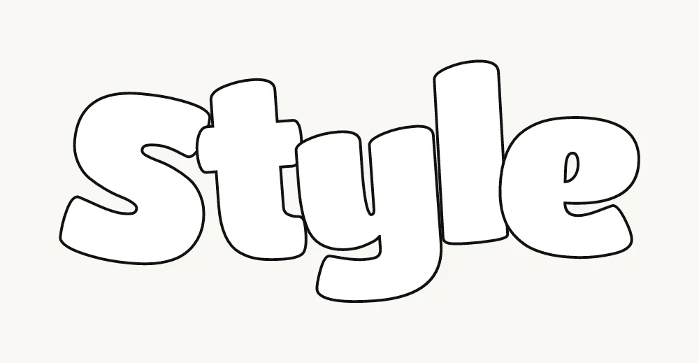
Step 1: Sketch the skeleton, then build the letters
Write your word in thin, light pencil lines, like a quick tag. This is the skeleton. Then draw the outer shape of each letter around it, about a finger-width out on every side. Round the corners for bubble letters or keep them square for block letters, and let neighboring letters touch or overlap. Rub out the skeleton when you are done.
Keep every stroke the same thickness, and keep the letters on one baseline. If a letter looks wrong now, fix it now: color will not save a bad shape. Most writers redraw the sketch two or three times before they are happy with it.
-
Step 2: Fill with color
Color the inside of every letter. A fade from a light color at the top to a darker one at the bottom looks finished straight away. Do not worry if the color goes a little over the edges: the outline in the next step covers that.
Graffiti writers call this the fill-in. Two or three colors that sit next to each other on the color wheel (yellow to orange, light blue to purple) are the easiest way to get a clean fade with markers.

-
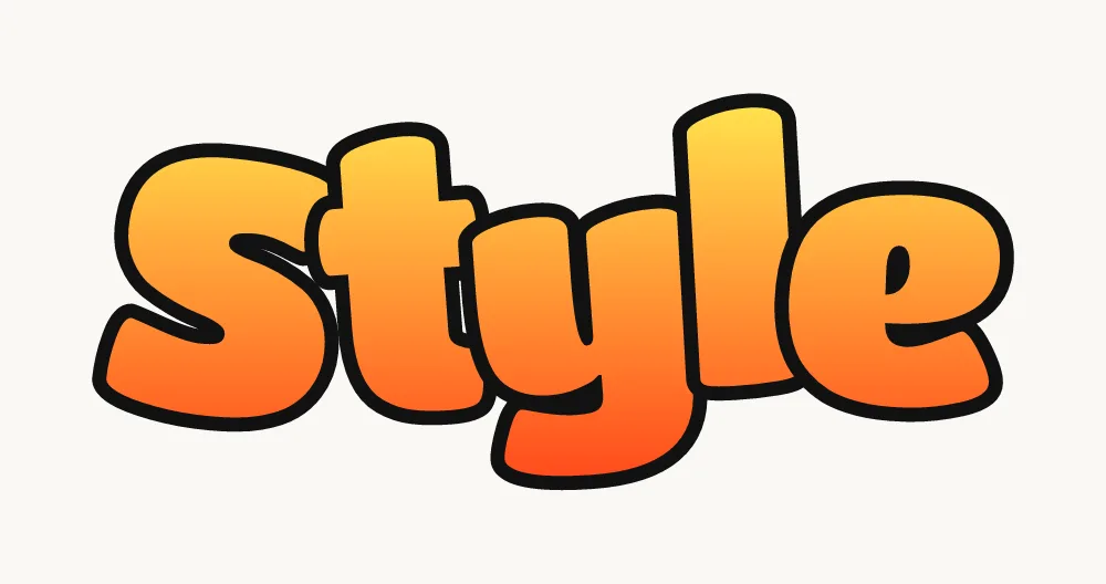
Step 3: Outline
Go around every letter with a thick black marker. The outline is what makes graffiti read from a distance, and it hides small wobbles in the fill. Where two letters overlap, outline the front letter fully and stop the back letter's line where it meets it.
Turn the paper as you go so your hand always pulls the line toward you. Slow, steady strokes look cleaner than fast ones. Painters do it in the same order on a wall: fill first, then a sharp outline that "cuts" the shape clean.
-
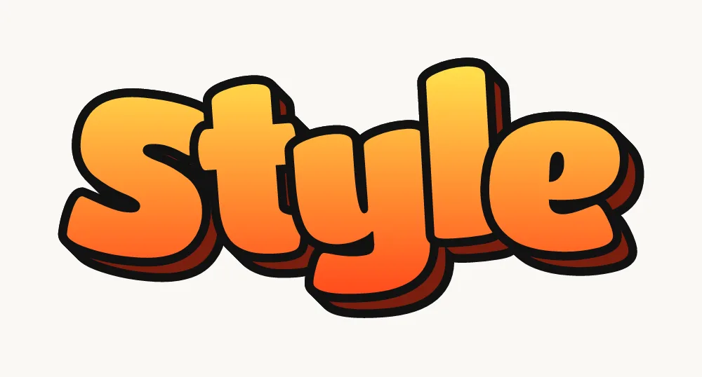
Step 4: Add a 3D block
Pick a direction for the light. On the opposite side, draw the same shape of each letter shifted a little, join the corners, and fill the gap with a dark color. That block makes the letters look solid.
Shift every letter by the same amount in the same direction, down and to the right is the easiest. If the 3D goes different ways on different letters, the piece looks broken. The 3D graffiti letters page shows other directions and depths.
-
Step 5: Highlights and shine
Add thin white lines along the edges that face the light, and a small four-point star or two for shine. Keep them on the same side of every letter.
A white gel pen or a fine white paint marker is the easiest tool for highlights on paper. Short curved strokes inside the top corners of each letter make them look round and glossy.

-
Step 6: Finishing touches and background
Add drips, a white outline around the whole piece, and a soft shadow underneath. Then add a simple background if you want one. Stop before it gets crowded: the letters should still be the loudest thing on the page.
The outer white line is called a keyline or second outline. It separates the piece from whatever is behind it, which is what lets you put a busy background behind the letters without losing them.

Adding a background
A background frames the piece. Keep it simpler and lower in contrast than the letters. Easy options are a cloud or bubble shape behind the word, a brick wall pattern, a city skyline in one dark color, a few stars and circles, or a flat color with spray-style dots. Draw it after the letters and their white keyline are finished, so you never color over the edges you worked hard on.
Want to skip ahead and see your own name finished? Type it into the graffiti generator, then copy what you see by hand. Tracing over a printout is a good way to learn the shapes before you draw them freehand.
How do you build a graffiti letter?
Every graffiti letter is a normal letter with a body built around it. Start from the plain shape you already know, then give it thickness, then change one thing at a time: the width, the lean, the corners, or an added arrow. As long as the skeleton underneath is a real letter, people can read it.
- Same thickness everywhere. Beginners often make some strokes fat and others thin by accident. Pick one thickness and keep it, unless you change it on purpose.
- Shared lines. Draw the tops of the letters on one line and the bottoms on another. Break that rule only once, for example a taller first letter.
- Small gaps. Counters (the holes in A, B, D, O, P, R) shrink as letters get fatter. Leave them open enough to see, or an A turns into a blob.
- Overlap order. Decide which letter sits in front and keep it consistent, usually each letter slightly in front of the one after it, or the other way round.
- Extensions and arrows. Once the base looks right, stretch a stroke out (an extension) or end one in an arrow. Add one or two per word, not one per letter.
Some letters are harder than others. The S tends to lean the wrong way, the E gets crowded, and the R needs a leg that does not fight the next letter. Each letter has its own page with steps and common fixes: see the graffiti S, graffiti E, graffiti R, or the full graffiti alphabet A to Z.
Should you draw graffiti with a pencil, markers or spray paint?
Use all three, in that order. Sketch in pencil so you can fix mistakes, finish on paper with markers, and only move to spray paint once your sketches look good, on a legal wall, a board or a canvas. Each tool teaches a different skill.
Pencil
Pencil is where the letters are designed. Light lines let you redraw a shape five times on the same page. Many writers do the whole sketch in pencil, then trace the final lines onto clean paper or use a light box, so the finished drawing has no eraser marks.
Markers
Markers turn a sketch into a finished graffiti drawing. Water-based paint markers like Posca give flat, opaque color and can layer light over dark, which is handy for highlights. Alcohol markers blend smoothly into fades but bleed through thin paper. The Posca markers guide covers tip sizes and tricks.
Spray paint
Spray paint is a different skill: can control. Distance from the wall, speed and the cap you use decide how thick and sharp a line is. Practice on cardboard, a canvas or a legal wall with permission, and wear a proper mask. The spray paint for beginners guide explains caps, pressure and safety.
Can you draw graffiti digitally?
Yes. A drawing tablet or an iPad with a stylus follows the same steps, and layers make it easier: put the skeleton, fill, outline, 3D and highlights on separate layers so you can change one without redrawing the rest. For vector files that work in Illustrator or with a Cricut, the generator exports your word as an SVG made of outlines.
Tag, throw-up, piece: words to know before you start
Graffiti writing has a few standard forms, from a quick signature to a full painting. Knowing them helps you pick what to practice. The step-by-step above draws a small piece. All 15 types are compared on the graffiti styles page.
- Tag
- A writer's signature, done quickly in one color with a marker or spray can. Every writer starts with a tag. See how to make a graffiti tag.
- Throw-up
- A quick two-color piece, usually bubble letters with one fill and one outline, done in a few minutes.
- Piece
- Short for masterpiece: a large, detailed painting with several colors, 3D, highlights and often a background.
- Burner
- A piece so good it "burns" the ones around it. The top tier of a piece.
- Blockbuster
- Big, square, readable block letters, often used to cover a large area quickly.
- Wildstyle
- Complex, interlocking letters with arrows and extensions. Hard to read on purpose and the hardest style to learn.
Which graffiti style should you learn next?
Learn the styles in order of difficulty: bubble letters first, then block letters, then 3D, then throw-ups, and wildstyle last. Each one reuses what the previous one taught you, so skipping ahead usually means going back later.





- Bubble letters: round, soft and forgiving. The best first style.
- Block letters: straight sides and square corners. They teach clean, even spacing.
- 3D letters: add depth with blocks, shadows and perspective.
- Throw-ups: fast bubble letters in two colors. They teach speed and confident lines.
- Wildstyle: interlocking letters, arrows and connections. Start only when the others feel easy.
The graffiti styles overview shows more, including drip, stencil and Old English.
What should you draw first?
Start with your name, your initials or a short word in bubble letters, and add one small extra like a crown or a few drips once the shapes look right. For finished examples to copy, from easy bubble words to cool wildstyle and full pieces, browse the graffiti drawings gallery; for more words, see graffiti ideas.
How do you learn graffiti? A simple practice routine
You learn graffiti by drawing a little almost every day and repeating the same letters until they become easy. Twenty minutes a day helps more than three hours once a week. A routine like this keeps practice focused.
- Warm up with tags (5 minutes). Fill half a page with your tag to loosen your hand.
- Alphabet run (10 minutes). Draw A to Z in one style on one page. It forces consistency.
- Same word, five times. Change one thing each time: the lean, the 3D direction, the overlap.
- Outline only. Fill a page with outlines and no color. Clean outlines matter most.
- One finished piece a week. Take your best sketch all the way to color, 3D and highlights.
- Copy, then change. Copy a piece you like, then redraw it from memory with your own twist.
Date your pages. Looking back a month later is the clearest way to see progress, and it shows you which letters still need work.
Common mistakes when drawing graffiti
Most beginner graffiti looks off for the same few reasons, and all of them are easy to fix once you can see them.
- Skipping the sketch. Going straight to marker locks in every mistake. Sketch in pencil first.
- Uneven letter thickness. One thin stroke next to a fat one makes the word look unsteady.
- Letters floating apart. Graffiti letters touch, overlap or connect. Big gaps look like separate words.
- 3D in different directions. Every block should point the same way, away from one light source.
- Too many colors. Two or three fill colors plus black and white is plenty.
- Too many extras. Arrows, stars and drips everywhere hide the letters. Pick one or two.
- Jumping to wildstyle too soon. If your bubble letters are not clean, wildstyle will only be messier.
- Copying someone's style exactly. Learning from others is fine, but writers call direct copying biting.
A very short history
Modern graffiti writing grew out of Philadelphia and New York in the late 1960s and early 1970s. Cornbread was tagging in Philadelphia in the late 1960s, and in 1971 a New York Times story on a teenager who wrote "Taki 183" helped turn tagging into a citywide craze. Through the 1970s, writers on New York's subway trains developed the bubble letters, 3D effects and wildstyle you see today. The 1983 documentary Style Wars and the 1984 book Subway Art by Martha Cooper and Henry Chalfant carried the style around the world. More terms are in the graffiti glossary.
See your name finished first
Open the generatorQuestions people ask
How do beginners draw graffiti letters?
Start with bubble letters on paper. Write the word as a thin pencil skeleton, draw a round shape around each letter, fill it with color, outline it in black, then add a 3D block and highlights. Draw the same word many times before moving on to harder styles like throw-ups and wildstyle.
How do you sketch graffiti before coloring it?
Use a light pencil and draw loosely. Write the word as a simple skeleton, build the letter shapes around it, and redraw any letter that looks wrong. When the sketch is right, go over the final lines in marker and erase the pencil, or trace the clean lines onto a new sheet so the finished drawing has no eraser marks.
What paper is best for drawing graffiti?
Plain printer paper is fine for practice sketches. For finished drawings, use marker paper or smooth Bristol board, which stop ink from bleeding and let fades blend cleanly. Many writers keep everything in one sketchbook, called a blackbook, so they can see their progress page by page.
Can kids learn to draw graffiti letters?
Yes. Bubble letters on paper are a fun way for kids to practice lettering, color and shapes. Start with their name or a short word, use washable markers, and print a graffiti coloring page if drawing the outlines is too hard at first. Keep the focus on paper and sketchbooks, never on walls without permission.
Is drawing graffiti illegal?
Drawing graffiti on paper, in a sketchbook, on a canvas or on a legal wall is not illegal. Painting on property without the owner's permission is illegal in most places and is treated as vandalism. Some cities have legal walls or community programs where you can paint openly, so check what exists near you.
How long does it take to get good at graffiti?
Clean bubble letters can take a few weeks of regular practice. A confident handstyle and good 3D usually take months, and strong wildstyle often takes years. Drawing a little every day helps more than drawing a lot once a week, and dating your pages makes the progress easy to see.
Why does my graffiti look messy?
Usually it is one of four things: no pencil sketch first, letters of uneven thickness, 3D blocks pointing in different directions, or too many colors and extras. Fix the shapes in pencil, keep one stroke width, pick one light direction, and limit the fill to two or three colors plus black and white.