



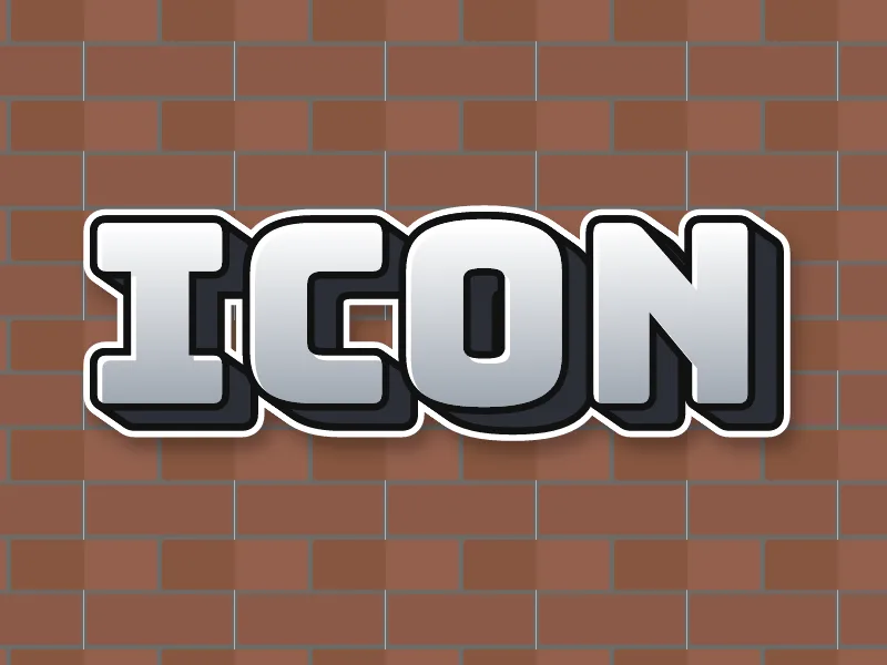

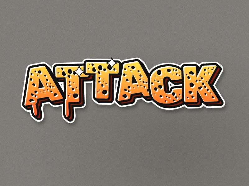
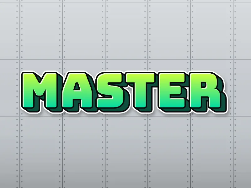
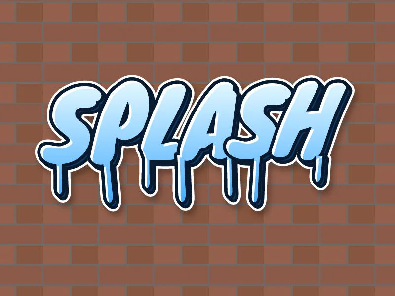
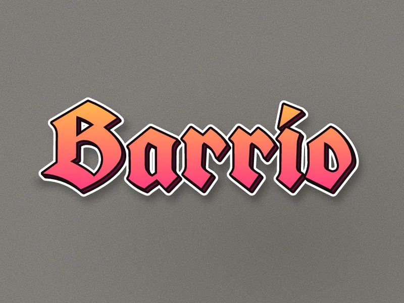
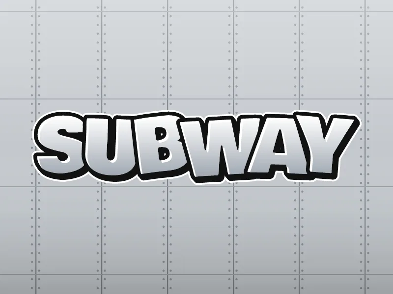
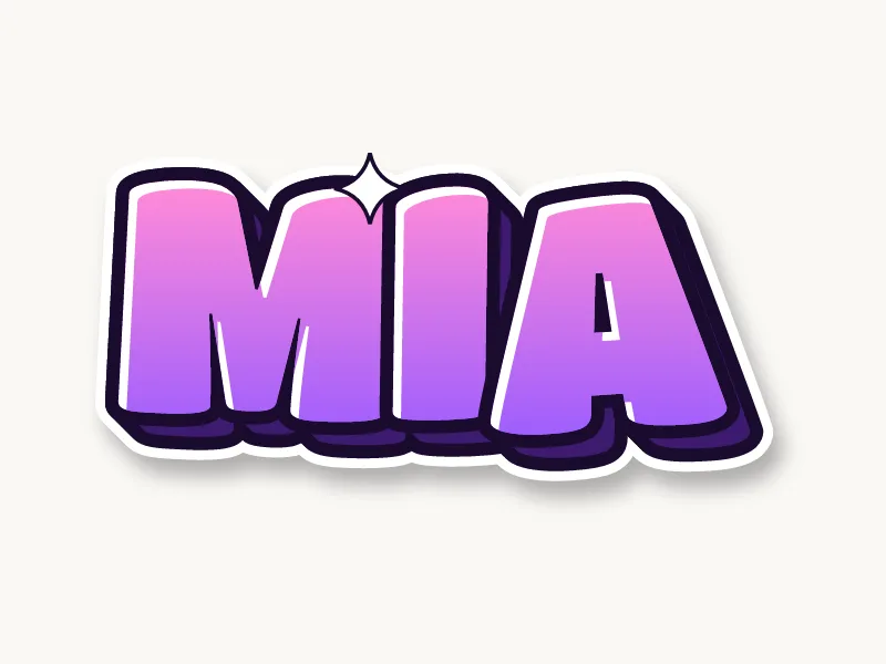
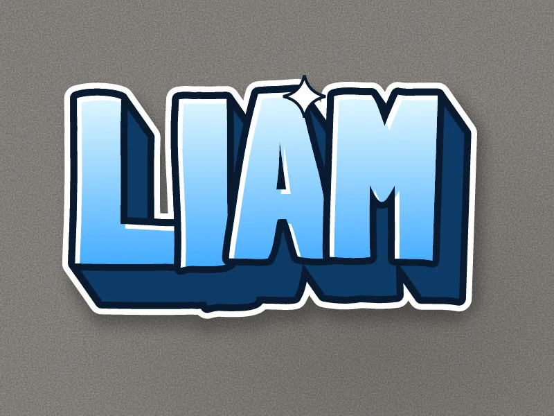
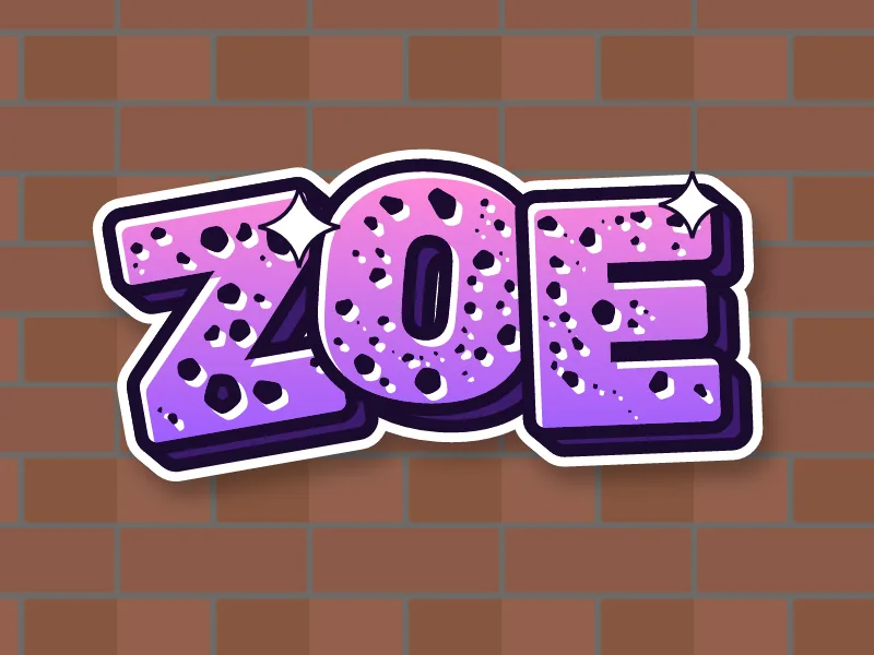
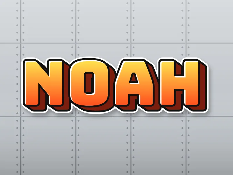
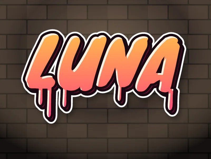
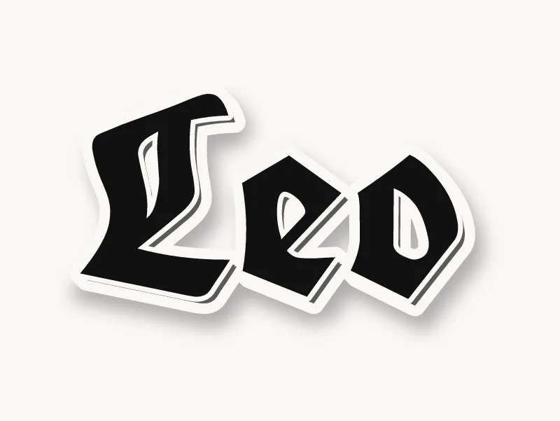
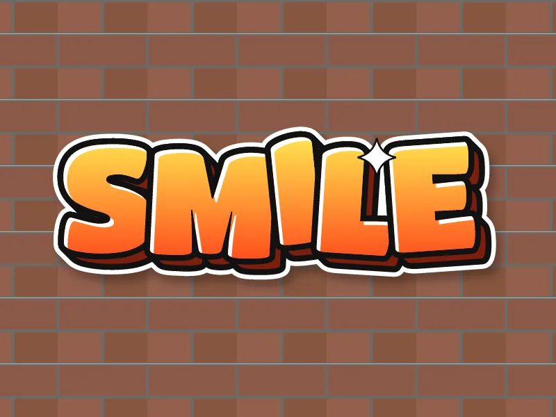
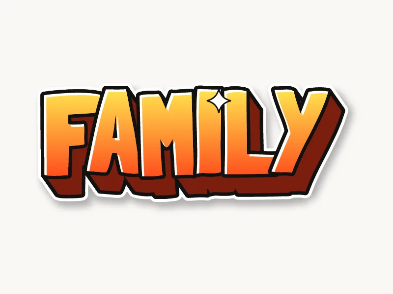
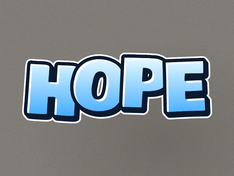
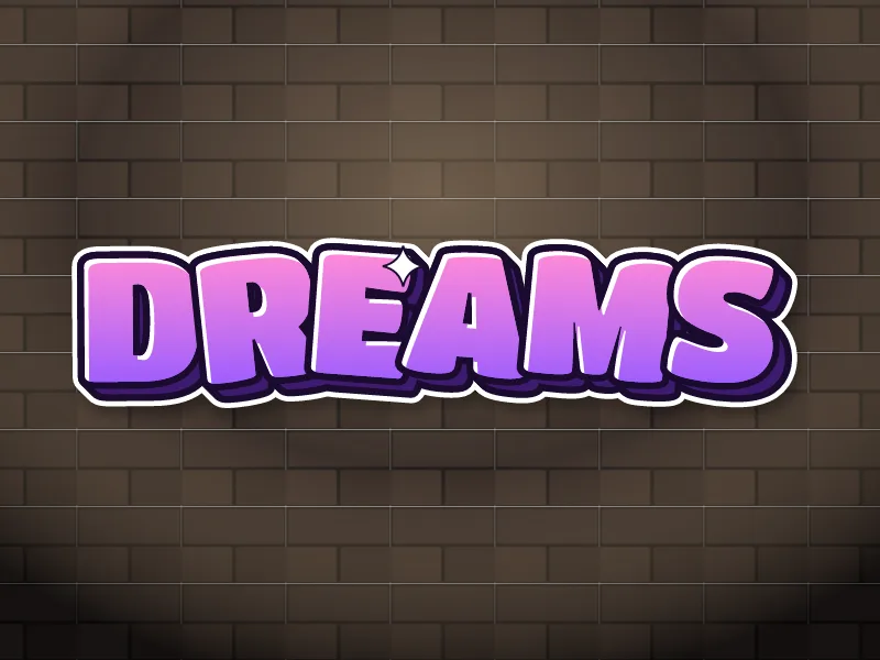
What makes a graffiti drawing look good?
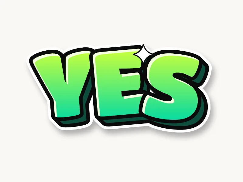
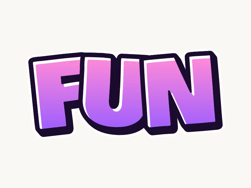
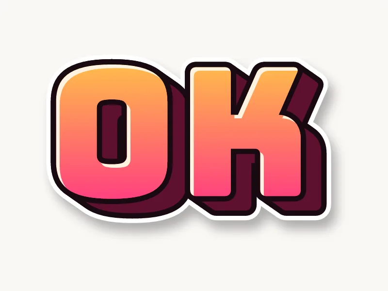
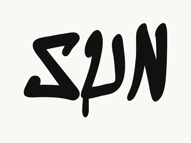
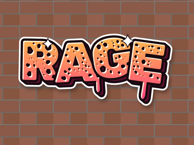
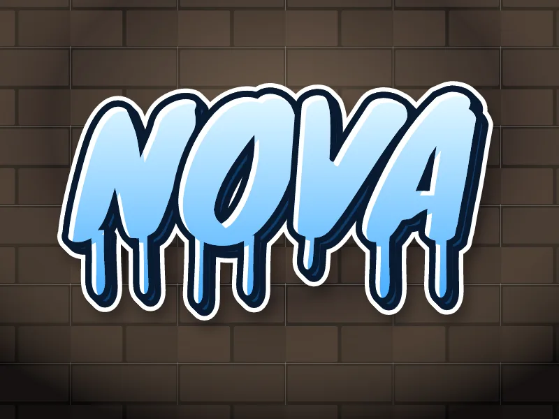
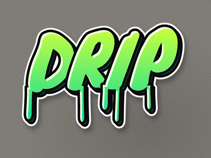
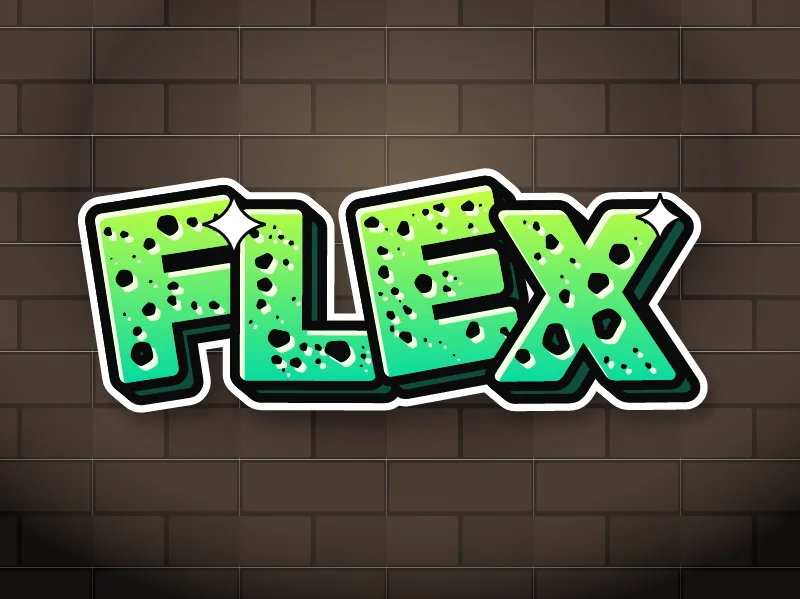
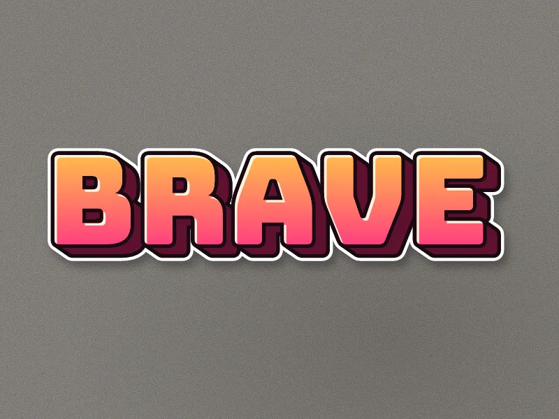
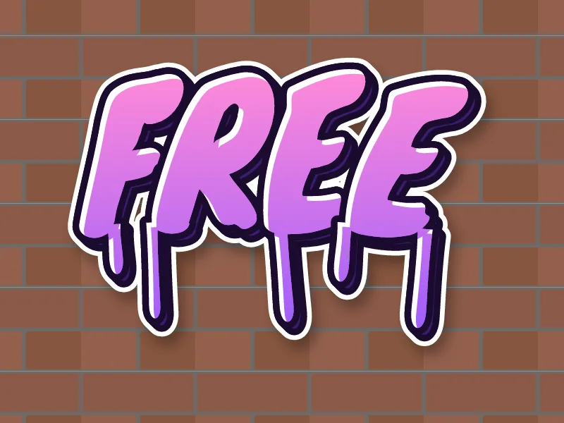
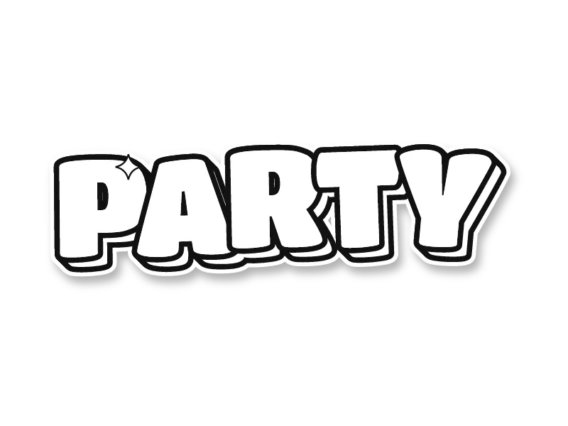
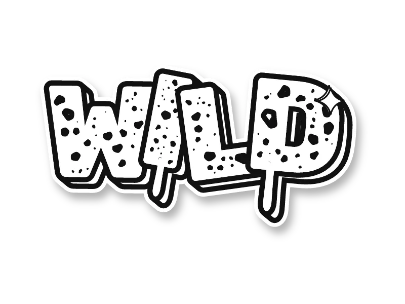
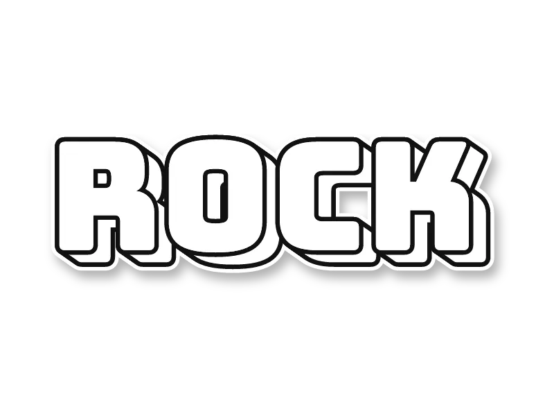
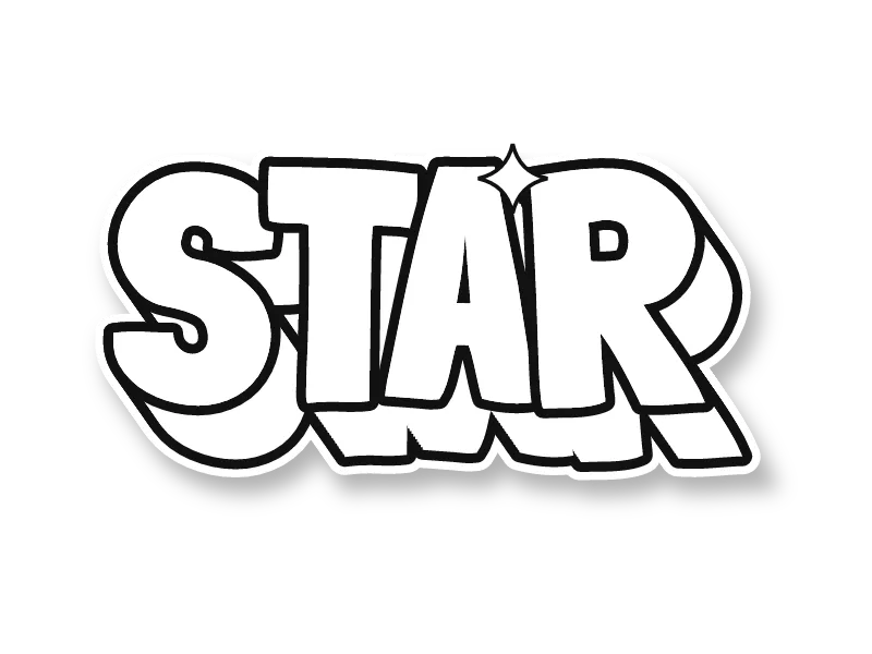
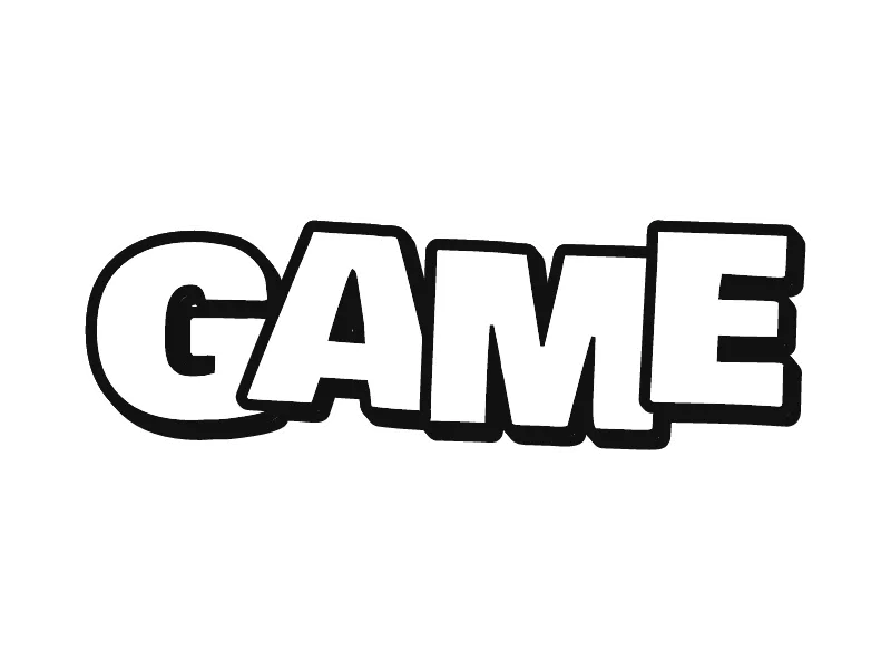
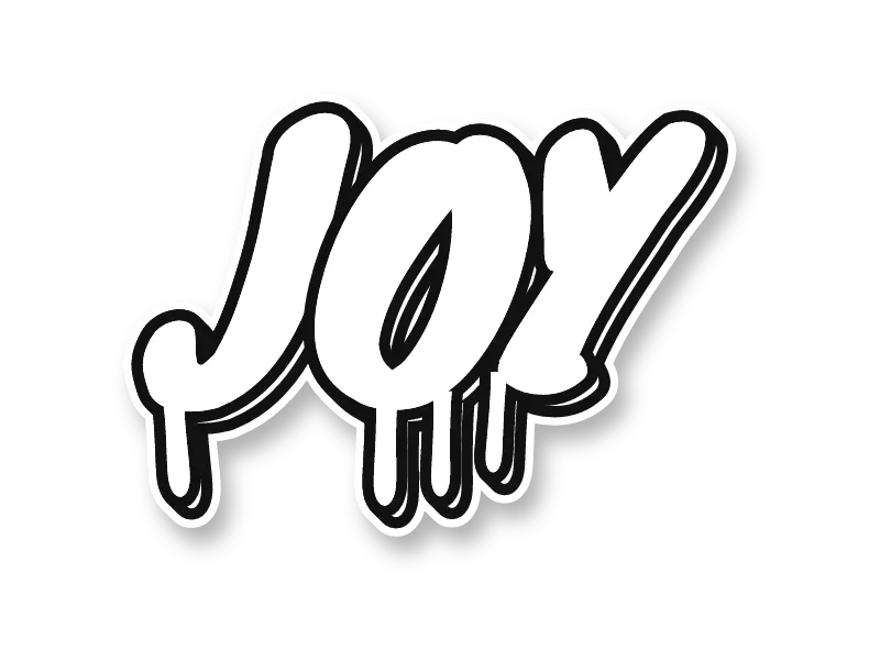
A good graffiti drawing has a readable skeleton, letters that flow into each other, one steady outline weight, 3D that points one way and highlights on the side facing the light. Get those five right and even a simple word looks finished. Get one wrong and no amount of color will fix it.
- Skeleton. Under every graffiti letter is a plain letter. If the skeleton is off, the drawing reads wrong.
- Flow. Letters lean the same way, sit on a shared baseline and touch or overlap, so the word reads as one shape.
- Outline weight. One thick, even outline holds the piece together. Wobbly or mixed line widths look unsure.
- 3D direction. Pick one direction for the depth, usually down and right, and use it on every letter.
- Highlights. Thin white lines and a shine star on the lit edges make flat color look glossy.
For depth options, see 3D graffiti letters. For letter shapes one by one, use the graffiti alphabet.
How do you copy a graffiti drawing step by step?
To copy a graffiti drawing, look at its overall shape first, sketch the skeleton of the word in pencil, then build the letters, fill, outline, 3D and highlights in that order. Copying the big shape before the details keeps the proportions right.
- Pick a drawing above and open it in the generator. Print it or keep it on screen next to your paper.
- Draw a light box the size of the whole word, then mark where each letter starts and ends.
- Sketch the skeleton: the plain letters in thin pencil lines.
- Build the letter shapes around the skeleton, matching how much they overlap in the original.
- Fill with color, then ink the outline with a thick black marker and erase the pencil.
- Add the 3D block, then the highlights.
- Draw it a second time from memory and change one thing, such as the colors or an arrow. That is how a copy becomes your own.
The full method with pictures of every stage is in how to draw graffiti step by step.
What simple symbols can you draw next to graffiti letters?
The easiest things to draw next to graffiti letters are simple symbols: a crown, arrows, stars, drips, a spray can or a speech bubble. They take a minute each, fill empty space and make a word look like a full piece.
- Crown: three or five points on a band, tilted on top of the first letter.
- Arrows: a curved line with a triangle head, coming out of the last letter.
- Stars: four-point shine stars on the letters, five-point stars around them.
- Drips: straight runs of different lengths from the bottom edge, each ending in a round drop.
- Spray can: a tall rounded rectangle, a cap, a nozzle and a small cloud of dots.
- Speech bubble: a rounded cloud with a tail, holding a short word like WOW or HEY.
Want a face or figure next to your word? The guide to drawing graffiti characters starts from simple shapes. For more words to draw, browse the graffiti ideas page.
Draw on paper, in a sketchbook or on canvas. If you paint a drawing on a wall, use a legal wall or get the owner's permission first.