






















How do you draw bubble letters step by step?
To draw (or write) graffiti bubble letters, write the word as a thin pencil skeleton, draw a soft round shape around each letter, fill the shapes with color, outline them in thick black, then add a 3D block and white highlights. The skeleton keeps the letters readable; everything after it is about making them look fat and solid.
You need a pencil, an eraser, smooth paper or a sketchbook (writers call it a blackbook), a thick black marker and two or three colors. Paint markers such as Posca cover well on paper; see the graffiti marker guide for options.
- Write the skeleton. Print the word lightly in pencil, in single lines. Leave about a letter's width between each one, because every letter is about to get much fatter. Keep the skeleton letters the same height.
-
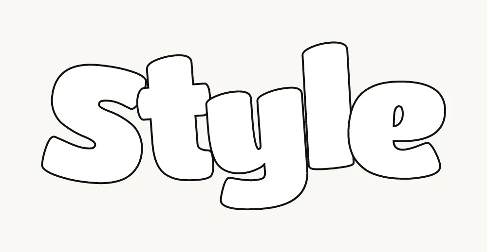
Draw the bubble around each letter. Trace around the skeleton about a finger-width out, keeping
that distance even all the way round. Turn every corner into a curve. Where two letters meet, let the shapes
touch or tuck one behind the other, then erase the skeleton and the hidden lines.
-
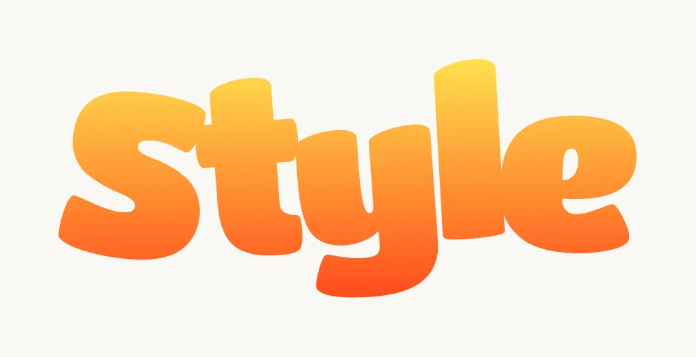
Fill with color. Two colors fading from light at the top to darker at the bottom look more
finished than one flat color. Fill before you outline, so the black covers any color that strays over the edge.
-
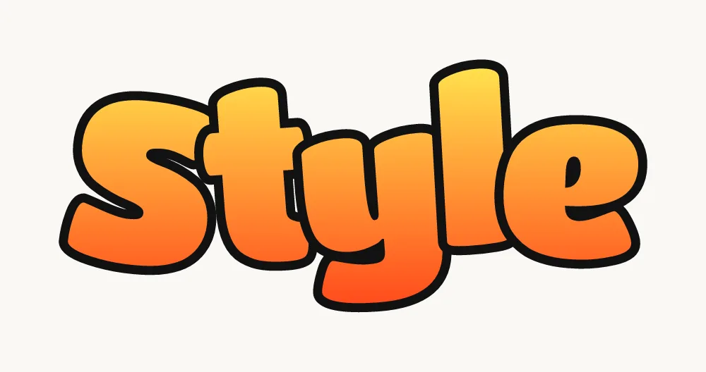
Outline in black. Go around each letter with a thick marker in long, smooth strokes. A heavy
outline is what turns soft shapes into graffiti, and it hides small wobbles in the fill.
-
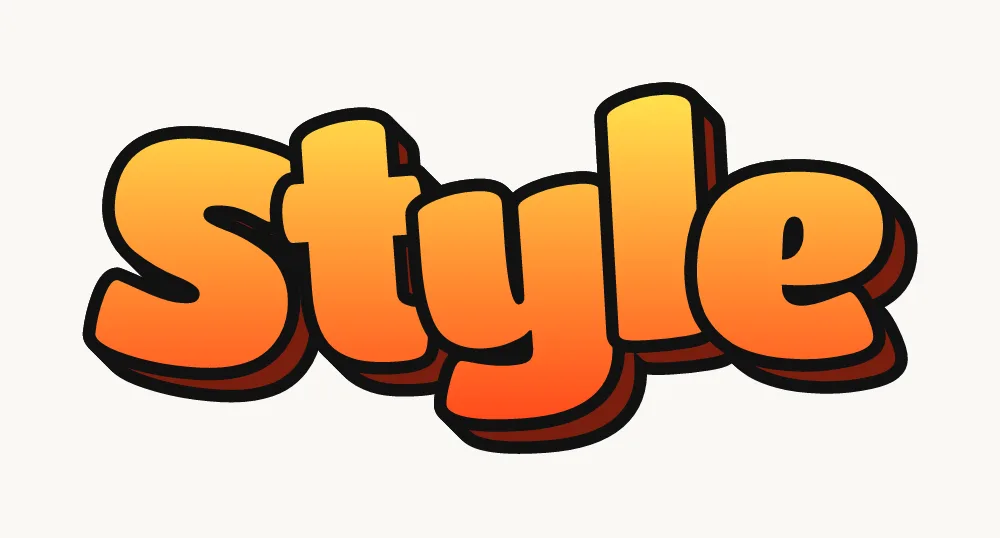
Add a 3D block. Pick where the light comes from and put the 3D on the opposite side: copy each
letter's outline a short way down and to the side, join the curves and fill the gap with a dark color. The 3D graffiti letters guide covers this in detail.
-
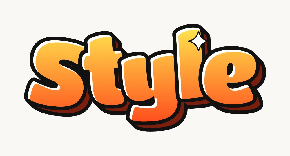
Add highlights. Draw thin white lines along the curves that face the light and a small shine mark
or two on the roundest parts. This is what makes bubble letters look puffy instead of flat.
For drips, a white cutline and a shadow under the whole word, see the full guide on how to draw graffiti.
How do you draw the whole bubble letter alphabet?
To draw the bubble letter alphabet, give every letter the same stroke thickness, the same height and the same roundness, so A to Z look like one family. Draw the skeleton for all 26 letters first, then inflate them in one sitting so the thickness stays even.
- Straight letters (E, F, H, I, L, T) only need rounded ends and corners. Do not make them perfect rectangles with soft edges; let the sides bulge a little.
- Round letters (C, G, O, Q, S, U) are the easiest. Keep the gaps in C and G wide, or they close up into an O.
- Letters with holes (A, B, D, O, P, Q, R) need the hole drawn bigger than looks right, because the outline eats into it.
- Diagonal letters (A, K, M, N, V, W, X, Y, Z) are the hardest, because diagonals meet at sharp points. Round each meeting point into a soft dip.
A good drill is one full alphabet per page, then the same page again a week later. Comparing the two shows you exactly which letters still look stiff.
Which bubble letters are hardest to draw?
The hardest bubble letters are the ones with diagonals or crowded strokes: A, K, M, R, S and W. Each one has its own page with step-by-step help, but the short version is:
- A: a rounded tent with a soft dome on top, fat feet and a small but open hole.
- R: a bubble P with the leg added as a separate puffy shape leaning out from under the bowl.
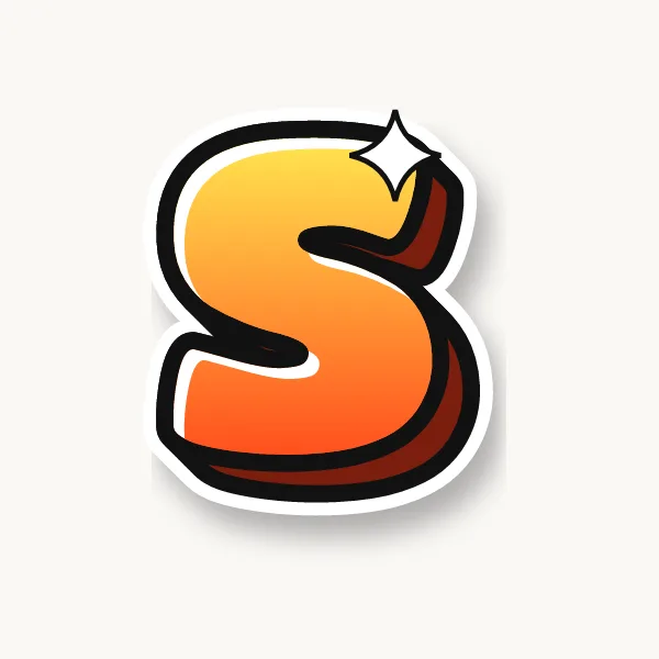
- S: keep the top curve a little smaller than the bottom one so it does not look upside down.
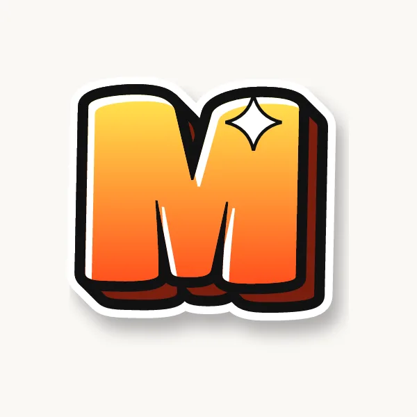
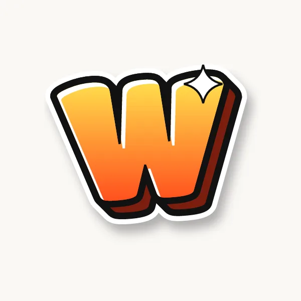
- M and W: shorten the middle point and let the outer strokes do the work.
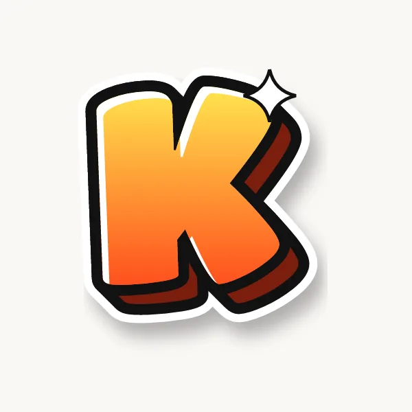
- K: leave a small notch where the arms meet the stem, so it does not turn into a blob.
For the graffiti version of any letter in other styles, see the graffiti alphabet.
Common bubble letter mistakes
- Holes that close up. A, B, D, O and P need a clear hole after outlining, so draw it bigger than you think.
- Uneven thickness. One fat letter next to a thin one looks like a mistake. Measure with your finger if you need to.
- Letters spaced apart. Bubble letters look best squeezed together, each one tucked slightly behind the next.
- Everything on one line. Bounce a few letters up or down and tilt them a little. Perfectly level letters look typed.
- Outlining with short strokes. Sketchy, hairy outlines kill the smooth look. Use long strokes and turn the paper as you go.
Cute, fancy, big, 3D and cool bubble letters
All of these start from the same inflated letter. What changes is how round the shapes are, how they are decorated and how much depth they get. Pick the look first, then draw the skeleton to match. Full alphabets and step-by-step tips for each look are on cute bubble letters, 3D bubble letters and lowercase bubble letters.
- Cute bubble letters: make them shorter and rounder, with extra-large bowls and dots, and let them lean against each other. Pastel fills, a heart for the dot on an i, and small stars around the word finish the look. In the generator, try the Pastel mix palette, which gives each letter its own soft color, or Candy.
- Fancy bubble letters: add a second outline a few millimeters outside the first, fill with a pattern (stripes, dots, checks) and add sparkle marks. Joined, cursive-style bubble letters count as fancy too: the cursive bubble letters page has the full joined alphabet and shows how to draw one outline around the whole word.
- Big bubble letters: draw one letter per page, or a short word across a whole poster. The bigger you go, the thicker the outline needs to be to stay readable from a distance. Big printed letters are on printable bubble letters.
- 3D bubble letters: copy each letter's outline down and to one side, join the curves and fill the gap dark. The 3D graffiti letters guide explains light direction and depth.
- Cool bubble letters: this is the graffiti version. Tilt and overlap the letters, bounce them off the baseline, add drips, a white cutline and a chrome or fade fill. Done fast in two colors, it becomes a throw-up.
Colors, shading and shadows
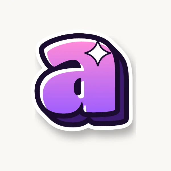
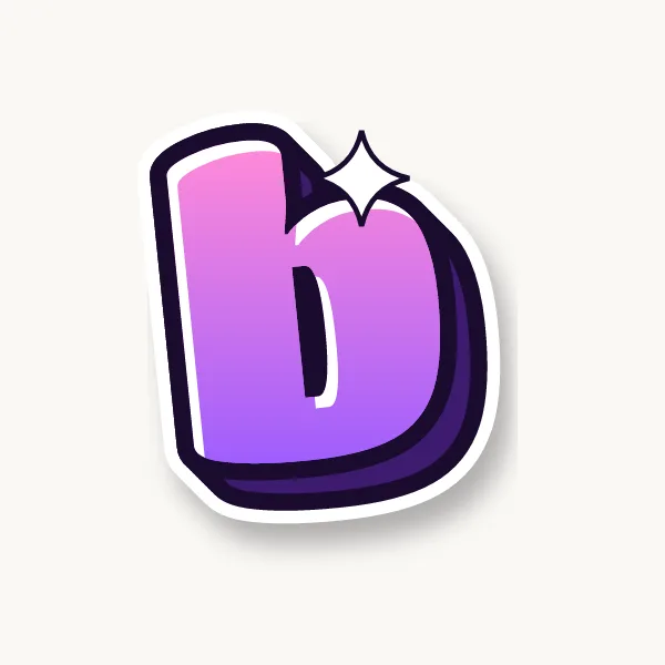
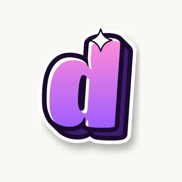
Bubble letters look best with a light-to-dark fade inside, a dark 3D block and white highlights on one side. Shade the bottom of each letter slightly darker than the top and they will look rounder straight away.
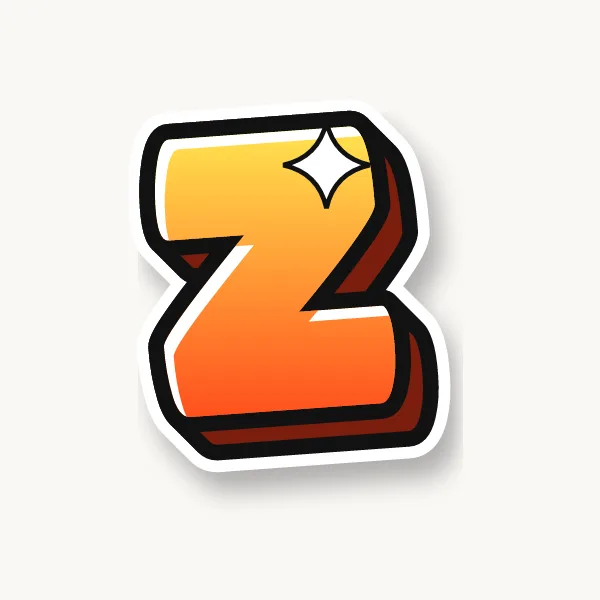
- Warm fade: yellow into orange or red, with a dark red 3D. The classic look.
- Cool fade: light blue into deep blue, with navy 3D and white highlights.
- Two-tone: one color for the top half, a second for the bottom, split by a wavy line.
- Drop shadow: a soft gray shape under the whole word lifts it off the page. It is different from 3D: a shadow is not attached to the letters.
In the generator, the Color tab swaps palettes, the Effects tab changes the 3D depth and direction, and the shuffle button tries a new bounce on the same word. The bubble letter generator page explains every color, effect and download option, and has a copy-and-paste bubble text tool.
Bubble letters for words and names
Bubble letters work best on short words: names, greetings and one-line signs. Type any word into the generator to see it in bubble letters and download it, or press Print as a coloring page to get an A4 outline page to color. Tap a word to try it:
How do you write happy birthday in bubble letters?
Put HAPPY on top and BIRTHDAY underneath so the letters can be big, and pencil the spacing before you ink. The happy birthday bubble letters guide has the full steps, layout ideas, six styles and a free printable banner, or you can make it in the generator.
Names, signs and posters
For a name, draw the first letter slightly bigger than the rest and tuck the others behind it. For signs and posters, stick to one or two words per line and keep the same letter height across the whole sign. The graffiti name generator suggests tag names you can open in the generator, and the graffiti ideas page has more words to practice. Ready-made pages for words like Love, Mom, Merry Christmas and Thank You, each with a printable outline, are in words in bubble letters.
What font is bubble letters?
Bubble letters are not one font. They are a hand-drawn lettering style, and every artist draws them a little differently. Many fonts imitate the look: thick, rounded faces often sold as "bubble" or "balloon" fonts. The Bubble style in our generator starts from Titan One, a free open-source font, then adds the outline, 3D block and highlights so the result looks like drawn graffiti rather than typed text. We do not offer font files to install; the generator turns your text into finished artwork instead. The SVG download is made of outlined shapes, so you can open it in Illustrator or Cricut Design Space without installing any font.
Bubble letters, throw-ups and block letters
| Style | What it looks like | Used for |
|---|---|---|
| Bubble letters | Round, inflated, often with 3D and highlights | Names, posters, learning the basics |
| Throw-up | Fast bubble letters in one fill color and an outline | Quick pieces done in minutes |
| Block letters | Square, straight edges, very readable | Big, bold names you can read from far away |
| Wildstyle | Interlocking letters with arrows and extensions | Advanced pieces, hard to read on purpose |
A throw-up is really a quick bubble letter. The writer Phase 2 is widely credited with popularizing the soft, rounded "bubble" style in New York in the early 1970s, and it has been the starting point for new writers ever since. The graffiti styles page compares all of them.
Printable bubble letters
The whole bubble alphabet is free to print as outlines, one big letter per page: uppercase A–Z, lowercase a–z and numbers 0–9. The printable bubble letters page has previews, printing and tracing tips and banner ideas. Printing a letter and tracing it a few times is a quick way to learn its shape before drawing it freehand. For graffiti-style sheets to color, see the graffiti coloring pages.