


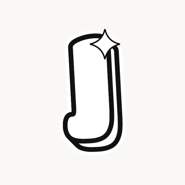
How do you draw a J in bubble letters?
Draw a straight stem on the right that curves into a hook at the bottom, swinging to the left and slightly up. Outline the stem and hook at an even thickness, give the hook a round end, and leave a clear rounded pocket inside the curve. Add a top bar if you want one, then ink.
- Draw the stem. Pencil a vertical line toward the right side of your letter space.
- Curve the hook. At the bottom, bend the line to the left and up, like a fishhook.
- Outline it. Trace around the stem and hook at the same thickness all the way, with a round cap at the tip.
- Open the pocket. Make sure the inside of the hook is a visible rounded space, not a closed hole.
- Add a top bar. Optionally, put a short puffy bar across the top, sticking out more to the left.
- Finish. Ink, erase and shade the outside of the hook.
What makes a J easy or tricky in bubble letters
The J's challenge is the hook. As it gets fat, its tip can curl back up and touch the stem, closing the pocket. Keep the hook shallow and let it rise only a little. The J also leaves empty space above the hook on the left, so in a word you can nudge the letter before it closer.
Lowercase j in bubble letters
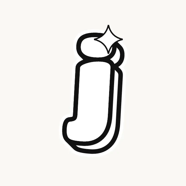
Lowercase j drops below the baseline, so its hook sits under the rest of the word, and it has a dot on top like an i. In bubble form make the dot a full round ball and the descender as thick as the stem. The hook curls left under the previous letter, so leave room in that space.
Cute, 3D and graffiti bubble J
A cute J works well with a heart for its dot or a small curl at the end of the hook. For 3D, the shadow follows the outside of the hook, showing the curve. Graffiti J's often extend the hook into a long swoosh or an arrow.
Common mistakes with a bubble J
- Curling the hook so high that it closes into a loop.
- Making the hook thinner than the stem.
- Forgetting the dot on the lowercase j, which turns it into a fishhook shape.
Printable bubble letter J to color or trace
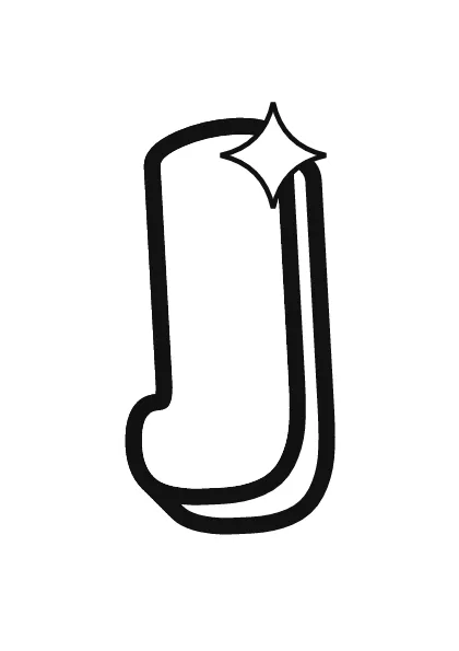
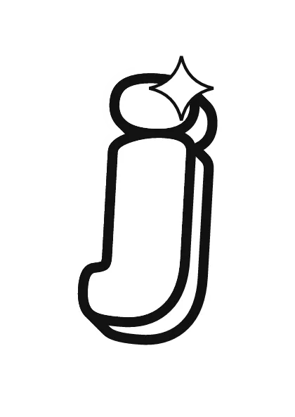
Each letter fills a full A4 page (choose "fit to page" to print on US Letter), so it is big enough to color, trace or cut out for a banner. Download the uppercase A–Z PDF, the lowercase a–z PDF or the numbers 0–9 PDF, and print only the pages you need. More sheets are on printable bubble letters.