


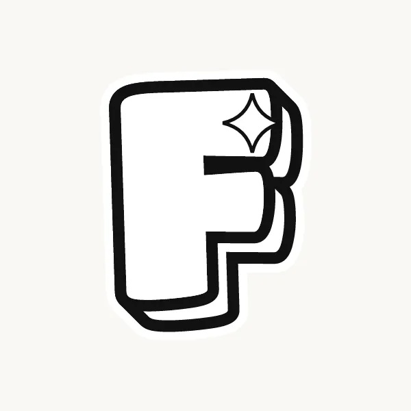

How do you do an F in bubble letters?
Draw a thin F, then trace around it with a rounded stem, a long top arm and a shorter middle arm. Cut one deep slot between the arms. Give the bottom of the stem a slightly wider foot so the letter stands steady, then ink the outline and erase the guide.
- Draw the skeleton. Pencil a stem with a long arm at the top and a shorter arm just above the middle.
- Trace the stem. Outline the left side and the bottom, giving the foot a round end.
- Wrap the top arm. Go out along the top arm and round off its tip.
- Cut the slot. Come back in under the top arm, cut a narrow channel toward the stem, then go out around the middle arm.
- Close the stem. Return down the right side of the stem to the foot.
- Balance it. If the F leans, widen the foot slightly to the right and ink the outline.
What makes an F easy or tricky in bubble letters
The F has the same top as an E but nothing at the bottom, so all its weight sits high. As a bubble letter it can look like it is about to tip over. A slightly wider foot, or a tiny kick to the right at the base, fixes that. In a word, the empty corner under the middle arm leaves a gap, so tuck the next letter a little closer.
Lowercase f in bubble letters
Lowercase f is a tall stem with a hook curling right at the top and a short crossbar at the x-height. As a bubble letter the hook should be a round curl, not a sharp turn, and the crossbar should poke out on both sides of the stem. Keep the hook from drooping so low that it touches the crossbar.
Cute, 3D and graffiti bubble F
A cute F can curl the end of its top arm like a little wave. For 3D, the shadow fills under both arms and shows at the open bottom corner, which actually helps the balance. Graffiti F's often get an arrow off the top arm or a foot that kicks out.
Common mistakes with a bubble F
- Letting the F float with a narrow foot so it seems to tip over.
- Making the two arms the same length, so it looks like a half-finished E.
- Drawing the lowercase f hook so low that it merges with the crossbar.
Printable bubble letter F to color or trace


Each letter fills a full A4 page (choose "fit to page" to print on US Letter), so it is big enough to color, trace or cut out for a banner. Download the uppercase A–Z PDF, the lowercase a–z PDF or the numbers 0–9 PDF, and print only the pages you need. More sheets are on printable bubble letters.