



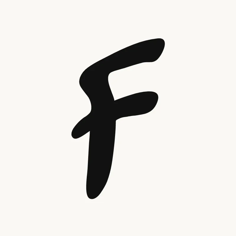







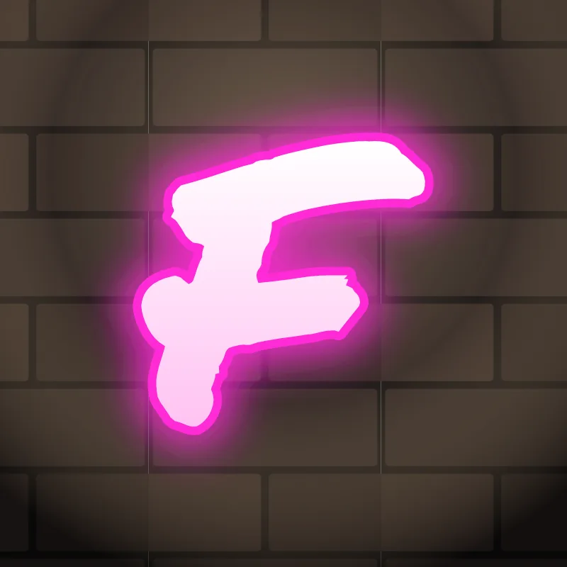
How to draw an F in graffiti
To draw an F in graffiti, sketch a stem with a long top arm and a shorter middle arm, then give the bottom of the stem a foot or flare it wider so the letter has a base. Thicken it, outline it, and use the long top arm as a roof over the next letter.
- Stem and two arms. Pencil a stem, a long top arm and a middle arm about two thirds as long.
- Give it a base. Draw a small foot or kick at the bottom of the stem, or flare the stem wider toward the bottom.
- Stretch the roof. Extend the top arm to the right so it can hang over the next letter.
- Thicken. Build the body, keeping the gap between the arms open and the stem heavy.
- Ground it. Ink the outline and put the 3D block on the bottom and right side so the foot looks planted.
Letter structure: the parts of an F
An F is an E without the bottom arm. The open space below the middle arm is the defining feature, and it is why an F needs help balancing: the eye expects weight at the bottom and finds none. The single counter between the two arms has to stay open, or the top of the letter becomes a solid flag.
The F in bubble, blockbuster, wildstyle, throw-up and Old English
Bubble. Two rounded lobes off a fat stem, with a small rounded foot. Make the foot obvious, or the bubble F tips over.
Blockbuster. A thick block of a stem with short shelves for arms. A clipped foot on the right keeps it level.
Wildstyle. The top arm grows into an extension that roofs one or two letters, and the middle arm turns into an arrow pointing forward.
Throw-up. Often written fast, almost like a 7 with a short crossbar. Keep the stem thick so it does not read as a T.
Old English. The blackletter F has a tall, slanting stem with a thin flag on top and a short crossbar, often dropping slightly below the line.
Common mistakes with a graffiti F
- Leaving the bottom bare. Without a base the F looks top-heavy.
- A middle arm as long as the top one. The F loses its shape and looks like a sideways comb.
- Dropping the middle arm too low. The upper gap gets huge and the letter looks unfinished.
Uppercase or lowercase F?
A lowercase f is a tall stem that hooks over at the top, with a crossbar. In graffiti the stem often drops below the line, which gives the letter a lively, leaning look.
Adding arrows to an F
The top hook is the natural arrow on an F. On a capital, the top arm can stretch into an arrow that roofs the next letter. See how whole words lock together in wildstyle.
Making an F flow in a word
The top arm can stretch over the next letter like a roof. F is common at the start of words (Finn, Fresh, Fly) and in the pairs "FR" and "FL". In both, let the top arm reach over the following letter so the two read as one unit. A double F, as in "Jeff" or "Biff", works best when the two stems share one long top arm.
Want to see it with your own name? Type it into the graffiti letter generator, or learn the whole process step by step in how to draw graffiti.