









How to draw a G in graffiti
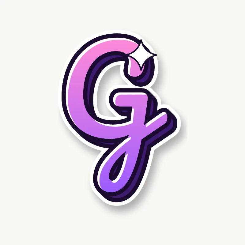
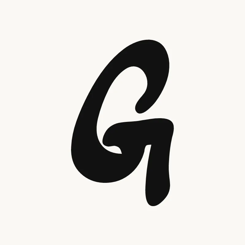
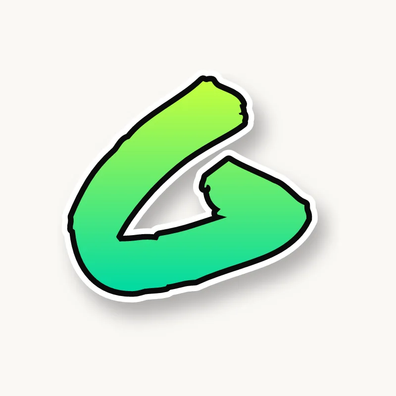
To draw a G in graffiti, draw a wide open C first, then add a chunky bar that turns inward from the bottom end, sometimes with a short spur dropping down. Thicken it all, keep the opening and the hole clear, outline it and add 3D. Make the bar bigger than seems necessary.
- Start from a C. Pencil a three-quarter circle with the opening on the right.
- Add the bar. From the bottom end, draw a short horizontal bar pointing into the middle of the letter.
- Add a spur if you like. A short vertical stroke under the bar gives the G a sharper corner that reads from further away.
- Thicken. Build the body, making the bar at least as thick as the curve.
- Check the gap, then 3D. Ink it, make sure the space above the bar is still open, then extrude away from the light.
Letter structure: the parts of a G
A G is a C with a short bar turning inward at the bottom right. The curved body works like a C, with a terminal at the top, a bar on the lower right and often a spur where bar and curve meet. The bar is what people look for. In graffiti it is often oversized or turned into an arrow so it reads from a distance.
The G in bubble, blockbuster, wildstyle, throw-up and Old English
Bubble. A round shape with a small tongue pushing in at the lower right. Keep a notch above the tongue so the G stays open.
Blockbuster. A square C with a short shelf inside the bottom right. Blockbuster Gs look strong with the top end clipped at an angle.
Wildstyle. The top terminal becomes an arrow sweeping up and back, and the bar can stab into the next letter. It gets busy, but the bar must still read.
Throw-up. A quick spiral: around and in. The inward curl stands in for the bar.
Old English. The blackletter G curls in on itself, with a heavy left side and a hairline tail, so it looks more like a spiral than a C with a bar.
Common mistakes with a graffiti G
- A bar that is too small. It disappears under the outline and the G reads as a C.
- Closing the top. If the top terminal curls too far down, the G becomes an O with a dent.
- Putting the bar on the outside. A bar sticking out to the right reads as a messy C, not a G.
Uppercase or lowercase G?
A lowercase g can be single-story, a bowl with a hooked tail below, or double-story, two stacked bowls with a small ear. The single-story g is easier and its tail is a great place for style.
Adding arrows to a G
On a capital G, the inward bar can point into the letter as an arrow. On a lowercase g, the hooked tail can sweep under the next letters. See how whole words lock together in wildstyle.
Making a G flow in a word
The top end of the curve lets an arrow sweep up and out of the letter. G turns up at both ends of words: Gold, Grace, King, Swag. At the end ("NG", "AG"), let the previous letter overlap the left curve and leave the bar free. At the start, the open top can sweep an arrow over the next letter. "GR" is easy to connect, because the stem of the R can tuck right into the G's open right side.
Want to see it with your own name? Type it into the graffiti letter generator, or learn the whole process step by step in how to draw graffiti.