







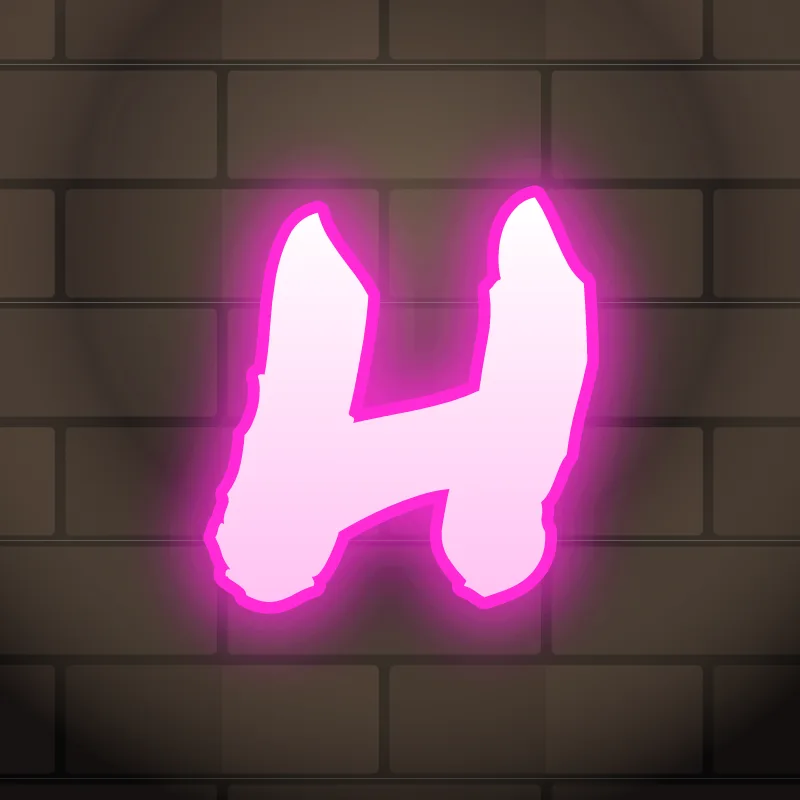
How to draw graffiti letter H
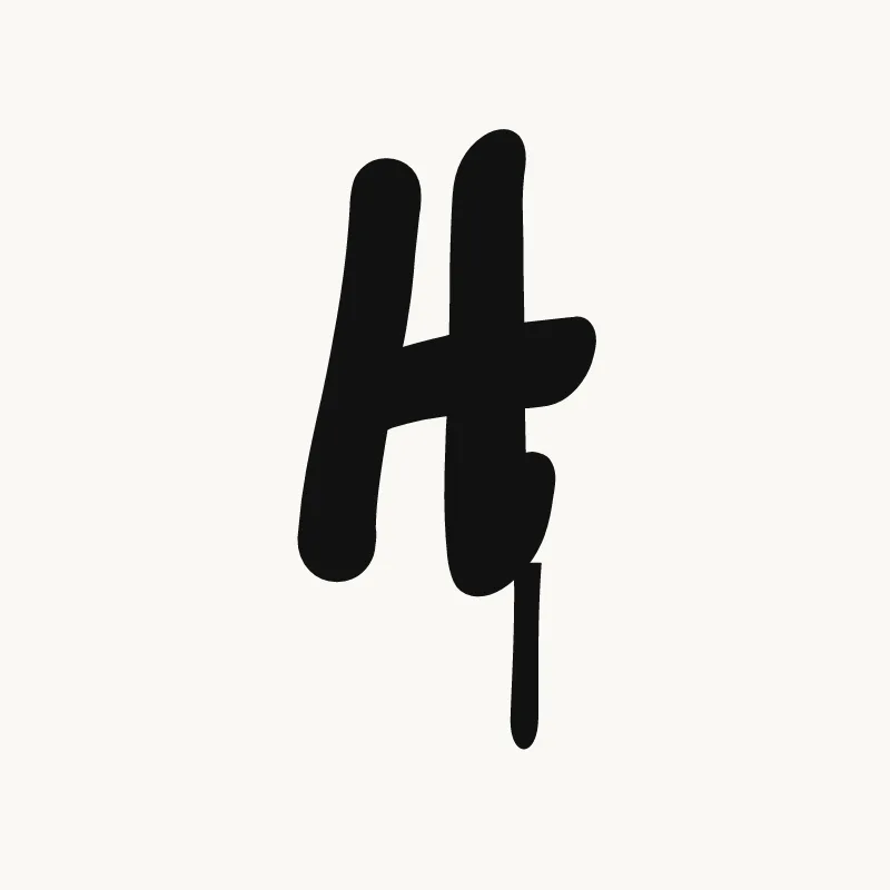
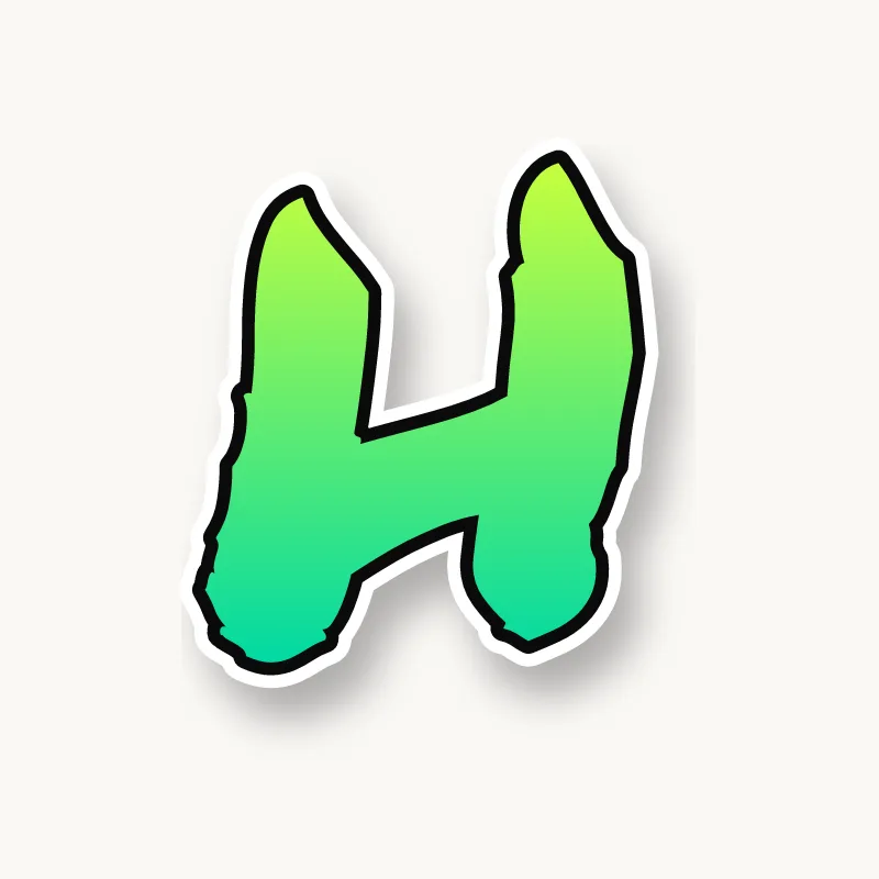
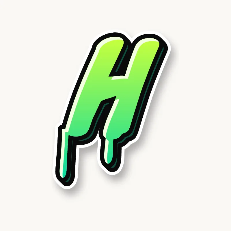
To draw graffiti letter H, pencil two stems, join them with a crossbar just below the middle, and make one stem a little taller than the other. Thicken the strokes, keep the gaps above and below the bar open, outline it and add 3D. Small asymmetries are what make an H look like graffiti.
- Two stems. Pencil two vertical lines, the right one slightly taller.
- Crossbar low. Join them with a bar just below the middle, or angle it slightly upward toward the taller stem.
- Tilt it. Lean the whole H forward a few degrees so it does not stand like a ladder.
- Thicken. Build the body around all three strokes. The crossbar can be a bit thinner than the stems.
- Outline and 3D. Ink it, keep both gaps clear and add the block. The space under the bar shows the depth well.
Letter structure: the parts of an H
An H is two stems joined by a crossbar. There is an open counter above the bar and another below it, and both open to the outside, so an H never closes up the way an O or a B can. The risk is the opposite: an H is so open that it can look loose next to round letters.
The H in bubble, blockbuster, wildstyle, throw-up and Old English
Bubble. Two soft pillars with a pinched waist. The crossbar often shrinks into a narrow neck between them.
Blockbuster. Two blocks and a bridge. Blockbuster Hs fill space well and carry a thick 3D block easily.
Wildstyle. The crossbar can push past the right stem into an extension, and one stem can split into an arrow. It still reads as long as the bridge is visible.
Throw-up. Often a rounded arch with a tall left side, like a lowercase h, filled flat.
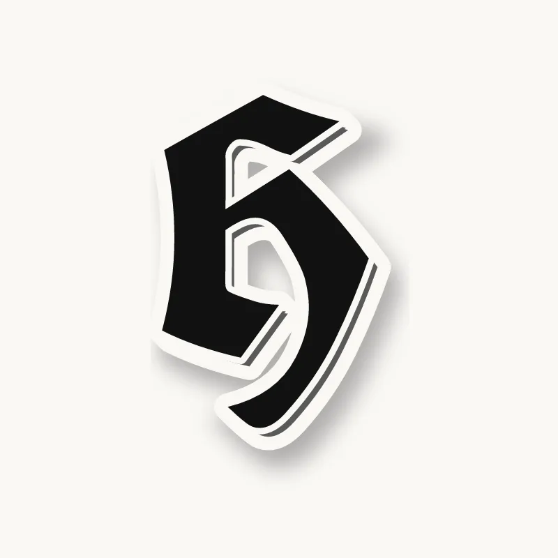
Old English. The blackletter H is curvy: a tall stem with a thin flag, and a right side that curls down and around, closer to a lowercase h than to two stems and a bar.
Common mistakes with a graffiti H
- Perfect symmetry. A mirror-image H looks rigid next to letters with more movement.
- A crossbar placed high. It makes the H look like an A without a point.
- Stems too far apart. A wide H leaves a hole in the word; keep it narrower than an O.
Uppercase or lowercase H?
A lowercase h is a tall stem with a single arch. It reads well at a glance, so you can push the arch wide or tilt the stem without losing the letter.
Adding arrows to an H
Arrows go on the top of a stem or on the end of an extended crossbar. On a lowercase h, the end of the arch can flick out into a short arrow. See how whole words lock together in wildstyle.
Making an H flow in a word
The right stem can slide behind the next letter, which is an easy way to start overlapping. H shows up in pairs like "TH", "SH", "CH" and "HA". In "TH", let the top bar of the T run over the H's left stem. In "SH", the bottom curve of the S can tuck into the lower gap. At the end of a word (Noah, Josh), let the right stem stand tall to close the piece.
Want to see it with your own name? Type it into the graffiti letter generator, or learn the whole process step by step in how to draw graffiti.