

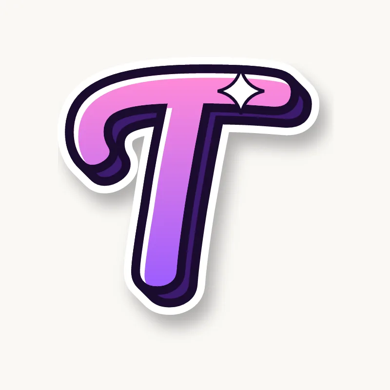

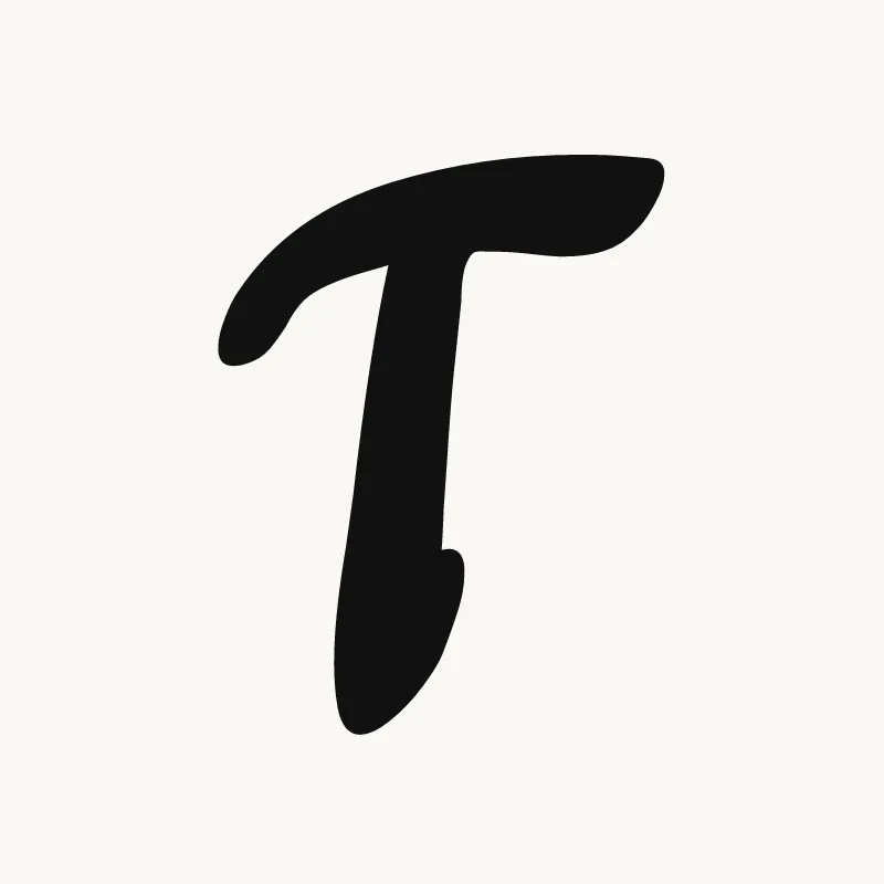
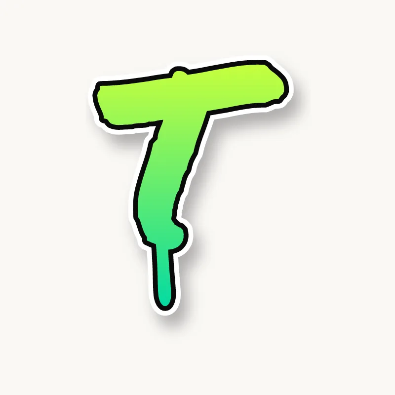
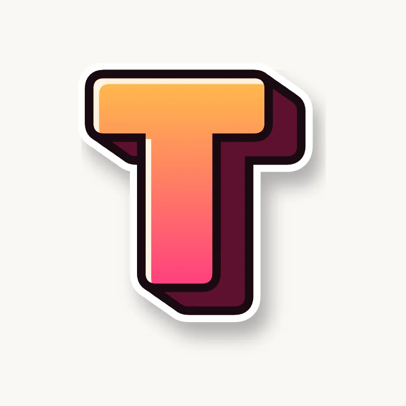


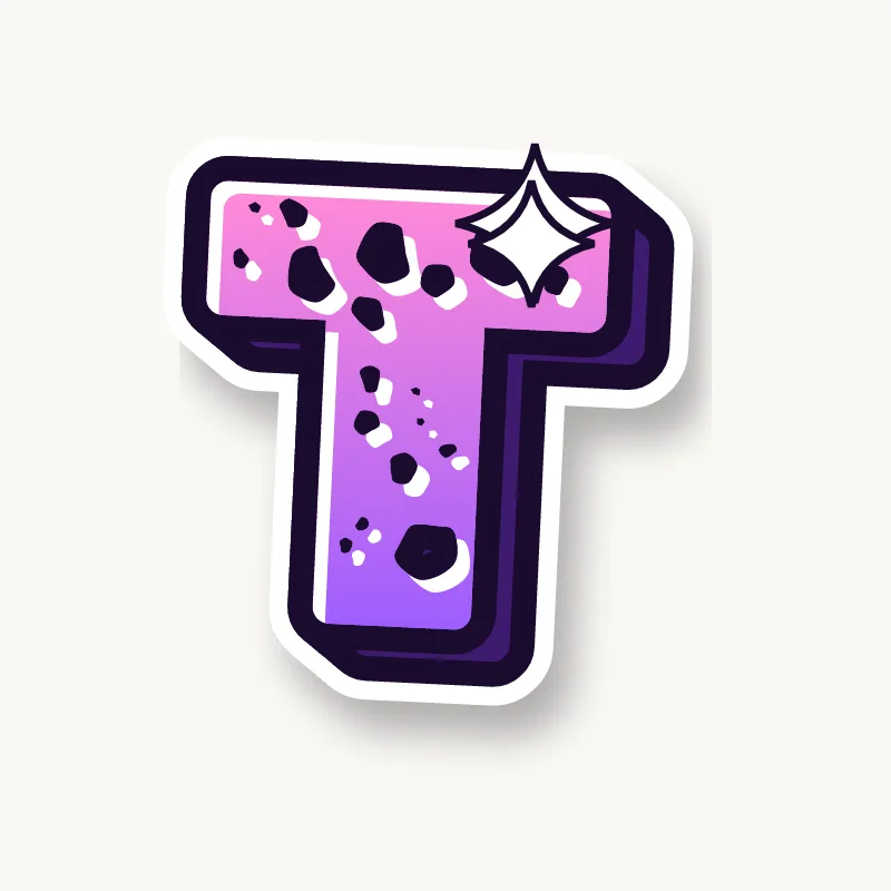

How do you draw a T in graffiti?
To draw a T in graffiti, pencil a wide top bar and a stem from its middle, let the stem drop a little below the other letters, and thicken the stem toward the bottom. Stretch one end of the bar over the next letter, outline it and add 3D. The bar is where the T gets its style.
- Top bar. Pencil a horizontal bar wider than your other letters.
- Stem. Draw a vertical from the middle of the bar, or a little left of it.
- Make it stand. Flare the bottom of the stem or add a foot so the T is not top-heavy.
- Stretch the bar. Extend the right end over the next letter, or angle the bar for movement.
- Shadow under the bar. Ink it and extrude so the 3D shows under the bar. That shadow is what makes a T pop.
Letter structure: the parts of a T
A T is a stem with a bar across the top. There is an open counter under each half of the bar. With nearly all of its width at the top, the T is one of the most top-heavy letters, so it needs either a wide base or a forward lean to look stable.
The T in bubble, blockbuster, wildstyle, throw-up and Old English
Bubble. A mushroom: a fat, round cap on a short stem.
Blockbuster. A thick bar on a thick post. Blockbuster Ts are often used as the roof of a whole word.
Wildstyle. Both ends of the bar become arrows, and the stem can split or hook under the next letter.
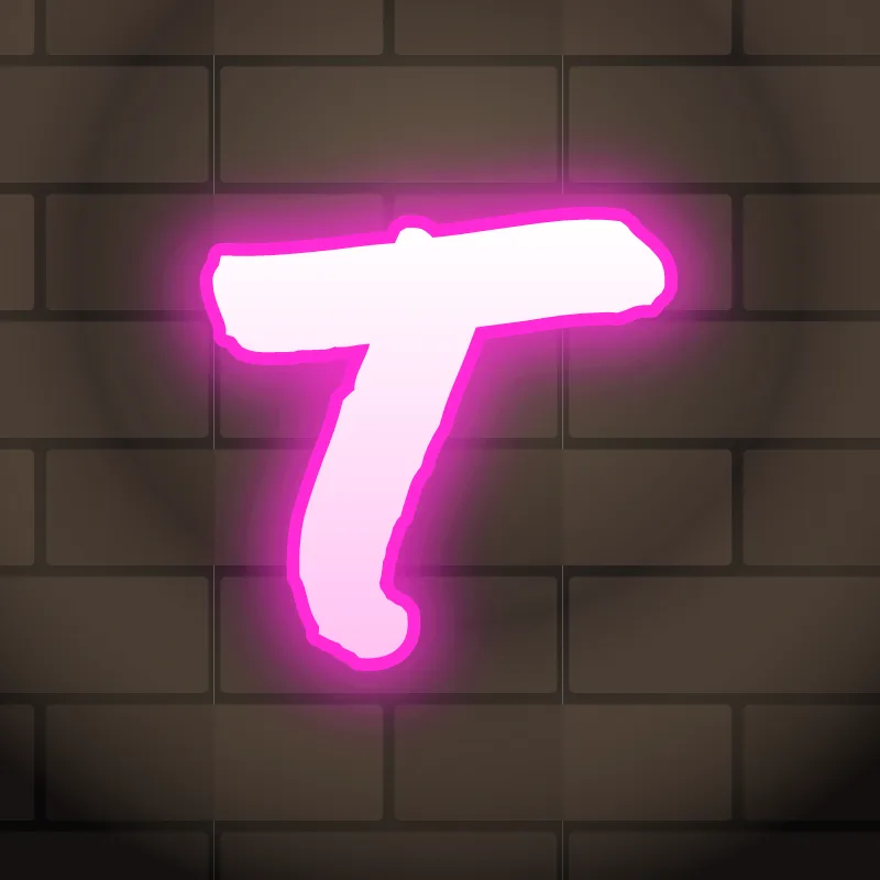
Throw-up. Often a lowercase t: a stem with a short crossbar and a curl at the foot.
Old English. The blackletter T looks surprisingly round: a curved, C-like shape with a bar on top and a hairline.
Common mistakes with a graffiti T
- A thin stem. With all the weight on top the T looks like it might fall.
- A bar that is too short. A narrow bar makes the T look like an I with caps.
- A stem shifted off-center by accident. Shift it on purpose, so the longer side of the bar can roof the next letter.
Uppercase or lowercase T?
A lowercase t is shorter than an l, with a crossbar near the top and often a curl at the foot. Let the crossbar reach out to the letters on either side.
Adding arrows to a T
Both ends of the top bar can be arrows on a capital T. On a lowercase t, the foot curl can end in one. See how whole words lock together in wildstyle.
Making a T flow in a word
The top bar can stretch over one or two letters and hold the word together. T sits in some of the most common English pairs: "TH", "ST", "TR" and "TT". In "TH" and "TR", let the bar roof the second letter. In "ST", the S can tuck under the left side of the bar. In "TT" (Matt, Scott), the two Ts can share one long bar with two stems.
Want to see it with your own name? Type it into the graffiti letter generator, or learn the whole process step by step in how to draw graffiti.