










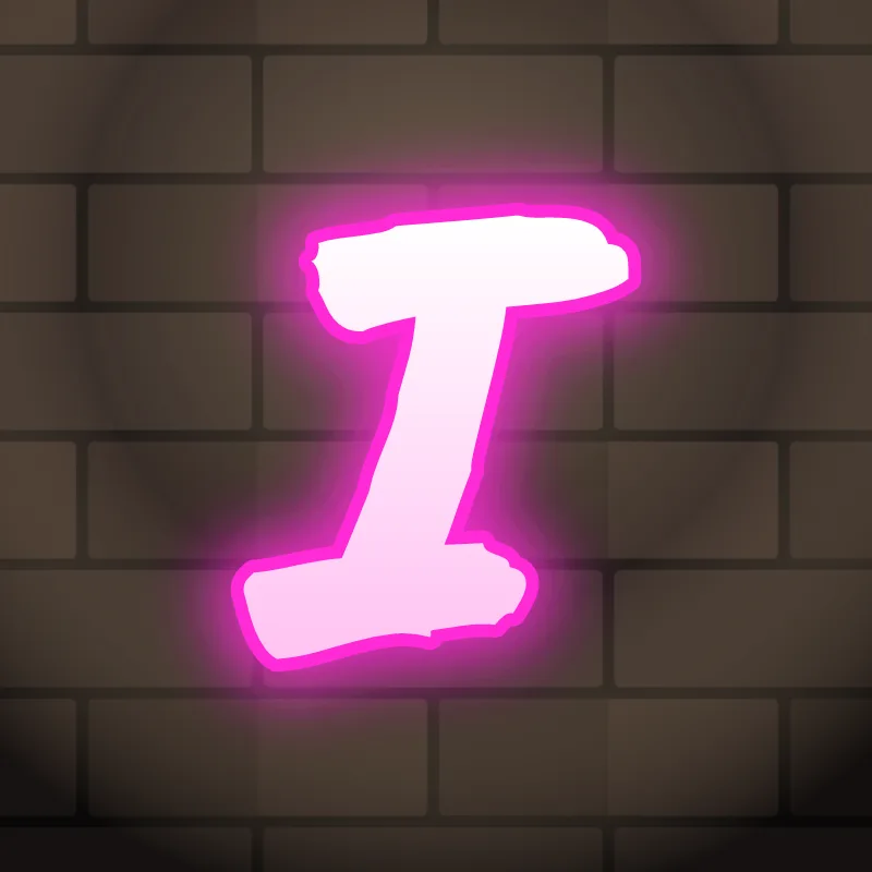
How do you draw the letter I in graffiti?
To draw the letter I in graffiti, make it wider than a normal I, add caps at the top and bottom, and give it a slight bend or tilt so it fills the same space as its neighbors. Thicken it, outline it and add a 3D block on one side. The caps are what stop it looking like a gap.
- Draw a wide stem. Pencil a tall rectangle about half as wide as your O, not a single thin line.
- Add caps. Draw a short bar across the top and the bottom, each sticking out on both sides.
- Bend it. Curve the stem slightly or lean it, so the I has some life.
- Shape the caps. Round them for bubble, keep them square for block, or turn one cap into an arrow.
- Outline and 3D. Ink it and add the block on the side away from the light. The caps make the 3D easy to see.
Letter structure: the parts of an I
An I is a single stem, so the job is making it heavy enough to hold its place. It has no counter at all, not even an open one like the L or T, so there is nothing inside to keep clear. That makes it easy to draw but hard to balance: a letter with no inside space looks lighter than its neighbors unless you widen it.
The I in bubble, blockbuster, wildstyle, throw-up and Old English
Bubble. A fat capsule or a dog-bone shape with rounded caps. Bubble Is are often drawn slightly bent, like a bean.
Blockbuster. A capital I shaped like a steel beam, with wide flat caps. It carries a 3D block cleanly.
Wildstyle. The caps turn into arrows pointing in opposite directions, or the stem splits halfway. Next to busy neighbors, the I is often where the eye rests.
Throw-up. A single fat bar, or a lowercase i with a big round dot. Quick and readable.
Old English. In blackletter the I and the J look almost the same: a heavy curved stroke with a hairline. Context tells the reader which is which.
Common mistakes with a graffiti I
- A thin I leaves a gap in the word, so the letters around it look far apart.
- Skipping the caps on a capital I. Without them it looks like a lowercase l or the number 1.
- Making it perfectly straight and the same height as everything else. A small tilt or bounce stops the I from looking like a fence post.
Uppercase or lowercase I?
A lowercase i is a short stem with a dot. The dot is the fun part: swap it for a star, a crown, a heart or a small drip.
Adding arrows to an I
On a capital I, add the arrow to the top cap, pointing back. On a lowercase i, the dot itself can become a small arrowhead. See how whole words lock together in wildstyle.
Making an I flow in a word
Let the neighboring letters lean in on it. The I can be the post the rest of the word rests against. I sits in the middle of many short names (Mia, Kai, Eli, Liam), squeezed between wider letters. Let the neighbors lean in and overlap its caps. In "IN" and "IT", the I and the next letter can share a cap. In "LI" and "ILL" (Bill, Will), avoid three thin uprights in a row by making one of them a different height.
Want to see it with your own name? Type it into the graffiti letter generator, or learn the whole process step by step in how to draw graffiti.