



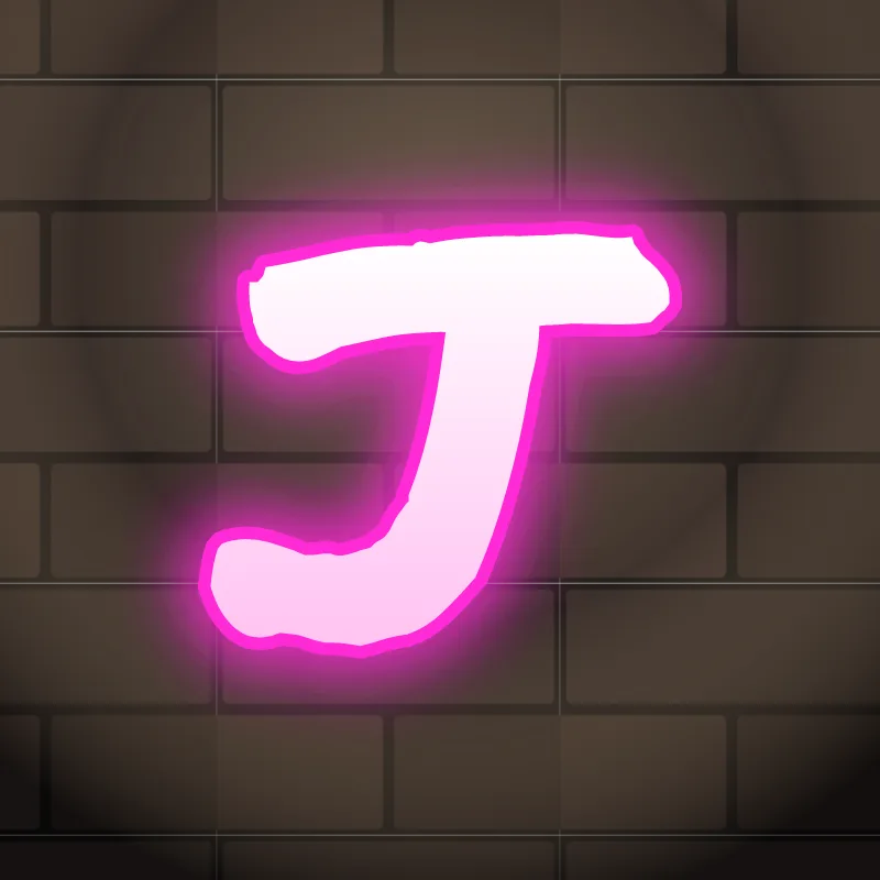
How to draw a J in graffiti
To draw a J in graffiti, pencil a stem with an optional short top bar, then curl the bottom into a big hook that drops below the other letters. Thicken it, keep the hole inside the hook open, outline it and add 3D. The bigger and rounder the hook, the more style the J has.
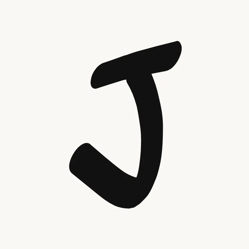
- Top bar and stem. Pencil a short top bar and a stem coming down from its right side.
- Drop the hook. Let the stem go below the baseline, then curl it left and back up.
- Open the hook. Make the curl wide enough that a clear hole will remain inside it after thickening.
- Thicken. Build the body, letting the hook get heavier toward the bottom.
- Hang it. Ink the outline and extrude down and to the side so the hook looks like it is hanging from the stem.
Letter structure: the parts of a J
A J is a stem that ends in a hook curling to the left. It is one of the few capitals that commonly drops below the baseline, so even a capital J behaves like a descender. The hook forms an open counter on the left, and that counter is where most of the J's character lives. The top bar is optional and many graffiti Js skip it.
The J in bubble, blockbuster, wildstyle, throw-up and Old English
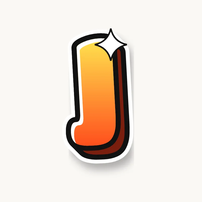
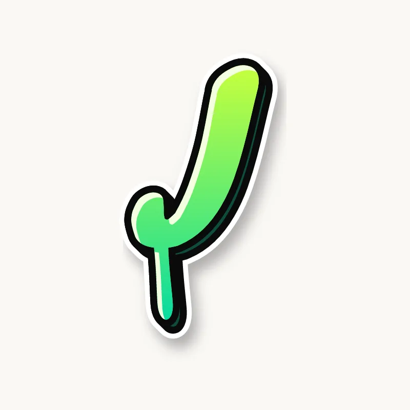
Bubble. A fat candy cane turned upside down. Keep the inside of the hook open or it becomes a blob.
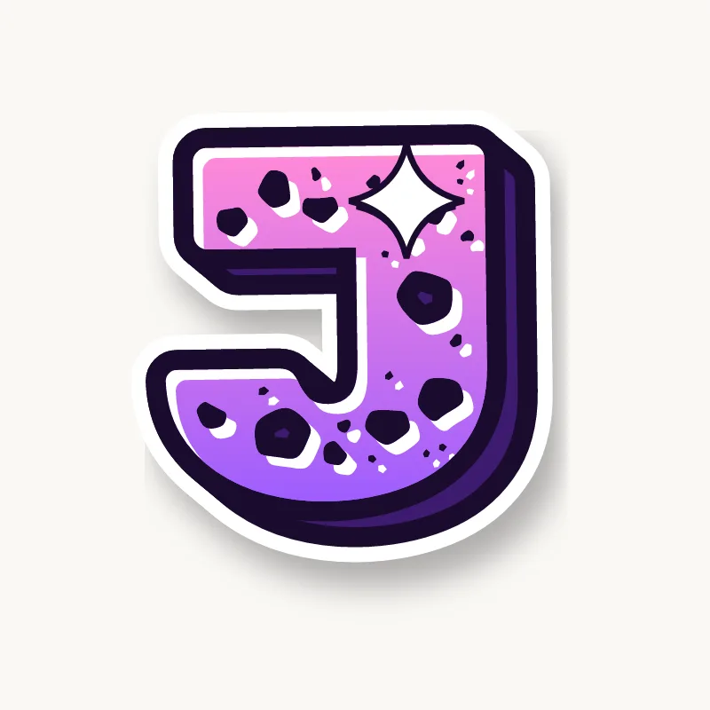
Blockbuster. A square hook: stem down, sharp corner, short foot pointing left. Easy to read and good with a deep 3D.
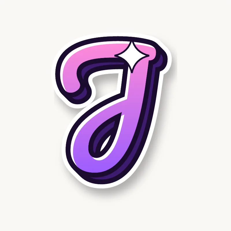
Wildstyle. The hook becomes an arrow sweeping back under the word, and the top bar can grow a second extension.
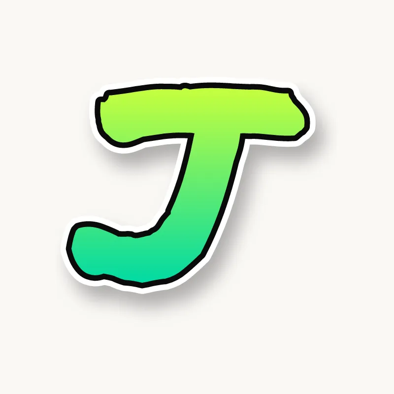
Throw-up. One curl in a single motion, often oversized so it reads from far away.
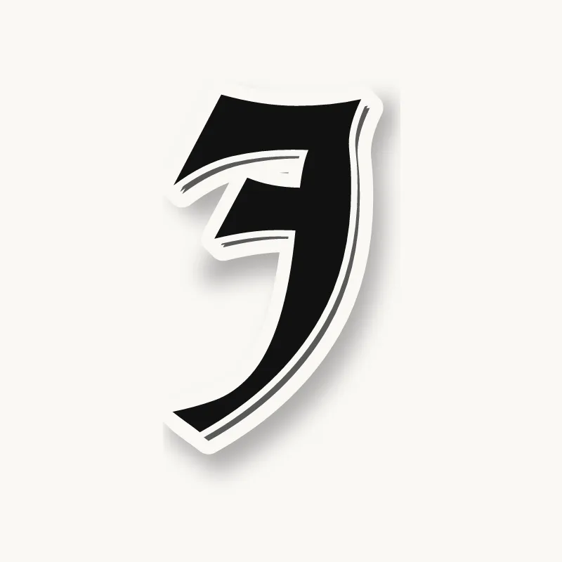
Old English. The blackletter J is close to the I, a heavy stroke with a hairline tail, so give it a longer descender to tell them apart.
Common mistakes with a graffiti J
- A small, polite hook. The hook is the whole character of the J.
- Keeping the J on the baseline. If the hook does not drop, the J looks short and squashed next to the other capitals.
- Curling the hook the wrong way. A hook bending right reads as a backwards J.
Uppercase or lowercase J?
A lowercase j is a dot over a stem that drops below the line and hooks left. Its descender can curl right under the letters before it.
Adding arrows to a J
The end of the hook is where the arrow goes, pointing back along the word. A capital J can also take an arrow on its top bar. See how whole words lock together in wildstyle.
Making a J flow in a word
J usually starts a name, so the hook can sweep under the first few letters and tie the word together. J almost always starts a name (Jay, Jade, Josh, Jasmine), so its hook can run under the second and third letters and act as a base for the word. In "JA" and "JO", tuck the next letter into the space above the hook. Inside words (Benji, Rajan) keep the hook short so it does not trip the letters before it.
Want to see it with your own name? Type it into the graffiti letter generator, or learn the whole process step by step in how to draw graffiti.