










How to draw a K in graffiti
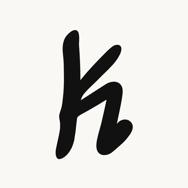
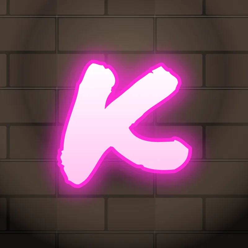
To draw a K in graffiti, pencil a stem, then an upper arm and a lower leg meeting the stem near the middle. Make the joint thick, kick the leg out further than the arm, thicken everything, keep the wedge-shaped gaps open, outline it and add 3D. The kicked leg gives the K its attitude.
- Stem. Pencil a vertical line.
- Arm and leg. From just above the middle of the stem, draw the arm up and right and the leg down and right.
- Kick the leg. Extend the leg further out than the arm, ending in a point or a foot.
- Thicken the joint. Build the body with a solid block where the arm and leg meet the stem.
- Check the wedges, then 3D. Ink it and make sure both gaps are open before you extrude.
Letter structure: the parts of a K
A K is a stem with two diagonals meeting at its middle. The upper diagonal is called the arm and the lower one the leg. They meet the stem at the waist, sometimes joining it directly and sometimes meeting each other first. The open wedges between stem, arm and leg are the counters, and they need to stay clear.
The K in bubble, blockbuster, wildstyle, throw-up and Old English
Bubble. The arm and leg become two round lobes off a fat stem, like a stem with two balloons tied to it.
Blockbuster. A thick stem with two angled blocks. Blockbuster Ks look best with the leg slightly longer than the arm.
Wildstyle. The leg kicks out as an arrow under the next letter, and the arm can split or point up and away. Its diagonals already suggest movement, which makes K a natural wildstyle letter.
Throw-up. A quick stem and a sideways V, filled flat. Keep the V wide open.
Old English. The blackletter K has a tall stem with a thin flag and a curling arm, and its leg ends in a sharp diamond foot.
Common mistakes with a graffiti K
- Joining the diagonals in a thin point. That joint fills in and the K turns into a blob.
- Arm and leg of equal length. The K then looks like half of an X stuck to a stem.
- A leg that drops straight down. It makes the K look like an R missing its bowl.
Uppercase or lowercase K?
A lowercase k is a tall stem with two short arms. The arms are small, so make the joint thick and the gap between the arms clear.
Adding arrows to a K
The lower leg of the K is one of the best arrow spots in the alphabet. Kick it out and finish it in a point. See how whole words lock together in wildstyle.
Making a K flow in a word
The kicked-out leg can run under the next letter. K shows up at the start of names (Kai, Kira, King) and at the end of words (Mike, Rock, Kick). At the end, the leg can kick out as the final flourish of the whole piece. In "CK", let the C wrap against the K's stem, and in "KI" the leg can slide under the I.
Want to see it with your own name? Type it into the graffiti letter generator, or learn the whole process step by step in how to draw graffiti.