




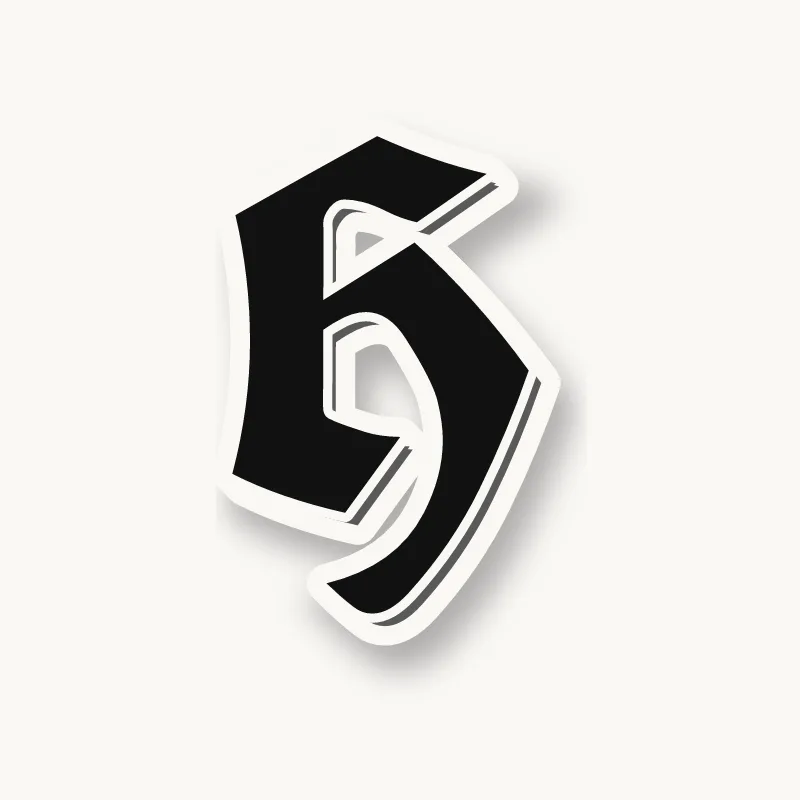

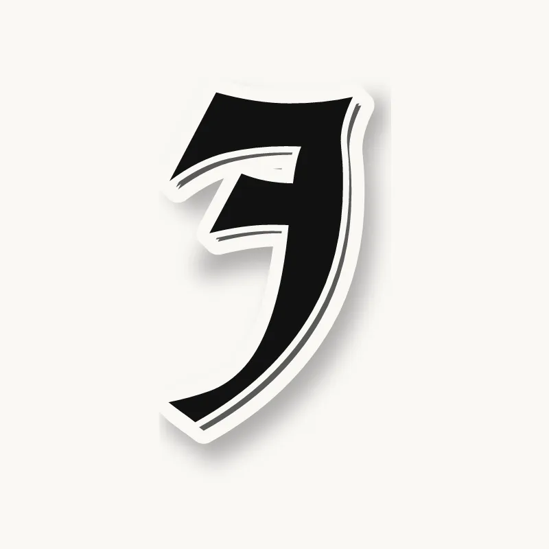

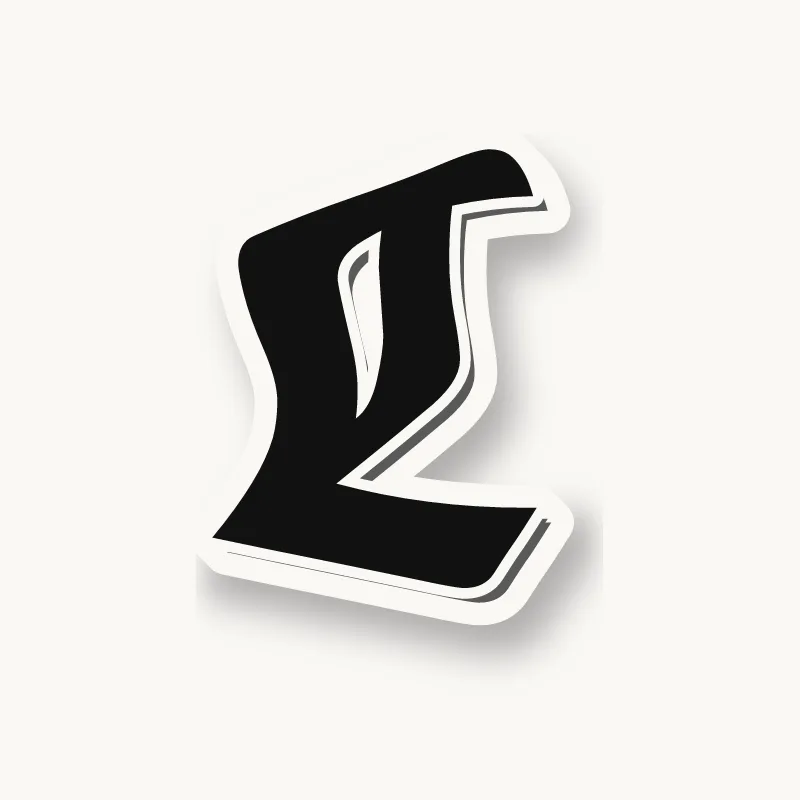

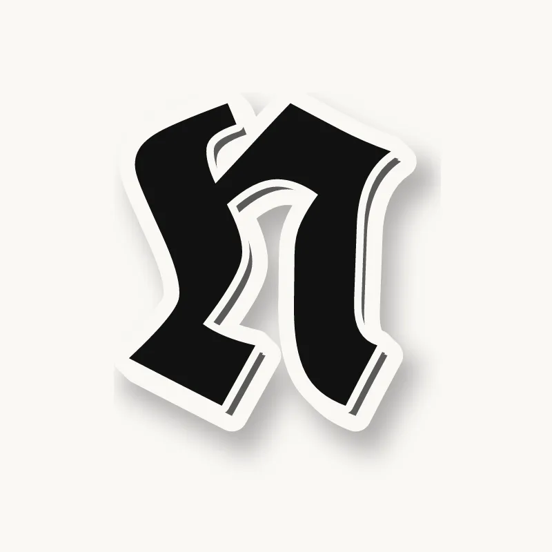


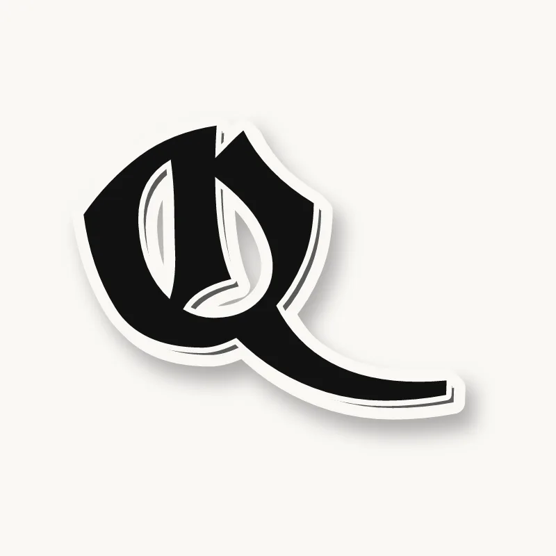





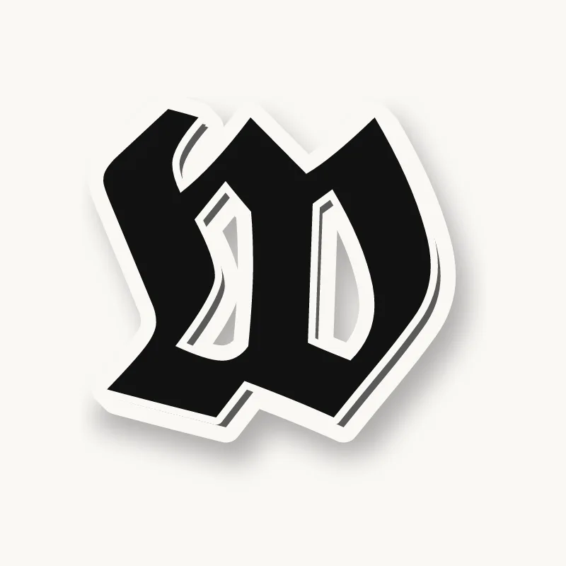


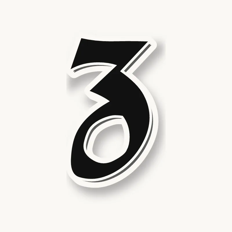
What are Old English letters?
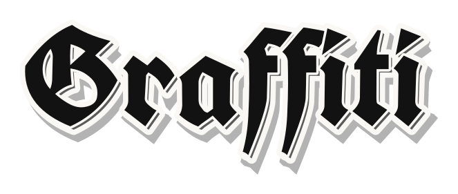
Old English letters are blackletter, a family of gothic scripts written with a broad pen in Europe from roughly the 12th century on. Textura, the formal book hand, is the version most people picture: tall, narrow, tightly packed strokes that look woven together. Gutenberg printed his Bible in textura-style type in the 1450s, and German printers kept a related style, Fraktur, in everyday use for centuries.
The label "Old English" came from printers and type sellers. It does not mean the Old English language spoken in Anglo-Saxon England, roughly 450 to 1150. That language was written in a rounder insular script and used letters modern English dropped, such as ash (æ), thorn (þ), eth (ð) and wynn (ƿ). If you want the font look, you want blackletter; if you want to read Beowulf, you want a language course.
How do you draw Old English letters with a chisel-tip marker?
To draw Old English letters, hold a chisel-tip marker at a fixed angle of about 30 to 45 degrees, pull straight vertical strokes with diamond-shaped starts and ends, and build every lowercase letter from those strokes. Curves are broken into straight segments. Keep the spaces between strokes about as wide as the strokes themselves.
You need a chisel-tip or calligraphy marker (3 to 6 mm), a pencil, a ruler, and smooth paper such as layout or printer paper. A fine black liner helps for finishing.
- Set the pen angle. Place the flat edge on the paper at about 30 to 45 degrees to the line and keep it there for every stroke. Down strokes come out thick and thin diagonals come out as hairlines. Turning the marker mid-letter is the most common reason lettering looks wrong.
- Rule guidelines in pen widths. Stack small squares of the marker tip, like a ladder, to measure. A body height (x-height) of about 5 pen widths is a classic textura proportion, with 2 to 3 more above for ascenders and below for descenders. Draw a baseline, an x-height line and an ascender line.
- Practice the minim. The minim is the basic stroke: a short diagonal tick to start, a straight pull down, and a short diagonal tick at the bottom. The ticks form the diamond head and foot. Fill a full line with minims spaced one stroke-width apart until they look like an even picket fence.
- Build letters from minims. An i is one minim with a diamond dot. An n is two minims joined by a hairline at the top, an m is three, and a u is two joined at the bottom. Then add letters with ascenders and descenders: l, h, b, d, then p and q.
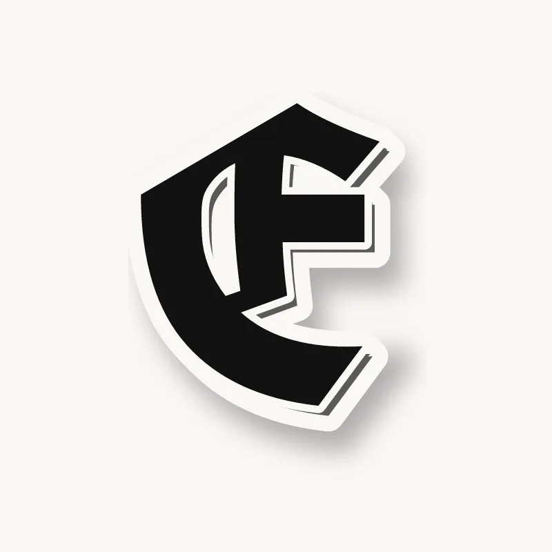
- Break the curves. For o, c, e and g, draw the left side and right side as two straight strokes with angled joins at top and bottom. Round curves are what make homemade Old English look off.
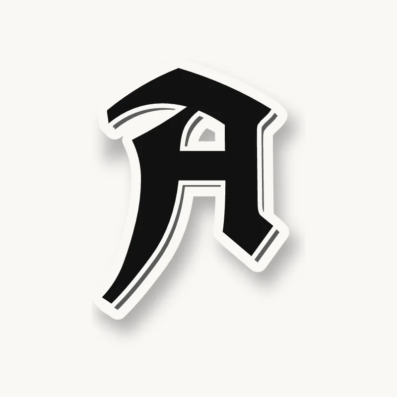
- Add one capital. Capitals are wider and more ornate: a heavy main stroke, a second thinner stroke beside it, and hairline flourishes. Use one at the start of a word and keep the rest lowercase.
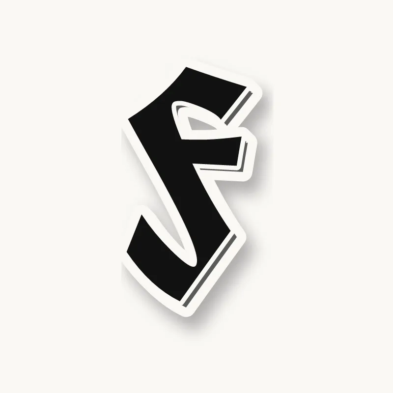
- Finish the piece. Clean edges with the fine liner, add small diamond accents and hairline whiskers, then a drop shadow on one side or a white outline so the letters stand off the background.
Common mistakes
- Changing the angle. Strokes turn uneven and hairlines vanish.
- Wide gaps. Blackletter should look dense. Letters sit close, with the gap between letters about the same as the space inside them.
- Too many flourishes. Start plain. Decoration only works once the basic strokes are even.
- All capitals. Hard to read, as covered in the FAQ below.
Black with a white or gray outline is the classic look; gold and red are popular accents. For the general method of outlining, filling and adding 3D, see how to draw graffiti.
Chicano lettering and Old English
Chicano lettering is the hand lettering that grew in Mexican-American neighborhoods of Los Angeles and the Southwest through the 20th century. It mixes blackletter with tall, sharp block capitals and flowing script, and it shows up on tattoos, lowrider cars and plaques, murals, shirts, album covers and storefronts. Black-and-gray fine-line tattooing, which grew up in the same communities, made the style famous worldwide.
The neighborhood writing that came before it is often called cholo writing or placas: a name or neighborhood written in careful, even capitals, usually in black. Los Angeles artist Chaz Bojórquez is known for carrying that tradition into galleries. If you use the style, learn where it comes from and treat it as the craft it is, not a costume.
Gangster and gang graffiti letters
"Gangster graffiti letters" and "gang graffiti letters" are what many people search for when they mean Old English and cholo-style block letters. The association comes from history: in Los Angeles, neighborhood and gang writing used these styles, and West Coast rap, film and fashion later carried the look everywhere.
Gang graffiti is a different thing from graffiti writing culture. It marks territory and sends messages between groups, while graffiti writers paint their own name for style and fame. This site covers the lettering, not gang marking. For a tattoo, shirt or logo, invent your own word rather than copying real neighborhood names, numbers or symbols, which can carry meanings you do not intend.
Old school graffiti letters
"Old school" means two things. In chicano lettering it means classic cholo block letters and Old English as they were painted decades ago. In hip-hop graffiti it means the 1970s and 1980s New York subway styles: simple tags, round bubble letters, tall straight letters and the first wildstyle. The graffiti styles guide compares them all.