
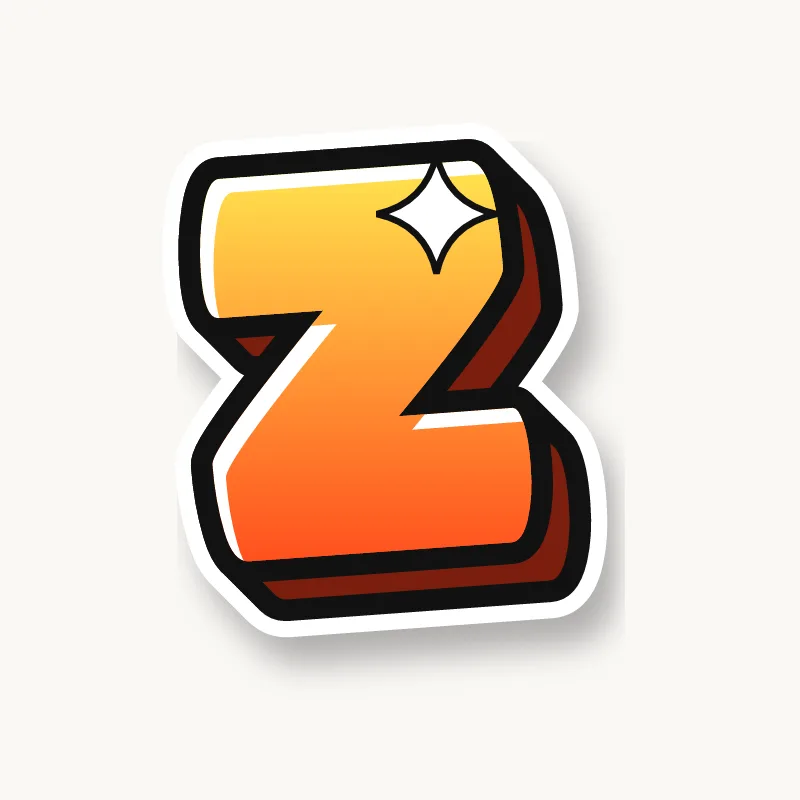

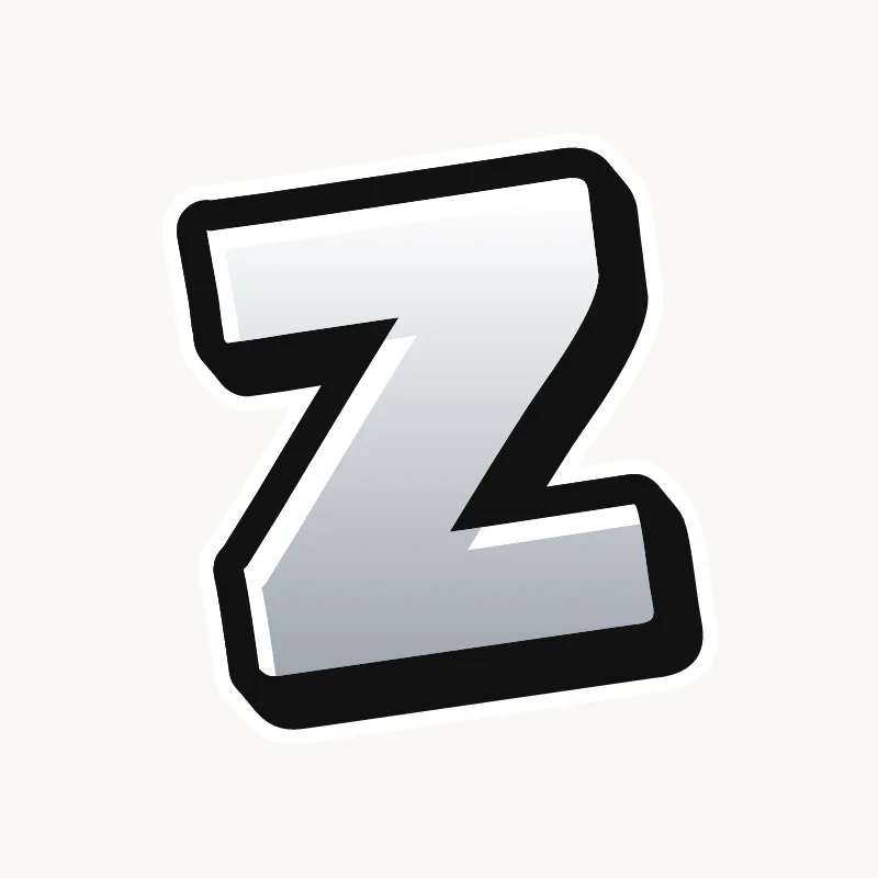
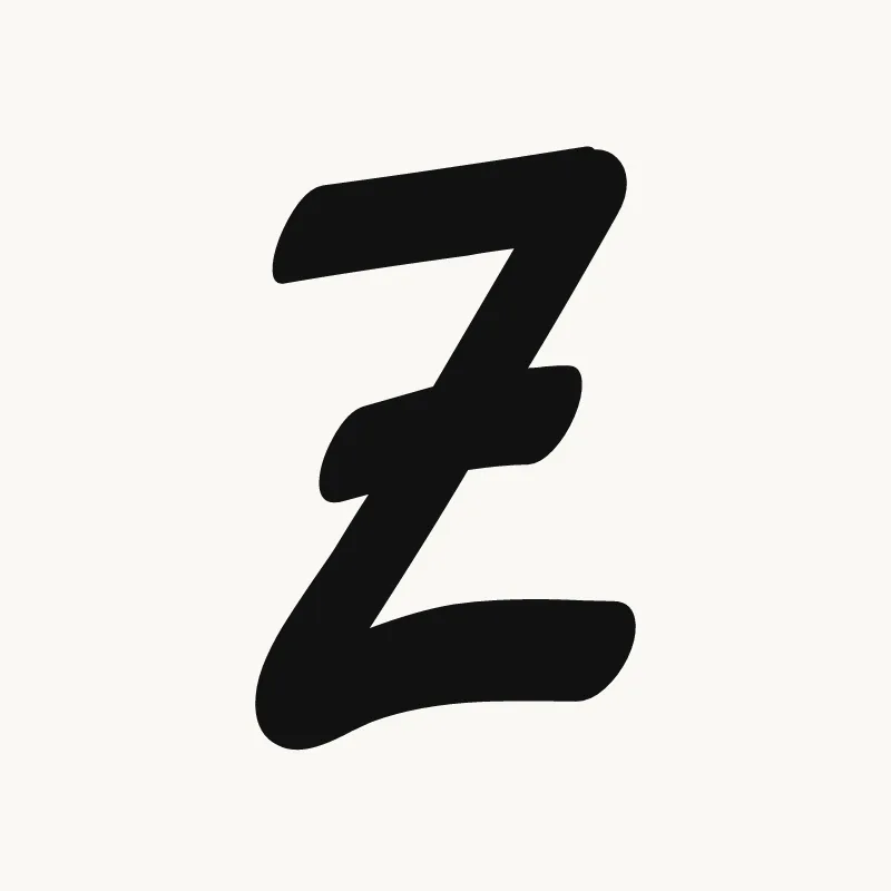
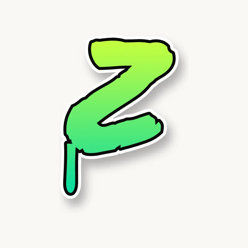
How to draw a Z in graffiti
To draw a Z in graffiti, pencil a short top bar, a thick diagonal and a longer bottom bar, then angle the bars slightly for a lightning-bolt feel. Thicken it, keep the two triangular gaps open, outline it and add 3D. Turn the end of the bottom bar into an arrow for style.
- Bars. Pencil a short top bar and a longer bottom bar.
- Diagonal. Connect the right end of the top bar to the left end of the bottom bar.
- Angle. Tilt the top bar up and the bottom bar down slightly.
- Thicken. Make the diagonal the heaviest stroke.
- Open corners, then 3D. Ink and extrude, checking that the sharp inner corners stay open.
Letter structure: the parts of a Z
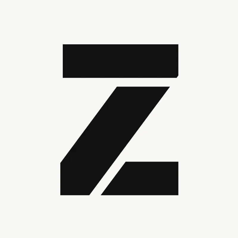
A Z is a top bar, a diagonal and a bottom bar. The diagonal leaves two triangular counters: one under the top bar, open to the left, and one above the bottom bar, open to the right. In serif type the diagonal is the thick stroke and the bars are thin, the opposite of how many beginners draw it.
The Z in bubble, blockbuster, wildstyle, throw-up and Old English
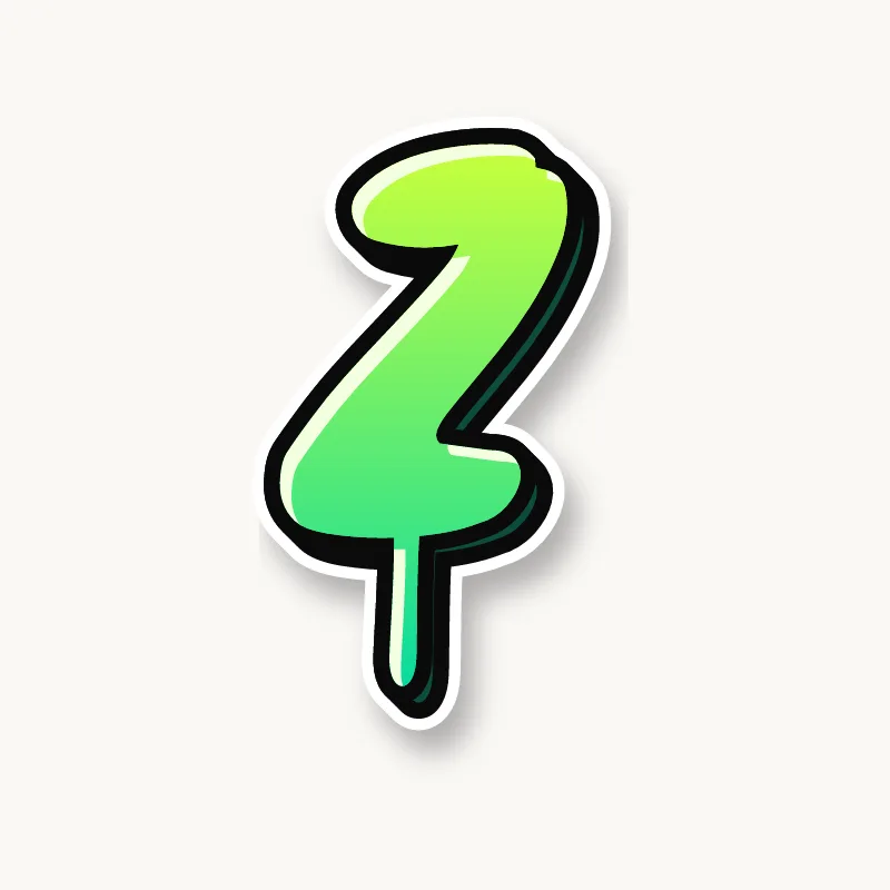
Bubble. A soft zigzag with rounded corners, like a ribbon folded twice.
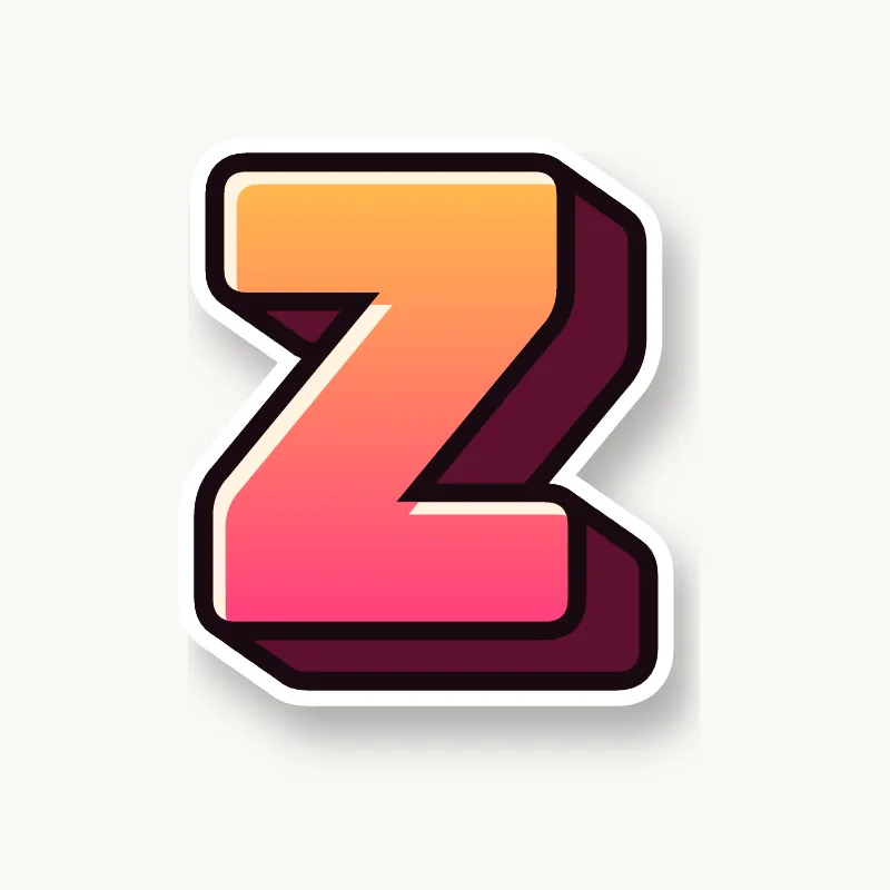
Blockbuster. Three slabs. The angled cuts show a 3D block well.
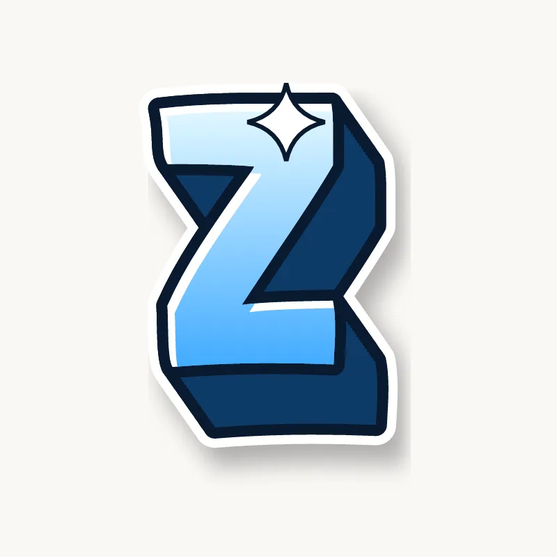
Wildstyle. The ends become arrows pointing opposite ways, and the diagonal can split.
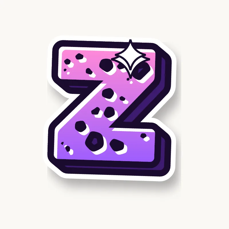
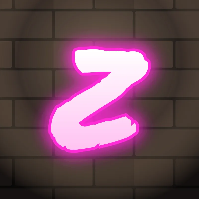
Throw-up. A quick zigzag in one stroke. Keep the bottom bar long.
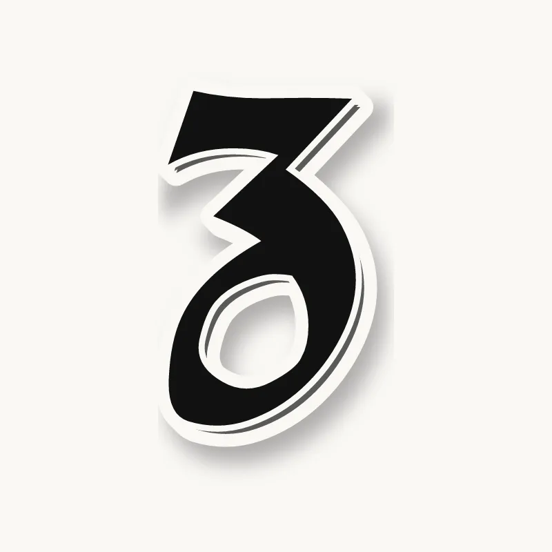
Old English. The blackletter Z often has a curled, descending bottom, closer to a 3 than to a straight zigzag.
Common mistakes with a graffiti Z
- A thin diagonal. It is the heart of the letter.
- Drawing it backwards. A mirrored Z looks like an S built from straight lines.
- Bars of equal length. A short top bar and a long bottom bar make the Z stand; equal bars make it look stamped.
Uppercase or lowercase Z?
The lowercase z has the same three strokes as the capital at x-height. Angle the bars a little and it keeps the lightning-bolt energy; in handstyles it is often written with a loop at the bottom.
Adding arrows to a Z
The end of the bottom bar is the classic arrow spot, pointing forward. The top bar can take a second arrow pointing back. See how whole words lock together in wildstyle.
Making a Z flow in a word
The bottom bar can carry the next letter. Z is rare in English, so wherever it appears it stands out (Zara, Zoom, Jazz, Liz). At the end of a word, the bottom bar can stretch out as the final arrow. At the start, the top bar can roof the next letter. In "ZO" and "ZA", the round letter can sit right on the Z's bottom bar.
Want to see it with your own name? Type it into the graffiti letter generator, or learn the whole process step by step in how to draw graffiti.