


How do you draw an A in graffiti?
Draw a thin pencil A, widen both legs into thick strokes, then shape the peak: round for bubble, flat for blockbuster, split or pointed for wildstyle. Keep the triangle hole open, outline it in marker and add a 3D block. Writing an A as a tag is different: fast single strokes and no outline (see the FAQ below).
- Spread the legs. Pencil two lines meeting at a peak, wider apart at the bottom than a normal A. A wide stance gives the hole room to survive the outline.
- Drop the crossbar. Place it just under the middle. A low bar makes the top triangle bigger, and that triangle is the part people read first.
- Fatten the legs. Draw around each leg about a finger-width out. In printed type the right leg of an A is the heavy one, so make it a little thicker and the letter feels balanced.
- Decide the peak. Round it for a bubble A, flatten it into a shelf for a blockbuster A, or cut it into a point that overshoots the other letters for wildstyle.
- Plant it. Ink the outer edge, rub out the pencil, then run the 3D block under both feet and down one leg so the A looks like it stands on the ground.
Letter structure: the parts of an A
An A is two diagonals leaning into each other with a crossbar between them. The two legs meet at the apex, and the space trapped above the crossbar is the counter. In graffiti the counter does most of the work: as long as a triangle of background shows inside, the A stays readable even when the legs bend, twist or sprout arrows.
The A in bubble, blockbuster, wildstyle, throw-up and Old English
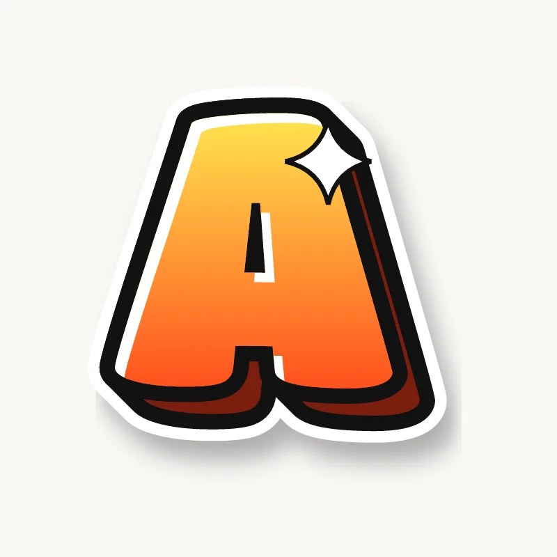
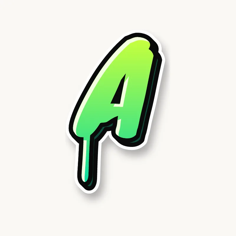
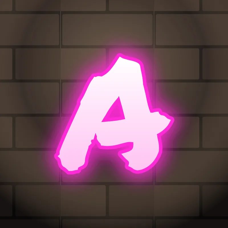
Bubble. The apex melts into a dome and the crossbar becomes a pinch at the waist, so the A looks like a soft tent. Keep the hole a clear teardrop.
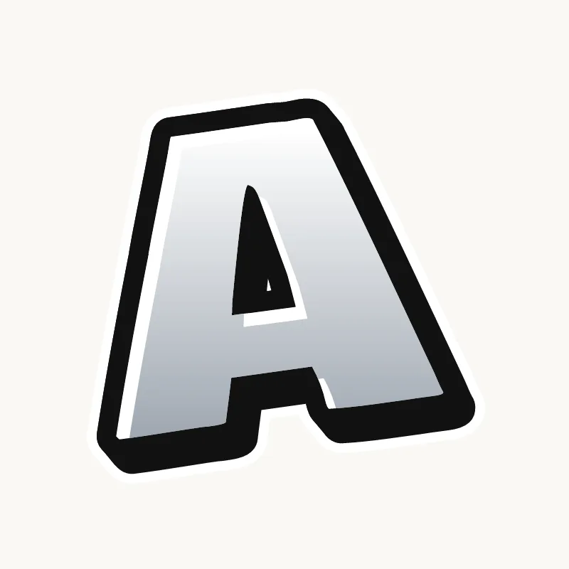
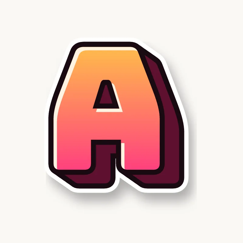
Blockbuster. Everything goes square. The apex turns into a flat roof as wide as the crossbar, and the A becomes a box on two feet with a small window.
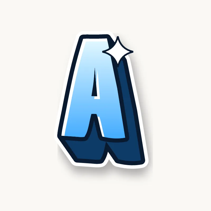
Wildstyle. Split the apex into two points, let one leg overlap the next letter and shoot an arrow off the right foot. The counter can shrink to a slit, but it should not vanish.
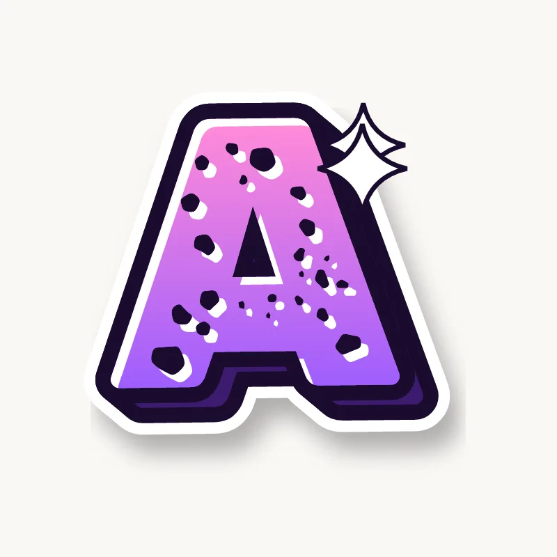
Throw-up. A rounded hump with a notch for the hole, filled in one color. Some throw-up As drop the crossbar and let the small hole stand in for it.
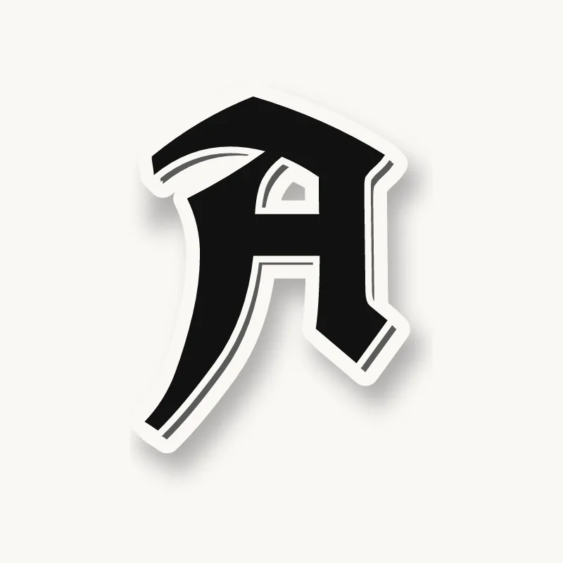
Old English. In most blackletter alphabets the capital A is not a triangle at all. It is built from thick upright strokes with a curled stroke on the left, closer to a dressed-up lowercase a.
Common mistakes with a graffiti A
- Keeping the triangle-shaped hole too small. Once the outline and 3D go on, a small counter fills in and the A turns into a blob.
- Putting the crossbar at the exact middle or higher. The top counter shrinks to a dot once the outline goes on.
- Making both legs the same thickness and angle. A perfectly symmetrical A looks like a road sign; tilt it or thicken one leg.
Uppercase or lowercase A?
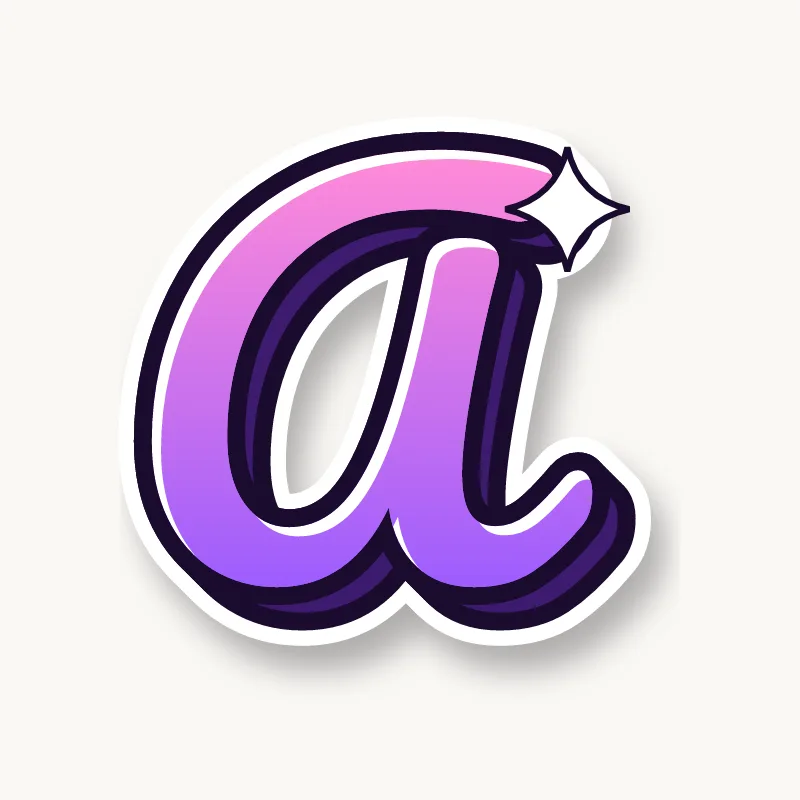
A lowercase a comes in two forms: the double-story a with a hook over a small bowl, and the single-story a, which is just a round bowl with a stem. The single-story version is easier to bubble and is the one most beginners use. The lowercase a on our bubble letter A page is the double-story kind, which shows how open its top hook has to stay.
Adding arrows to an A
Arrows usually shoot off the right leg, or out of the peak if you split it. A second, smaller arrow can come off the left foot and point back along the word. See how whole words lock together in wildstyle.
Making an A flow in a word
The right leg is a natural place to kick out a foot or an arrow that hooks into the next letter. A usually sits between consonants (Max, Sam, Jay, Kai), so it has to connect on both sides. Slide the left foot under the letter before and let the right leg lean on the next one. In "AR" and "AN", tuck the next stem right against the right leg, and in "LA" the foot of the L can run under the whole A.
Want to see it with your own name? Type it into the graffiti letter generator, or learn the whole process step by step in how to draw graffiti.