


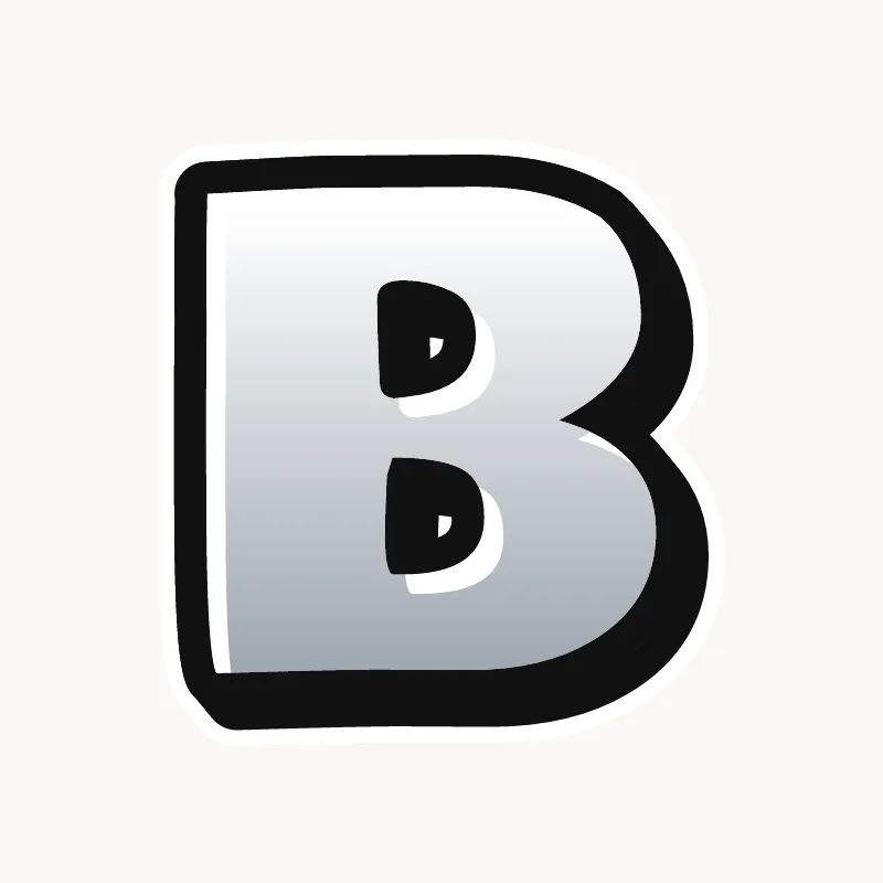
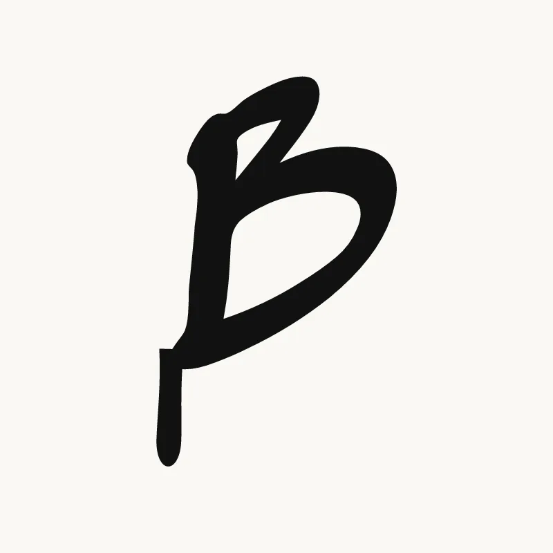

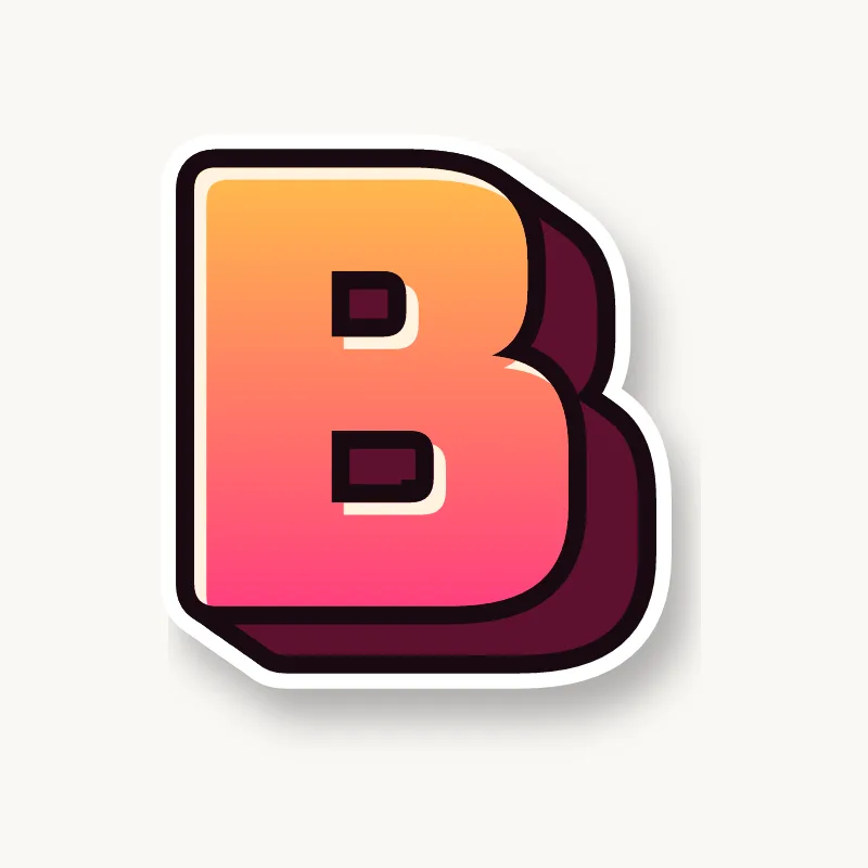

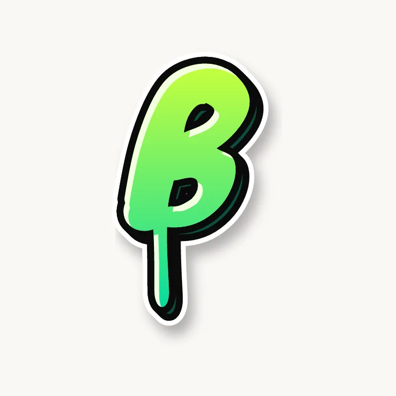



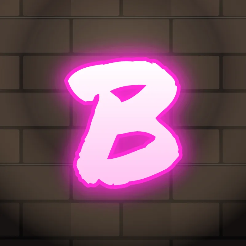
How to draw graffiti letter B step by step
To draw a graffiti B, pencil a stem, add a small top bowl and a wider bottom bowl, then thicken all three parts into one shape. Pinch the waist where the bowls meet, keep both holes open, outline it and add a 3D block. The bottom bowl carries the weight, so it should be the biggest part.
- Stand the stem. Draw a straight vertical line the full height of the letter. Leaning it slightly forward gives the B movement without hurting readability.
- Stack two unequal bowls. Give the top bowl a little under half the height and the bottom bowl the rest, pushing the bottom one further to the right.
- Cut the notch. Where the bowls meet, halfway down, cut a deep notch into the right side. That notch is what separates a B from a D.
- Inflate. Trace around the skeleton a finger-width out. Let the bowls bulge past the top and bottom of the stem for bubble, or keep them flush for block letters.
- Ink and extrude. Outline in one continuous line, check both holes are still open, then add the 3D block along the bottom and the right side.
Letter structure: the parts of a B
A B is a straight stem with two bowls stacked on its right side. That gives three parts: the stem, the upper bowl and the lower bowl, with a counter inside each bowl and a notch on the right where they meet. Readers recognize a B by that notch and the straight left side. Lose either one and it turns into an 8, a D or a blob.
The B in bubble, blockbuster, wildstyle, throw-up and Old English
Bubble. Two balloons stacked on a short, fat stem. Bubble Bs often let the stem disappear into the bowls, so keep a flat left edge as a hint.
Blockbuster. The bowls become rectangles with clipped corners, and the notch becomes a square bite out of the right side. It reads well from far away.
Wildstyle. The top of the stem grows an extension pointing back, and the bottom bowl can split into an arrow. Keep the notch; it holds the letter together.
Throw-up. Usually two quick loops on a stem in one motion, filled flat. Because it is fast, exaggerate the bottom loop so the letter does not wobble.
Old English. The blackletter B has a thick stem with a thin flag at the top, and its bowls are angular and broken rather than round.
Common mistakes with a graffiti B
- Drawing two equal bowls. The B then reads as an 8 or tips over visually.
- Letting the stem shrink. In bubble style the bowls swallow the stem and the letter loses its straight back.
- A shallow notch. If the waist does not cut in, the outline smooths it away and you get a D.
Uppercase or lowercase B?
A lowercase b is a tall stem with one round bowl at the bottom. The stem rises above the other letters, which gives you a natural place for an extension or a tilted cap.
Adding arrows to a B
Put an arrow on the top of the stem pointing back over the previous letter, or let the bottom bowl kick out into a short arrow at the base. See how whole words lock together in wildstyle.
Making a B flow in a word
The top of the stem is a good spot for an arrow or extension pointing back over the previous letter. B usually opens a word (Ben, Bold, Blaze), so it sets the size for everything after it. Its flat back means nothing has to connect on the left. On the right, the bottom bowl is the contact point: in "BO" or "BE" the round bowl nests against the next shape. In "BB" (Bubba, Robby), overlap the second B onto the first one's bowl instead of repeating it side by side.
Want to see it with your own name? Type it into the graffiti letter generator, or learn the whole process step by step in how to draw graffiti.