






How to draw graffiti letter C
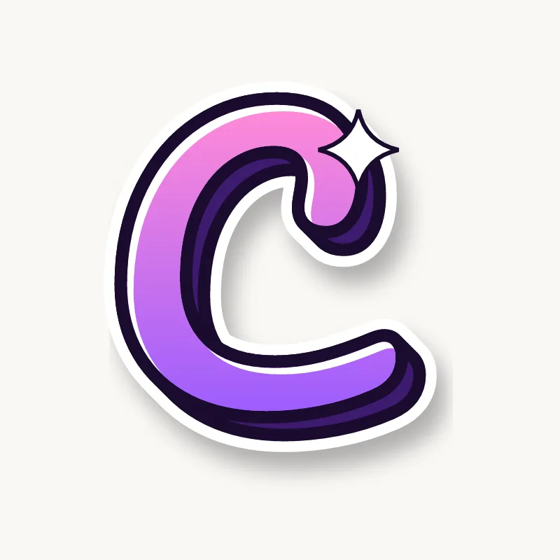
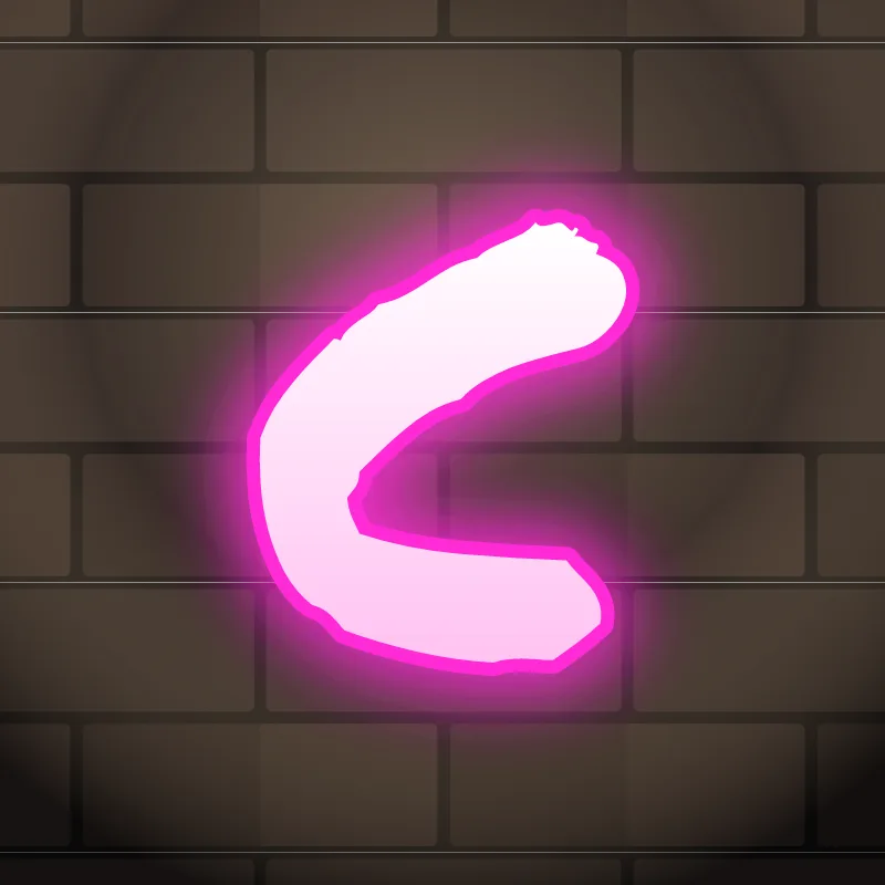
To draw graffiti letter C, sketch about three quarters of a circle, thicken it, and give the two ends different shapes: one cut sharp or turned into an arrow, the other round and heavy. Leave the opening wider than looks right, because the outline and the 3D block will close it a little.
- Draw an open ring. Pencil a circle and erase the right quarter. Rotate the gap slightly upward so the C seems to lean forward.
- Weight the bottom. Thicken the lower curve more than the top, like a crescent sitting on the line.
- Shape the terminals. Cut the top end at an angle or point it into an arrow. Round off the bottom end so the two ends look clearly different.
- Open the mouth again. Before inking, widen the gap by a few millimeters. Thick outlines always eat into it.
- Outline, then 3D. Ink the edge, add the block behind the letter, and run a highlight along the top of the arc.
Letter structure: the parts of a C
A C is an open circle, and the opening is what makes it a C. The single curved stroke ends in two terminals, and the space between them is the aperture. The aperture is what matters: a C with a wide aperture reads instantly, a C with a narrow one is an O waiting to happen. The inside curve is where a 3D block or a shadow shows best.
The C in bubble, blockbuster, wildstyle, throw-up and Old English
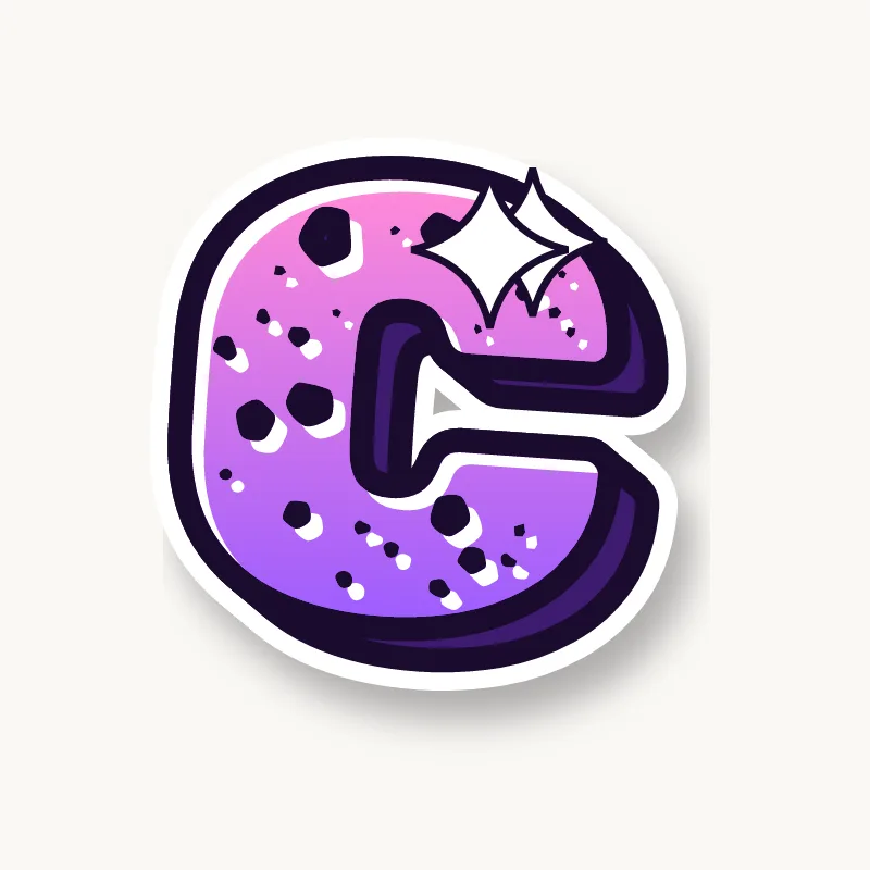
Bubble. A thick crescent, like a donut with a bite taken out. Keep the bite generous and round off both ends.
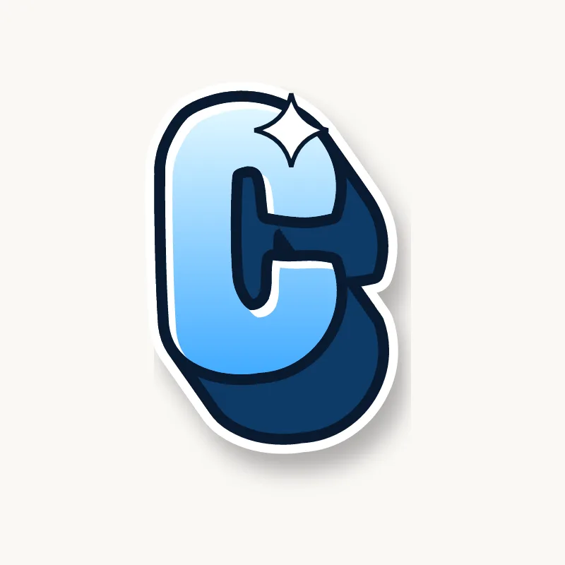
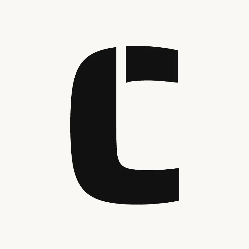
Blockbuster. A square bracket with clipped corners. Blockbuster Cs are often the easiest letters in a word to read.
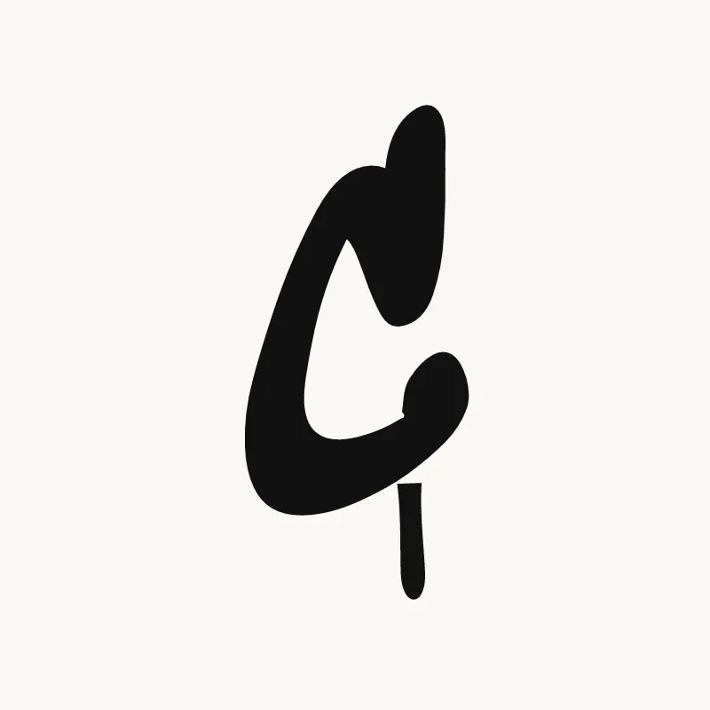
Wildstyle. The top terminal becomes an arrow aimed back over the letter, and the bottom can grow a second extension under the next letter. Some writers break the arc into two pieces.
Throw-up. One fast curve with a flat fill. The bottom end usually ends heavy and round, where the hand slows down.
Old English. In blackletter the C is built from broken strokes: a thick left side and a hooked top with a hairline. There is no smooth round curve in it at all.
Common mistakes with a graffiti C
- Closing the gap too much. Thick outlines eat into the opening, so leave it wider than looks right in pencil.
- Matching ends. Two identical terminals make the C look like a horseshoe lying on its side.
- A 3D block that fills the aperture. Push the extrusion behind the letter so the mouth stays clear.
Uppercase or lowercase C?
A lowercase c is the same shape as the capital, just shorter. Because it is small, make the opening extra clear so it does not close up next to taller letters.
Adding arrows to a C
The top end of the C is the classic arrow spot. Turn it into an arrow pointing up and back, and keep the bottom end round so the two ends look different. See how whole words lock together in wildstyle.
Making a C flow in a word
The open side lets the next letter tuck in close, which helps words like "CO" or "CA" hold together. The open side of a C lets the next letter sit inside the curve. In "CO" and "CA" the next letter can tuck its left edge into the mouth, which pulls the word tight. In "CH" (Chris, Chloe) let the stem of the H rise just past the top terminal. In "CK" (Rock, Jack), the C can wrap around the K's stem.
Want to see it with your own name? Type it into the graffiti letter generator, or learn the whole process step by step in how to draw graffiti.