
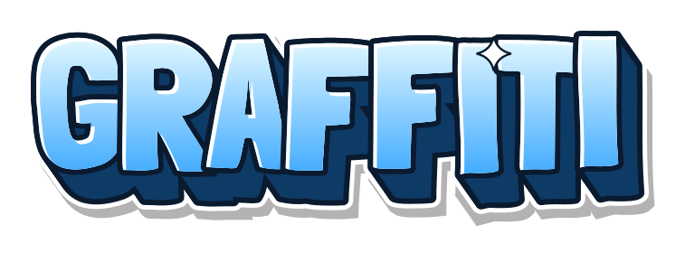
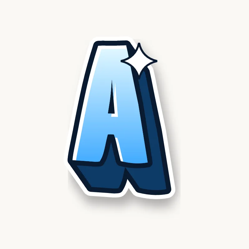

























How do you draw 3D graffiti letters?
To draw 3D graffiti letters, finish and outline your letters first, choose a light direction, then draw short lines from every corner in the opposite direction and join their ends to form the side of a block. Fill that side with a darker color. The 3D always goes on last, behind letters that are already finished.
- Draw and outline your letters first. Bubble, block or straight letters all work. Leave a little more space between them than usual, because the 3D needs room.
- Pick a light direction. If light comes from the top left, the 3D side goes bottom right. Mark a small arrow in the corner of the page so you do not forget halfway through.
- Draw short parallel lines from every outer corner of each letter, all at the same angle and the same length. On round letters, start the lines where the curve faces away from the light.
- Join the ends so they follow the shape of the letter. You now have the side of a block. Erase any lines that would sit behind the letter itself.
- Do the holes. Inside A, B, D, O, P and R, the 3D shows along the edge of the hole nearest the light (top left, if the light comes from the top left), not the far edge.
- Fill the block with a darker color and outline it. Add thin highlights on the edges that face the light.
Three kinds of 3D
Graffiti writers use three main kinds of 3D, from quick to hard. Learn them in this order: each one builds on the skills of the one before.
| Type | How it looks | Difficulty |
|---|---|---|
| Drop block | The letter shape copied behind, slightly offset | Easy |
| Extrude | Corners joined to the copy, so the sides are solid | Medium |
| Perspective | Sides shrink toward a vanishing point, like a real object | Hard |
For perspective 3D, put a dot somewhere off the page (the vanishing point) and draw every corner line toward it, stopping at the same distance. Letters near the dot get thin sides; letters far away get wide ones. It looks impressive but is easy to get wrong, so try it on a three-letter word first.
The generator uses an extrude. Change its depth and direction with the 3D depth and 3D direction sliders in the Effects tab, and try it on the whole graffiti alphabet.
How to color and shade the 3D block
Color the 3D block a darker shade of the fill color, or a dark neutral like navy or deep brown, so it reads as the shadowed side of the same object. Pure black works but can look heavy next to a black outline.
- Two tones: make the bottom faces of the block darker than the side faces. It adds depth with no extra lines.
- Stripes or lines: thin parallel lines across the block, all at the same angle, look like old school subway 3D.
- Light edge: a thin light line where the block meets the letter face separates the two and sharpens the look.
A drop shadow is not the same as 3D. A shadow is a soft, separate shape on the wall behind the letters; 3D is attached to them. Many pieces use both.
3D graffiti letters A–Z: which letters need care?
In a 3D graffiti alphabet, straight letters like E, H, L and T are the easiest because every corner gives a clear starting point. Round letters (O, S, C) and letters with diagonals (K, M, V, W) take more thought.
- O and other round letters: there are no corners, so the 3D starts where the curve turns away from the light. See how to make a graffiti O look 3D.
- E: three arms means three short blocks, and the gaps between them fill fast. Keep the 3D shallow. Tips on the letter E page.
- L and V: good letters to practice on, with long faces and few corners. See the L and V.
- S: the 3D follows both curves and flips sides halfway. Draw it slowly. More on the letter S.
Is this a 3D text generator?
It is a 3D graffiti text generator: it draws flat images where the 3D is part of the artwork, the same way a writer paints it. That suits thumbnails, posters, stickers, shirts and cut files. It does not make 3D models for Blender, games or 3D printing. For those, you need modeling software; the SVG download gives you clean vector outlines that programs able to import and extrude vector paths can start from.
Tips
- Keep the same angle and depth on every letter, or the word looks broken.
- Deeper 3D suits short words. On long names, keep it shallow so letters do not crash into each other.
- A darker shade of the fill color looks more natural than black.
- Outline the 3D with the same marker as the letters, but you can use a thinner line inside the block.
- If a letter looks wrong, check the holes first. A 3D edge on the wrong side of a hole is the most common mistake.
For the full process from sketch to finish, see how to draw graffiti. For blocky, square 3D letters, try the Blockbuster style in the generator.