



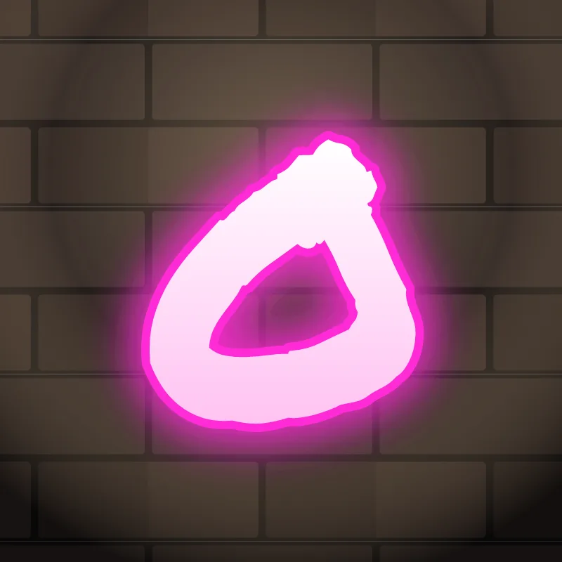
How to draw an O in graffiti
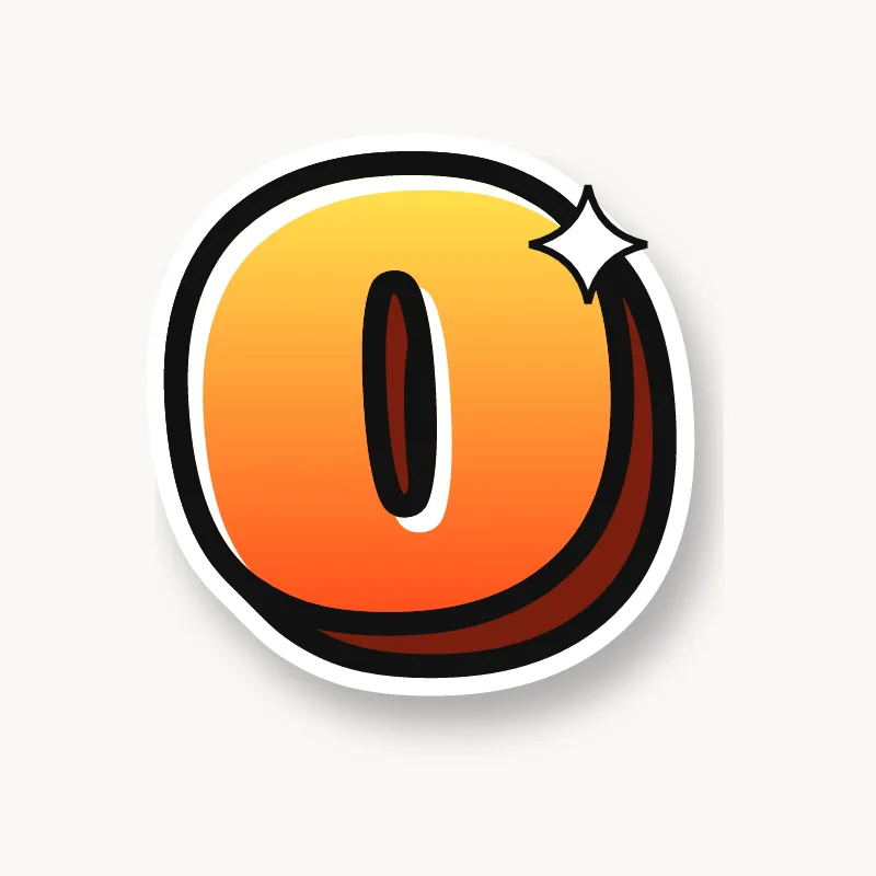
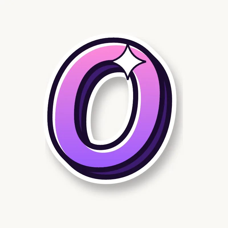
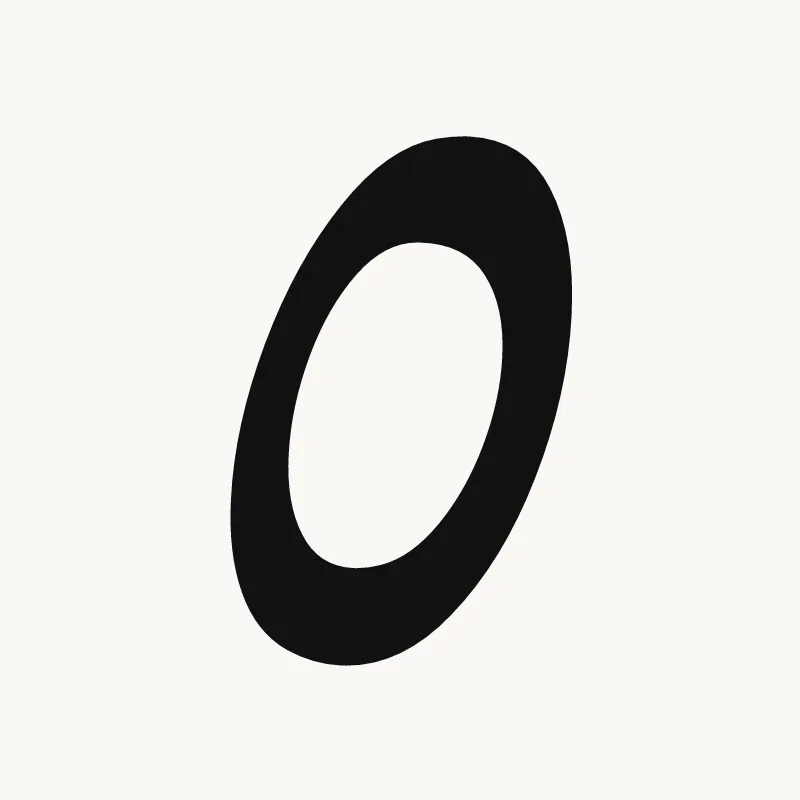
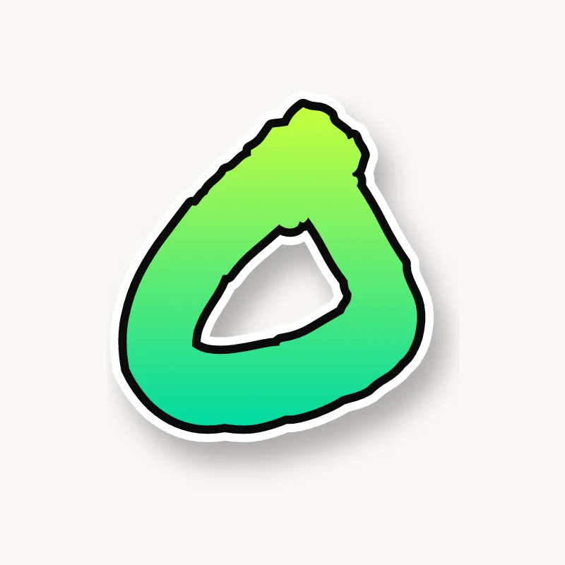
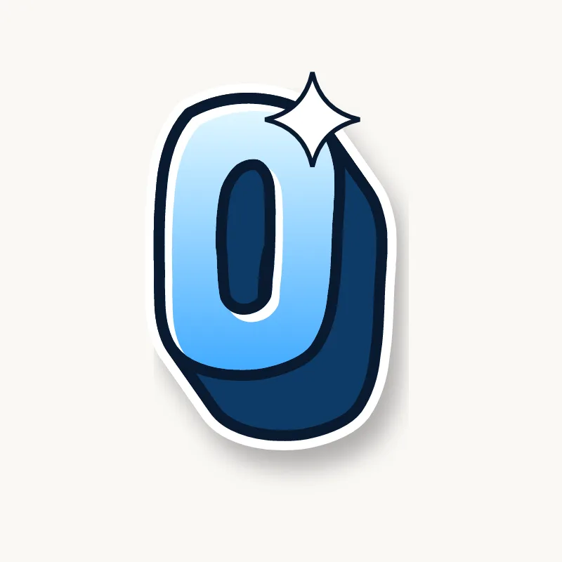
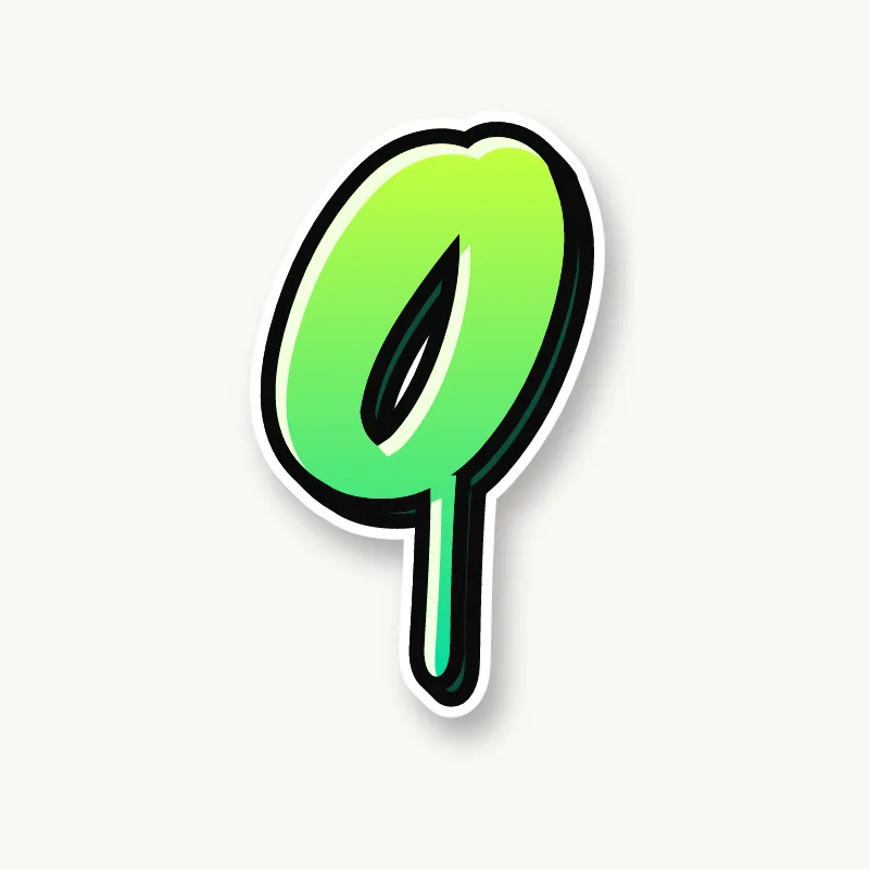
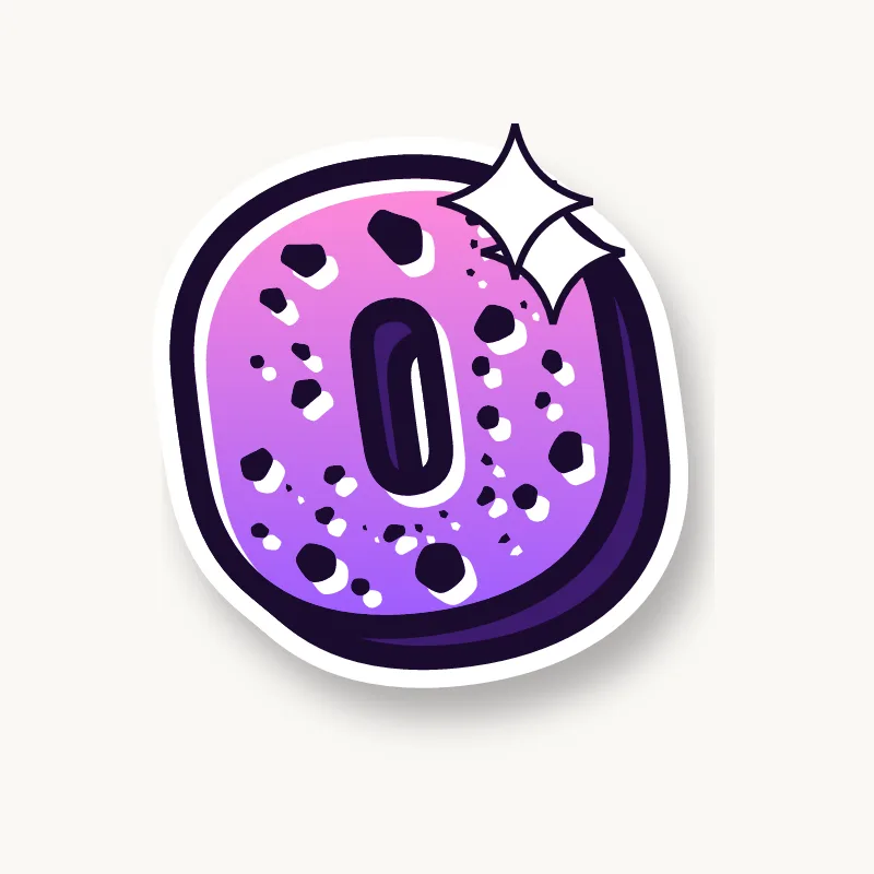
To draw an O in graffiti, sketch a slightly squashed or tilted oval, draw a smaller hole inside it pushed off-center, then outline it and add a 3D block on the side where the ring is thickest. Finish with a curved highlight. The off-center hole is the trick that makes it look three-dimensional.
- Tilted oval. Pencil an oval and lean it slightly forward.
- Off-center hole. Draw the counter smaller and nudge it up and to one side.
- Flatten the base. A slightly flat bottom helps the O sit on the line instead of rolling.
- Smooth outline. Ink both rings in long strokes, turning the paper as you go rather than your wrist.
- 3D and shine. Extrude on the thick side of the ring and run a curved highlight along the top.
Letter structure: the parts of an O
An O is a ring with a hole in it. In printed type, round letters like O are drawn slightly taller than flat ones (designers call it overshoot) so they do not look small, and the ring is thicker at the sides than at the top and bottom. Copying those two details makes a graffiti O sit right next to straight letters.
The O in bubble, blockbuster, wildstyle, throw-up and Old English
Bubble. Already a bubble. Make it fat with a small hole, and squash it slightly so it matches the rest of the word.
Blockbuster. A square with clipped corners and a square hole. Blockbuster Os look like heavy bolts.
Wildstyle. Break the ring: cut a gap and turn one side into an arrow, or split the O into two interlocking halves.
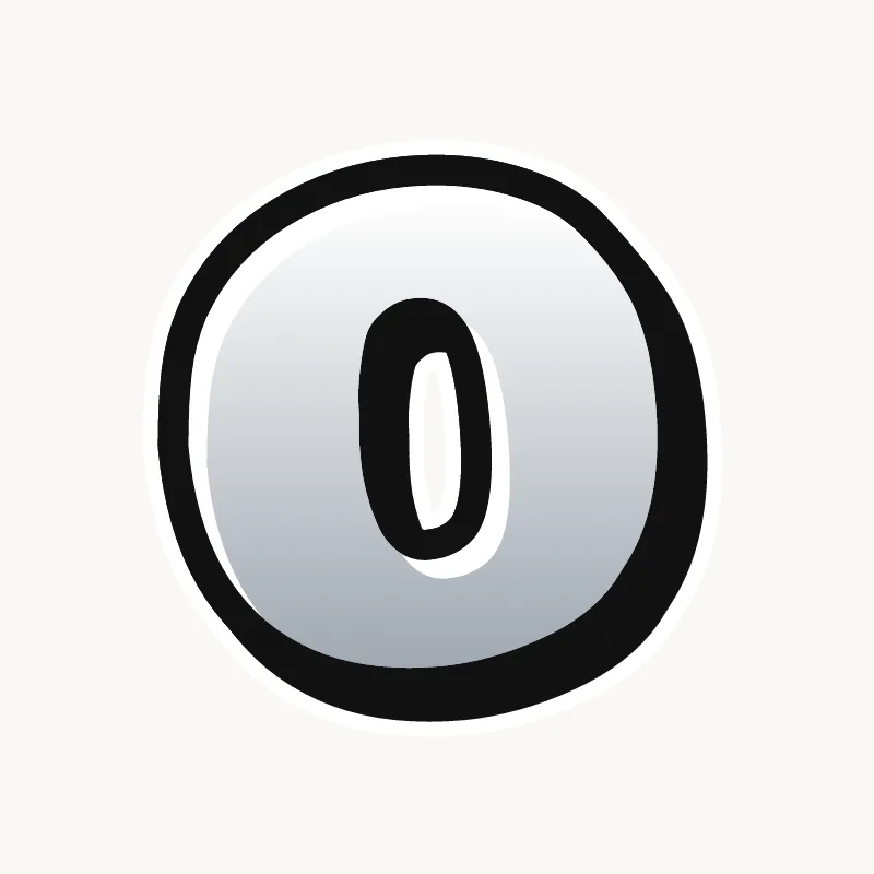
Throw-up. The classic throw-up shape: a fat round blob with a small hole, fast to fill.
Old English. The blackletter O is not round. It is made of two thick broken curves with flat, angled joins, closer to a lens than a circle.
Common mistakes with a graffiti O
- A perfect circle with a centered hole. It looks like clip art rather than lettering.
- A hole that is too big. A thin ring looks like a tire rather than a letter.
- Letting the hole close. The outline and the 3D both push inward, so leave the hole at least a stroke wide.
Uppercase or lowercase O?
A lowercase o is the same ring as the capital, just smaller. Next to tall letters, make it a little wider so it holds its own.
Adding arrows to an O
An O has no ends, so writers break the ring: cut a gap and turn one side into an arrow, or add a small flick off the top right. See how whole words lock together in wildstyle.
Making an O flow in a word
An O can sit lower or higher than its neighbors to add bounce to the word. O sits in the middle of many words (Bold, Cool, Leo, Noah). Its round edge lets neighbors overlap without hiding anything. In "OO" (Cool, Moon, Zoom), stagger the two Os in height or let one overlap the other. Next to tall letters, raise or lower the O slightly for bounce. The O is the starting point for a Q, too.
Want to see it with your own name? Type it into the graffiti letter generator, or learn the whole process step by step in how to draw graffiti.