
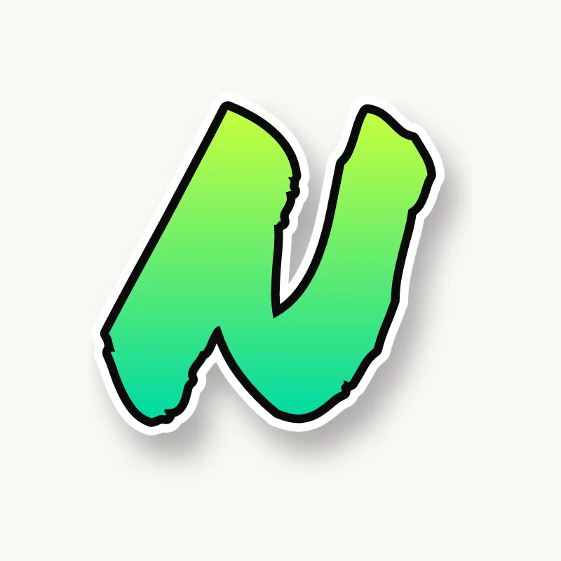
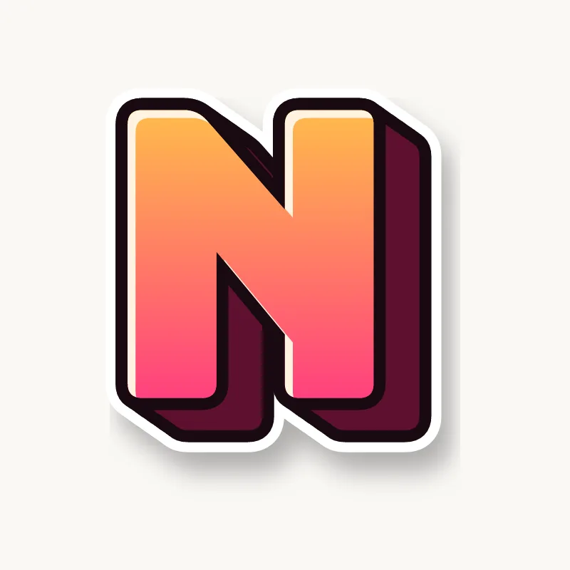
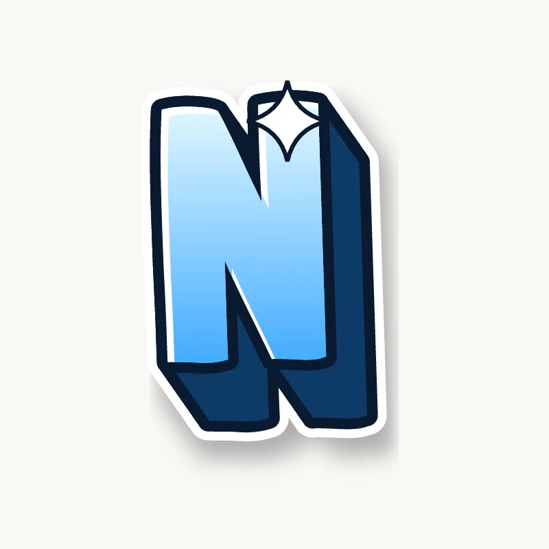
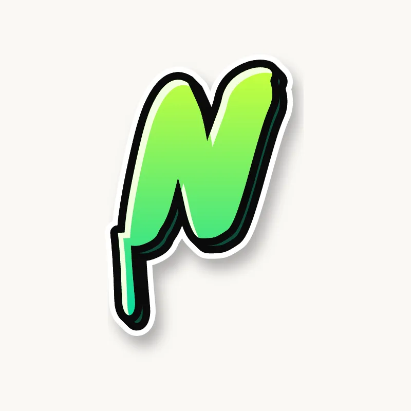
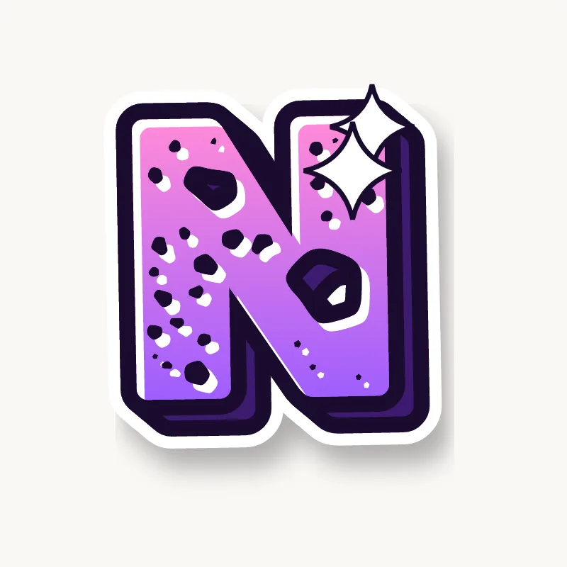

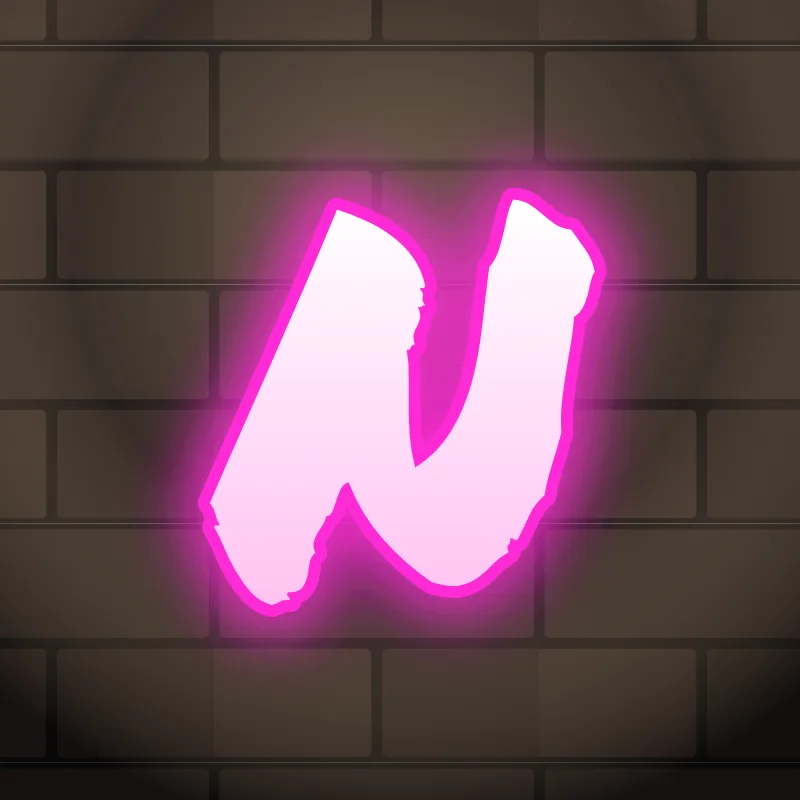
How do you draw a graffiti N?
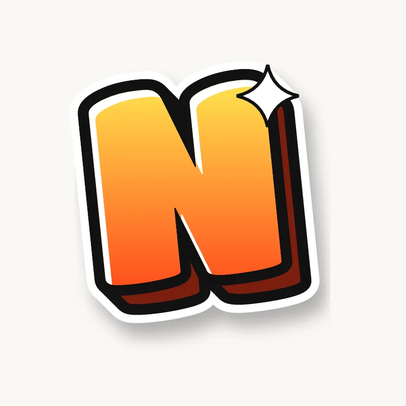
To draw a graffiti N, pencil two stems and a diagonal from the top left to the bottom right, then make the diagonal the thickest stroke. Lean the whole letter forward, keep the two triangular gaps open, outline it and add 3D. For extra style, run the diagonal past the top as an extension.
- Stems. Pencil two vertical lines, a little less than an O's width apart.
- Diagonal. Connect the top of the left stem to the bottom of the right one.
- Lean forward. Tilt the whole N a few degrees to the right.
- Thicken. Make the diagonal the heaviest stroke and the stems slightly lighter.
- Extend, then outline. Try pushing the diagonal past the top-left corner as an arrow, then ink it, keep the gaps clear and extrude.
Letter structure: the parts of an N
An N is two stems joined by a diagonal. The diagonal leaves two triangular counters, one opening at the bottom left and one at the top right. In most serif type the diagonal is the thick stroke and the stems are thin, which is why an N with a thin diagonal looks wrong even to people who could not say why.
The N in bubble, blockbuster, wildstyle, throw-up and Old English
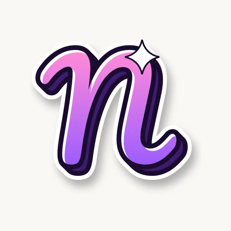
Bubble. A soft zigzag, or a lowercase-style arch that looks like a horseshoe turned over.
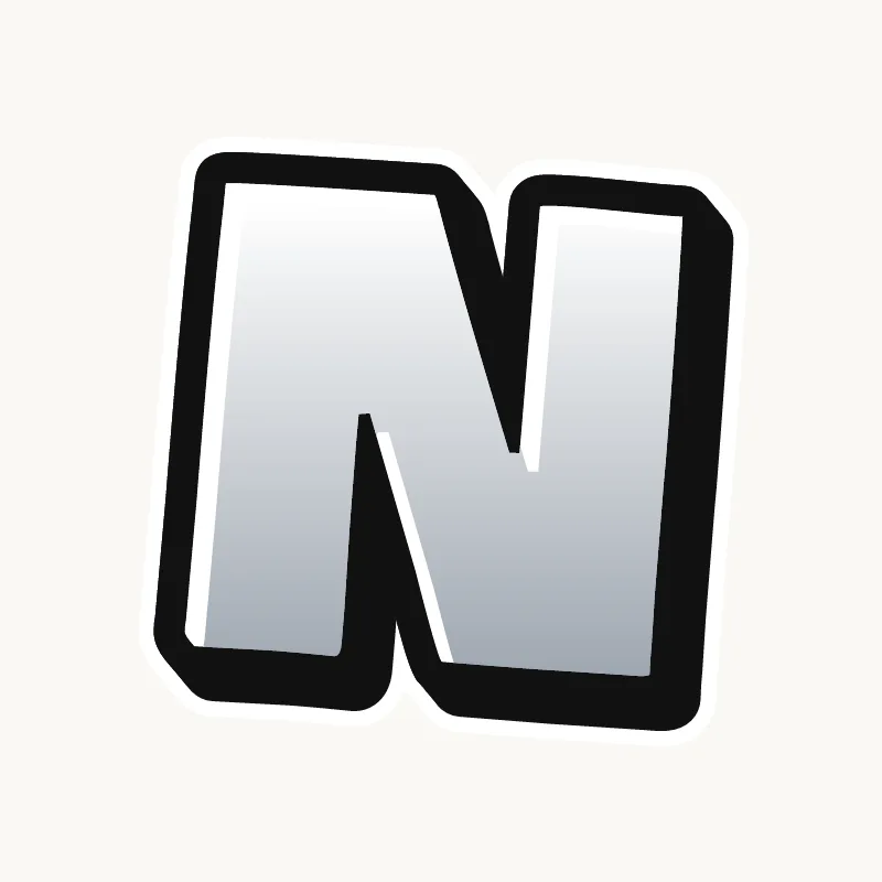
Blockbuster. Two posts and a thick slab between them. Square corners keep it readable.
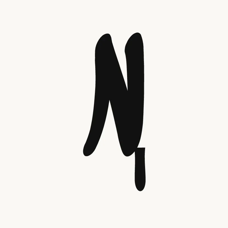
Wildstyle. The diagonal shoots past the top left as an arrow, and the right stem can drop into an extension under the next letter.
Throw-up. Usually lowercase: a stem and a single arch, done in one stroke.
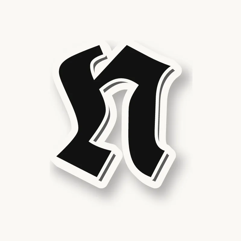
Old English. The blackletter lowercase n is two minims joined at the top, while the capital N is curvy with hairline flourishes.
Common mistakes with a graffiti N
- A thin diagonal. It is the part people read, so it should be the heaviest stroke.
- A diagonal running the wrong way. Top right to bottom left makes a backwards N, an easy slip when you are focused on style.
- Stems too far apart. A wide N flattens the diagonal and starts to look like an H with a slash.
Uppercase or lowercase N?
A lowercase n is a short stem with one arch. It is simple, so it is a good letter to try bounce on: tilt it or lift it slightly above its neighbors.
Adding arrows to an N
On a capital N, extend the diagonal past the top left as an arrow. On a lowercase n, the end of the arch can flick out. See how whole words lock together in wildstyle.
Making an N flow in a word
A forward-leaning N pushes the word along and pairs well with an arrow on the next letter. N is common at the end of names (Ben, Finn, Ryan) and in pairs like "AN", "IN", "NG" and "ND". At the end of a word, let the right stem rise or drop as a finish. In "NN" (Finn, Anna), the two Ns can share a stem. In "ND" or "NG", point the diagonal straight into the next letter.
Want to see it with your own name? Type it into the graffiti letter generator, or learn the whole process step by step in how to draw graffiti.