
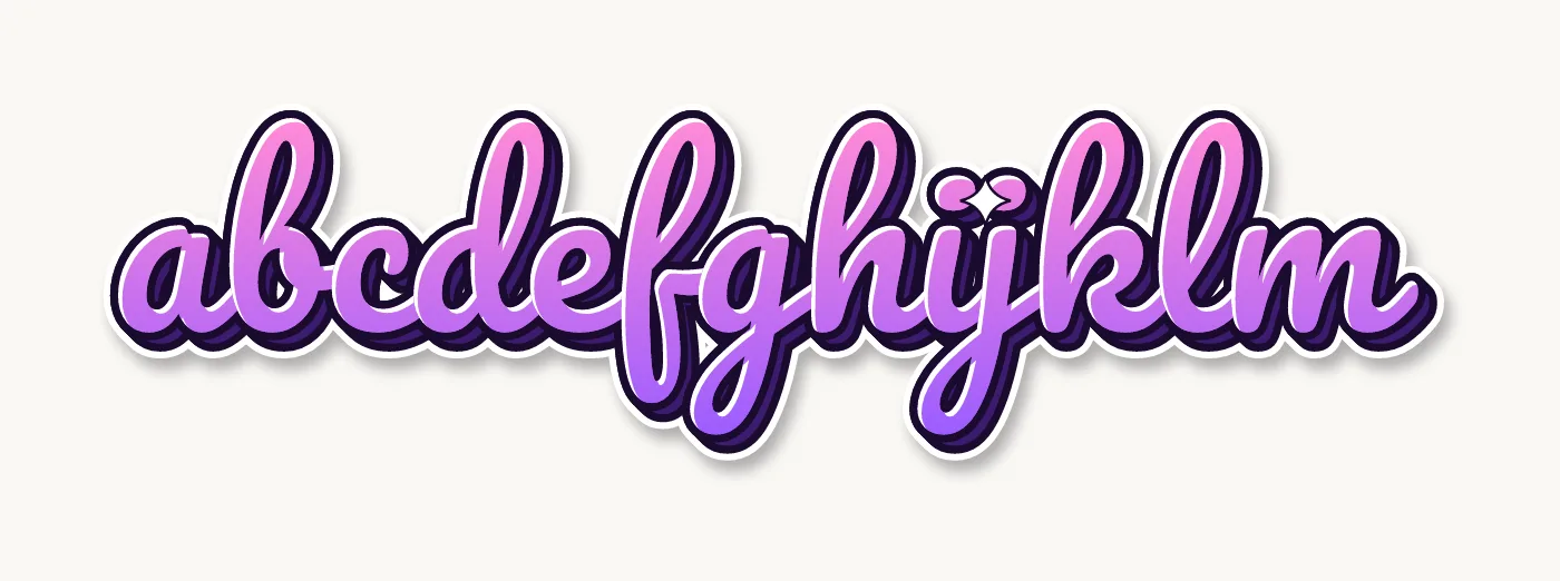
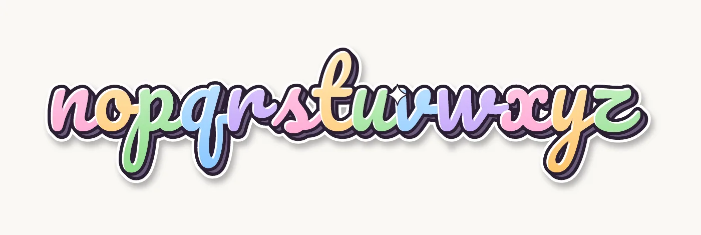
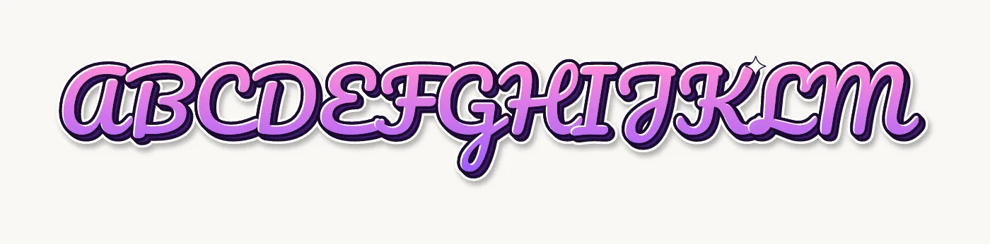
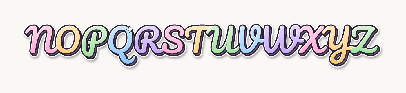
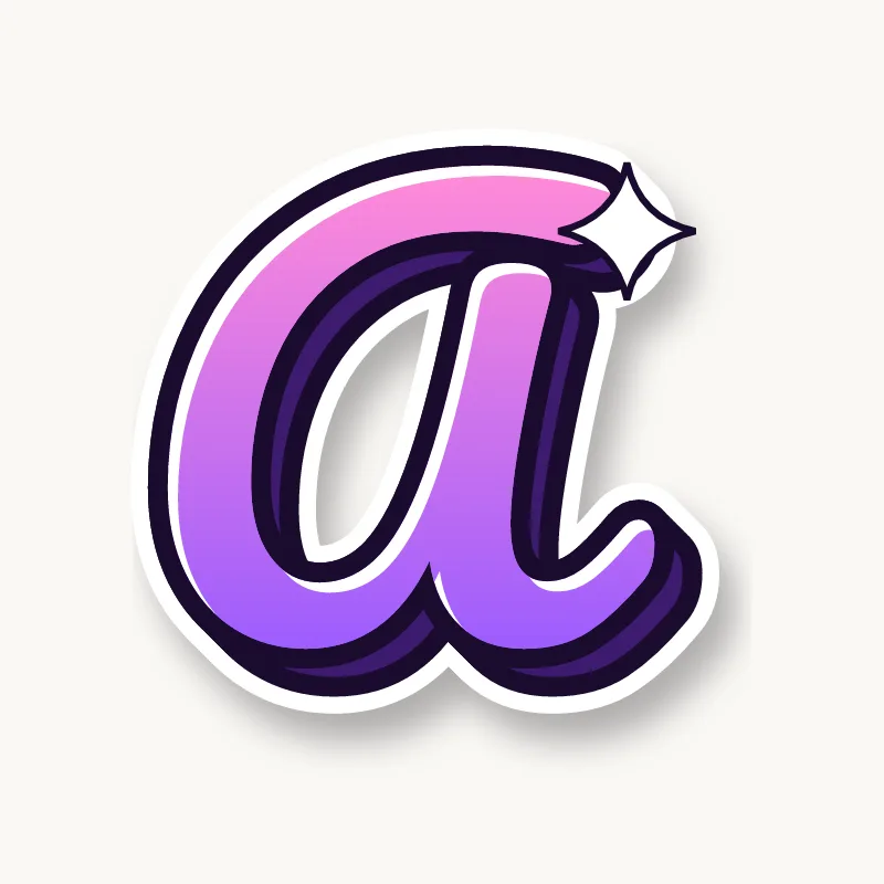
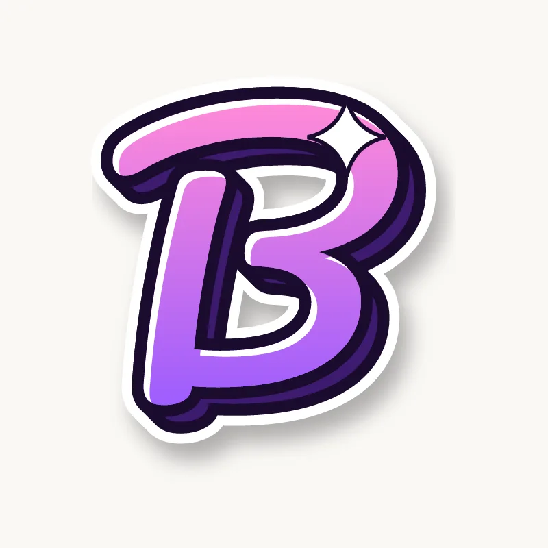
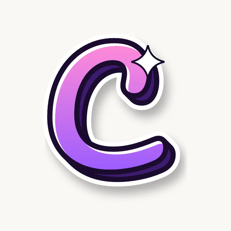
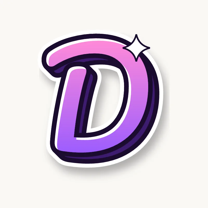
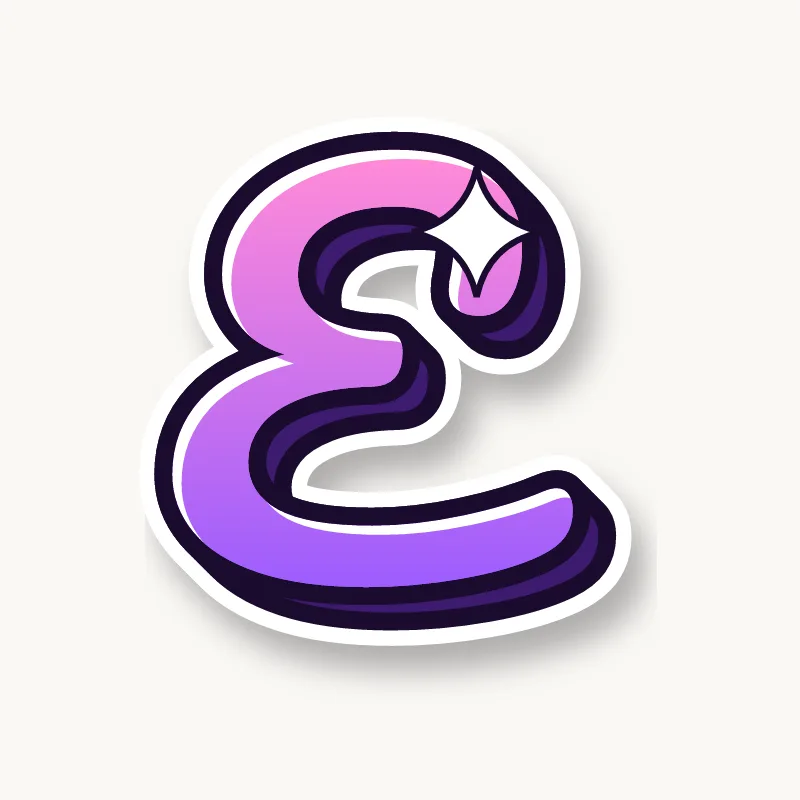

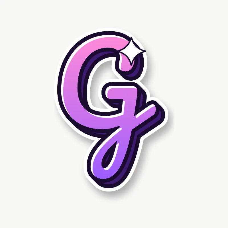
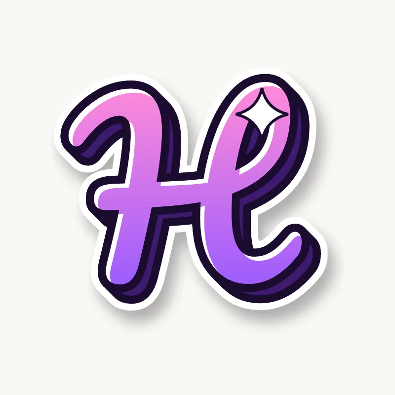
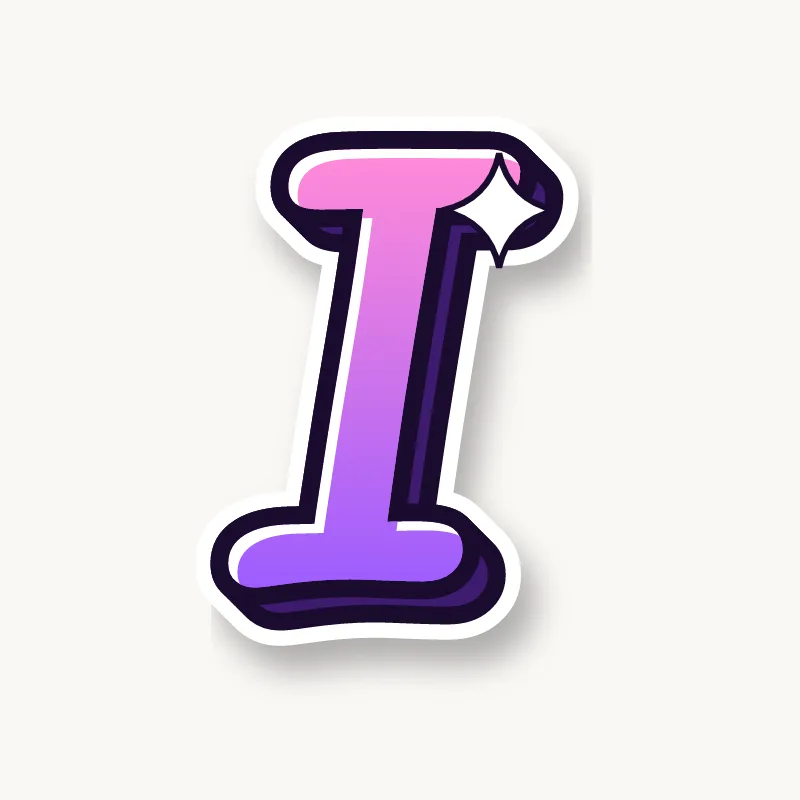
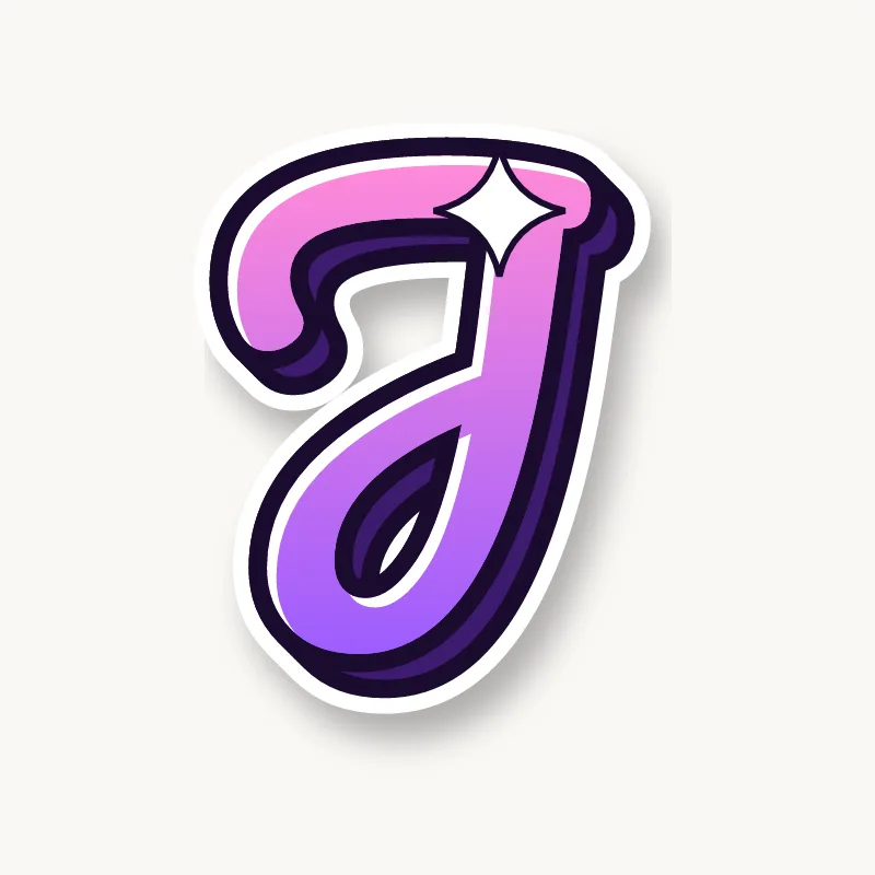
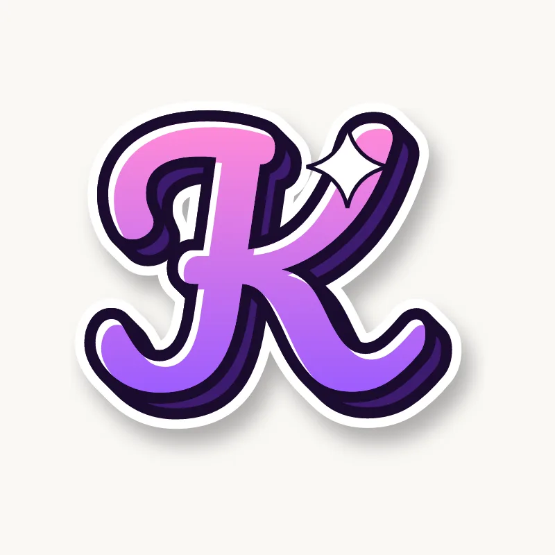
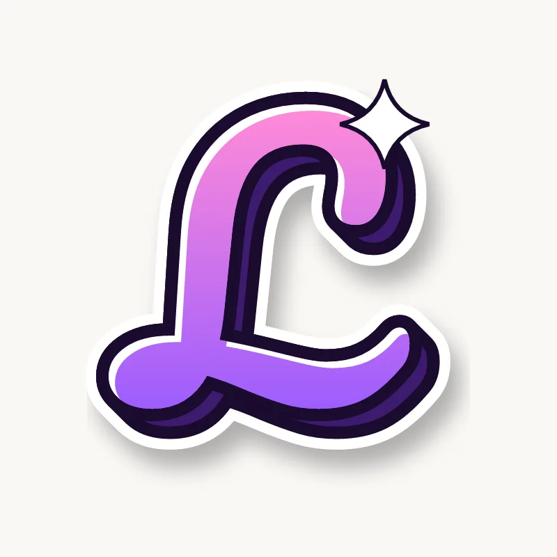
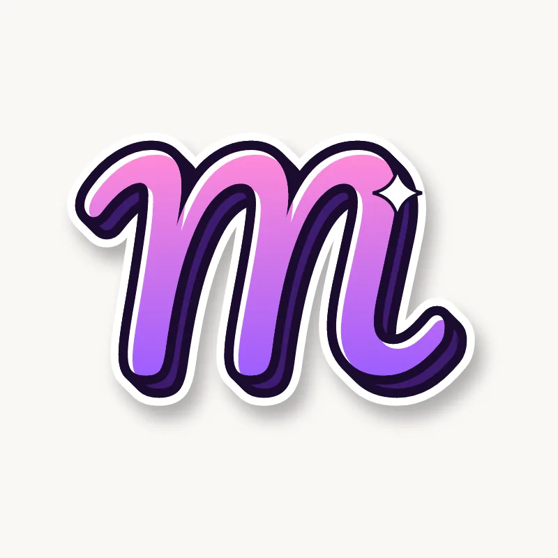
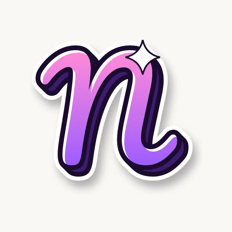
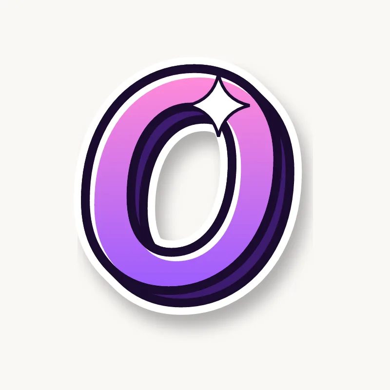
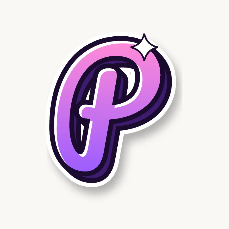

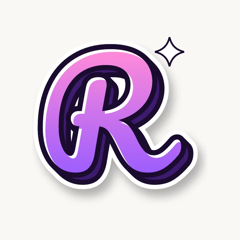
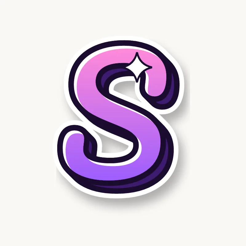



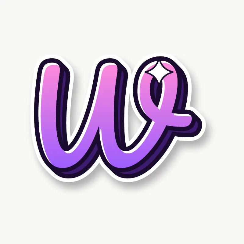
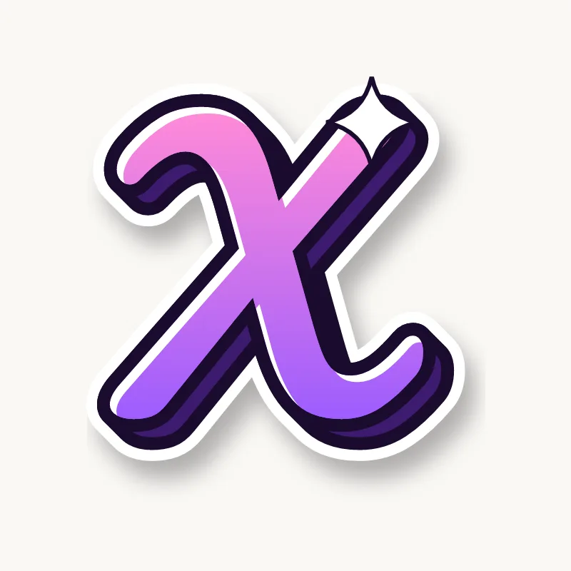
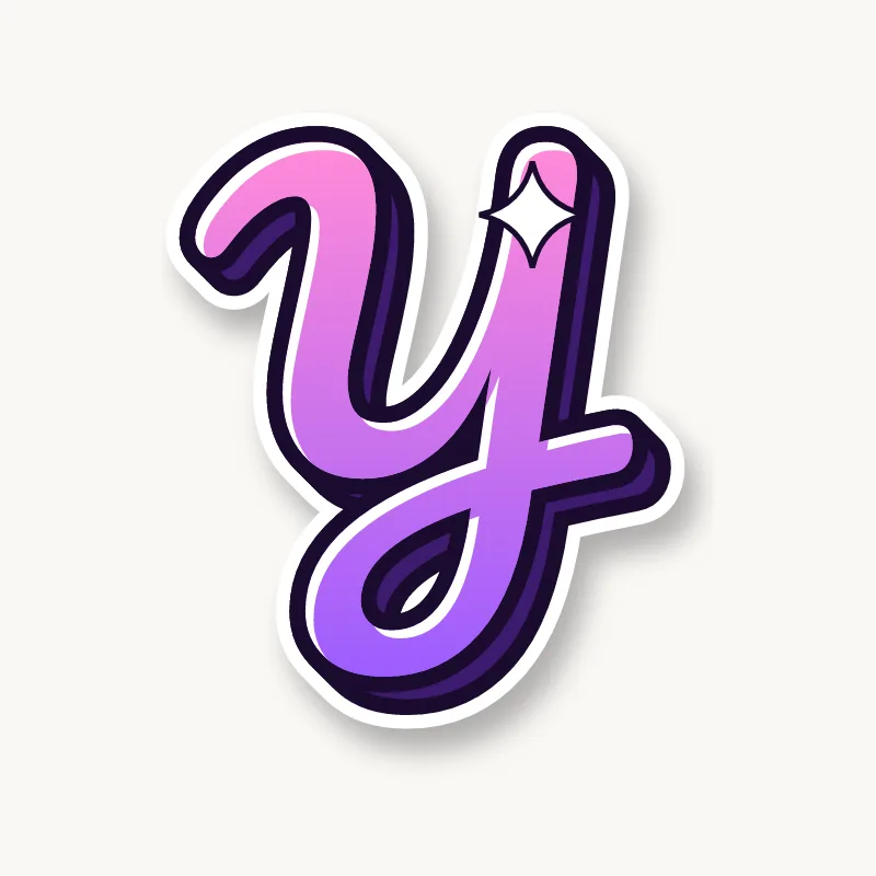

What are cursive bubble letters?
Cursive bubble letters combine two things: the flowing, connected strokes of cursive handwriting and the inflated, rounded shape of bubble letters. The letters lean slightly, join at the baseline, and the whole word sits inside one smooth outline, so it looks like a single balloon shaped like a word.
That shared outline is the difference from normal bubble letters, where each letter is a separate blob that overlaps the next. In cursive, the joins are part of the letters, so they get the same thickness, color and 3D drop as everything else. The result reads like a signature, which is why this style is popular for names and short words.
How do you draw cursive bubble letters step by step?
Write the word in normal cursive first, then draw one continuous outline around the whole word at an even distance from your pencil line. Do not outline each letter separately. Round every end, then add a 3D side and shine marks. These steps work for any word:
- Write the word in pencil cursive. Use your normal joined handwriting, a little larger and looser than usual. Leave extra space inside loops (l, b, h, k) and between letters, because the outline will fill some of it.
- Thicken the joins. Go over the connecting strokes so they are as heavy as the letters. Thin joins are the first thing to break when you inflate the word.
- Draw one outline around the whole word. Start at the first letter and trace around the pencil line at the same distance, like a racetrack, without lifting the pencil where letters meet. Keep going over joins instead of stopping at them.
- Leave the inner shapes. Draw small outlines inside closed loops and bowls (the holes in a, d, e, o, g). If a loop is too small to keep open, let it close into a tiny slit.
- Round every end. The first entry stroke, the last exit stroke, and tails on y, g and j finish in soft, round tips, never points.
- Erase the skeleton and ink. Rub out the original cursive line, then ink the outline with a fine pen.
- Add a 3D side. Pick one direction, usually bottom-right, and draw a short drop along every edge facing it. The 3D graffiti letters guide shows the method in detail.
- Color and shine. Fill with a fade, color the 3D side darker, and add a white curved line or dot near the top-left of the big shapes.
The most common mistake is outlining letters one at a time. Every place where two outlines meet leaves a line across the join, and the word looks chopped into pieces. One outline around everything keeps the script smooth.
Capital vs lowercase cursive bubble letters
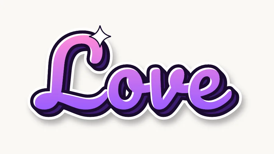
Write words in lowercase cursive and use a capital only for the first letter. Lowercase letters join naturally, so the outline flows. Capital cursive letters are bigger and loopier and many of them do not connect to the next letter, so a whole word in capitals looks crowded and hard to read.
A capital at the start of a name is where cursive looks best. Make it about one and a half to two times the height of the lowercase letters, and let its last stroke sweep under or into the second letter. If a capital does not join (cursive G, S and L often don't), leave a small gap and keep the next letter close.
Tips for tricky cursive letters
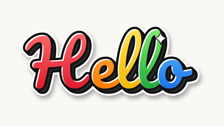
A few cursive letters have loops or turns that get messy when inflated. The fix is usually to simplify the loop or give it more room before you draw the outline.
- Cursive f. It has a loop above and below the line. Make both loops tall and narrow, and let the lower loop close into a slit rather than a hole.
- Cursive z. The loop under the baseline looks like a 3. Keep the top part small and give the bottom loop room, so it does not merge with the next letter.
- Cursive q. The tail turns up to the right, unlike g. Exaggerate that upward flick so readers do not confuse the two.
- Cursive r. The small shoulder on top disappears once the letter is fat. Lift the shoulder higher than you normally would and leave a clear notch.
- Cursive s. The pointed top can close up. Draw the top as a small peak with space under it, and keep the bottom round.
- Capital G, S and L. These have big loops that turn into blobs. Draw them larger, keep only one main loop each, and make the inner hole an oval instead of a circle.
Practice the tricky letters inside real words such as "fizz", "queen" or "rose", since the joins change how they look. For capital shapes in a blockier style, see the graffiti letters A–Z.
Fancy cursive bubble letters
Fancy cursive bubble letters add flourishes to the script: swashes on the first and last letters, hearts or stars as dots, and a second outline. Because cursive already moves, a little decoration goes a long way.
- Swashes. Extend the last letter's exit stroke into a long curve that sweeps back under the word, like an underline.
- Heart dots. Replace the dots on i and j with small hearts, same color as the letter.
- Double outline. Draw a second line around the whole word a few millimeters out and color the gap white or a contrasting color.
- Sparkles. Add a few small four-point stars around the word, not inside it.
For more decoration ideas in soft colors, see cute bubble letters.

Where to use cursive bubble letters
Cursive bubble letters suit short, personal words: names, nicknames, and one or two words like "love", "hello" or "best friends". Use them for name tags, birthday and thank-you cards, notebook and binder covers, bedroom door signs, stickers and sign headers. Keep long sentences in print letters; cursive gets hard to read after a few words.
Cursive bubble letters generator
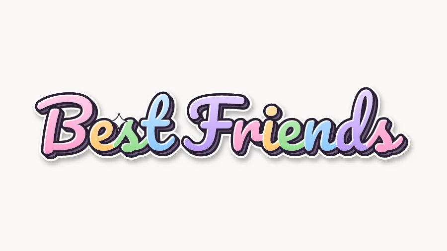
Type a word into the cursive bubble letters generator and it writes it in joined script with one outline, a 3D drop and shine marks, in the Candy palette by default. Switch to Rainbow for a different color on each letter or Pastel mix for soft tones. Download a PNG with a transparent background, or an SVG to cut on a Cricut.
What font is used for cursive bubble letters?
The generator's Cursive style is built on Pacifico, a round script font released under the SIL Open Font License. You do not need to download or install it: the letters are drawn as outlined shapes, so the exported image looks the same everywhere. See the license page for how you can use the images.