









How to draw a P in graffiti
To draw a P in graffiti, pencil a stem and a bowl that covers roughly the top half, thicken both, and let the stem run a little below the other letters. Keep the hole in the bowl open, outline it and add 3D. A big bowl keeps the P readable; a styled foot gives it character.
- Long stem. Pencil a vertical line slightly longer than the other letters.
- Bowl. Draw a round bowl from the top of the stem down to about halfway.
- Close it cleanly. Where the bowl rejoins the stem, make a clean join so the counter is a closed hole.
- Thicken. Build the body. The bowl can be heavier than the stem.
- Finish the foot. Ink it, extrude, and give the bottom of the stem a foot, a point or a curl.
Letter structure: the parts of a P
A P is a stem with a bowl at the top. Everything below the bowl is open stem, and that leg is where the style goes: a drop below the line, a foot, a curl or an arrow. Add a leg to the bowl and you have an R, so keep the space under the bowl empty.
The P in bubble, blockbuster, wildstyle, throw-up and Old English
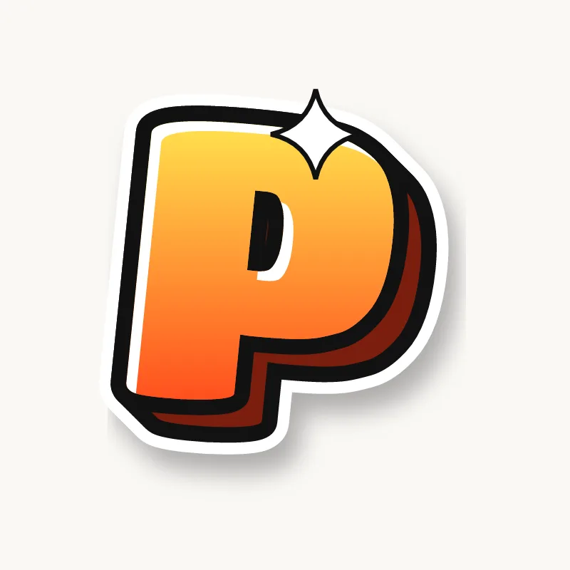
Bubble. A balloon on a short stick. Let the bowl swell past the stem on the left too.
Blockbuster. A square bowl on a thick post. Clip the top right corner for movement.
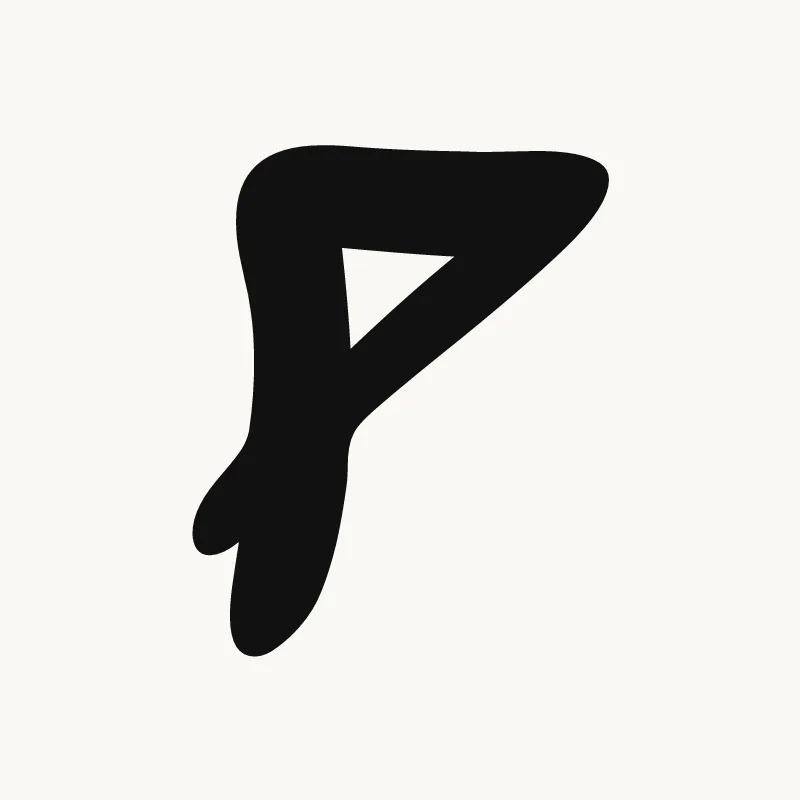
Wildstyle. The stem drops into an arrow or hooks under the next letter, and an extension can come off the top of the bowl.
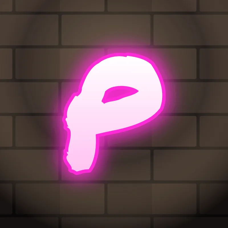
Throw-up. One motion: up the stem and around the bowl. Keep the hole a clear dot.
Old English. The blackletter P has a stem that drops well below the line, ending in a diamond tip, and a broken, angular bowl.
Common mistakes with a graffiti P
- A small bowl. The P then looks like an F or a T.
- A bowl that closes at the bottom of the stem. Then it is a D.
- A straight stem the same length as everything else. A P with no movement at the foot looks unfinished in graffiti.
Uppercase or lowercase P?
A lowercase p has a stem that drops below the line and a bowl at the top. The descender is a chance to sweep under the next letter.
Adding arrows to a P
The bottom of the stem is the arrow spot on a P, pointing down and back, or forward under the word. See how whole words lock together in wildstyle.
Making a P flow in a word
A P can lean back against the letter after it. P starts words like Peace, Pop and Priya, and sits inside "SP" and "PR". In "PR", the two bowls can line up, with the R's leg kicking out. In "PP" (Happy, Pippa), drop one stem lower than the other. In "OP" or "AP", let the previous letter overlap the stem and keep the bowl clear.
Want to see it with your own name? Type it into the graffiti letter generator, or learn the whole process step by step in how to draw graffiti.