



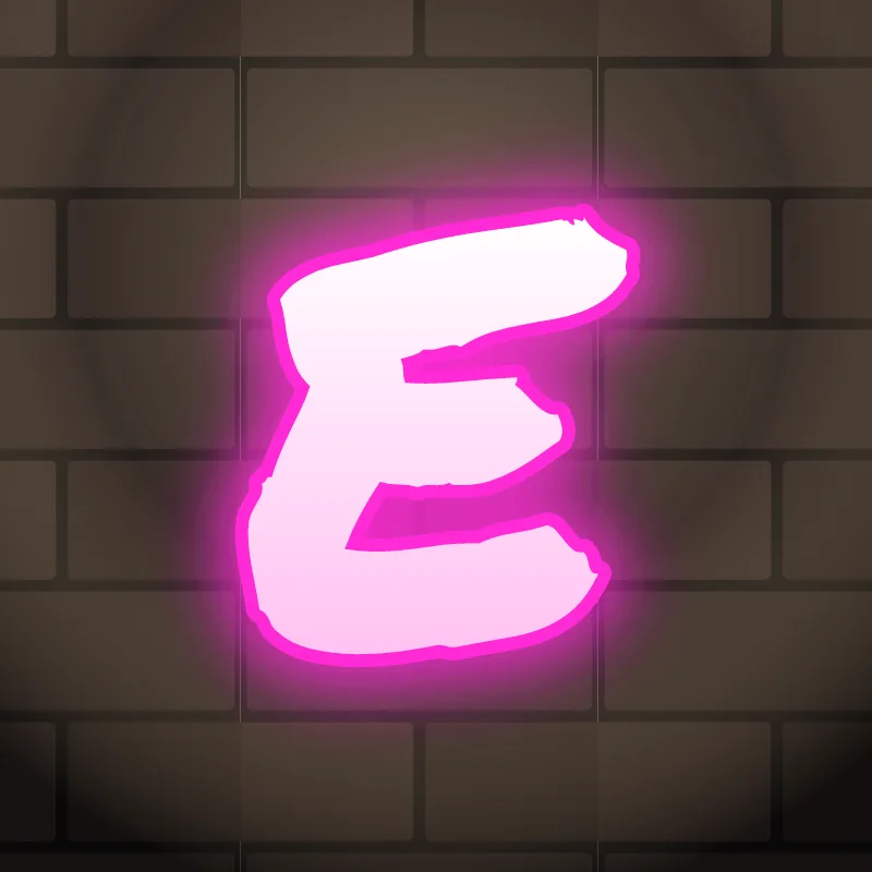
How do you draw a graffiti E?
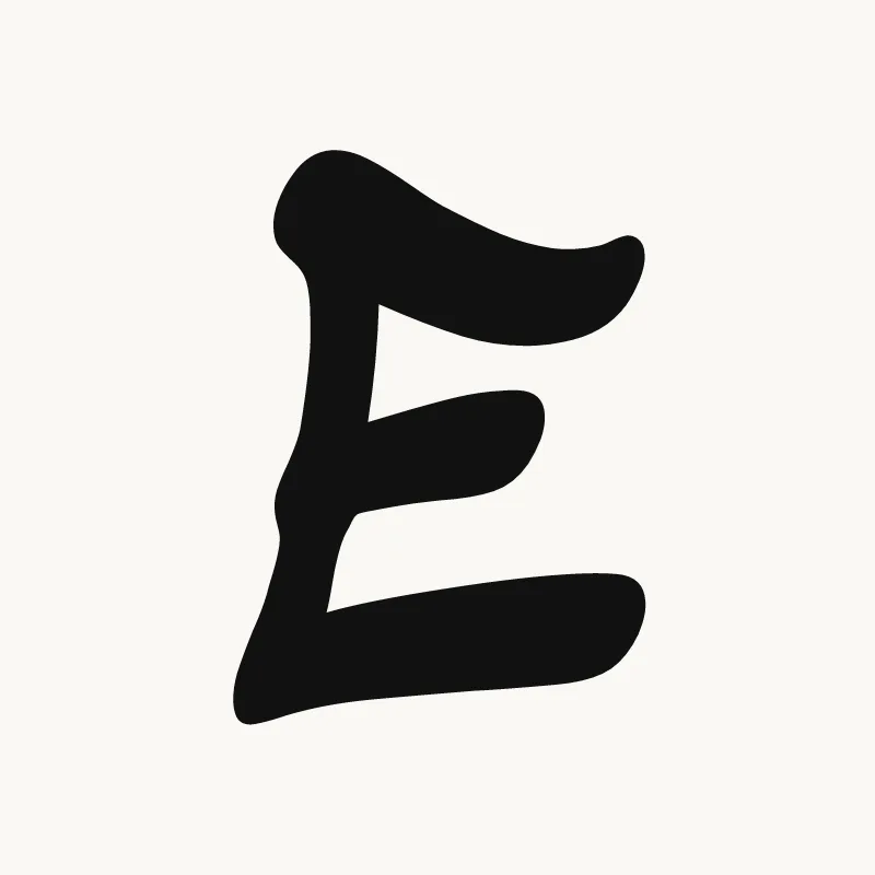
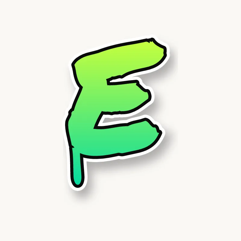
Draw a stem, then a top arm, a shorter middle arm and the longest bottom arm, and thicken everything into one shape. Leave clear gaps between the arms, outline it, and put the 3D block on the open side. Varying the arm lengths is what turns a plain E into a graffiti E.
- Stem and arms. Pencil the stem and three arms. Make the middle arm short and the bottom arm the longest.
- Tilt the arms. Angle the top arm slightly up and the bottom arm slightly down, so the letter opens like a hand.
- Thicken. Build the body around the skeleton, keeping both gaps between the arms at least as wide as a stroke.
- Style the ends. Round the arm ends for bubble, cut them square for block, or point the middle arm into an arrow for wildstyle.
- Outline and 3D. Ink the outer edge and put the block on the right, where it shows inside both gaps.
Letter structure: the parts of an E
An E is a stem with three arms, usually with the middle arm the shortest. Between the three arms sit two counters that open to the right, which is why the E looks broken when they close up. In most typefaces the middle arm is the shortest and sits at or a little above the center, which keeps the letter from looking top-heavy.
The E in bubble, blockbuster, wildstyle, throw-up and Old English
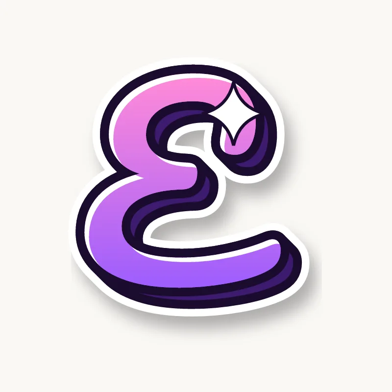
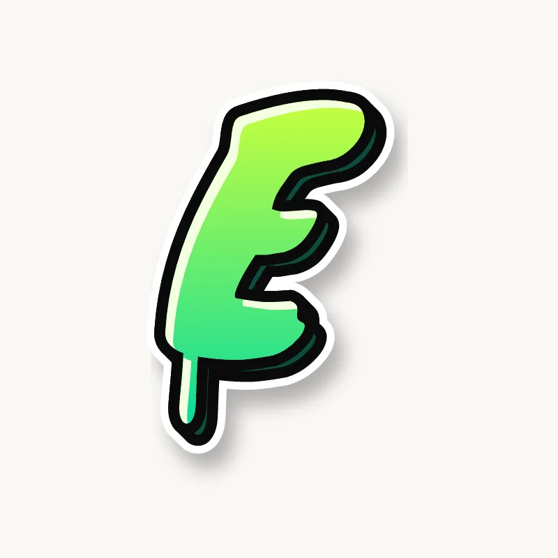
Bubble. The arms become three soft lobes on a round back, a bit like a cloud. Keep the gaps between the lobes deep or they merge.
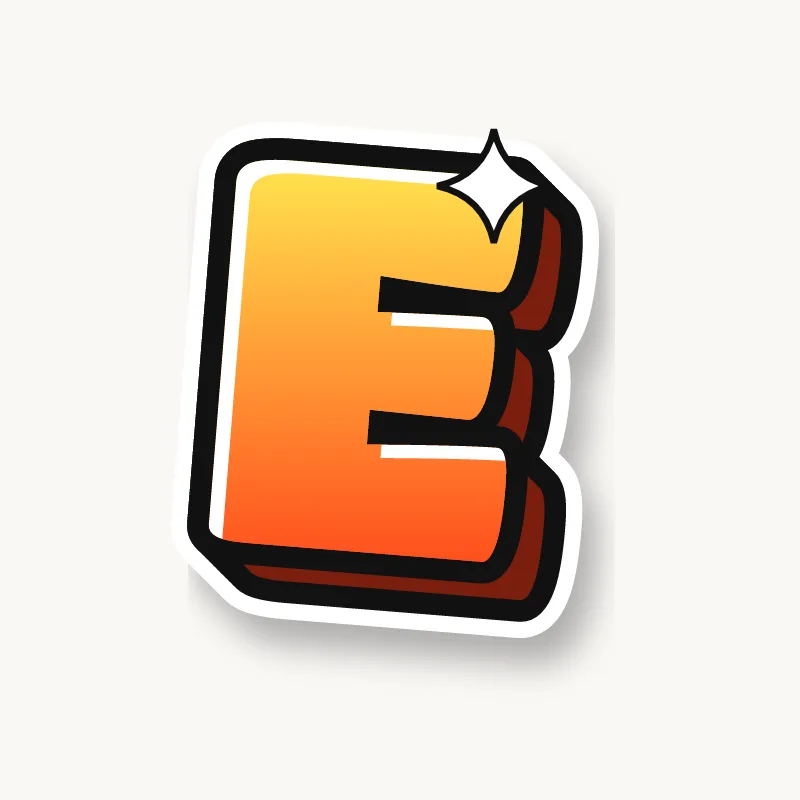
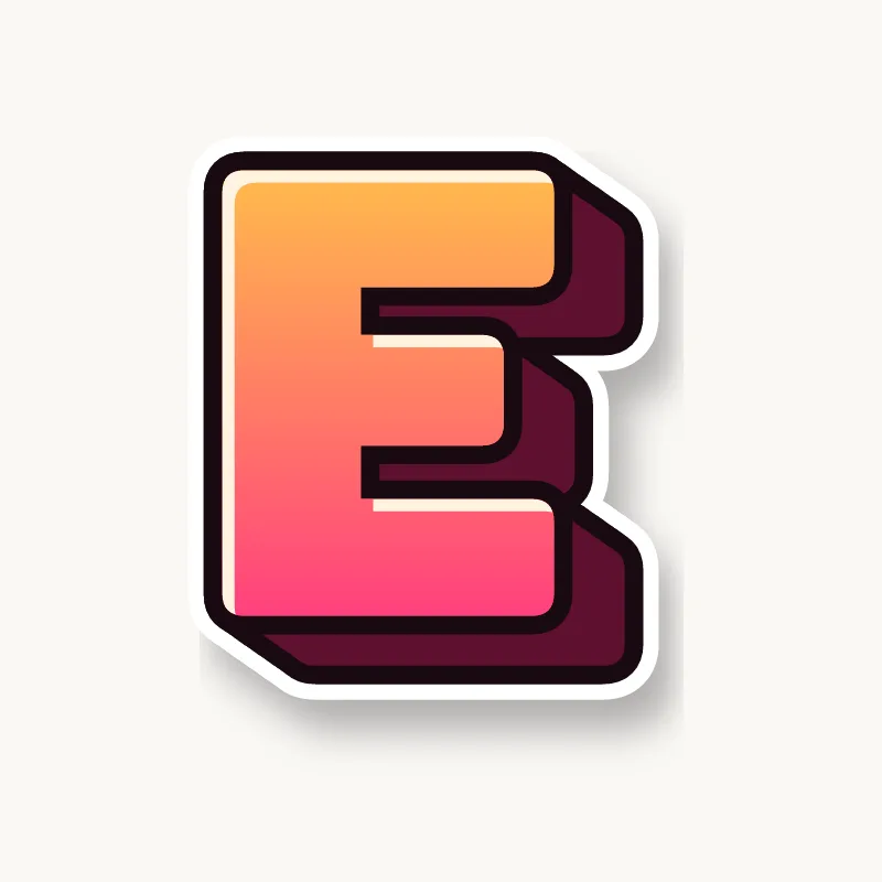
Blockbuster. A stack of rectangles. Blockbuster Es are good for showing off a deep 3D block, because the depth shows in both gaps.
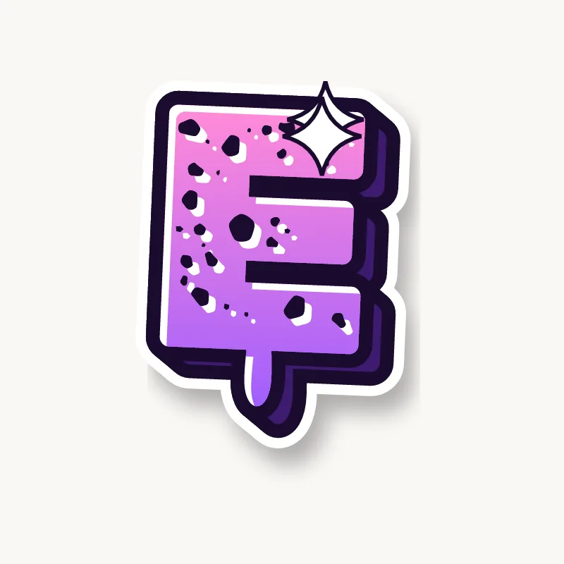
Wildstyle. Any arm can become an arrow, and the middle arm often pierces the next letter. Some writers split the stem or drop the bottom arm below the line.
Throw-up. Often a rounded, backwards 3 with a flat back. Speed matters more than straight arms here.
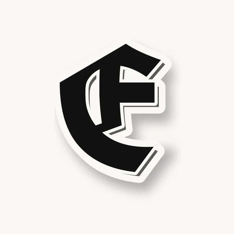
Old English. The blackletter capital E is round, built like a C with a thin bar through the middle, not a stem with three arms.
Common mistakes with a graffiti E
- Three arms of equal length. The E looks stiff, like a comb.
- Closing the gaps. Thick arms with thin gaps fill in once outlined, and the E becomes a rectangle.
- Putting the 3D block on the left. It hides behind the stem and you lose the best part of the E's depth.
Uppercase or lowercase E?
A lowercase e is a round bowl with a short horizontal bar and an open tail. It is one of the most rounded lowercase letters, which makes it a favorite in bubble pieces.
Adding arrows to an E
Any of the three arms of a capital E can become an arrow. Most writers turn the middle arm into one, so it points into the next letter. See how whole words lock together in wildstyle.
Making an E flow in a word
E is the most common letter in English, so it often appears twice in a name. Give the second E a slightly different tilt or arm so the word does not look stamped. You will meet E at the start (Emma, Echo), in the middle (Ben, Alex) and at the end (Grace, Mike). In the middle, tuck the stem behind the previous letter and point the middle arm into the next. In "ER", the bottom arm can run under the leg of the R, and in "EL" the E and L can share one long foot.
Want to see it with your own name? Type it into the graffiti letter generator, or learn the whole process step by step in how to draw graffiti.