






How to draw a V in graffiti
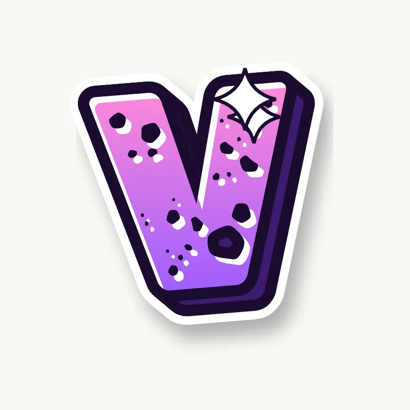
To draw a V in graffiti, pencil two diagonals meeting at the bottom, then flatten that point into a short base. Thicken the strokes, keep the open top wide, outline it and add 3D. Extending the right arm into an arrow is the quickest way to add style.
- Diagonals. Pencil two lines meeting at the baseline, opening wide at the top.
- Flat base. Cut the point off so the V has a short foot to stand on.
- Uneven arms. Make the left arm thicker than the right, as in most printed fonts.
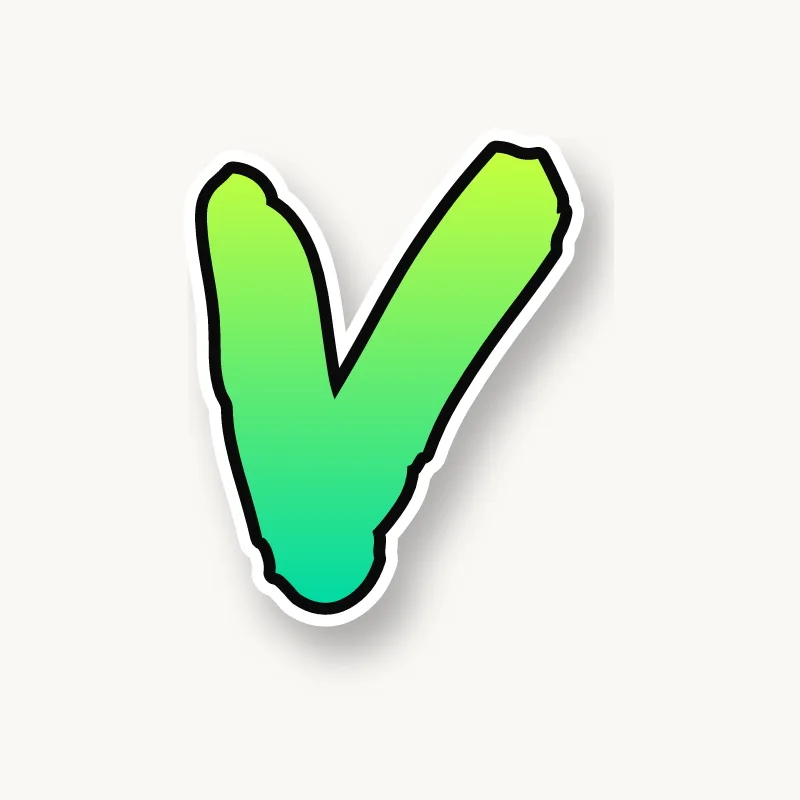
- Extend one arm. Push the right arm up past the other letters, ending in a point.
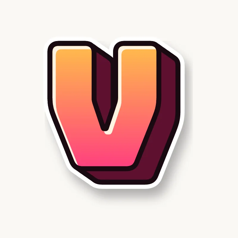
- Outline and 3D. Ink it and extrude; the inside of the V shows the depth.
Letter structure: the parts of a V
A V is two diagonals meeting at a point. There is one large counter open at the top. The vertex at the bottom is the weak spot: a sharp point gets thinner when it is outlined, so the letter looks like it is balancing on a needle.
The V in bubble, blockbuster, wildstyle, throw-up and Old English
Bubble. A soft wedge with a round bottom, close to a bubble U. Keep the bottom narrower than a U so it still reads as V.
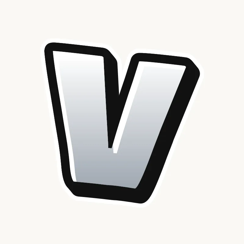
Blockbuster. A thick wedge with a flat bottom and clipped top corners.
Wildstyle. The arms become arrows, and the vertex can drop below the line as an extension.
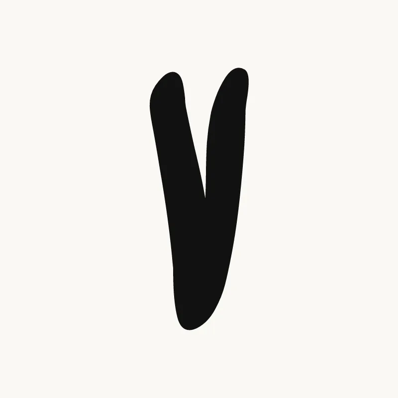
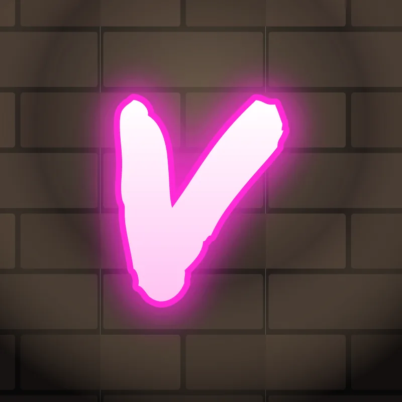
Throw-up. A quick check-mark shape, filled flat. Make the base clear.
Old English. The blackletter V curls at the top left with a hairline and closes into a rounded base, close to its U.
Common mistakes with a graffiti V
- A sharp point that the outline turns into a thin, weak foot.
- Arms too upright. A narrow V looks like a U with a point, or a Y missing its stem.
- A base that is too wide. Flatten the point, but not so much that the V turns into a U.
Uppercase or lowercase V?
The lowercase v keeps the capital shape at x-height, so next to tall letters it can look tiny. Flatten its point a little so it sits on the line, and widen it slightly so it holds its space.
Adding arrows to a V
The right arm is the natural arrow on a V. Extend it up and out past the top of the other letters. See how whole words lock together in wildstyle.
Making a V flow in a word
The open top lets letters on either side lean in. V is common inside words (Ava, Vibe, Kevin, Steve), so it is often squeezed between round letters. Its open top lets neighbors lean in. In "AV" and "VA", the diagonals fit into each other; type designers close that gap with kerning, while graffiti writers overlap the letters outright. In "VE", tuck the E under the V's right arm.
Want to see it with your own name? Type it into the graffiti letter generator, or learn the whole process step by step in how to draw graffiti.