








How to draw a U in graffiti
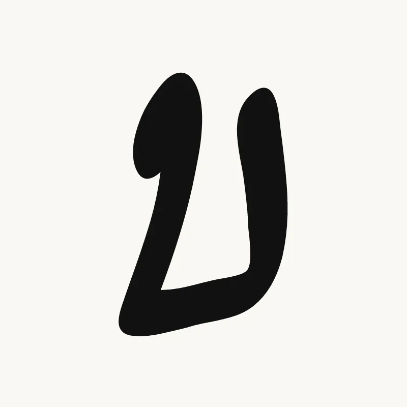
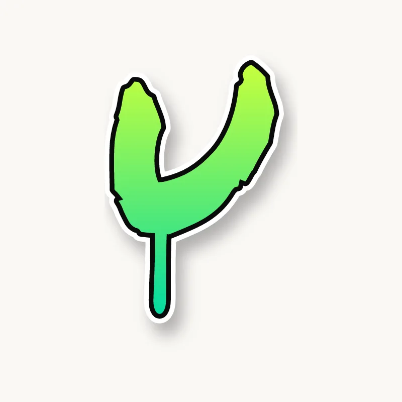
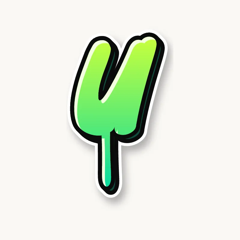
To draw a U in graffiti, pencil two stems and join them with a wide, round curve at the bottom, then make the bottom thicker than the sides. Let one stem rise higher than the other for bounce, keep the inside open, outline it and add 3D. A heavy, round base keeps it from looking like a V.
- Stems. Pencil two verticals, the right one slightly shorter or with a small spur.
- Wide bottom. Join them with a broad, round curve.
- Weight the base. Make the bottom of the U thicker than the stems.
- Shape the tops. Round them for bubble, clip them for block, or point one into an arrow.
- Outline and 3D. Ink it and extrude down and to the side. The inside of the cup is a good spot for a highlight.
Letter structure: the parts of a U
A U is two stems joined by a curve at the bottom. Its one counter opens upward. Some typefaces add a short spur on the right stem, borrowed from the lowercase u, and in graffiti that spur is a handy anchor for an arrow or a cap.
The U in bubble, blockbuster, wildstyle, throw-up and Old English
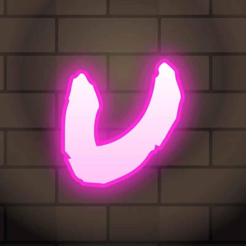
Bubble. A horseshoe. Keep the walls fat and the opening narrow.
Blockbuster. A square cup: two posts and a slab. Very readable.
Wildstyle. The right stem grows an arrow, and the bottom can split into an extension under the next letter.
Throw-up. One stroke down, around and up. Easy and fast.
Old English. The blackletter u is two minims joined at the bottom, almost an n turned upside down, which is why blackletter readers relied on context.
Common mistakes with a graffiti U
- A narrow bottom. It starts to look like a V.
- Tops pulled inward. A U with stems curling in starts to look like an O with a gap.
- Even stems. Perfect symmetry makes a U look like a magnet; let one side rise or lean.
Uppercase or lowercase U?
A lowercase u is a cup with a short stem on the right. It is a good partner for bubble letters because its curve matches theirs.
Adding arrows to a U
The top of the right stem is the usual arrow spot, pointing up and forward. See how whole words lock together in wildstyle.
Making a U flow in a word
One stem can rise higher than the other to add bounce. U usually follows Q and appears inside short names (Luna, Ruby, Hugo). Its open top lets the letter before it lean in. In "QU", sit the U on the Q's tail. In "OU" and "UR", match the curves so the round shapes flow into each other.
Want to see it with your own name? Type it into the graffiti letter generator, or learn the whole process step by step in how to draw graffiti.