








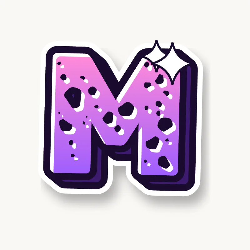


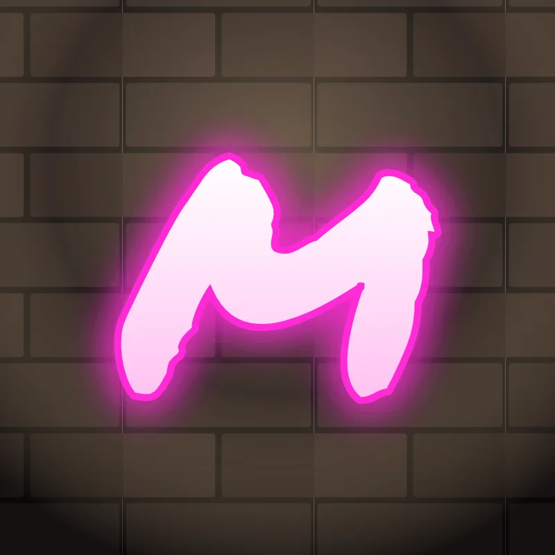
How do you draw a graffiti M?
To draw a graffiti M, pencil two stems close together, add a V between them that stops above the baseline, then thicken all four strokes. Lean the outer stems in slightly, keep the notch inside the V and the gap under it open, outline it and add 3D. Keep it narrower than feels natural.
- Two stems, close. Pencil two verticals, nearer together than a normal M.
- Short V. Draw the middle V from the top of each stem, stopping well above the baseline.
- Lean in. Tilt the outer stems slightly toward each other so the M looks compact.
- Thicken. Build the body. If the V starts to disappear, make it heavier than the stems.
- Outline and 3D. Ink it and add the block on one side; the inner notches show the depth.
Letter structure: the parts of an M
An M is two stems with a V between them. The two inner diagonals meet at a vertex in the middle. That leaves a notch opening at the top, inside the V, and a gap opening at the bottom between the stems. If the V reaches the baseline, the bottom gap splits into two narrow triangles that fill in fast; stopping the V short keeps one wider gap and makes the whole M look tighter.
The M in bubble, blockbuster, wildstyle, throw-up and Old English
Bubble. Two soft peaks, or three humps for the lowercase form. Bubble Ms look best slightly squashed.
Blockbuster. Two thick posts and a deep V. Clip the top corners so it does not look like a fence.
Wildstyle. The outer stems become arrows pointing outward, and the V can drop through the baseline as an extension.
Throw-up. Two rounded humps in one motion, usually drawn as a lowercase m.
Old English. The blackletter capital M is built from curves, and the lowercase m is three identical upright strokes called minims, the feature that makes blackletter words hard to read.
Common mistakes with a graffiti M
- Drawing the M at full width. It stretches the word and makes the letters around it look small.
- A V that reaches the baseline. The M then looks like a V standing between two posts and loses weight at the bottom.
- Thin middle strokes. If the V is thinner than the stems, the M reads as two Is.
Uppercase or lowercase M?
A lowercase m is a short stem with two arches. It is wide, so squeeze the arches together or let it overlap the letter before it.
Adding arrows to an M
Arrows usually go on the outer stems of an M, pointing out. Keep the middle simple so the letter still reads. See how whole words lock together in wildstyle.
Making an M flow in a word
The humps or peaks of an M can overlap the letter before it. M often starts names (Max, Mia, Maya) and ends words (Sam, Liam, Dream). Because it is wide, let it overlap the next letter, as in "MA" or "MO", instead of sitting beside it. At the end, the right stem can drop low as a finishing foot. Watch "MM" and "MW": two wide letters in a row need squeezing, as on the W page.
Want to see it with your own name? Type it into the graffiti letter generator, or learn the whole process step by step in how to draw graffiti.