



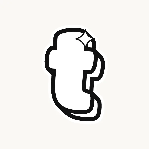
How do you write a T in bubble letters?
Pencil a crossbar and a stem dropping from its center, then outline both at the same distance. Round the two ends of the bar and the foot, and bend each inside corner into a soft curve where bar meets stem. Keep the bar a little shorter than feels natural, then ink and erase.
- Mark the bar. Pencil a horizontal line across the top, a little shorter than the letter is tall.
- Drop the stem. From the exact center of the bar, draw a straight line down to the baseline.
- Wrap the bar. Outline the top edge and round off both ends like the ends of a hot dog.
- Soften the shoulders. Under the bar, curve smoothly into the stem on each side. The two curves should mirror each other.
- Round the foot. Trace down both sides of the stem and close the bottom with a half-circle. Widen it a touch if the letter feels top-heavy.
- Ink and shade. Finish the line, erase, and shade the underside of the bar where it overhangs the stem.
What makes a T easy or tricky in bubble letters
With only one join, the T is mostly about weight. The bar is wide and the stem is narrow, so a puffed-up T can look like it might topple. Shorten the bar slightly and let the stem be a hair thicker than your other strokes. The open spaces on either side of the stem also leave holes in a word; let the neighbors tuck under the ends of the bar.
Lowercase t in bubble letters
Lowercase t is not a small capital. Its stem rises only a little above the short letters, the crossbar sits lower, near the top of the x-height, and the bottom usually curls to the right. In bubble form that curl becomes a rounded foot, which helps the t sit steady next to round letters like o and e.
Cute, 3D and graffiti bubble T
A cute bubble T can turn its bar into a soft cloud or curl both ends upward. For 3D, the shadow under the bar is the key detail, because it makes the bar look like a lid sitting on the stem. Graffiti writers tilt the bar or shoot one end off as an arrow.
Common mistakes with a bubble T
- Drawing the bar wider than the letter is tall, so the T looks top-heavy.
- Setting the stem off-center, so one side of the bar hangs longer than the other.
- Leaving sharp inside corners under the bar instead of soft curves.
Printable bubble letter T to color or trace

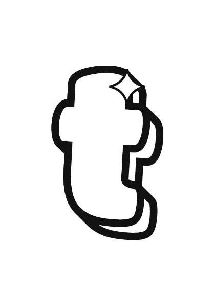
Each letter fills a full A4 page (choose "fit to page" to print on US Letter), so it is big enough to color, trace or cut out for a banner. Download the uppercase A–Z PDF, the lowercase a–z PDF or the numbers 0–9 PDF, and print only the pages you need. More sheets are on printable bubble letters.