


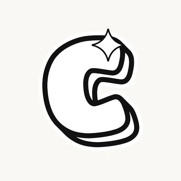

How do you make a C in bubble letters?
Draw a thin C that is a bit more open than usual, then trace a smooth curve around the outside and a smaller one around the inside. Close each end with a round cap and check the mouth is still wide. Ink it, erase the pencil, and add a shine on the upper curve.
- Draw an open curve. Pencil a C shaped like three-quarters of a circle, leaving a generous gap on the right.
- Trace the outer edge. Follow the curve from the top end round to the bottom end, staying an even distance outside your line.
- Trace the inner edge. Do the same on the inside. This inner curve is smaller and tighter.
- Cap the ends. Join the outer and inner lines at each tip with a round half-circle, like the end of a sausage.
- Check the mouth. If the two caps nearly touch, rub them out and pull them back so the opening stays obvious.
What makes a C easy or tricky in bubble letters
A bubble C is easy because it is one continuous stroke with no joins. The only real danger is the mouth: every layer you add, outline, shadow and shine, eats into that gap. A C with a nearly closed mouth reads as an O. Start the pencil curve more open than feels right, around a third of the circle missing.
Lowercase c in bubble letters
Lowercase c is the same shape as the capital, just shorter, so in a word its size is what tells them apart. Draw it about two-thirds the height of the capital and keep the stroke just as thick. A lowercase c drawn with thinner strokes than its neighbors looks deflated next to them.
Cute, 3D and graffiti bubble C
Cute bubble C's often get a face, because the open mouth is already there: two dot eyes and a smile inside the curve. A 3D C shows its shadow inside the mouth as well as outside, which gives it depth fast. In graffiti, the top end of the C often curls into a hook or arrow.
Common mistakes with a bubble C
- Closing the mouth so far that the C turns into an O once it is outlined.
- Leaving the two ends pointed instead of capping them with round ends.
- Letting the curve get flat on the left side, which makes it look like a square bracket.
Printable bubble letter C to color or trace
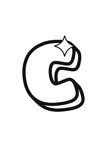
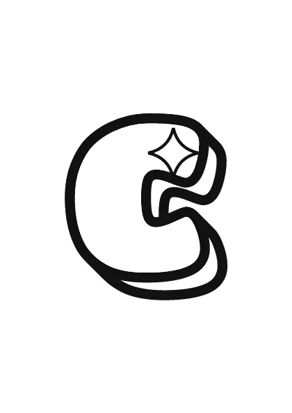
Each letter fills a full A4 page (choose "fit to page" to print on US Letter), so it is big enough to color, trace or cut out for a banner. Download the uppercase A–Z PDF, the lowercase a–z PDF or the numbers 0–9 PDF, and print only the pages you need. More sheets are on printable bubble letters.