


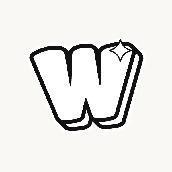
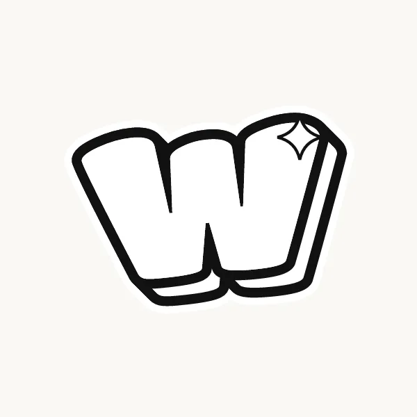
How do you write a W in bubble letters?
Pencil a W as two Vs sharing a middle stroke, then outline the whole shape. Round the three top ends, soften the two bottom tips, and cut two narrow notches down from the top. Make the middle peak a little shorter than the outer arms, then ink the line and erase.
- Draw two Vs. Pencil two V shapes side by side so they share the middle stroke.
- Lower the middle. Stop the center peak a little below the tops of the outer arms.
- Round the tops. Cap all three top ends with half-circles.
- Soften the tips. Turn both bottom points into round, blunt tips.
- Cut two notches. Between the arms, cut two narrow V-shaped notches of the same depth.
- Ink and shade. Finish the line and shade into both notches from the same side.
What makes a W easy or tricky in bubble letters
With four strokes, the W gets wide fast when you inflate it. It has two notches to keep open and two bottom tips to balance. Squeeze it sideways while you sketch and keep the arms steep. A shorter middle peak gives the letter a clear silhouette and stops it from looking like a zigzag fence.
Lowercase w in bubble letters
Lowercase w is the same shape at the short-letter height, and with so little room the notches tend to close. Draw it a bit narrower than the capital. In round bubble styles you can give the lowercase w rounded bottoms, so it looks like two u's joined together, which keeps it soft and readable.
Cute, 3D and graffiti bubble W
A cute bubble W with round bottoms looks like two cups side by side, and it pairs well with a wink face in "Wow". In 3D, the shadows fill both notches, which helps them stay visible. Graffiti W's sometimes cross the middle strokes or stretch the outer arms; see the graffiti letter W.
Common mistakes with a bubble W
- Letting the W grow far wider than every other letter in the word.
- Closing one or both notches with fat strokes.
- Drawing the middle peak as tall as the outer arms, so the shape reads as a zigzag.
Printable bubble letter W to color or trace


Each letter fills a full A4 page (choose "fit to page" to print on US Letter), so it is big enough to color, trace or cut out for a banner. Download the uppercase A–Z PDF, the lowercase a–z PDF or the numbers 0–9 PDF, and print only the pages you need. More sheets are on printable bubble letters.