


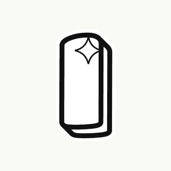

How do you make an I in bubble letters?
For a plain bubble I, draw a rounded pillar like a long capsule. For a capital with bars, add a short puffy bar across the top and bottom and soften the corners where they meet the stem. For a lowercase i, draw a short capsule and a round dot floating above it.
- Decide the style. Choose a plain pillar or an I with top and bottom bars. Use the barred one if the word also has an l or a 1.
- Draw the stem. Pencil a straight line, then outline it as a tall capsule with rounded ends.
- Add the bars. For the barred version, draw short bars across the top and bottom, each about twice the width of the stem.
- Soften the joins. Curve the four inside corners where the bars meet the stem.
- Ink it. Trace in marker, erase the pencil, and place a shine down the stem.
What makes an I easy or tricky in bubble letters
The I is the simplest bubble letter: no holes, no curves to balance. That makes its width the main decision. A skinny pillar next to fat letters looks lost, so give it the same stroke thickness as everything else. The barred I takes up more room and fills space better in short words.
Lowercase i in bubble letters
Lowercase i is a short pillar with a dot above it. In bubble style the dot is a full circle, not a speck, about as wide as the stem. Leave a clear gap between dot and stem so they stay two shapes. This dot is the best place to add personality: a heart, a star or a flower all work.
Cute, 3D and graffiti bubble I
Cute bubble i's almost always swap the dot for a heart or star. For 3D, give the dot its own shadow in the same direction as the stem's, so it looks like it floats. In graffiti, a capital I might get a lean or an arrow off the top bar.
Common mistakes with a bubble I
- Drawing the pillar thinner than the other letters so it looks deflated.
- Letting the dot of the lowercase i touch the stem.
- Using a plain pillar in a word with an l, so the two cannot be told apart.
Printable bubble letter I to color or trace
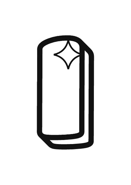

Each letter fills a full A4 page (choose "fit to page" to print on US Letter), so it is big enough to color, trace or cut out for a banner. Download the uppercase A–Z PDF, the lowercase a–z PDF or the numbers 0–9 PDF, and print only the pages you need. More sheets are on printable bubble letters.