




























How do you draw lowercase bubble letters?
Draw lowercase bubble letters the same way as capitals: write a thin pencil skeleton, draw a round outline about a finger-width around it, then erase the skeleton. The difference is height. Lowercase letters come in three heights, so draw guide lines first and keep every letter on them.
- Draw four guide lines. From top to bottom: the ascender line, the x-height line, the baseline and the descender line. Space the middle gap (the x-height) a bit wider than the others.
- Write the skeleton. Print the word lightly in single lines, with wide gaps between letters so the bubbles have room.
- Puff up each letter. Draw one smooth outline around each skeleton, rounding every end. Keep the thickness the same on every letter.
- Keep holes open. Small letters have small bowls. In a, b, d, e, g, o, p and q, leave the hole big enough to see, or the letter turns into a blob.
- Ink, color and shine. Erase the pencil, outline in black, color, then add white highlights on the same side of every letter.
x-height, ascenders and descenders
The x-height is the height of a lowercase x, and of a, c, e, m, n, o, r, s, u, v, w and z. Ascenders are the parts that rise above it, and descenders hang below the baseline. In bubble letters, matching these three heights across a word is what makes it look neat.
- Ascender letters: b, d, f, h, k, l and t. Make their stems reach the same top line. The t is the exception: its top usually stops a little lower than the others.
- Descender letters: g, j, p, q and y. Let their tails drop the same distance below the baseline, and round the tail ends of g, j and y into a soft hook.
- Short letters: everything else sits between the baseline and the x-height. Most mistakes happen here, when an n or o grows taller than its neighbors.
Bubble outlines are thick, so a tall x-height reads better than in normal handwriting. If tails bump into the line below, shorten the descenders slightly rather than shrinking the whole word.
Which lowercase letters look different in our font?
The bubble letters on this page use Titan One, a rounded display font. Its a is double-story, with a small arch on top of the bowl, like printed books, and its g is single-story, a round bowl with a hooked tail, like most handwriting. Kids who learned the single-story a at school can draw it that way; both are correct.
- b, d, p and q are mirror images of each other. Check the bowl side before you outline.
- l and capital I can look the same. Give the l a slight curve at the bottom.
- i and j need their dots. Draw each dot as a separate round bubble just above the stem, with a clear gap, so it does not merge into the letter.
- r and n look alike when puffed up. Keep the r's arm short and the n's second stem full height.
Printable lowercase bubble letters a–z
The free lowercase bubble letters PDF has one big outlined letter per page, a on page 1 through z on page 26, on A4 pages (choose "fit to page" on US Letter). Print it to color, trace or cut out for a word wall.
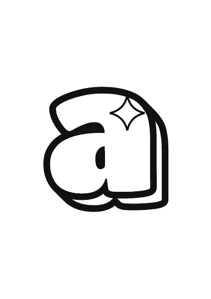
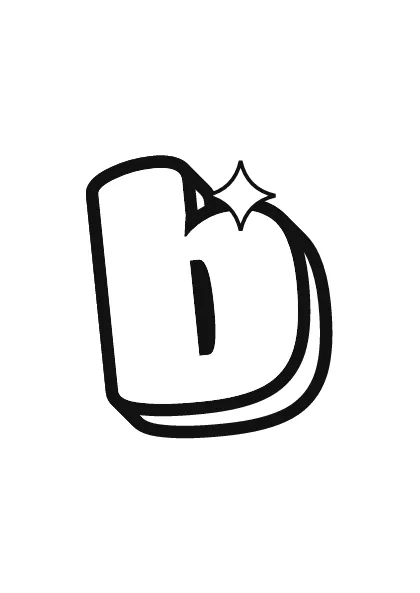
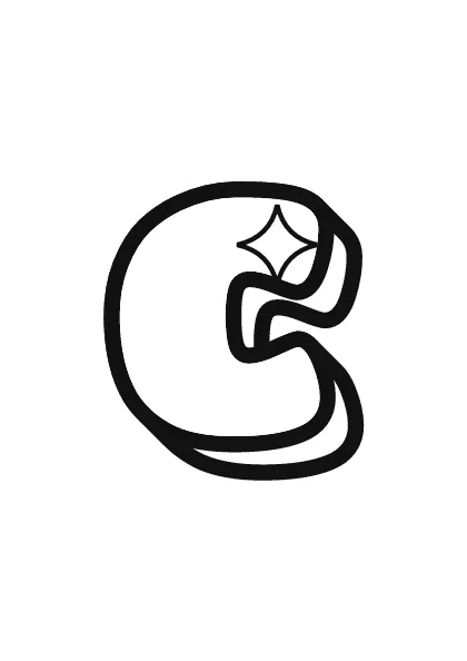
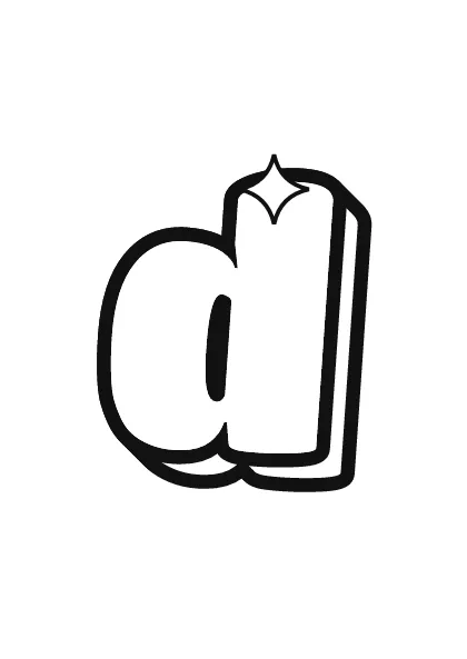
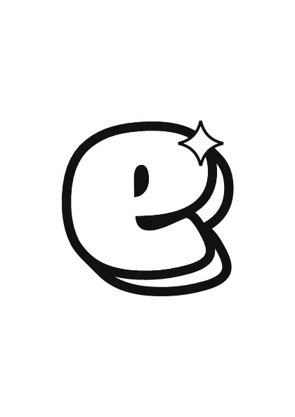
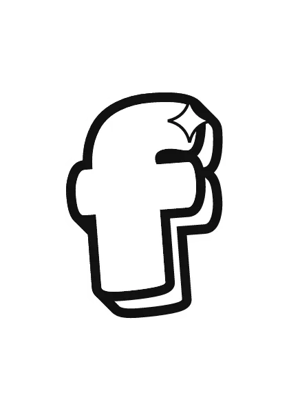
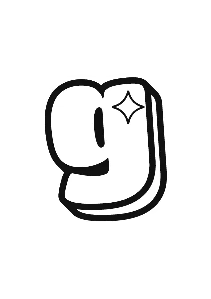
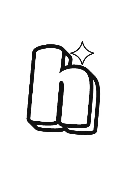
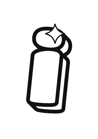
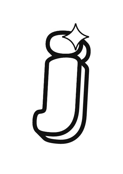
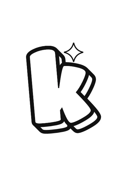
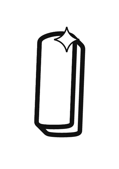

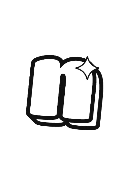
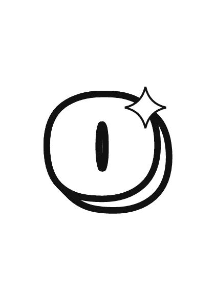
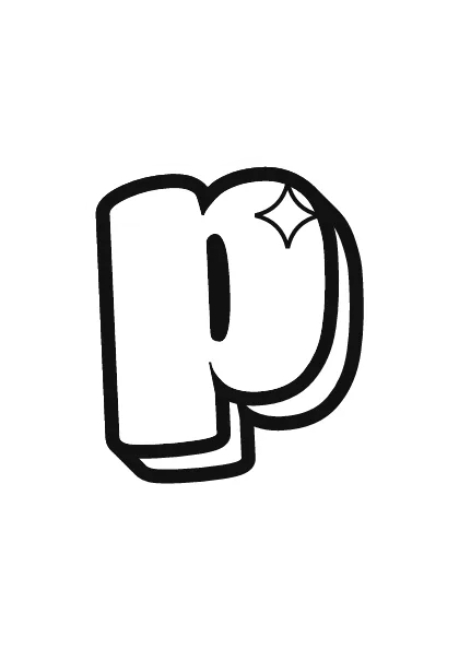
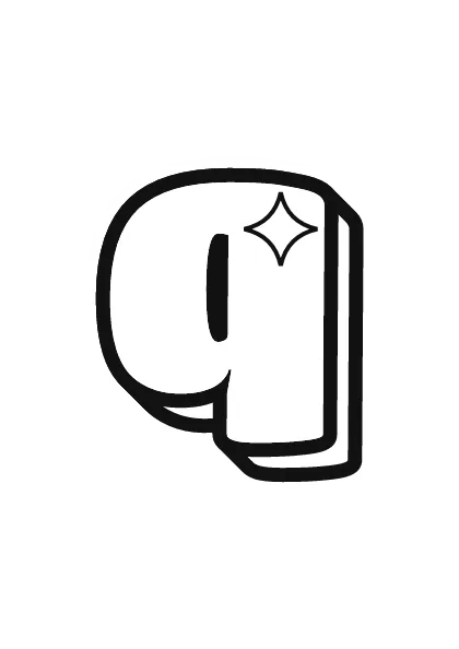
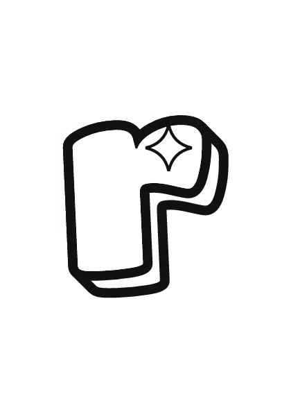
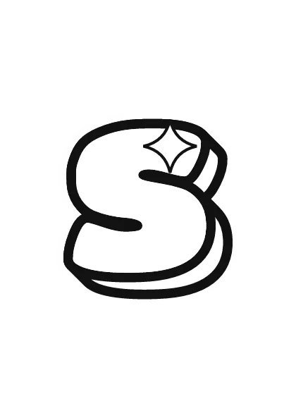
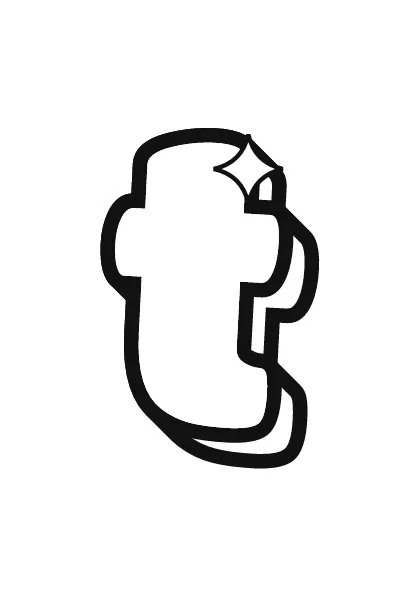

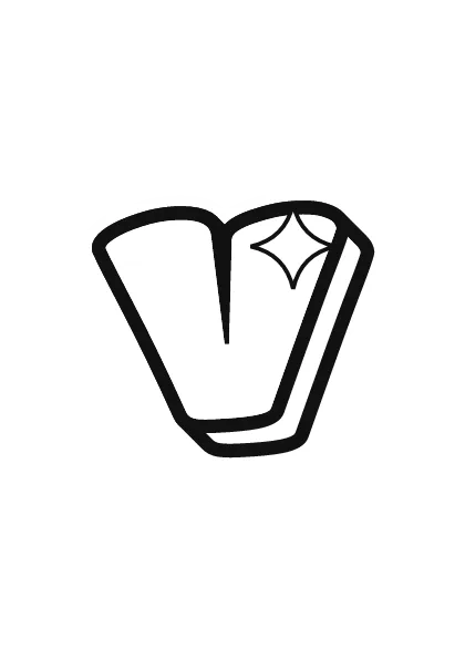

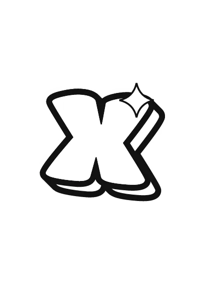
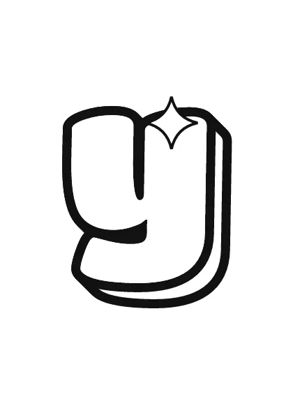
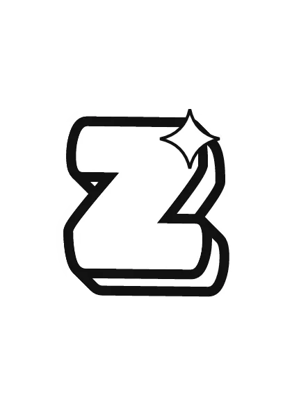
In a classroom, lowercase bubble letters are handy for word walls and spelling displays, because most of what children read is lowercase. Hang each lowercase page next to its capital so kids match the pairs, color the short letters one color and the tall and tailed letters another to show the three heights, or let each child cut out the first letter of their name for a door display. Thick outlines are easy for small hands to color inside and to cut around with safety scissors.
Printing tips, capitals and numbers are on printable bubble letters. For a softer, pastel version of the same alphabet, see cute bubble letters.
Mixing uppercase and lowercase in names
The usual way to write a name in bubble letters is a capital first letter and lowercase for the rest, such as "Mia" or "Leo". It reads like normal writing and the capital gives the name a strong start. All-lowercase looks relaxed and cute; all-capitals looks bold and graffiti-like.
- Line up the bases. The capital and the lowercase letters share one baseline. The capital reaches the ascender line.
- Match the thickness. The outline around the capital should be as thick as around the small letters.
- Tuck letters in. Let a short lowercase letter sit close under the arm of a capital like T, F or P.
- Pick one style per word. Avoid random capitals in the middle of a name unless that is the look you want.
The generator keeps whatever case you type with the Bubble style, so "Mia" stays mixed case and "mia" stays lowercase. Graffiti writers usually prefer capitals; the graffiti letters page explains why.