
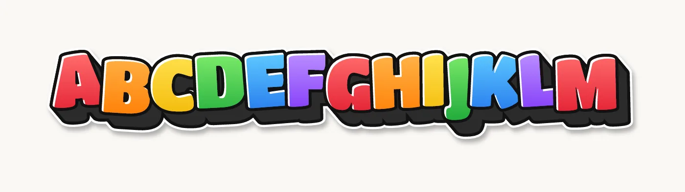
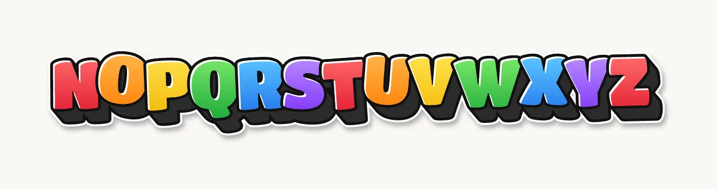
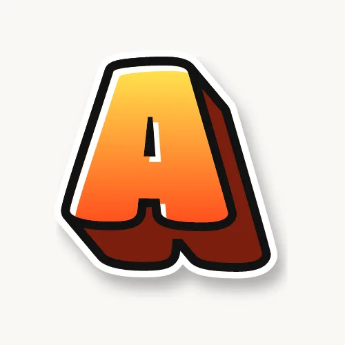

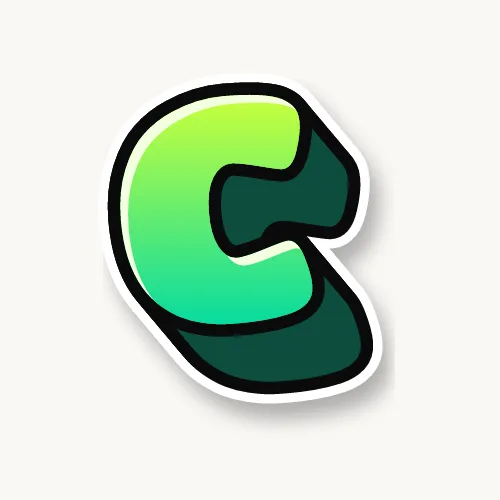
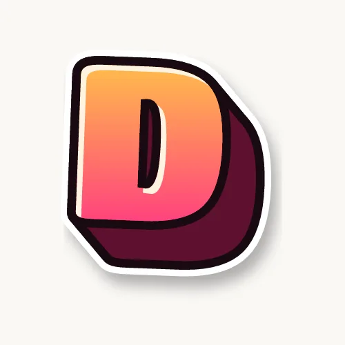
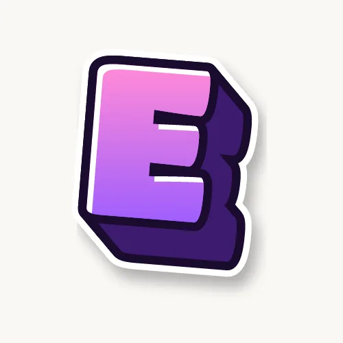
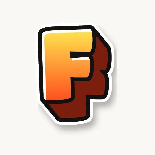

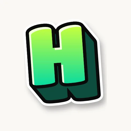
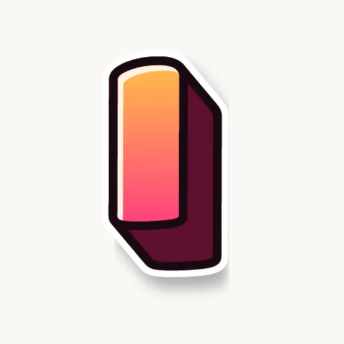

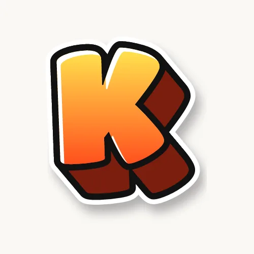

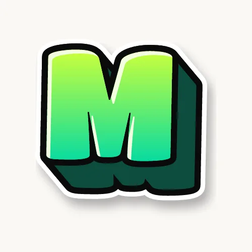
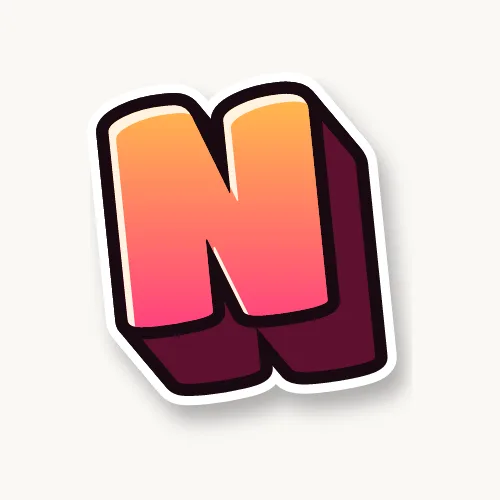
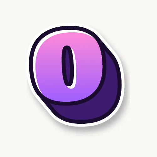
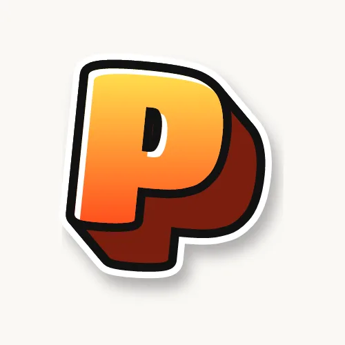

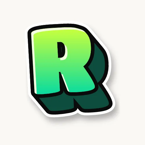




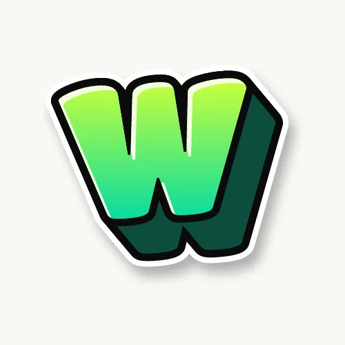


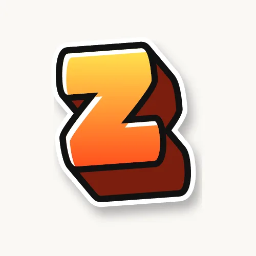
How do you draw 3D bubble letters step by step?
Draw the bubble letters first, choose where the light comes from, then draw short parallel lines from every outer curve away from the light, connect their ends with a copy of the letter's edge, and fill that block in a dark color. Shading and a soft cast shadow finish the effect.
- Draw and ink the bubble letters. Finish the front faces first: skeleton, round outline, then a clean black line. If you need a refresher, the bubble letters guide covers this part.
- Pick a light direction. Decide the light comes from one corner, usually the top left. The block goes the opposite way, down and to the right. Write a small arrow in the corner of the page so you do not forget.
- Draw the depth lines. From the bottom and right edges of each letter, draw short lines all pointing the same way and all the same length. Put one wherever a curve turns, at the ends of strokes and at the widest point of each bulge. On a bubble letter that is more lines than you expect, because curves turn everywhere.
- Connect the ends. Join the line ends with a curve that copies the letter's outline, as if you traced the letter again slightly shifted. Only draw the parts you can see; the front letter hides the rest.
- Check the holes. Inside O, D, B, P and A, the block shows on the top and left edges of the hole, not the bottom and right. This is the step most people get wrong.
- Fill the block. Color it darker than the letter: dark gray, black, or a deep version of the fill color. Erase the leftover depth lines that cross the block.
- Shade and shine. Make the block a little darker where it meets the letter, add a white highlight on the side of each letter facing the light, and draw a soft gray shadow on the ground below and to the right of the whole word.
The block's depth sets the mood. Short blocks look like thick stickers; long blocks look like heavy, puffy signs. On bubble letters, a depth of about one quarter of the letter's height looks solid without hiding the shapes.
Common mistakes with 3D bubble letters
Most 3D bubble letters look wrong for one of three reasons: the depth lines point in different directions, the block lines have different lengths, or the block is drawn inside the holes on the wrong side. Fix those and the letters look solid.
- Mixed directions. Every block on every letter goes the same way. Check with your page arrow.
- Uneven depth. If one line is longer, the letter looks twisted. Measure the first one with your pencil and copy it.
- Straight block on a round letter. The back edge must curve like the front. Straight lines on a bubble letter make it look like a block letter.
- Block lighter than the letter. The side is in shade, so it must be darker than the front.
- Overlaps in the wrong order. If letters overlap, each block goes behind the next letter's front face, never on top of it.
How to make 3D bubble letters in the generator
Open the generator with 3D in rainbow bubble letters, type your word, then go to the Effects tab. Raise the 3D depth slider for a deeper block, and use 3D direction to swing it: around 45° points down-right, around 135° points down-left. Keep Shadow on for the soft ground shadow. Download a transparent PNG, or an SVG made of outlined paths that opens in Illustrator or Cricut Design Space.
Big bubble letters for posters and signs
Big bubble letters need thicker outlines and simpler decoration than small ones, because they are seen from across a room. Draw them on a large sheet, or print one letter per page and tape them in a row. The 3D block helps big letters stand out on a busy wall.
- Sketch with a grid. Fold the poster into equal sections so every letter gets the same width.
- Outline with a broad marker. A chisel tip or paint marker keeps the line thick enough at size.
- Fill large areas evenly. Paint or broad markers in one direction avoid streaks.
- Print huge. The printable bubble letters PDFs can be split across several sheets with your PDF reader's Poster option.
Cool bubble letters: adding graffiti style
Cool bubble letters take the 3D bubble shape and add graffiti details: letters that lean and overlap, a white cutline around the word, drips, a chrome or fade fill, and stars or shine marks. Two colors, done fast, and you have a throw-up.
- Overlap each letter onto the next and bounce them off the baseline.
- Fill with a two-color fade, light at the top and dark at the bottom.
- Draw a thick white line around the finished word, then a black line around that.
- Add two or three drips from the bottom edge, never from the top.
For sharp-edged graffiti letters with 3D, such as block letters and wildstyle, see 3D graffiti letters. Practice on paper or in a blackbook, and keep any spray paint for legal walls and canvas.