
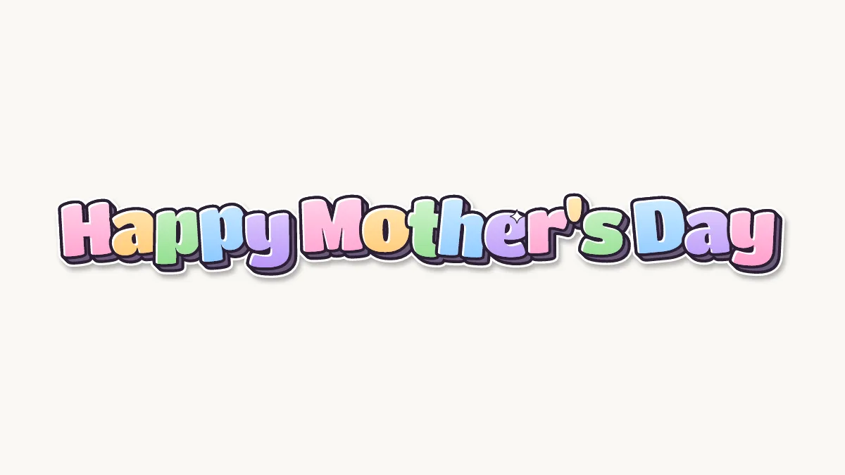
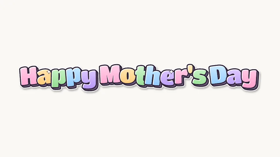
How do you write Happy Mother's Day in bubble letters?
- Plan three rows. HAPPY has 5 letters, MOTHER'S has 7 plus an apostrophe, and DAY has 3. Center the three rows. For a wide card, HAPPY MOTHER'S on top and DAY below works too.
- Put the apostrophe in the right place. It is Mother's Day, one mother, so the apostrophe goes between the R and the S. Draw it as a small teardrop or a tiny heart at the top of the row.
- Handle the double P. The two P's in HAPPY sit side by side. Overlap them slightly with the second behind the first, and keep both bowls the same size.
- Watch the H and the M. M is wide and H has two straight sides. Keep the H narrower than the M, and round its corners so the crossbar looks like a fat bridge, not a thin line.
- Finish with the R and S. Give the R a round bowl and a short, fat leg. The S after the apostrophe should be the same height as the others; tilt it slightly so the row ends cleanly.
Ideas for Happy Mother's Day in bubble letters
- Handmade card: draw HAPPY MOTHER'S DAY on the front and a short note inside. For the single word, see MOM in bubble letters.
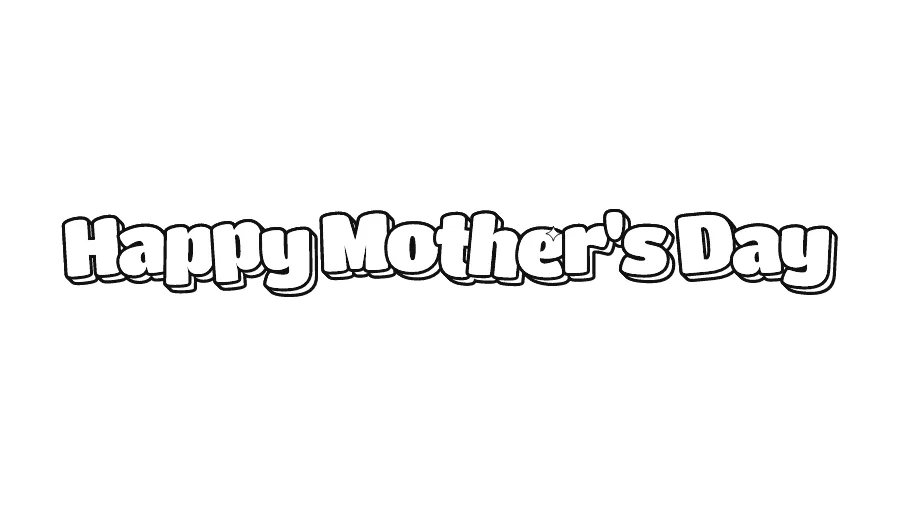
- Classroom craft: print the outline for each student to color and glue onto folded cardstock.
- Breakfast-in-bed sign: print the colored PNG, fold it into a tent card and put it on the tray.
- Flower bouquet tag: shrink the outline, color it and tie it to the flowers with ribbon.
- Social post: download the PNG with a transparent background and place it over a family photo.
Colors and decorations for Happy Mother's Day
Spring pastels fit: pink, lilac, peach, mint and soft yellow, either one color per row or a pastel mix across all letters. Flowers suit this message, so draw small daisies or tulips in the corners, a heart for the apostrophe or a little flower in the counter of the O. A soft gray or purple shadow looks gentler than black.
Happy Mother's Day in graffiti letters
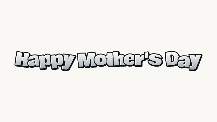
The graffiti image is a throw-up: round letters with a light fill and a heavy outline, painted fast. A three-line phrase works as a stacked throw-up where each row overlaps the one above a little. Keep the letters fat and bouncy and the outline even. The throw-up page explains the shapes and the two-color method.