
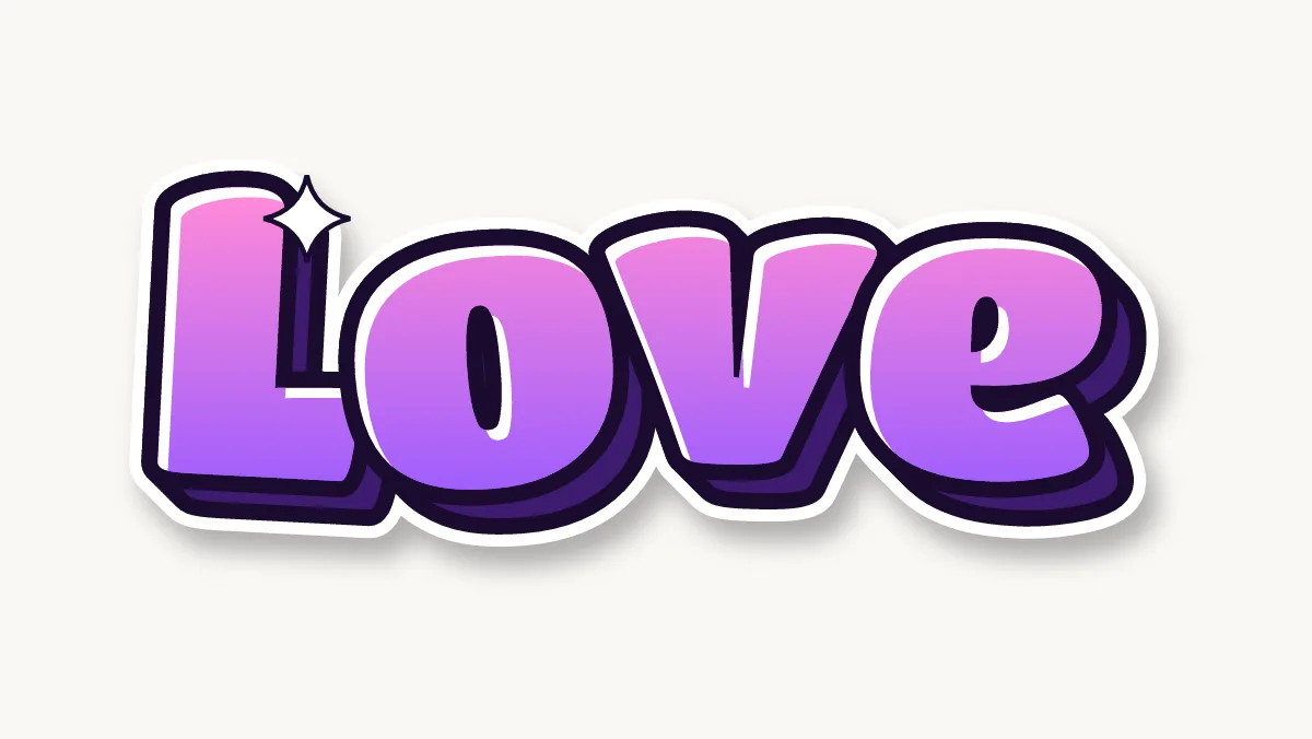


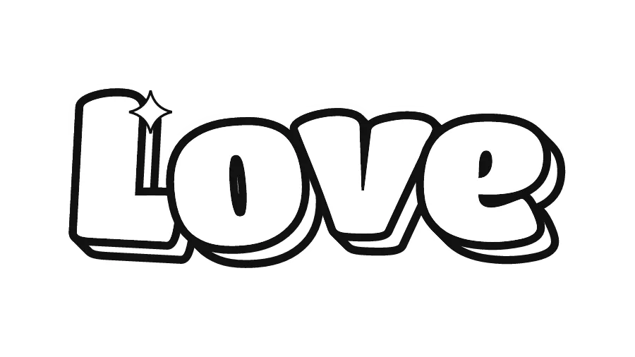
How do you write Love in bubble letters?
- Plan four wide letters. LOVE has four letters with very different widths. O and V are wide, E is medium and L is narrow at the top but wide at the foot. Lightly mark four slots on the paper before you draw, with the O and V slots a little wider.
- Tuck the O into the L. The L has an empty corner above its foot. Slide the O into that space so it overlaps the foot slightly. This closes the gap that makes LOVE look like L OVE.
- Round the point of the V. V is the hardest letter here because it ends in a point. In bubble letters, turn that point into a soft U-shaped bottom and keep the two arms fat. A sharp V looks out of place next to the round O.
- Give the E three even bumps. Draw the E as a tall rounded block with two small notches cut in from the right. Make the notches shallow so the arms stay thick and the E does not turn into a comb.
- Swap the O for a heart (optional). The most common twist on LOVE is a heart in place of the O. Draw a puffy heart the same height as the other letters, with the dip at the top lined up with the tops of L, V and E.
Ideas for Love in bubble letters
- Valentine's card front: LOVE across the middle, one small heart above the E. See Happy Valentine's Day in bubble letters for a longer message.
- Anniversary or wedding card: LOVE in soft pastels with the couple's initials underneath in smaller letters.
- Bedroom wall print: print the colored PNG at letter size and frame it, or color the outline version with markers.
- Notebook or binder doodle: four letters fit across the bottom corner of a cover, which makes LOVE a good warm-up word.
- Note in a lunchbox: a quick LOVE in bubble letters on a sticky note, colored in two minutes.
Colors and decorations for Love
Pink to purple (the Candy palette) is the classic choice for LOVE, and red to pink works for Valentine's Day. For a softer look, fill each letter in a different pastel: blush, peach, lilac and mint. Small hearts fit inside the counter of the O or float above the word, and a few white shine marks on the upper left of each letter make it look glossy. Keep the outline black or dark purple so pale fills still read.
Love in graffiti letters
The graffiti version above uses the Drip style: brush-shaped letters with paint running from the bottom edge. On LOVE, drips look best under the O and the E, because L and V have narrow bottoms. Keep drips to two or three, in different lengths, each ending in a round drop. For other looks, compare the styles on the graffiti styles page.